As requested, here's my experience in its own thread. Ultimately, I'll be jailbreaking and looking for advice on what apps to download in jailbreak to make my experience better. Thanks in advance.
HISTORY: Previous iPhone 4S owner, then switched to Galaxy Nexus, then to Nexus 4. You can read about my N4 experiences in the Nexus 4 Owners Thread (long story short: bad, disappointing). Also an iPad 3rd gen owner, so I'm not unfamiliar with iOS 6, but as y'all know, using iOS on an iPad for leisure is vastly different than using iOS as a smartphone for work, everyday use, etc.
My recent disappointments with Android's offerings this year (so far) coupled with my recent return of multiple Nexus 4 devices has left me looking at iOS again to either be a) my smartphone to tie me over until I change my mind about the S4, or b) my return to iOS for the foreseeable future.
THOUGHTS:
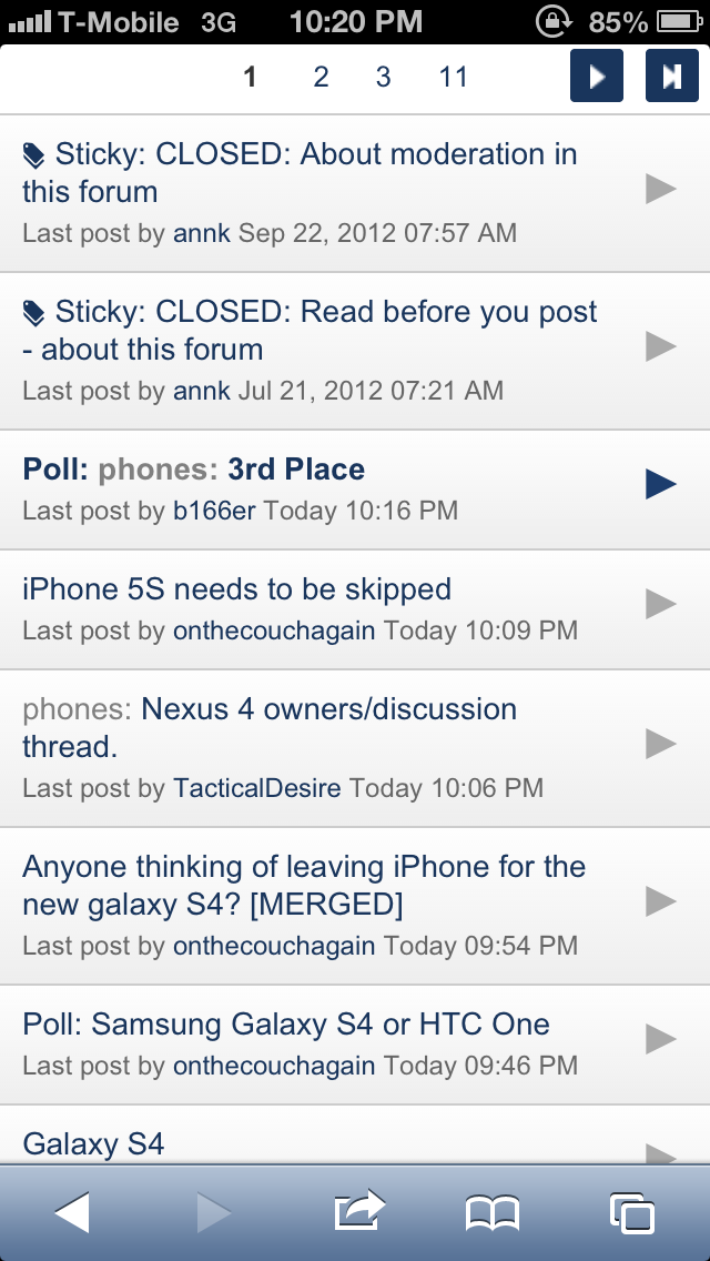
-Boy do I miss the dedicated back button. Sure iOS has a button that takes you back but it's not always in the same place. Sometimes it's upper left, sometimes it's lower left (Safari's back button), sometimes it's upper right, and other times it's a "Cancel" button in the lower middle of the screen. You have to search for it, instead of just having muscle memory of tapping back. I post example pictures:
Sometimes the only way to go back is the upper right:

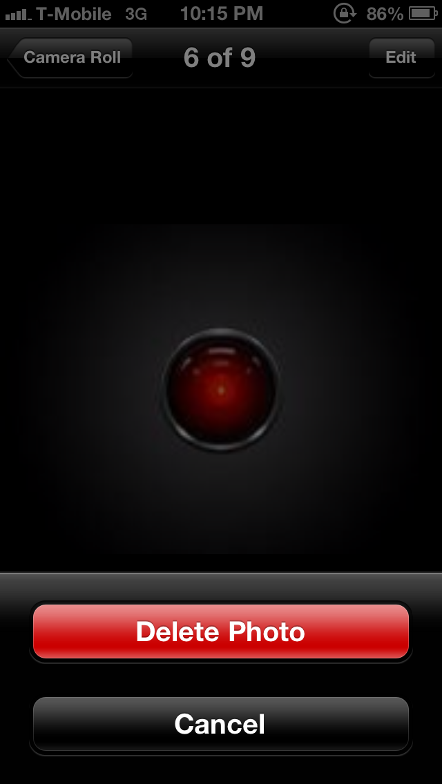
Other times, it's a cancel button bottom of the screen (you cannot tap elsewhere on the screen to get out of this):
And in Safari, it's lower left to go back a page:
-Also miss the dedicated menu button. Goodness gracious, iOS Settings is a mess! It's honestly difficult to find certain things. And I hate how you have to leave an app in order to go to the iOS Settings to get to that app's settings. It's... so counterintuitive. Then, once in a while, you'll have an app like Gmail or Facebook where there are no settings in the iOS Settings screen. It's actually in the app, so you feel like a fool going to look for it in the iOS Settings screen. Very inconsistent.
-Why does the App Store keep asking me for my password every time I download something? It's so annoying. I already registered the device and signed into iTunes/App Store with my Apple ID. Make it stop.
-Scrolling in Safari is dreadfully slow. The elastic flicking method is cute, but grows old very fast. Anytime you want to navigate to the end of a page, or scroll anywhere remotely farther, up or down, is a laborious waiting game of flicking and flicking and flicking. I can't stress how silly it feels doing this on the most advance operating system in the world.
-While the keyboard has been faring okay, it's still no where as easy to use as Swiftkey. Boy, do I miss swiping. The iOS keyboard with its narrow screen BEGS for swiping abilities. Everything on this keyboard feels so "manual". That's the best way for me to describe it. You have to really labor to get what you want to type and what symbols you want out. I miss predictions: Swiftkey used to finish sentences for me. It's such a breeze tapping once to get a full word onto the screen. The one plus, I gotta say, is I love editing with iOS. Something about the cursor placement is more accurate. I also love Shortcuts. In my opinion, stock Android keyboard does shortcuts wrong (they shouldn't be suggestions in the suggestion bar. They should just automatically change it to the word you want).
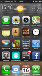
-Small thing, but I miss my scrollable wallpaper. iOS looks so static and dead. It's really kind of sad.
-All Mail is nice, but it's kind of annoying you can't immediately tell which mailbox the email you're looking at is from. It's annoying that emails are only partially downloaded too. I have to click "download" toward the bottom to get more of it. What the heck is that? It also has to load any old mail or mail in other Labels. With Gmail, your entire mailbox (literally) was available instantaneously.
-BIG MISS: Notification light. I hate having to keep turning the device on just to see if I've got anything waiting for me. This is such a useful feature. To all those people who keep talking about how Apple doesn't implement something until people are ready for it or until they can do it right, here's a perfect example of that philosophy being utter BS. Notification light is majorly useful and it's not hard to get a simple light "right."
-I miss not being able to toggle the lock screen on/off. It really sucks having to put in my lock code every single time I access my phone, even if I don't need it, say like when I'm at home. On Android, you can do this, and so when you're at home, you toggle off your lock screen, thus allowing instant access to your phone.
-Another thing that irks me: Notifications. The little flippy thing that comes down from the top of the screen is so obnoxious. No offense, but I don't know how anyone can accept that this is all Apple could come up with to notify you. It literally blocks any access to the buttons on top. How is blocking something part of Apple's software philosophy? And since the "back" or "cancel" buttons are usually at the top, you have to either wait for it to go away, or swipe it away first. It's so dreadfully unintuitive. I can't believe this is what Apple software developers, after a year, came up with. This is all they could offer? Likewise, when you're on a call, and you want to navigate back to your home screen and/or apps, the green "In a call" thing on top pushes everything down. It's really kind of ridiculous.
-Screen size: actually okay. I thought this would be a bigger issue going back to the smaller 4" screen, but it so far hasn't bothered me terribly. I do feel it though when I'm looking at NYC subway map apps, or the Apple Maps app, or when browsing certain things. But it's not as horrendous as I thought it would be. I have said this before: the iPhone would be glorious with a larger screen. That day will hopefully come soon. And it's no joke a serious change from the 4S screen. Just like going from 4" to 4.5" would make a huge difference, going from 3.5" to 4" is a huge difference, too. The size of the actual device itself, though, is still awkward to me. So narrow... feels like I'm holding a candy bar.
-Design: hard not to fall in love. Let's face it, this is a sort of the ugly child of the former all glass 4S and the aluminum of Apple's iPad and modern day laptops. It's a sort of ugly mesh of them, but it somehow... works. It's hard not to be enamored by such a cute little device. The edges, especially, are captivatingly stunning. I got it in white, by the way.
-Hate the physical home button, but it definitely feels "sturdier" than I remember the 4S being. I just can't help but feel that every time I tap it, that's one closer tap to failure I'm getting it to. By the way, I'm using the phone 100% naked. It's wild.
I don't know what more I can say. In short, everything about iOS is so laborious and manual. Everything just REEKS of limitations. Even the new Lightning cable is annoyingly short.
Jailbreak to come soon...
HISTORY: Previous iPhone 4S owner, then switched to Galaxy Nexus, then to Nexus 4. You can read about my N4 experiences in the Nexus 4 Owners Thread (long story short: bad, disappointing). Also an iPad 3rd gen owner, so I'm not unfamiliar with iOS 6, but as y'all know, using iOS on an iPad for leisure is vastly different than using iOS as a smartphone for work, everyday use, etc.
My recent disappointments with Android's offerings this year (so far) coupled with my recent return of multiple Nexus 4 devices has left me looking at iOS again to either be a) my smartphone to tie me over until I change my mind about the S4, or b) my return to iOS for the foreseeable future.
THOUGHTS:
-Boy do I miss the dedicated back button. Sure iOS has a button that takes you back but it's not always in the same place. Sometimes it's upper left, sometimes it's lower left (Safari's back button), sometimes it's upper right, and other times it's a "Cancel" button in the lower middle of the screen. You have to search for it, instead of just having muscle memory of tapping back. I post example pictures:
Sometimes the only way to go back is the upper right:

Other times, it's a cancel button bottom of the screen (you cannot tap elsewhere on the screen to get out of this):

And in Safari, it's lower left to go back a page:

-Also miss the dedicated menu button. Goodness gracious, iOS Settings is a mess! It's honestly difficult to find certain things. And I hate how you have to leave an app in order to go to the iOS Settings to get to that app's settings. It's... so counterintuitive. Then, once in a while, you'll have an app like Gmail or Facebook where there are no settings in the iOS Settings screen. It's actually in the app, so you feel like a fool going to look for it in the iOS Settings screen. Very inconsistent.
-Why does the App Store keep asking me for my password every time I download something? It's so annoying. I already registered the device and signed into iTunes/App Store with my Apple ID. Make it stop.
-Scrolling in Safari is dreadfully slow. The elastic flicking method is cute, but grows old very fast. Anytime you want to navigate to the end of a page, or scroll anywhere remotely farther, up or down, is a laborious waiting game of flicking and flicking and flicking. I can't stress how silly it feels doing this on the most advance operating system in the world.
-While the keyboard has been faring okay, it's still no where as easy to use as Swiftkey. Boy, do I miss swiping. The iOS keyboard with its narrow screen BEGS for swiping abilities. Everything on this keyboard feels so "manual". That's the best way for me to describe it. You have to really labor to get what you want to type and what symbols you want out. I miss predictions: Swiftkey used to finish sentences for me. It's such a breeze tapping once to get a full word onto the screen. The one plus, I gotta say, is I love editing with iOS. Something about the cursor placement is more accurate. I also love Shortcuts. In my opinion, stock Android keyboard does shortcuts wrong (they shouldn't be suggestions in the suggestion bar. They should just automatically change it to the word you want).
-Small thing, but I miss my scrollable wallpaper. iOS looks so static and dead.
-All Mail is nice, but it's kind of annoying you can't immediately tell which mailbox the email you're looking at is from. It's annoying that emails are only partially downloaded too. I have to click "download" toward the bottom to get more of it. What the heck is that? It also has to load any old mail or mail in other Labels. With Gmail, your entire mailbox (literally) was available instantaneously.
-BIG MISS: Notification light. I hate having to keep turning the device on just to see if I've got anything waiting for me. This is such a useful feature. To all those people who keep talking about how Apple doesn't implement something until people are ready for it or until they can do it right, here's a perfect example of that philosophy being utter BS. Notification light is majorly useful and it's not hard to get a simple light "right."
-I miss not being able to toggle the lock screen on/off. It really sucks having to put in my lock code every single time I access my phone, even if I don't need it, say like when I'm at home. On Android, you can do this, and so when you're at home, you toggle off your lock screen, thus allowing instant access to your phone.
-Another thing that irks me: Notifications. The little flippy thing that comes down from the top of the screen is so obnoxious. No offense, but I don't know how anyone can accept that this is all Apple could come up with to notify you. It literally blocks any access to the buttons on top. How is blocking something part of Apple's software philosophy? And since the "back" or "cancel" buttons are usually at the top, you have to either wait for it to go away, or swipe it away first. It's so dreadfully unintuitive. I can't believe this is what Apple software developers, after a year, came up with. This is all they could offer? Likewise, when you're on a call, and you want to navigate back to your home screen and/or apps, the green "In a call" thing on top pushes everything down. It's really kind of ridiculous.
-Screen size: actually okay. I thought this would be a bigger issue going back to the smaller 4" screen, but it so far hasn't bothered me terribly. I do feel it though when I'm looking at NYC subway map apps, or the Apple Maps app, or when browsing certain things. But it's not as horrendous as I thought it would be. I have said this before: the iPhone would be glorious with a larger screen. That day will hopefully come soon. And it's no joke a serious change from the 4S screen. Just like going from 4" to 4.5" would make a huge difference, going from 3.5" to 4" is a huge difference, too. The size of the actual device itself, though, is still awkward to me. So narrow... feels like I'm holding a candy bar.
-Design: hard not to fall in love. Let's face it, this is a sort of the ugly child of the former all glass 4S and the aluminum of Apple's iPad and modern day laptops. It's a sort of ugly mesh of them, but it somehow... works. It's hard not to be enamored by such a cute little device. The edges, especially, are captivatingly stunning. I got it in white, by the way.
-Hate the physical home button, but it definitely feels "sturdier" than I remember the 4S being. I just can't help but feel that every time I tap it, that's one closer tap to failure I'm getting it to. By the way, I'm using the phone 100% naked. It's wild.
I don't know what more I can say. In short, everything about iOS is so laborious and manual. Everything just REEKS of limitations. Even the new Lightning cable is annoyingly short.
Jailbreak to come soon...
Last edited:


