-Boy do
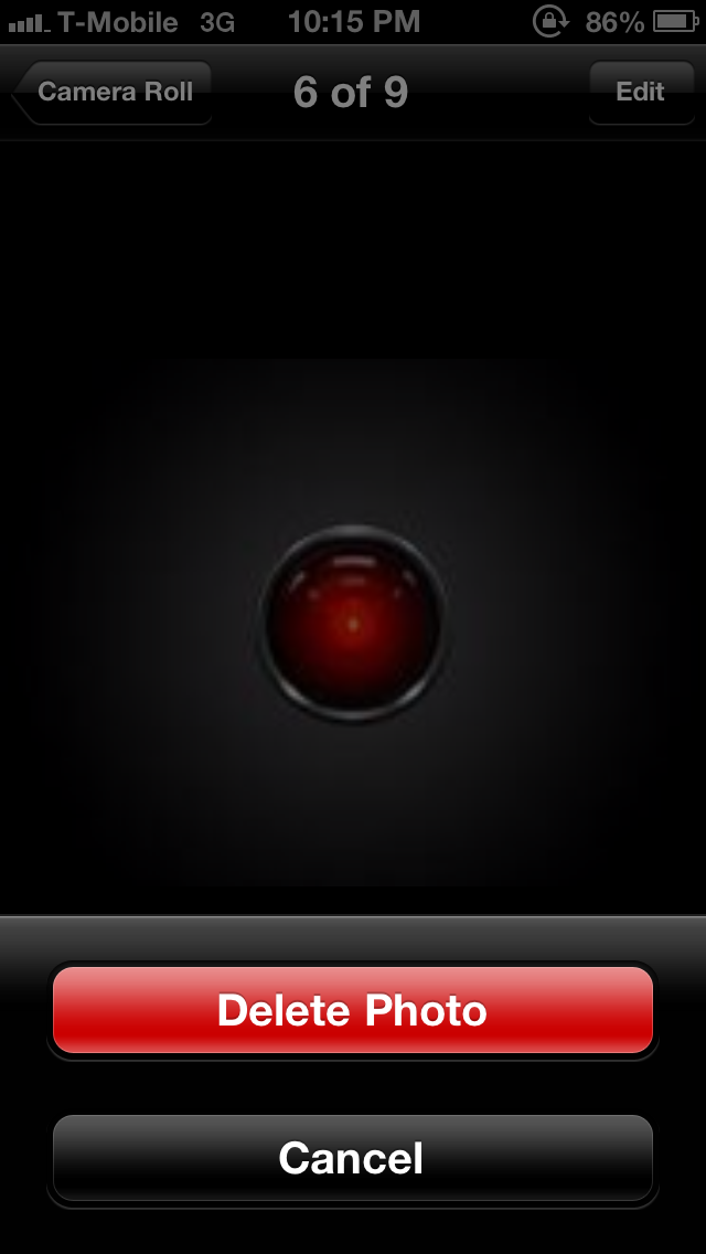
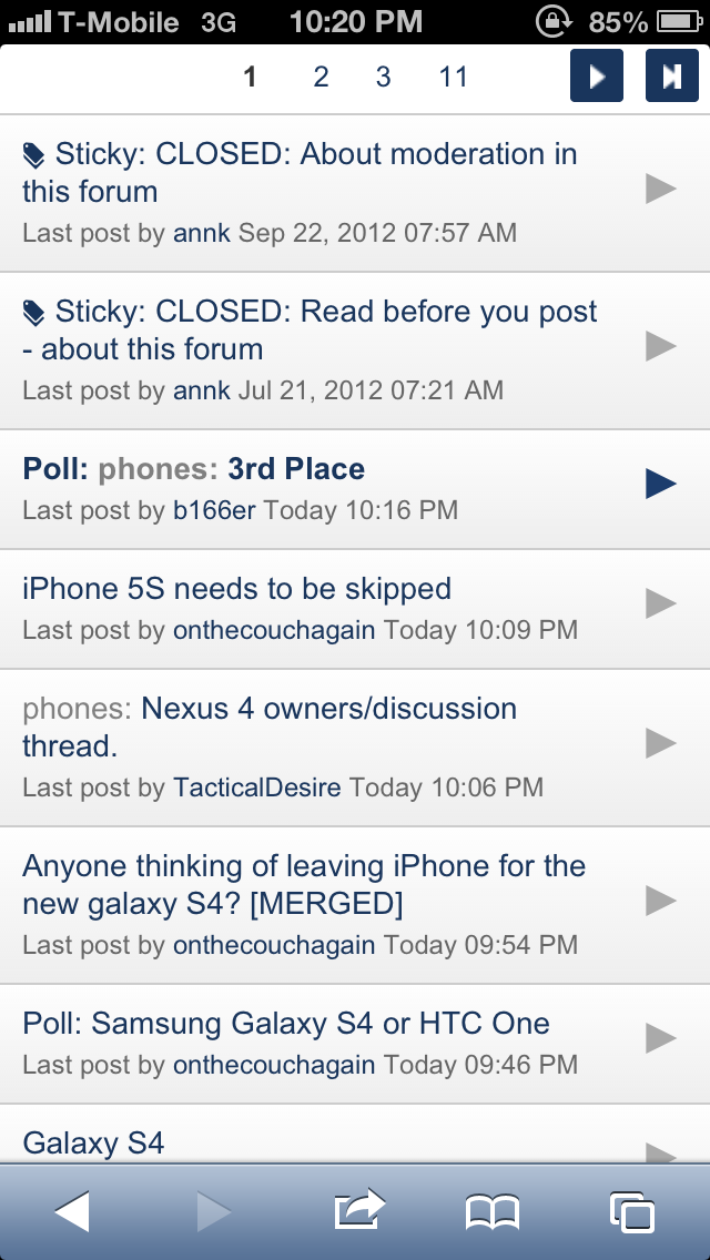
I miss the dedicated back button. Sure iOS has a button that takes you back but it's not always in the same place. Sometimes it's upper left, sometimes it's lower left (Safari's back button), sometimes it's upper right, and other times it's a "Cancel" button in the lower middle of the screen. You have to search for it, instead of just having muscle memory of tapping back. I post example pictures:
Sometimes the only way to go back is the upper right:
Other times, it's a cancel button bottom of the screen (you cannot tap elsewhere on the screen to get out of this):
And in Safari, it's lower left to go back a page:
Matt's completely right- all it's about what you're used to. There's no dedicated back button in desktop/laptop operating systems, I never hear any whinging about how you have to use alt+tab, cmd+tab, the app's own back/forward buttons, expose, the Windows taskbar etc. to switch apps or to go back to what you were doing, or back to the screen you were previously on. The lack of a dedicated back button has never harmed desktop operating systems, nor does it harm iOS.
The positioning of buttons is generally very, very consistent. Top left to go back in a menu, or back a screen, top right to indicate that you're done. An example is how you can fill out forms in certain apps- you can progress through pages of the form, with the top-left button being dedicated to going back to the previous page of the form you were on, and the top-right button being used to indicate that you're done filling out information.
Occasionally, for important things, like the aforementioned completion of a form, the only button will be found at the top-right, so you don't hammer the top-left position out of habit accidentally and lose what you were doing. That goes for your message example, in a new message that isn't a reply to an existing message thread, the back/cancel button will be at the top right so you don't hammer the top-left out of habit and lose what you were writing. In an existing message thread, going back using the top left button will save your unwritten message for when you return to that message thread.
Of course, there are inconsistencies, such as the Safari example, where Apple doesn't follow their own guidelines (and I'm glad for it, I hate iOS browsers which have the back/forward buttons up the top), but on the whole, button placement is very, very consistent. Besides, it's not like Android's back button's function is always consistent. It always drove me mad when using the Commonwealth Bank app- pressing back would exit the entire app instead of going back to the previous screen. Also, if you read an email from the Gmail widget, pressing back would take you into Gmail- I thought the point was to take you back to whatever the previous screen you were on was?
-Also miss the dedicated menu button. Goodness gracious, iOS Settings is a mess! It's honestly difficult to find certain things. And I hate how you have to leave an app in order to go to the iOS Settings to get to that app's settings. It's... so counterintuitive. Then, once in a while, you'll have an app like Gmail or Facebook where there are no settings in the iOS Settings screen. It's actually in the app, so you feel like a fool going to look for it in the iOS Settings screen. Very inconsistent.
This is something Apple needs to nail down. It rarely affects me, as most apps opt to place their settings within the app nowadays, but sometimes you do need to visit the Settings app for certain settings.
-Why does the App Store keep asking me for my password every time I download something? It's so annoying. I already registered the device and signed into iTunes/App Store with my Apple ID. Make it stop.
Definitely not going to argue with that! That's one of my iOS pet peeves.
-Scrolling in Safari is dreadfully slow. The elastic flicking method is cute, but grows old very fast. Anytime you want to navigate to the end of a page, or scroll anywhere remotely farther, up or down, is a laborious waiting game of flicking and flicking and flicking. I can't stress how silly it feels doing this on the most advance operating system in the world.
Again, it's a case of what you're used to. If you flick really fast about 4-5 times, scrolling speeds up with each flick until you're at the end of the page. Then you have the OS-wide tap-to-top, which is such a great little feature- you really miss it when using a different touchscreen OS.
-While the keyboard has been faring okay, it's still no where as easy to use as Swiftkey. Boy, do I miss swiping. The iOS keyboard with its narrow screen BEGS for swiping abilities. Everything on this keyboard feels so "manual". That's the best way for me to describe it. You have to really labor to get what you want to type and what symbols you want out. I miss predictions: Swiftkey used to finish sentences for me. It's such a breeze tapping once to get a full word onto the screen. The one plus, I gotta say, is I love editing with iOS. Something about the cursor placement is more accurate. I also love Shortcuts. In my opinion, stock Android keyboard does shortcuts wrong (they shouldn't be suggestions in the suggestion bar. They should just automatically change it to the word you want).
Another example of personal preference. I had no idea what the fuss was about Swiftkey, and a lot of that can probably be attributed to what I'm used to. The buttons in Swiftkey felt awkwardly placed compared to the stock Android keyboard, the long pressing for symbols and numbers actually felt like it was slowing me down compared to a quick tap to the numerical keyboard and tap back (maybe it feels faster once you're used to it, it felt clunky to me, even with the long press timing reduced).
-Small thing, but I miss my scrollable wallpaper.
iOS looks so static and dead. 
It's really kind of sad.
Agree with this!
-BIG MISS: Notification light. I hate having to keep turning the device on just to see if I've got anything waiting for me. This is such a useful feature. To all those people who keep talking about how Apple doesn't implement something until people are ready for it or until they can do it right, here's a perfect example of that philosophy being utter BS. Notification light is majorly useful and it's not hard to get a simple light "right."
Personal preference, but you're right, it's something Apple could easily add without affecting the overall experience at all.
-I miss not being able to toggle the lock screen on/off. It really sucks having to put in my lock code every single time I access my phone, even if I don't need it, say like when I'm at home. On Android, you can do this, and so when you're at home, you toggle off your lock screen, thus allowing instant access to your phone.
There's a Cydia tweak for this.
-Another thing that irks me: Notifications. The little flippy thing that comes down from the top of the screen is so obnoxious. No offense, but I don't know how anyone can accept that this is all Apple could come up with to notify you. It literally blocks any access to the buttons on top. How is blocking something part of Apple's software philosophy? And since the "back" or "cancel" buttons are usually at the top, you have to either wait for it to go away, or swipe it away first. It's so dreadfully unintuitive. I can't believe this is what Apple software developers, after a year, came up with. This is all they could offer? Likewise, when you're on a call, and you want to navigate back to your home screen and/or apps, the green "In a call" thing on top pushes everything down. It's really kind of ridiculous.
It's supposed to force your attention onto the notification, so you don't miss it, but you're right, it can be quite intrusive and could be easier to dismiss. I like it though- when using 4.1/4.2 on the N7, I always wished the notification bar would more obviously change colour when an email or other notification would come in, it could be quite easy to miss when it was white symbols/text swapping out for other white symbols/text, especially with the device on silent. I love having the constant "In a call" bar though- a call should be the number one priority, and there should always be an easy way back to the call in progress.


