Still No Customisation
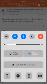
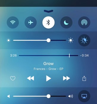
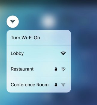
Control Center looks fresh and new introducing a level of uniformity with the rest of iOS, multiple pages of content are a great way to organise different parts of the UI while still being easily and quickly accessible, however there's still no form of customisation which considering how personal Control Center should be is particularly shortsighted. Not everyone needs quick access to the same things! Some people would benefit greatly from accessibility functionality and others from personal hotspot and or mobile data toggles...
These are just a few examples!

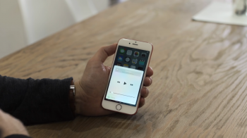
(Screenshots by: Iphone5preorder)
These are just a few examples!


(Screenshots by: Iphone5preorder)
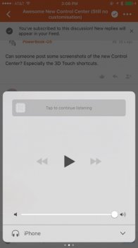
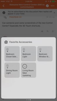
(Screenshots by: ajiuo)
(Deleted stock Apps also have their corresponding Control Center shortcuts removed!)
"A place for everything and everything in its place"
Personally I have always felt the App Shortcuts pretty irrelevant, especially in iOS 9 and iOS 10 where we now have Siri App Suggestions! Apple moved in the right direction categorising the different elements of Control Center in to separate pages but it feels more like a work in progress with the main page still being a mismatch of everything. Oversized and overpowering banner style buttons to toggle settings such as AirPlay, AirDrop, NightShift and Flashlight from a visual, functional and economical standpoint would work just as well as traditional toggles and the removal of app shortcuts from the bottom of the main page would also help to create space for more relevant quick settings not to mention allow Apple to concentrate solely on Siri App Suggestions for this type of functionality.

Glances Esque Widget Dock
I can't be the only one that's noticed it, the pages that make up the new Control Center layout look like widgets and kind of feel like Glances from WatchOS! How great would it be if we could add our own... Being able to take expandable 'show more' widgets from Today View and pin them as Control Center pages would be very powerful! Those that are particularly interested in email for example could pin the Mail widget, those wanting instant access to Stocks would be able to just flick up and know exactly what's going on from where ever they are, Siri App Suggestions could have its very own page and could even group apps with attributes such as time of day most used etc. Categorising sections of Control Center in to different areas paves the way for additional pages of content that could prove to be extremely useful and if it's worked just right the OS could be intelligent enough to not only remember what page you left Control Center on, but open it to different pages based on current activity, time of day and much more. Just like Siri Suggestions.
How important do you think Control Center is and do you think it should be more personal to you?
MacStories Concept
Update
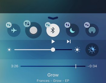
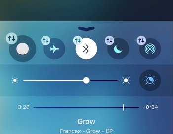
"A new framework has been discovered in iOS 10, named “ControlCenterUI”. Inside of this framework is a class named “CCUICellularDataSetting”. When hacked to run inside of the iOS Simulator, it shows what amounts to an unmistakable placeholder." Source
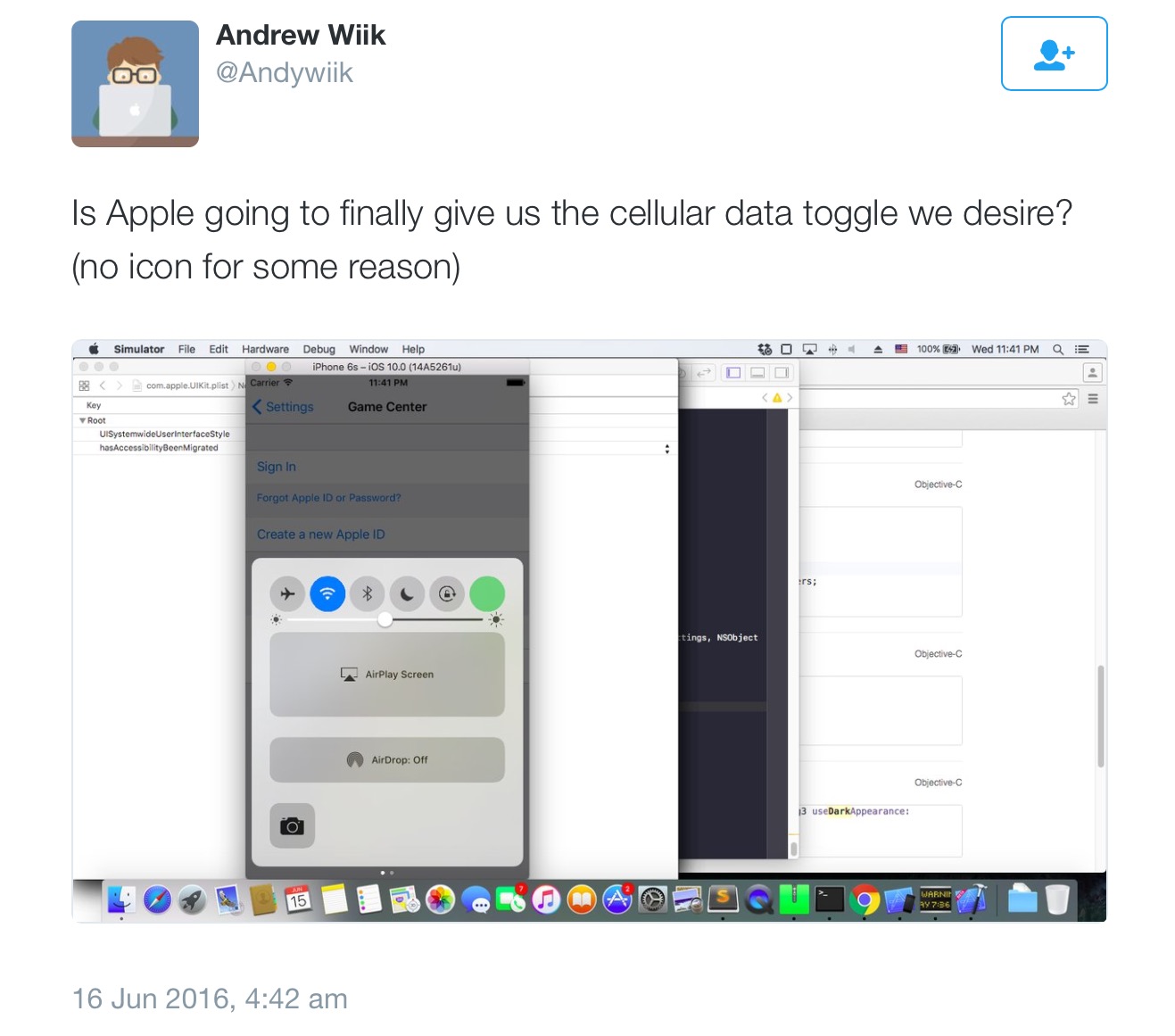
Another toggle crammed in to the same row proceeded bellow by huge banner buttons doesn't seem very logical but then this is only a beta and still being actively worked on so I'm pretty confident this isn't how the final UI will look. Hopefully the new framework paves the way for users to add a selection of toggles that will form scrollable pages.
Also we might see third party Control Center pages in the future...

How important do you think Control Center is and do you think it should be more personal to you?
MacStories Concept


Update
"A new framework has been discovered in iOS 10, named “ControlCenterUI”. Inside of this framework is a class named “CCUICellularDataSetting”. When hacked to run inside of the iOS Simulator, it shows what amounts to an unmistakable placeholder." Source
Another toggle crammed in to the same row proceeded bellow by huge banner buttons doesn't seem very logical but then this is only a beta and still being actively worked on so I'm pretty confident this isn't how the final UI will look. Hopefully the new framework paves the way for users to add a selection of toggles that will form scrollable pages.
Also we might see third party Control Center pages in the future...
Last edited:


