Become a MacRumors Supporter for $50/year with no ads, ability to filter front page stories, and private forums.

TurboPGT!

Suspended
Sep 25, 2015
1,595
2,620
Side note: Comtrol Center on iPad looks absolutely ridiculous! Opinions?

No, it doesn't. But it will probably change a bit before release.

And why do you need customization of control center? Its fine the way it is. What makes you such an expert on the most valuable things to include in control center? What wisdom can you impart that Apple's exhaustive testing processes have not already vetted out?

Or do you just want customization for the sake of customization?
 

ZEEN0j

macrumors 68000
Sep 29, 2014
1,569
721
I was watching a video review by iDownload blog on YouTube and the guy mentioned developers could add pages to the Conteol Center! Does anyone know if Apple released a Control Center API?

Side note: Comtrol Center on iPad looks absolutely ridiculous! Opinions?

That would be awesome. Kinda like glances on apple watch.
 

mattoligy

macrumors 6502
Original poster
May 15, 2010
396
191
Cloud 9
No, it doesn't. But it will probably change a bit before release.

And why do you need customization of control center? Its fine the way it is. What makes you such an expert on the most valuable things to include in control center? What wisdom can you impart that Apple's exhaustive testing processes have not already vetted out?

Or do you just want customization for the sake of customization?

I'm not an expert on what should be in Control Center because I am only one of millions of users! Different people have different needs and requirements! If you took my point as it was projected you would understand I don't think I know best, I think each and every user knows what is best, for them! Apple's "exhaustive testing processes" determines what is best for millions of different people does it?

Sorry Mr vision impaired, you can't swap your "Do Not Disturb" toggle for a "Voice Over" toggle in Control Center or the "Rotation Lock" toggle for a "Zoom" toggle as we are apparently all the same! What's that sir, you never use Do Not Disturb or Rotation Lock and would benefit greatly from quick access to accessibility toggles via a single swipe up from where ever you are in the OS? Sorry Sir...

Sorry Mrs hearing impaired, you can't swap an unused toggle you don't need for "Mono Audio"

And it's not just accessibility, the list goes on! Control Center might be fine for you, but maybe it's not for many others! Have you considered that?
 

TurboPGT!

Suspended
Sep 25, 2015
1,595
2,620
I think each and every user knows what is best, for them!
Fundamentally wrong when it comes to software. Users are most often the people with the least idea of what should or should not be. Oh, they like to act like they would know. But they don't.
 

mattoligy

macrumors 6502
Original poster
May 15, 2010
396
191
Cloud 9
Fundamentally wrong when it comes to software. Users are most often the people with the least idea of what should or should not be. Oh, they like to act like they would know. But they don't.

Speechless at that comment, do you have any idea of how insulting that is to, well, everyone...
 

TurboPGT!

Suspended
Sep 25, 2015
1,595
2,620
Speechless at that comment, do you have any idea of how insulting that is to, well, everyone...
That's one way of looking at it. Another way is to acknowledge that No, you the user really do not know what's best for the software that is developed by not-you, but you appreciate the opportunity to use it just the same.
 

mattoligy

macrumors 6502
Original poster
May 15, 2010
396
191
Cloud 9
That's one way of looking at it. Another way is to acknowledge that No, you the user really do not know what's best for the software that is developed by not-you, but you appreciate the opportunity to use it just the same.

Yeah you're right, we are only the paying customer, we should follow this example throughout our everyday lives... No more menus in restaurants because the chef knows what is best for us to eat, no more cars on showroom floors as the manufacturer knows what is best for us to drive, no more looking at real estate before we purchase a house as the builders and estate agents know better where we should live! No more TVs on display, no grocery isles in supermarkets, we should all just wait in a line and get what we're given!

What a wonderful world that would be... I'm not entertaining this arrogance any further.
 

TurboPGT!

Suspended
Sep 25, 2015
1,595
2,620
Yeah you're right, we are only the paying customer, we should follow this example throughout our everyday lives... No more menus in restaurants because the chef knows what is best for us to eat, no more cars on showroom floors as the manufacturer knows what is best for us to drive, no more looking at real estate before we purchase a house as the builders and estate agents know better where we should live! No more TVs on display, no grocery isles in supermarkets, we should all just wait in a line at get what we're given!

What a wonderful world that would be... I'm not entertaining this arrogance any further.
You only think that's the same thing because of your usual consumer arrogance.
Even in the examples you listed...you're still eating off the menu. You're not demanding your own spin on the restaurant because YOU KNOW BEST.
 

xtwentyseven

macrumors member
Apr 26, 2008
72
25
Dallas, TX
No, it doesn't. But it will probably change a bit before release.

And why do you need customization of control center? Its fine the way it is. What makes you such an expert on the most valuable things to include in control center? What wisdom can you impart that Apple's exhaustive testing processes have not already vetted out?

Or do you just want customization for the sake of customization?

This is just like the asinine argument against getting rid of the 16GB starting point for iPhone. Just because some people are fine with one arrangement doesn't mean another option wouldn't be good. No one who is ok with 16GB would be upset to get 32GB at the same price point. No one who is ok with the current control center options would be upset if I had the option to replace the night shift icon (I use night shift, but only on a schedule and do not need the cc icon) and put something more useful to me in that place. I get that software customization is not always so simple, but they can at least allow a few other toggle options.
 

mattoligy

macrumors 6502
Original poster
May 15, 2010
396
191
Cloud 9
You only think that's the same thing because of your usual consumer arrogance.
Even in the examples you listed...you're still eating off the menu. You're not demanding your own spin on the restaurant because YOU KNOW BEST.

I understand an element of your point. However the restaurant gives the customer a variety of choices to avoid this!

Everyone is entitled to an opinion though yes? Or is that wrong also...
 

stevemiller

macrumors 68020
Oct 27, 2008
2,057
1,607
You only think that's the same thing because of your usual consumer arrogance.
Even in the examples you listed...you're still eating off the menu. You're not demanding your own spin on the restaurant because YOU KNOW BEST.

its one thing to defer to an 'expert' opinion on the matter rather than the layperson, but its also arrogant to say that apple can't be wrong by virtue of being the developer. there are some VERY fundamental UX failures in the current beta. hit target size and steps to accomplish a task are key things to consider in design, and right now, the design says manual override of night shift is super important and adjusting your volume is an extremely secondary task.
[doublepost=1465912507][/doublepost]
I understand an element of your point. However the restaurant gives the customer a variety of choices to avoid this!

Everyone is entitled to an opinion though yes? Or is that wrong also...

also to continue the analogy, the customer should be able to point out when there is a fly in their soup! ;)
 

varsityhero

macrumors regular
Jul 2, 2013
175
52
06d709be83852032f3923be03afaf6a1.jpg

Just saw "Living Room Nest Updating"... Is that the Nest Thermostat? Does it work with the new Home.app?
 

ajiuo

macrumors 65816
Apr 9, 2011
1,129
641
No, it doesn't. But it will probably change a bit before release.

And why do you need customization of control center? Its fine the way it is. What makes you such an expert on the most valuable things to include in control center? What wisdom can you impart that Apple's exhaustive testing processes have not already vetted out?

Or do you just want customization for the sake of customization?

That's a really ignorant statement. You could ask the same thing about Apple. What makes them an expert on the most valuable things to put in control center? Every person is different, and they use different things. Nobody is saying specifically what they should put in Notification Center... Except for Apple. Most people want it to be customizable so that it can be adjusted to suit individual needs... You don't need to do a lot of research to determine what's best in that scenario, because each person can do what's best for them. Instead of making night shift take up a whole row, I should've just made two rows of toggles and made that one toggle... And once again they should let people decide what toggles they have there, and even have APIs that will allow toggles that control other apps.

For example I never use the privacy mode toggle, but I constantly have to going to settings to turn on and off auto lock... So why shouldn't I be able to replace that toggle? It wouldn't affect you or anybody else you could have what you want there. If you're happy with what Apple thinks is best there than great! But that's not best for everybody.
 

Smith288

macrumors 65816
Feb 26, 2008
1,237
990
No, it doesn't. But it will probably change a bit before release.

And why do you need customization of control center? Its fine the way it is. What makes you such an expert on the most valuable things to include in control center? What wisdom can you impart that Apple's exhaustive testing processes have not already vetted out?

Or do you just want customization for the sake of customization?

Apple's UX design staff chimes in....
 

mattoligy

macrumors 6502
Original poster
May 15, 2010
396
191
Cloud 9
That's a really ignorant statement. You could ask the same thing about Apple. What makes them an expert on the most valuable things to put in control center? Every person is different, and they use different things. Nobody is saying specifically what they should put in Notification Center... Except for Apple. Most people want it to be customizable so that it can be adjusted to suit individual needs... You don't need to do a lot of research to determine what's best in that scenario, because each person can do what's best for them. Instead of making night shift take up a whole row, I should've just made two rows of toggles and made that one toggle... And once again they should let people decide what toggles they have there, and even have APIs that will allow toggles that control other apps.

For example I never use the privacy mode toggle, but I constantly have to going to settings to turn on and off auto lock... So why shouldn't I be able to replace that toggle? It wouldn't affect you or anybody else you could have what you want there. If you're happy with what Apple thinks is best there than great! But that's not best for everybody.

Very well said. Completely agree.

Apple's UX design staff chimes in....

I certainly didn't mean to offend anyone, I just feel that everyone is different and deserves to use their device (in certain areas) how it better works for them as an individual! As Ajiuo says above, just because one user has the option to change certain toggles doesn't mean another can't leave them as they are! It doesn't hurt anybody and on the flip side benefits millions of individuals!

The extensive research on Apples part would of been better spent coding a Control Center that is flexible for everyone!

And for the record, personally there is only a few toggles I would change and from my standpoint, access to more toggles is the desirable outcome, but the beauty in the flexibility is everyone can have a "Control" Center than suits them.

MacStories Concept (Same viewpoint)
 
Last edited:

Creek0512

macrumors 6502
Jun 15, 2012
497
450
I actually think it's a step backwards. You now have to take extra steps to get to audio controls. There is still no customization. 3-D touch does work on the quick launch icons but not the toggles... Still very difficult to open with a keyboard is up.
Do people use the audio controls in control center that often? The exact same controls are also available on the lock screen, and are built into every modern headphones set. There are also hardware volume buttons on the iPhone.
 

mattoligy

macrumors 6502
Original poster
May 15, 2010
396
191
Cloud 9
Does anyone know what the Music Widget in today view consists of? I'm s it similar to that of the Control Center now playing widget?
 
Last edited:

The Mad Hatter

macrumors 6502a
Oct 12, 2004
555
89
SoCal
Do people use the audio controls in control center that often? The exact same controls are also available on the lock screen, and are built into every modern headphones set. There are also hardware volume buttons on the iPhone.

Also, if you're currently playing music, the CC will default to the music controls when you swipe up (or at least it does on my iPad).
 
  • Like
Reactions: mattoligy

mattoligy

macrumors 6502
Original poster
May 15, 2010
396
191
Cloud 9
mattoligy said:
Side note: Control Center on iPad looks absolutely ridiculous! Opinions?

No, it doesn't. But it will probably change a bit before release.

I've changed my mind, it looks pretty nice on iPad now I've had a better chance to check it out! The multiple pages of widgets in Control Center are so cool and it got me thinking... It would be fantastic if one could take certain (compatible) widgets from today view and pin them as a Control Center Pages! I did hear talk of there being an API for third party Control Center pages as well as third party today view widgets which would be very cool but based on the pages in Control Center pretty much already being widgets it would be super cool if standard widgets had extra APIs to allow them to be pinned as Control Center pages :)

Control Center would kinda be a widget dock. Each widget would hold the set widget size to match that of standard Control Center widgets.

So for example, those that are particularly interested in email could pin the Mail widget as a Control Center page and have instant access to their emails from anywhere in the OS... Or those wanting instant access to Siri App Suggestions would have them at their fingertips.

How cool and flexible would that be :p
 
Last edited:

Iphone5preorder

macrumors 6502a
Sep 20, 2012
873
466
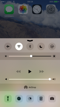
Currently, the control center has five applications across the bottom

Flashlight, timer, night mode, calculator, and camera.

Then you have your airdrop icon and the best part, access to the music player.

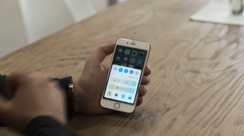
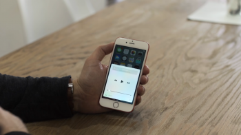
On the new ios10, it looks as if they've reduced it down to four applications on the bottom and made the night view application button the size of Jupiter, and thus, not having space for the music player.

Now the music player has its own new "tab" if you will that is 85% empty and bland.

My frustration and shock is... Instead of being able to quickly swipe up and pause our music, we now need to swipe up, then swipe right, then pause. For what reason though? To make the night view application button extremely massive? To reduce the # of apps accessible on the first tab of the control center?

I can honestly say that this is by far the most mind blowing change to apples functionality that I've seen since the beginning. Not only did they manage to add an extra step to something that needs quick access (pausing music for example), but they've literally added nothing to replace it, and instead, have a completely new tab for the control center that is 85% empty with nothing other than "pause, play, next etc"

Forgive my emotional rampage here but I truly cannot understand how this was approved. I can bet Steve Jobs would've laughed at whoever suggested this horrific change.

Thoughts? Can anyone logically explain what the purpose of making it more difficult to control music while adding nothing else that benefits anyone except possible the elderly who can't seem to find the night mode button?
 

Attachments

  • image.png
    image.png
    680.4 KB · Views: 781
  • image.png
    image.png
    1.2 MB · Views: 826
  • image.png
    image.png
    1.2 MB · Views: 825

jclardy

macrumors 601
Oct 6, 2008
4,233
4,577
I tend to agree - the music screen looks nice but it really isn't needed. Also I set up homekit bridge, so I have the third tab, which is also terrible - the "main" screen should be the middle tab, and homekit should show up to the left, and the music on the right (If they keep the swiping pages around.) You shouldn't have to do three swipes and a tap to turn off a light when it could easily be two.

Also I don't understand the massive amount of whitespace, but maybe that is just on the plus size?
 

Armen

macrumors 604
Apr 30, 2013
7,408
2,274
Los Angeles
Currently, the control center has five applications across the bottom

Flashlight, timer, night mode, calculator, and camera.

Then you have your airdrop icon and the best part, access to the music player.

On the new ios10, it looks as if they've reduced it down to four applications on the bottom and made the night view application button the size of Jupiter, and thus, not having space for the music player.

Now the music player has its own new "tab" if you will that is 85% empty and bland.

My frustration and shock is... Instead of being able to quickly swipe up and pause our music, we now need to swipe up, then swipe right, then pause. For what reason though? To make the night view application button extremely massive? To reduce the # of apps accessible on the first tab of the control center?

I can honestly say that this is by far the most mind blowing change to apples functionality that I've seen since the beginning. Not only did they manage to add an extra step to something that needs quick access (pausing music for example), but they've literally added nothing to replace it, and instead, have a completely new tab for the control center that is 85% empty with nothing other than "pause, play, next etc"

Forgive my emotional rampage here but I truly cannot understand how this was approved. I can bet Steve Jobs would've laughed at whoever suggested this horrific change.

Thoughts? Can anyone logically explain what the purpose of making it more difficult to control music while adding nothing else that benefits anyone except possible the elderly who can't seem to find the night mode button?

A few things to consider:

- The beta program is for developers to test their apps on. It is NOT a user preview although most of us download it and play around with it anyway.
- This is a work in progress. Many elements can change by September.
 
Last edited:
Register on MacRumors! This sidebar will go away, and you'll see fewer ads.