Got a tip for us?
Let us know
Become a MacRumors Supporter for $50/year with no ads, ability to filter front page stories, and private forums.
OS X 10.10 Yosemite: All The Little Things
- Thread starter WhackyNinja
- WikiPost WikiPost
- Start date
- Sort by reaction score
You are using an out of date browser. It may not display this or other websites correctly.
You should upgrade or use an alternative browser.
You should upgrade or use an alternative browser.
- Status
- The first post of this thread is a WikiPost and can be edited by anyone with the appropiate permissions. Your edits will be public.
Another few observations: Safari loading times for most webpages are noticeably faster, and Mail is MUCH more responsive, especially with Gmail. Both programs are choppy in terms of GUI, but that is a systemwide issue with DP1. When we get to the later DPs, using these programs is going to be a real pleasure, I think.
Now we can check to 'close windows when closing apps' in preferences finally!
No more annoying zillion of documents popping out every time you launch ms office.")
That was changed in Mavericks (and possibly Mountain Lion too.)
----------
Another few observations: Safari loading times for most webpages are noticeably faster, and Mail is MUCH more responsive, especially with Gmail. Both programs are choppy in terms of GUI, but that is a systemwide issue with DP1. When we get to the later DPs, using these programs is going to be a real pleasure, I think.
Safari does seem quicker, but I can't get used to the UI. I'm sure it'll be refined over the DPs. The address bar should be slighter longer to fill up all that dead space.
Love it!
I am loving it so far! Keep all the screenshots coming!
What I like:
1. Clean
2. Minimalist
3. Content focus
4. Familiar
5. Sleek/modern
6. FASSSSSSTTTTT!!!!!
One thing I hate is bloated UI that makes operating feels more sluggish than the actual.
I am loving it so far! Keep all the screenshots coming!
What I like:
1. Clean
2. Minimalist
3. Content focus
4. Familiar
5. Sleek/modern
6. FASSSSSSTTTTT!!!!!
One thing I hate is bloated UI that makes operating feels more sluggish than the actual.
I am loving it so far! Keep all the screenshots coming!
What I like:
1. Clean
2. Minimalist
3. Content focus
4. Familiar
5. Sleek/modern
6. FASSSSSSTTTTT!!!!!
One thing I hate is bloated UI that makes operating feels more sluggish than the actual.
What Mac model do you have?
----------
Im genuinely surprised no one has said
"Safari seems snappier"
I am loving it so far! Keep all the screenshots coming!
What I like:
1. Clean
2. Minimalist
3. Content focus
4. Familiar
5. Sleek/modern
6. FASSSSSSTTTTT!!!!!
One thing I hate is bloated UI that makes operating feels more sluggish than the actual.
One of the things I loved the most when I moved fom Windows to Mac was how much more refined the UI was. I do like the new UI in Yosemite, but it's definitly a work in progress.
swingerofbirch
macrumors 68040
My big take is that applying new aesthetics to an existing paradigm isn't a great idea. The new aesthetics should follow a new way of doing things. I could think of quite a few approaches changing OS X. I think most of all it needs a new way of managing windows.
Hello everyone! Those of you who have 10.10, can you tell me if the reader and reading list functions are still available in Safari, and also can you tell me if the font for reader is still a serif font (Times New Roman, etc.) or if they changed it to a sans serif font (Arial, Helvetica etc.)
Thank you very much!
Reading list is definitely still there, and I don't know what font the reader is in, but it's there. Here's a picture of reader
Attachments
In launchpad, folders have an extra row of space, and you can put multiple pages of apps in them, like iOS 7/8.
Reading list is definitely still there, and I don't know what font the reader is in, but it's there. Here's a picture of reader
EXCELLENT
Thank you SO much! I was worried that they would change the reader to a sans serif font like they did in iOS 7, which completely loses the entire point of increasing legibility.
Excellent news for those with multiple-router systems at home:
I have an Airport Time Capsule (the new 802AC one) and 2 802N expresses extending the network throughout the house. Before, my Macbook Air would just connect to the router with the strongest signal, not the router with which it could get the fastest transmit rate. This means I usually got connected to the 802N routers in Mavericks. That is no longer the case with 10.10. Even if the signal is a tad weaker with the AC router, I'm connecting to it and getting double the transmit rate as a result.
the ".11" in "802.11n" is really quite important and you shouldn't leave it out if you're going to mention the "802" bit.
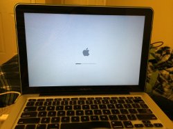
- boot screen is now the same as iOS: black background, white apple, thin loading bar
- login screen is your desktop picture blurred, instead of black background.
iOS has either black or white background at boot screen, depending on if you have white/silver or black/space gray device.
But nice find anyways.
Love how when you click on the battery icon it tells you if and what app(s) are using significant energy!
dude thats in mavericks too
I just registered for the "preview beta". Waiting an email for more info.... Should I anticipate problems with updating when the final version is released ?
Im genuinely surprised no one has said
"Safari seems snappier"
Well let me be the first one to say it! Because this Safari feels a lot snappier, and the difference it pretty perceivable too. I think this is because of the new FTL complier which is super fast JIT.
I suspect it will get a makeover. The computer shown in System Information is still showing the Tiger default desktop picture.
That's deliberate though, the mac icon itself is a rMBP, so they could've changed the wallpaper if they wanted.
Last edited:
I can't get AirDrop to work between Yosemite and iOS 8. Is this not enabled yet?
dude its a DP just wait god
Hi all,
Just about to install the beta at home but am wondering what PHP version this ships with. Does anybody know? Last time i had a MARE trying to get all my PHP versions working again when installing Mavericks so just doing a pre-check first this time
If anyone knows could they let me know please?
Cheers
A
Calculator surprised me. The icon and widget have the flat look and i'm sure it will soon.
So is Aqua dead? Is this a continuation of Aqua? If not, what is this called?
Well that sucks, I use the green button all of the time at work. With the loss of the green button 'best-fit' function, there's no auto window resizing now
Fret not, I read somewhere that Option-clicking the green button invokes the previous behavior
Register on MacRumors! This sidebar will go away, and you'll see fewer ads.