Become a MacRumors Supporter for $50/year with no ads, ability to filter front page stories, and private forums.
Status
The first post of this thread is a WikiPost and can be edited by anyone with the appropiate permissions. Your edits will be public.
I knew some would common on that :) , and yes I know it's still a DP and not even a beta :) , but there isn't a single hint directs that the dock and the Menu Bar aren't the only UI elements to get darkened :) not even in the keynote.

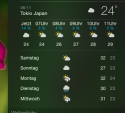
But seeing as the Keynote only shown a screenshot and not even live footage of Dark mode suggests that even now it is not finished.
 
Anyone else having issues with Messages, and AIM / Google "friends" not displaying the full name? I have it set to full name, but it only shows the first name and last initial.

There is a similar setting on iOS. Have you checked the Messages or Contacts app whether there are any settings for it (both in the menu bar as well as the app’s settings)?
 
I'm glad they softened the shadow on the menu bar. I also hated how on light background there was a clear dark line underneath it.

Surprised they didn't change the finder icon to the tweaked one on the website.
 
There is a similar setting on iOS. Have you checked the Messages or Contacts app whether there are any settings for it (both in the menu bar as well as the app’s settings)?

Yep, I checked. Toggled a bunch of settings...no luck. Weird thing is my Facebook chat account in Messages (through Jabber) displays as expected, but Google and AIM do not.
 
I'm glad they softened the shadow on the menu bar. I also hated how on light background there was a clear dark line underneath it.

Surprised they didn't change the finder icon to the tweaked one on the website.

I recently checked the website, and it now sports the icon from the developer previews :(

According to the Wayback Machine, it was changed somewhere between the 17th and 24th of June. Looks like we're stuck with it the way it is...
 
Last edited:
Is it only me or if the Dark Theme is actually harder on the eyes ?
It's definitely not just you. I said the same thing few pages back and in another thread. I think it has to do with the contrast between the Dark Dock en Menu Bar and light window chrome. Also, it doesn't blend as well with your desktop picture. This is something the Light theme does much better. So yeah, all in all the Light theme seems to be easier on the eyes.
 
Last edited:
iPhone 5 running latest iOS 8 beta 3.

MacBook Pro (late 2012) running Yosemite DP 3 (latest version).

Call comes in, my Mac But I cant attend My call from Macbook
How can solve This ?

Thanks in advance
-Arun-
 
It's definitely not just you. I said the same thing few pages back and in another thread. I think it has to do with the contrast between the Dark Dock en Menu Bar and light window chrome. Also, it doesn't blend as well with your desktop picture. This is something the Light theme does much better. So yeah, all in all the Light theme seems to be easier on the eyes.
I think the dark theme is needed for night work at the computer.
 
I think the dark theme is needed for night work at the computer.

It's for making the OS less obstructive so users (mainly pro users) can focus on their content. Having less colour in the OS also allows for users to determine colours better (say in Photoshop or FCPX).

Would be nice as a nighttime use though, neat idea :)
 
It's for making the OS less obstructive so users (mainly pro users) can focus on their content. Having less colour in the OS also allows for users to determine colours better (say in Photoshop or FCPX).

Problem is, white text on black is actually harder to read than black text on white on monitors. Luckily, they have the transparency to save their asses, but it still doesn't work. It's hurting my eyes. I thought they wouldn't go anywhere near the Pixelmator route, but really, that's what they did. It's better, but they did.

They should go with light gray text instead. Think of FCPX or Logic Pro X, or Aperture, or GarageBand, or iMovie... now THESE are pro interfaces.


Bottom line, it's all marketing and preferences. There's nothing more "pro" about a certain set of colors.
 
Problem is, white text on black is actually harder to read than black text on white on monitors. Luckily, they have the transparency to save their asses, but it still doesn't work. It's hurting my eyes. I thought they wouldn't go anywhere near the Pixelmator route, but really, that's what they did. It's better, but they did.

They should go with light gray text instead. Think of FCPX or Logic Pro X, or Aperture, or GarageBand, or iMovie... now THESE are pro interfaces.

I do agree with you, that is what I meant. I was just saying that that is what they were going for. All Pro apps that I use go for the dark grey colour scheme apart from a few.
 
double-click of any city, shows the weather for the next 5 days ;)
 

Attachments

  • Bildschirmfoto 2014-07-11 um 23.15.43.png
    Bildschirmfoto 2014-07-11 um 23.15.43.png
    67.4 KB · Views: 2,777
:confused: Seems to me Yosemite ('s font rendering) is designed to sell Retina displays...

After all changes in DP3 it looks very good on my 27" iMac too. On my 13" rMBP it looked amazing from the beginning. I love the new look and it is certainly refreshing. I hope we get the DP4 in two weeks and that most of the annoying bugs get resolved (yeah, I know it's a beta)
 
After all changes in DP3 it looks very good on my 27" iMac too. On my 13" rMBP it looked amazing from the beginning. I love the new look and it is certainly refreshing. I hope we get the DP4 in two weeks and that most of the annoying bugs get resolved (yeah, I know it's a beta)
What are the noticeable bugs? I have been waiting to dive into the beta.
 
Register on MacRumors! This sidebar will go away, and you'll see fewer ads.