Got a tip for us?
Let us know
Become a MacRumors Supporter for $50/year with no ads, ability to filter front page stories, and private forums.
OS X 10.10 Yosemite: All The Little Things
- Thread starter WhackyNinja
- WikiPost WikiPost
- Start date
- Sort by reaction score
You are using an out of date browser. It may not display this or other websites correctly.
You should upgrade or use an alternative browser.
You should upgrade or use an alternative browser.
- Status
- The first post of this thread is a WikiPost and can be edited by anyone with the appropiate permissions. Your edits will be public.
Wow that's bad. I sure hope it doesn't stay that way, otherwise they are idiots!
It's undoubtedly a bug, they were pushing the improved multiple displays support with Mavericks pretty hard.
I like Yosemite a lot. It's a little glitchy right now. That is completely understandable. It's a beta. But wow...there's a lot of promise here.
Yosemite boots like iOS 7 with a black screen with white Apple logo and white loading progress bar at startup. When the computer gets to the login window, it's your desktop picture out of focus with a nice list of the users. An improvement over Lion/Mountain Lion/Mavericks.
When you set up your Mac you can set it up to sign in with your Apple ID. I think this is long overdue and I very much welcome this.
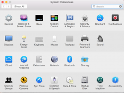
A lot of the old interface is still there (although Lucida Grand has been swapped out for the new Helvetica version) and the iconography and designs will probably be updated as the beta matures. A lot of spit and polish is needed but you can definitely see how great this is going to be. I was pretty leery but I'm pleasantly surprised.
Attachments
Going Full Screen with multiple displays now goes back to Mountain type full screens.
Full screen on 1 screen, empty darkness on the others.
You must have the relevant setting disabled because this behaviour is exactly the same as in mavericks.
I like Yosemite a lot. It's a little glitchy right now. That is completely understandable. It's a beta. But wow...there's a lot of promise here.
Yosemite boots like iOS 7 with a black screen with white Apple logo and white loading progress bar at startup. When the computer gets to the login window, it's your desktop picture out of focus with a nice list of the users. An improvement over Lion/Mountain Lion/Mavericks.
When you set up your Mac you can set it up to sign in with your Apple ID. I think this is long overdue and I very much welcome this.
A lot of the old interface is still there (although Lucida Grand has been swapped out for the new Helvetica version) and the iconography and designs will probably be updated as the beta matures. A lot of spit and polish is needed but you can definitely see how great this is going to be. I was pretty leery but I'm pleasantly surprised.
I see the wallpapers icon is still with Leopard's wallpaper....
IT NEVER CHANGES
- boot screen is now the same as iOS: black background, white apple, thin loading bar
- login screen is your desktop picture blurred, instead of black background.
Nice find!
You must have the relevant setting disabled because this behaviour is exactly the same as in mavericks.
I upgraded directly from Mavericks and this was one of the 1st things I noticed.
Are Yosemite Extensions the same as iOS 8 Extensions? Hadn't noticed that until now.
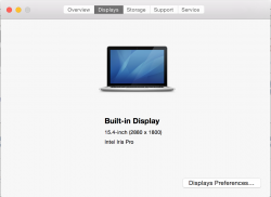
Also note how the CFL is gone, replaced by an LED bulb... But "Startup Device" is still an HDD...
Extensions points you to the Mac App Store, they're for the share menu and notification center
I see the wallpapers icon is still with Leopard's wallpaper....
IT NEVER CHANGES
I suspect it will get a makeover. The computer shown in System Information is still showing the Tiger default desktop picture.
Attachments
Game Center in Yosemite is pretty plain.
Plain is better than the felt...does it have the blobs? Screenshot?
Someone said:
"iMovie, iPhoto and final cut pro X doesnt work."
If true, that is just sad. Apples own apps are not compatible? Why do we always have to step back to step ahead?
It's a beta. It's completely understandable.
Plain is better than the felt...does it have the blobs? Screenshot?
The icon is the blobs and the blobs are on the sign in screen. Other than that it's like the mavs one but just white. Will upload a screen later.
App Store is exactly the same.
Thoughts:
New UI is decidedly unattractive, although at least the icons are still okay. Just flat and simplified, but not to the point of being hideous like iOS.
New features are awesome.
New UI is decidedly unattractive, although at least the icons are still okay. Just flat and simplified, but not to the point of being hideous like iOS.
New features are awesome.
Register on MacRumors! This sidebar will go away, and you'll see fewer ads.


