Become a MacRumors Supporter for $50/year with no ads, ability to filter front page stories, and private forums.
Status
The first post of this thread is a WikiPost and can be edited by anyone with the appropiate permissions. Your edits will be public.

randolorian

macrumors 6502a
Sep 3, 2011
584
1,863
It is these kind of little things which seem to be de-evolving rather than simply improving on what was good.

This probably had to do with the deal they made with MS for Bing. Maybe MS demanded that Bing search results were always high on the list.
 

hamis92

macrumors 6502
Apr 4, 2007
475
87
Finland
This probably had to do with the deal they made with MS for Bing. Maybe MS demanded that Bing search results were always high on the list.
This frustrates me – making the user experience worse for the sake of something that's completely irrelevant to the users. Bing search was the first thing I disabled when I installed El Cap, so I'm not going to see them anyway.
 

KALLT

macrumors 603
Sep 23, 2008
5,380
3,415
It is these kind of little things which seem to be de-evolving rather than simply improving on what was good.

Indeed. Now my dictionary definitions are completely at the bottom, making them completely useless to me. :( I was thinking of disabling everything except the things I really need, but that not only cripples Spotlight even further, it also completely destroys the “Arrange by Kind” sorting in Finder, as everything will be thrown together under “Other”. What are they thinking?!
 

RednBlue

macrumors regular
Dec 17, 2013
209
81
Reading UK
I personally do not like the iOS-style swipe gestures in Mail - does anyone know if this feature can be switched off, and if so, how? Cheers.
 

smokesletsgo

macrumors regular
Oct 23, 2013
166
140
After more than a year, this bug is still here:

When you minimize a window, it goes under the dock before appearing on the dock. Very minor but yeah, so much for attention to detail. They just flattened the dock forgetting to update the effects. Dock overall just feels rushed and it's probably the only thing i don't like about the new look of OS X.
RIQ9kjM.png
 

fisherking

macrumors G4
Jul 16, 2010
11,252
5,563
ny somewhere
After more than a year, this bug is still here:

When you minimize a window, it goes under the dock before appearing on the dock. Very minor but yeah, so much for attention to detail. They just flattened the dock forgetting to update the effects. Dock overall just feels rushed and it's probably the only thing i don't like about the new look of OS X.
RIQ9kjM.png

looks to me like it goes into the dock, seems fine. and the 'scale' effect happens so fast it's irrelevant...
 
  • Like
Reactions: iPhil

mrchinchilla

macrumors 6502
Mar 6, 2009
478
164
looks to me like it goes into the dock, seems fine. and the 'scale' effect happens so fast it's irrelevant...

The scale effect actually goes behind the dock as well, you can see it if you hold shift while minimising. It's bugged me for a while.
 

fisherking

macrumors G4
Jul 16, 2010
11,252
5,563
ny somewhere
The scale effect actually goes behind the dock as well, you can see it if you hold shift while minimising. It's bugged me for a while.

if you're doing the shift-minimize thing regularly, you may have too much time on your hands. ;). seems the effect apple is going for is: disappear behind the dock then pop up IN the dock. you'd prefer it goes OVER the dock then inside it (or something). anyway......
 

bluefirex

macrumors member
Jun 23, 2015
42
39
Germany
if you're doing the shift-minimize thing regularly, you may have too much time on your hands.

It is very much noticeable even without holding Shift. That was one of the first things I noticed in Yosemite and it still bugs me that this is not fixed in El Capitan.
 

redheeler

macrumors G3
Oct 17, 2014
8,623
9,247
Colorado, USA
After more than a year, this bug is still here:

When you minimize a window, it goes under the dock before appearing on the dock. Very minor but yeah, so much for attention to detail. They just flattened the dock forgetting to update the effects. Dock overall just feels rushed and it's probably the only thing i don't like about the new look of OS X.
RIQ9kjM.png
You mean after more than 10 years ;)
Tiger Minimize.png
 

bmac89

macrumors 65816
Aug 3, 2014
1,388
468
This frustrates me – making the user experience worse for the sake of something that's completely irrelevant to the users. Bing search was the first thing I disabled when I installed El Cap, so I'm not going to see them anyway.

Same here. I disabled it immediately. I'm concerned the way OSX is heading lately. I love many aspects of the newer OSX but I feel so many things are de-evolving and the small touches which made OSX so great are slowly being removed or ruined for no apparent reason. More and more control is being removed from the user.
 

snusnu

macrumors newbie
Sep 12, 2015
1
3
Indeed. Now my dictionary definitions are completely at the bottom, making them completely useless to me. :( I was thinking of disabling everything except the things I really need, but that not only cripples Spotlight even further, it also completely destroys the “Arrange by Kind” sorting in Finder, as everything will be thrown together under “Other”. What are they thinking?!

Just for your information. After you have typed the words you are looking for in spotlight, you can press 'cmd+L' to jump to the dictionary entry (L for Lexikon).

For a file you can hold 'cmd' to show the path of it or press 'cmd+Enter' to open the folder which contains the file.

Oh, and you can type some text in spotlight and press 'cmd+B' so that your standard browser opens and the text get searched with your standard search engine. (which is in my case safari+duckduckgo)
 

tombiscuit

macrumors member
Jul 23, 2015
84
67
UK
Not sure if this has been mentioned yet but Reminders notifications now feature a "Complete" button, avoiding the annoying situation where you get notified and then have to open Reminders to check the box.
 

Attachments

  • Screen Shot 2015-09-13 at 12.28.01.png
    Screen Shot 2015-09-13 at 12.28.01.png
    197.9 KB · Views: 342

KALLT

macrumors 603
Sep 23, 2008
5,380
3,415
Just for your information. After you have typed the words you are looking for in spotlight, you can press 'cmd+L' to jump to the dictionary entry (L for Lexikon).

This is useful, but it used to show me the dictionary right away, at the top. The pre-Yosemite spotlight even showed me all results immediately, the new spotlight always has a slight delay. It’s just sad how we come from a really useful tool to a search window that you can’t meaningfully customise anymore.
 
  • Like
Reactions: MARKBOARD

hamis92

macrumors 6502
Apr 4, 2007
475
87
Finland
The pre-Yosemite spotlight even showed me all results immediately, the new spotlight always has a slight delay. It’s just sad how we come from a really useful tool to a search window that you can’t meaningfully customise anymore.
Having just upgraded from Mavericks I also miss this a lot.
 

navaira

macrumors 68040
May 28, 2015
3,934
5,161
Amsterdam, Netherlands
The pre-Yosemite spotlight even showed me all results immediately, the new spotlight always has a slight delay. It’s just sad how we come from a really useful tool to a search window that you can’t meaningfully customise anymore.
I noticed it too. I use Spotlight to fire up applications, especially Disk Utility and Terminal, open it, type "term", hit Enter and... whoops... not what I expected... I believe it's a new feature implemented in GM.

Speaking of Disk Utility, it is DUMB. I had a USB stick with Linux on it – fiddling with my Chromebook – the stick was named "Bodhi Linux 3.1." El Cap can't format that because of "error". Yosemite, which we have on boyfriend's iMac? No problems.
 

jbarley

macrumors 601
Jul 1, 2006
4,023
1,895
Vancouver Island
If I'm dropping it to Mail, I get the HTML (a broken image in fact if it's not just the window). In Yosemite I would get the file. Clearly this functionality is broken.
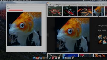
Point of interest, Firefox lets me drag and drop to mail app.
Just tried a test, drag a photo from google images to my mail app.
Screenshot 2015-09-13 at 9.30. PM.jpg

Edit: just tried the same drag and drop from Safari to mail app, and it also works just fine.
Am I missing something here?
 
Last edited:

ErikGrim

macrumors 604
Jun 20, 2003
6,526
5,145
Brisbane, Australia
Point of interest, Firefox lets me drag and drop to mail app.
Just tried a test, drag a photo from google images to my mail app.
View attachment 581366

Edit: just tried the same drag and drop from Safari to mail app, and it also works just fine.
Am I missing something here?
You are not dropping the image, you are dropping a link to that image on the server it resides. If you delete that image on the server, it's gone from mail.
 

=E=

macrumors regular
Nov 8, 2013
132
8
.se
Having a weird problem, my iMac has El Capitan from MAS and it supposedly is the GM (?) thats what the email I received last week said anyways..(10.11 15A282a is the version) and my rMBP has the latest Yosemite.

I cannot see my files I have on USB thumb drives / external drives in a good way anymore. What I mean with that is, if I format the drives inside El Capitan and then put some files on it to view on my Yosemite computer, it will not show up. And same with, if I format the drive on the Yosemite computer, and later wanna view them on El Capitan, same thing. Wont show up.

Whats going on? Really confused to say the least. :( It does only work if I continue to use the same external / usb thumb drive on the same computer I formated it on. With the same OS. It does not work with El Capitan to Yosemite vs Yosemite to El Capitan. Why? Any ideas?
 
Register on MacRumors! This sidebar will go away, and you'll see fewer ads.