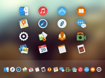
The next fad will almost certainly be darker, deeper colours that are less garish.Ah, so less of Ive's pastel gradients. Yeah, I would like that. The problem is that apparently it has been psychologically proven that those bright colours are considered most attractive by people (I have no source for that, I read it half a year ago or so) and therefore they are here to stay... until the next fad comes.
I do think there's a lot to be said for the flat style meeting skeumorphism a little more. I think the whole dynamic, subtly shifting icons from the Apple TV will make their way to iOS and maybe the Mac somehow too. On iOS I guess it could be more of a motion thing, on Mac more of a hover/clicking thing.
I have replaced my Mac dock icons with similar icons but darker versions and they look great. I'll upload a screenshot when I'm on it next. They are very much in the Mac style but just without the brightness which in my opinion is too much and not aesthetically pleasing.
Apple also need to sort out the whole icon shape on Mac too. Some icons are circular, others not, it's all a bit random. Either adopt circles across the board or ditch them in my view.
The attached image is more like I mean in terms of colours but not icon style. Not as cartoony as these and would be more like the current flat but detailed icons on OS X, but colours more like that.


