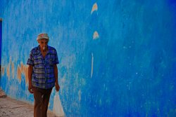
Hey pdxflint, I think this photo is fantastic, and I have to disagree with ryan1524 that the reflection and the way you framed it take away from the photo. On the contrary, I think it is the only way to convey the meaning that you did.
He was one of several interesting characters I encountered who added to the diversity of a rapidly gentrifying area of town.
To me this photo is about the way that people cope with rapid changes in the areas they live in and the human brightspots, those ever interesting people, that maintain their identity and individualism in the face of increasingly homogenous landscapes, typified by starbucks, brownstone condo like buildings like in the reflection, etc.
I wouldn't have immediately come to this conclusion had you not said that last bit about the diversity in a rapidly gentrifying are, but i would've gotten there eventually.
Visually it is very interesting, with many exquisite and meaningful details for the eye to focus on. Your subject has wonderful body language and expression that helps convey your theme. Exposure and development seem spot on, nice and contrasty. I can't find too much that i would change so overall, 4/5
i posted this one for last month's critique, but didn't receive any response so i thought i might post it again? thanks for any comments and criticisms.
in new orleans june 2007
1/25 s, handheld, iso 200, 55mm, f5.6

")