Become a MacRumors Supporter for $50/year with no ads, ability to filter front page stories, and private forums.

DevNull0

macrumors 68030
Jan 6, 2015
2,714
5,413
The fact that they are enthusiastic enough, and sufficiently interested to take and post pictures should be sufficient to participate. This is not a forum for professionals but for hobbyists, amateurs, enthusiasts, a few who may make some sort of income from photography, and almost all of whom are interested in wanting to learn more.

You do sound like a good contemporary teacher. Everyone's opinions are equally valid as long as they're expressed in a positive tone.

Holding people to professional standards - and critiquing accordingly - may undermine the very purpose of the exercise which is that it should be a fun experience where people showcase what they do, get others to comment, and hopefully learn from the experience while enjoying it.

Telling people they did good and should just go and have more fun will undermine the entire exercise of a critique forum which is to help people improve on their photographic skills.

At this stage of the business, while I think it an excellent idea, if a culture of 'harsh but truthful' criticism becomes the norm on such a thread, those who simply enjoy photography as a hobby will politely withdraw and exclude themselves from the whole endeavour, leaving it to those who view themselves as professionally proficient and qualified to participate. Then, it will not be a learning process, but an esoteric sub-thread for a self selected photographic elite.

If a culture of "you did great, keep plucking away" becomes the norm, there is simply no point in even having the forum. People who want to grow as photographers will withdraw and exclude themselves leaving it to those who need their egos stroked with shallow praise and have no interest in actual growth as a photographer. It will not be a learning process but an esoteric sub-thread of people who believe everyone should get a trophy just for showing up.

People enter the weekly contest - which, remember, is not a professional setting, but one that is designed to be and intended to be fun, - in a spirit of cheerful optimism, and exchanges take place in a similar tone, one that prioritises constructive criticism. That allows a safe space where people feel confident enough to want to share what they have done.

And the weekly contest is fun. you nailed the intentions right on the head except that is no room for constructive criticism. The weekly contest has nothing to do with helping people grow as photographers. Nor should it, it serves its role well as it is.

At the end of the day, it is a venue for enthusiasts and hobbyists, not professionals, and a nicer and more welcoming atmosphere, to my mind, is a better place to hang out for hobbies, than one where strict standards of proficiency are applied.

And why do you think being a venue for enthusiasts and hobbyists should mean we don't want people to aspire to professional standards?
 

Phrasikleia

macrumors 601
Feb 24, 2008
4,082
403
Over there------->
If a culture of "you did great, keep plucking away" becomes the norm, there is simply no point in even having the forum. People who want to grow as photographers will withdraw and exclude themselves leaving it to those who need their egos stroked with shallow praise and have no interest in actual growth as a photographer. It will not be a learning process but an esoteric sub-thread of people who believe everyone should get a trophy just for showing up.

Yeah, that is the biggest problem with feedback on photography forums of every sort. Most people are too afraid to be honest and just heap praise on whatever they see. That's fine and probably how it should be for photos that are just up for sharing, but when someone specifically requests a critique, they want some honesty.

How that honesty is delivered is another matter entirely. Of course it should be constructive and balanced, but even feedback that is harsh is more valuable than feedback that lacks honesty.
 

simonsi

Contributor
Jan 3, 2014
4,851
735
Auckland
If they are so sensitive a little harsh wording will scare them away, they shouldn't even be asking for opinions of their work because they really don't want to hear the answer.....when someone who knows what they're talking about tells me how my picture fails compared to a professional, they is very helpful to me.

But the point is you aren't the only person here. There will be a wide range of feedback seekers (say from sensitive to robust), and a wide range of feedback givers (say from constructive to nonsense), we can't predict or control how those ranges will match up and in a medium such as a forum when there are so few clues outside the actual words written, it makes sense to have some means of expectation-setting.

Its great that you are so robust and can somehow tell the quality of the feedback giver but that won't be the case for everyone and the forum should cater for that, otherwise those most in need to feedback will get burnt.
 

Scepticalscribe

macrumors Haswell
Jul 29, 2008
65,199
47,583
In a coffee shop.
My concern is with tone, even more than content, and anyone who spends time online ought to be able to see why this is a matter for concern.

It is because distance, and anonymity serve to remove the inhibitors - or inhibitions - which normally govern face to face interactions, and allow people to be a lot ruder and more offensive - even under the guise of speaking plainly - than they would ever dare to be face to face (for a variety of reasons, manners, shyness, the legitimate fear that someone would respond with an equal lack of inhibition or verbal ferocity).

Above all, it is because any post which asks that criticism posted ought to be allowed to be 'harsh' is starting from a point I am not particularly comfortable with, in that I can see all too easily that permission to be 'harsh' allied with anonymity, can rapidly descend into granting themselves permission to be downright unpleasant, where harshness and frankness trumps the need for courtesy and respect.

If the original suggestion had been couched in a form of words which suggested that criticism would be constructively offered, rather then the enthusiastic use of words like 'honest' and 'harsh' I would have little quarrel with it. However, the desire to be allowed to express oneself freely can all too easily slide into a happiness with 'harsh', but blunt thoughts, with little thought of the effect or impact of this on some who are legitimately seeking assistance and guidance.

Even on this forum, which is very well moderated, discussion frequently - and very rapidly - descends into exchanges of insults while seeking safe refuge in anonymity.

My argument is not one that calls for everyone to be praised; it is one that calls for criticism to be delivered in a courteous and respectful, and not contemptuous manner.

As a teacher, my goal was to make the kids - persuade the kids - to want to learn; that does not mean that 'everyone's opinions are equally valid' - manifestly, they are not. If they are wrong, incorrect, or downright clueless, this needs to be pointed out to them.

However, that did mean cultivating an environment where it was alright to be clueless, alright to make mistakes, alright not to know the stuff, and alright to admit to this. My task was to try to remedy this, in as congenial an atmosphere - which was better for me and for them - as it was possible to create. And yes, a positive environment works an awful lot better than one where stringent criticism is the norm; it works better for learning, and it is an awful lot nicer to be in.

Besides, nobody - in an educational setting, or, in a voluntary (i.e. hobbyist setting) has the right to destroy or undermine the confidence of another.

The workplace is somewhat different, and hobbies are different again, and different standards for behaviour and engagement apply to each.

Re professional photographers, and professionalism, of course I will hold those who make a living from the business to a far higher degree of skill and standards. This is because I am paying them to deliver a premium product, and my aim is different. In fact, often, I am and will be quite demanding and explicit and firm that they adhere to the standards that they charge for.

The same applies for any professional exchange where a good, or service is charged for; in this instance, I do not seek to encourage anyone to learn anything - they are expected to know it already, this is why they charge me for their good or service. Thus, the whole nature of the exchange is different, and I do not ask for, but I do insist upon, professional standards being upheld.

I have no quarrel with aspiring photographers seeking to emulate professional standards in their work. However, I have every quarrel with the standards which apply to professionals - artistic standards, or bluntly delivered critiques, critical comments and otherwise - being applied without respect, courtesy and a degree of sensitivity in a forum where most of those who will post their pictures are not professional photographers.

Expertise in an area does not confer the right to be rude to those who lack it.
 
Last edited:

Reality4711

macrumors 6502a
Aug 8, 2009
738
558
scotland
Knee jerk reaction

Screen%20Shot%202015-03-23%20at%2019.05.45_zpsf2dkh7hz.png


Seems to me the biggest problem is the word Critique itself.

Assessing a photographic image is a minefield of inappropriate opinion mixed with actual measurements made against a background of personality/experience/education and bias.

Simply put are we asking for a true 'critique' or 'do you like/dislike this'?

The first can be as clinical and cold as you like as long as it is backed up with explanation and reasoning.
The second however is more of a friendly 'what do you think mate' and so must be answered accordingly as if the questioner is stood in front of you; eyes gleaming with anticipation and excitement waiting for your affirmation of their joy at their own achievement. (Overstated - sorry) but you get my drift I hope.

Given the distances between us(physical/social etc) a clear unambiguous set of criteria are essential so as to avoid emotional hand wringing that will most certainly follow.

My comments are meant in a constructive way so you can see how this medium can cause problems and why letters should be a very considered form of communication.
 

Phrasikleia

macrumors 601
Feb 24, 2008
4,082
403
Over there------->
Am I the only one who thinks that some people are overthinking this issue a bit? Maybe I don’t understand the exact proposal of the OP, but I don’t quite understand why we need two pages of discussion to decide whether or not forum members should post threads asking for photo critique. People have done that before here and have received excellent feedback. There was a time when it was actually fairly common for people to request critique.

So: go for it, people! I for one will be happy to chime in as time allows.
 

The Bad Guy

macrumors 65816
Original poster
Oct 2, 2007
1,141
3,539
Australia
Am I the only one who thinks that some people are overthinking this issue a bit? Maybe I don’t understand the exact proposal of the OP, but I don’t quite understand why we need two pages of discussion to decide whether or not forum members should post threads asking for photo critique. People have done that before here and have received excellent feedback. There was a time when it was actually fairly common for people to request critique.

So: go for it, people! I for one will be happy to chime in as time allows.

There was no hidden meaning behind the OP, 'twas merely a question. I'm not sure what's happened here either. :confused:
 

simonsi

Contributor
Jan 3, 2014
4,851
735
Auckland
Like the leading lines of the road/yellow lines and the wires.
Like the tease that they lead you around a corner :)

Don't like the blank wall bottom right, I know its got texture but...and unfortunately you were gifted a plain sky but then it doesn't detract :)
 

Phrasikleia

macrumors 601
Feb 24, 2008
4,082
403
Over there------->
OK, I'll throw this one in as a tester - show me how you would critique this - I can take it kind or harsh

[url=https://farm8.staticflickr.com/7588/16607580648_b203fc9ef1_b.jpg]Image[/url]

Back Street
by Hugh Russell, on Flickr

Nikon D3100 / Sigma 17-50 f2.8 OS HSM, 1/320 @ f9, ISO 200

Cheers :)

Hugh

The road with its strong yellow lines provides a nice sense of depth in this shot, and presumably that quality of the scene provided the impetus for taking the photo. The light is working against the flow of the composition, however, since it’s appearing mostly all up front. The light tells us to look at the trash can and the balcony, while the road directs us elsewhere; that kind of schism tends to make a photo seem unresolved. So overall, I would say that this scene lacks a strong sense of timing. It’s a fairly ordinary little street, so it needs some exciting light or activity to make it come to life.
 

Hughmac

macrumors 603
Feb 4, 2012
6,002
32,569
Kent, UK
↑ Thank you both ↑

You are obviously seeing things I didn't consider before taking the shot, especially the lighting.

More please; if all the posters have views on how to conduct a critique, now's the chance to practise :)
... without feeling embarrassed about being honest.

How could I have done it better?

Cheers :)

Hugh

PS I'm not trying to wind you all up; I'm trying to draw you out, or nobody will be willing to submit photos
 

Apple fanboy

macrumors Ivy Bridge
Feb 21, 2012
57,006
56,027
Behind the Lens, UK
Am I the only one who thinks that some people are overthinking this issue a bit? Maybe I don’t understand the exact proposal of the OP, but I don’t quite understand why we need two pages of discussion to decide whether or not forum members should post threads asking for photo critique. People have done that before here and have received excellent feedback. There was a time when it was actually fairly common for people to request critique.

So: go for it, people! I for one will be happy to chime in as time allows.

Well put. For me I look at the quality of the work of the person critiquing my work before deciding to take on what they have said. For example if I was taking a landscape shot, I'd value your opinion higher than a lot of other people's on here. If it was wildlife, we have s couple of guys that are very good.
If someone says something you don't agree with, you can choose to ignore it. Especially if their own work is below par.
 

MCH-1138

macrumors 6502
Jan 31, 2013
448
543
California
OK, I'll throw this one in as a tester - show me how you would critique this - I can take it kind or harsh

Thanks for jumping in, Hugh -- I'll throw a few thoughts out there.

Composition: As others have noted, the street itself and the yellow lines provide nice leading lines that draw the viewer into the scene. But other parts of the composition work against that flow. For example, the light-colored wall on the building at right and the the leading line created by the shadow from the building at left both draw the eye to the right side, unintentionally focusing us on the trash bin or the chair on the balcony.

You may have been able to eliminate some of the clutter by taking a few steps into the scene (perhaps up past the trash bin), but I suppose that if you moved too far in, you would lose the building at left in the foreground. You could also emphasize the street disappearing around the bend by moving in and going wider on your focal length.

I think you are losing some of the perspective of the street by shooting from almost at the right-hand curb. If you stood more to the middle, you would also open up the sides of the buildings at right.

To my eye, the photo is listing to the right.

Lighting: I think this scene could be more interesting if there were a light source (or sources) where the street bends out of view. It looks like you took this in the late afternoon, so perhaps the light in the early morning might be coming back into the scene from around the bend, possibly illuminating the buildings on the left? Or maybe lights in the windows just before/after sunset?
 
Last edited:

Hughmac

macrumors 603
Feb 4, 2012
6,002
32,569
Kent, UK
Thanks for jumping in, Hugh -- I'll throw a few thoughts out there.

Composition: As others have noted, the street itself and the yellow lines provide nice leading lines that draw the viewer into the scene. But other parts of the composition work against that flow. For example, the light-colored wall on the building at right and the the leading line created by the shadow from the building at left both draw the eye to the right side, unintentionally focusing us on the trash bin or the chair on the balcony.

You may have been able to eliminate some of the clutter by taking a few steps into the scene (perhaps up past the trash bin), but I suppose that if you moved too far in, you would lose the building at left in the foreground. You could also emphasize the street disappearing around the bend by moving in and going wider on your focal length.

I think you are losing some of the perspective of the street by shooting from almost at the right-hand curb. If you stood more to the middle, you would also open up the sides of the buildings at right.

To my eye, the photo is listing to the right.

Lighting: I think this scene could be more interesting if there were a light source (or sources) where the street bends out of view. It looks like you took this in the late afternoon, so perhaps the light in the early morning might be coming back into the scene from around the bend, possibly illuminating the buildings on the left? Or maybe lights in the windows just before/after sunset?

Thanks MCH, I will take all the comments on board and maybe have another go at the same shot when we visit that town next. Unfortunately it will still be in the afternoon because that's the time we usually go and see our grandchild (soon to be 2 children:)).
When I do, I'll resubmit for comparison.

Cheers :)

Hugh
 

The Bad Guy

macrumors 65816
Original poster
Oct 2, 2007
1,141
3,539
Australia
Thanks MCH, I will take all the comments on board and maybe have another go at the same shot when we visit that town next. Unfortunately it will still be in the afternoon because that's the time we usually go and see our grandchild (soon to be 2 children:)).
When I do, I'll resubmit for comparison.

Cheers :)

Hugh
Good on you, Hugh. That's the spirit.

I'm not going to offer you a critique, because I don't shoot streetscapes often enough to know what I'm talking about. But to me? yeah...the lighting could be better.
 

Hughmac

macrumors 603
Feb 4, 2012
6,002
32,569
Kent, UK
Good on you, Hugh. That's the spirit.

I'm not going to offer you a critique, because I don't shoot streetscapes often enough to know what I'm talking about. But to me? yeah...the lighting could be better.

Thank you, but I really look up to you and others as more capable than I.

Perhaps a larger aperture and wider angle but further up the street next time?

Cheers :)

Hugh
 

tomnavratil

macrumors 6502a
Oct 2, 2013
876
1,588
Thank you, but I really look up to you and others as more capable than I.

Perhaps a larger aperture and wider angle but further up the street next time?

Cheers :)

Hugh

Hugh, regarding lightning, there is a few things you can do. As you mention, you can use a larger aperture to allow more light in. This might compromise your depth of field however (there are many DOF calculators for both iOS and Android) and change the perception of the image.

You can also bump up your ISO to increase sensitivity to light.

In addition, I might have missed if you shoot JPG or RAW but shooting RAW offers certain advantages when it comes to post-production. As your camera's sensor captures RAW data there is more you can do with blacks / shadows / lights / highlights to adjust the image as you want it.

Looking forward to your new take on this! I might also submit a few images once the critique section kicks in properly.
 

kenoh

macrumors 604
Jul 18, 2008
6,507
10,850
Glasgow, UK
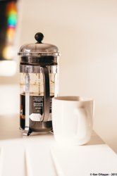
OK, Throw my hat in the ring.

I wanted to take a picture of my coffee pot, I am looking for tips on what you would have done different.

1. I now know I should have taken the shot when it was full not half full with nasty smears on it.
2. I was going for high key but a white mug on a white bench against a white wall is a tough gig to get separation with them.
3. The handle of the pot should have been to the side.
4. I am still learning to "see" properly and well generally I suck with a camera but enjoy the journey.
5. I keep forgetting to turn off the watermark. Ignore it. I thought we were supposed to do that but on the other thread it seems it is not en vogue.

Comments welcome
 

Attachments

  • coffee-1.jpg
    coffee-1.jpg
    1.6 MB · Views: 103

Reality4711

macrumors 6502a
Aug 8, 2009
738
558
scotland
Bad experiences make people wary

Am I the only one who thinks that some people are overthinking this issue a bit? Maybe I don’t understand the exact proposal of the OP, but I don’t quite understand why we need two pages of discussion to decide whether or not forum members should post threads asking for photo critique. People have done that before here and have received excellent feedback. There was a time when it was actually fairly common for people to request critique.

So: go for it, people! I for one will be happy to chime in as time allows.

Not over thinking just a little sensitive given the flamings/rudeness/cliqueiness/
(if thats a word) that have appeared on numerous sites to many to mention.

Best intentions and man made plans and all that .

I shall contribute with pics. and crits. "God Save us All" ;):D:D

Qualifications:- BSc Photography + 30yrs. + plus earning a living with my camera. Retired and oddly dismisseth of modern trend to over produce everything. EOE
 

tomnavratil

macrumors 6502a
Oct 2, 2013
876
1,588
OK, Throw my hat in the ring.

I wanted to take a picture of my coffee pot, I am looking for tips on what you would have done different.

1. I now know I should have taken the shot when it was full not half full with nasty smears on it.
2. I was going for high key but a white mug on a white bench against a white wall is a tough gig to get separation with them.
3. The handle of the pot should have been to the side.
4. I am still learning to "see" properly and well generally I suck with a camera but enjoy the journey.
5. I keep forgetting to turn off the watermark. Ignore it. I thought we were supposed to do that but on the other thread it seems it is not en vogue.

Comments welcome

Thanks for sharing kenoh!

Regarding the composition, I might turn one of the items in a different angle so the handles do not face the same direction to create a bit of a contrast as you have said yourself.

I think you've made a lot of good observations yourself. High key image might be a good idea however for me the shadows are a bit disturbing around the items.

The last thing I would mention are the colourful items in the background. It got quite a lot of my attention but I'm not sure it's adding too much to the picture.

Otherwise I really like the colour and I think with those tweaks you've mentioned yourself this could be a good image, thank you for sharing!

PS: I'm not a professional, just making images for a few years but mostly landscapes / travel photography. :)
 

kenoh

macrumors 604
Jul 18, 2008
6,507
10,850
Glasgow, UK
Thanks for sharing kenoh!

Regarding the composition, I might turn one of the items in a different angle so the handles do not face the same direction to create a bit of a contrast as you have said yourself.

I think you've made a lot of good observations yourself. High key image might be a good idea however for me the shadows are a bit disturbing around the items.

The last thing I would mention are the colourful items in the background. It got quite a lot of my attention but I'm not sure it's adding too much to the picture.

Otherwise I really like the colour and I think with those tweaks you've mentioned yourself this could be a good image, thank you for sharing!

PS: I'm not a professional, just making images for a few years but mostly landscapes / travel photography. :)

Thank you. Very much appreciated.

I think the handles is the main one for the contrast.

This is where my learning to see comes in. I am learning the differences between looking through the viewfinder vs seeing through it. I have a habit of taking a shot, focussing on the main subject then seeing artefacts later that I wish I had seen at the time.

Such artifacts as the colours here which is the sun reflecting off the screen of the iMac we have in the kitchen and the other shot today on POTD where I got the corner of the bed on my chair shot.

I need to learn to see the whole picture and slow down and take deliberate observations more.

Thank you, valuable advice and like I said earlier, you may not be a professional but you are better than me and so I can learn from you. Really appreciate it.
 

tomnavratil

macrumors 6502a
Oct 2, 2013
876
1,588
Thank you. Very much appreciated.

I think the handles is the main one for the contrast.

This is where my learning to see comes in. I am learning the differences between looking through the viewfinder vs seeing through it. I have a habit of taking a shot, focussing on the main subject then seeing artefacts later that I wish I had seen at the time.

Such artifacts as the colours here which is the sun reflecting off the screen of the iMac we have in the kitchen and the other shot today on POTD where I got the corner of the bed on my chair shot.

I need to learn to see the whole picture and slow down and take deliberate observations more.

Thank you, valuable advice and like I said earlier, you may not be a professional but you are better than me and so I can learn from you. Really appreciate it.

You're welcome - no problem at all!

It seems to be. Otherwise you might use light and create a contrast between the dark coffee pot and the bright cup.

It happens to me as well, sometimes I'm too focused on one thing in the shot and I forget about the overall composition - I'm definitely learning this as well.

Thanks for explaining the colours, I was wondering what it could be!

No problem at all, I'm glad it helped, I would be interesting to hear others as well as I find critiques and feedback one of the best ways to improve my images. I wouldn't say better, I think everyone has his own personal style, which is what makes it interesting, isn't?

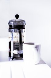
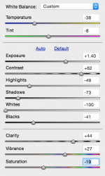
I hope you don't mind this - I have downloaded your image and made a few tweaks as I've seen the image:
- Removed the lights in the corner
- Blurred a part of the coffee pot
- Post-processing through Camera Raw Filter (please see attached sliders I've used) - white balance / contrast / clarity / saturation / curves a bit

If you have any issues with my edit / downloading the pic - I will, of course, take it down immediately! :)
 

Attachments

  • coffee-1-edited.jpg
    coffee-1-edited.jpg
    1.6 MB · Views: 108
  • sliders_camera_raw.png
    sliders_camera_raw.png
    83.8 KB · Views: 79
Last edited:

Hughmac

macrumors 603
Feb 4, 2012
6,002
32,569
Kent, UK
Ken, the mistakes you say you make go the same for me, so as you learn I will also learn by reading the observations on your shots.

tomnavratil, thanks, I didn't consider upping the ISO to get more light in - I don't yet think naturally when composing a shot.

I shoot in JPEG because I lack the finer post processing skills to benefit from RAW, apart from allowing DxO*Optics*Pro to do all the work for me, that is.

Cheers :)

Hugh
 

tomnavratil

macrumors 6502a
Oct 2, 2013
876
1,588
tomnavratil, thanks, I didn't consider upping the ISO to get more light in - I don't yet think naturally when composing a shot.

I shoot in JPEG because I lack the finer post processing skills to benefit from RAW, apart from allowing DxO*Optics*Pro to do all the work for me, that is.

Cheers :)

Hugh

No problem at all! Modern sensors and DSLRs definitely give you more noise-free options when it comes to ISO than 5 years ago for example. Even entry-level DSLRs can go to ISO1600 without any large difficulties - generally speaking of course.

No problem at all - in that case you can always look at JPG pictures styles in your DSLR to adjust your images directly in camera - for less post-production / adjusting settings further.

You're welcome, no probs! :)
 
Register on MacRumors! This sidebar will go away, and you'll see fewer ads.