Become a MacRumors Supporter for $50/year with no ads, ability to filter front page stories, and private forums.

kenoh

macrumors 604
Jul 18, 2008
6,507
10,850
Glasgow, UK
You're welcome - no problem at all!

It seems to be. Otherwise you might use light and create a contrast between the dark coffee pot and the bright cup.

It happens to me as well, sometimes I'm too focused on one thing in the shot and I forget about the overall composition - I'm definitely learning this as well.

Thanks for explaining the colours, I was wondering what it could be!

No problem at all, I'm glad it helped, I would be interesting to hear others as well as I find critiques and feedback one of the best ways to improve my images. I wouldn't say better, I think everyone has his own personal style, which is what makes it interesting, isn't?

I hope you don't mind this - I have downloaded your image and made a few tweaks as I've seen the image:
- Removed the lights in the corner
- Blurred a part of the coffee pot
- Post-processing through Camera Raw Filter (please see attached sliders I've used) - white balance / contrast / clarity / saturation / curves a bit

If you have any issues with my edit / downloading the pic - I will, of course, take it down immediately! :)

Thats fantastic! thank you for taking the time to do this. No issues at all! This is the effect I had in my mind when I took the picture. I do tend to get frustrated that the colours always seem muted or dull when I take a shot too. This is great. I have a few thousand others if you have the time? :)

Yes with the colour cropped out it does restore the balance!
By blurred a part of the coffee pot, how did you do that? was it a selective brush?

and you know what I mean about looking but not seeing. I really Struggle to scan the whole image - too much rushing around.
 

tomnavratil

macrumors 6502a
Oct 2, 2013
876
1,588
Thats fantastic! thank you for taking the time to do this. No issues at all! This is the effect I had in my mind when I took the picture. I do tend to get frustrated that the colours always seem muted or dull when I take a shot too. This is great. I have a few thousand others if you have the time? :)

Yes with the colour cropped out it does restore the balance!
By blurred a part of the coffee pot, how did you do that? was it a selective brush?

and you know what I mean about looking but not seeing. I really Struggle to scan the whole image - too much rushing around.

That's no problem, sometimes I have difficulties to fully explain what I would change so I just did this quickly do demonstrate it. I'm glad you like it! Haha I'm already working on so many post-processes I never seem to have time to finish these days. :)

Yes, just used a blur brush in Photoshop on that area. Removing the colour in the corner was fairly easy - content-aware fill does a pretty good job in areas like this.

Yes, absolutely but it's good analyse it afterwards as well, good for learning!
 

shaunp

Cancelled
Nov 5, 2010
1,811
1,395
OK, I'll throw this one in as a tester - show me how you would critique this - I can take it kind or harsh

[url=https://farm8.staticflickr.com/7588/16607580648_b203fc9ef1_b.jpg]Image[/url]

Back Street
by Hugh Russell, on Flickr

Nikon D3100 / Sigma 17-50 f2.8 OS HSM, 1/320 @ f9, ISO 200

Cheers :)

Hugh


Hi Hugh,

I would say it's difficult to tell what you are trying to draw the viewers attention to - what's the story? There's no central theme other than the street. If this was the aim try a different perspective, very low down, high up, or shot from above to give it a different character.

The focus, exposure, etc all all fine it just doesn't excite me at all. Now it's time for me to post one of my own. All constructive feedback welcome :)
 

shaunp

Cancelled
Nov 5, 2010
1,811
1,395
I was going to say, rather than talking about why we don't do it, let's just do it, but Hugh beat me to that.

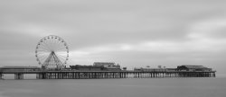
Here's one of mine. Taken in Blackpool allurer this year, shot using an ND10 filter. It's the first time I'd had a chance to use it.

Let me know what you think.

Thanks


Shaun
 

Attachments

  • Blackpool Cenral Pier.jpg
    Blackpool Cenral Pier.jpg
    2.8 MB · Views: 135

shaunp

Cancelled
Nov 5, 2010
1,811
1,395
OK, Throw my hat in the ring.

I wanted to take a picture of my coffee pot, I am looking for tips on what you would have done different.

1. I now know I should have taken the shot when it was full not half full with nasty smears on it.
2. I was going for high key but a white mug on a white bench against a white wall is a tough gig to get separation with them.
3. The handle of the pot should have been to the side.
4. I am still learning to "see" properly and well generally I suck with a camera but enjoy the journey.
5. I keep forgetting to turn off the watermark. Ignore it. I thought we were supposed to do that but on the other thread it seems it is not en vogue.

Comments welcome


I think overall I like the lighting, composition and a wide aperture. The only thing I would change is the top left corner. that splash of colour is distracting, I keep looking at this rather than the coffee pot (can't remember the proper name for them).
 

kenoh

macrumors 604
Jul 18, 2008
6,507
10,850
Glasgow, UK
I think overall I like the lighting, composition and a wide aperture. The only thing I would change is the top left corner. that splash of colour is distracting, I keep looking at this rather than the coffee pot (can't remember the proper name for them).

French press, caffeterre or "that thing full of manky black sludge" :)

Thanks for the feedback guys. Loving this so far...
 

kenoh

macrumors 604
Jul 18, 2008
6,507
10,850
Glasgow, UK
I was going to say, rather than talking about why we don't do it, let's just do it, but Hugh beat me to that.

Here's one of mine. Taken in Blackpool allurer this year, shot using an ND10 filter. It's the first time I'd had a chance to use it.

Let me know what you think.

Thanks


Shaun

Ok I will give it a try. So I am an amateur as you know so pinch of salt time.

I like the picture overall. It is a postcard picture. What I think would make it amazing would be to have not used the ND filter so strongly.

I think the scene has smoothed out too much with the use of the filter. What I mean is the sea and the clouds have gone creamy whereas the grain in the image makes me want to see a little more contrast and texture in the clouds.

Also by using the ND, to make the sea look awesome, I would consider showing more of it maybe to accentuate the ND effect with something in the foreground to give scale. Maybe move the horizon above the centre rather than below to see more of the sea and show off more of that ND magic?

Does that sound plausible?
 

Phrasikleia

macrumors 601
Feb 24, 2008
4,082
403
Over there------->
Not over thinking just a little sensitive given the flamings/rudeness/cliqueiness/
(if thats a word) that have appeared on numerous sites to many to mention.

Best intentions and man made plans and all that .

I shall contribute with pics. and crits. "God Save us All" ;):D:D

Qualifications:- BSc Photography + 30yrs. + plus earning a living with my camera. Retired and oddly dismisseth of modern trend to over produce everything. EOE

Sorry to hear that this forum has seen some of that bad behavior recently, if that's what you're saying. I haven't been reading it as much as I would like, but in general, I think that the people posting here tend to be very courteous and respectful.

As for qualifications...I reckon that a person's photos say all that anyone needs to know in that department! :)
 

shaunp

Cancelled
Nov 5, 2010
1,811
1,395
Ok I will give it a try. So I am an amateur as you know so pinch of salt time.

I like the picture overall. It is a postcard picture. What I think would make it amazing would be to have not used the ND filter so strongly.

I think the scene has smoothed out too much with the use of the filter. What I mean is the sea and the clouds have gone creamy whereas the grain in the image makes me want to see a little more contrast and texture in the clouds.

Also by using the ND, to make the sea look awesome, I would consider showing more of it maybe to accentuate the ND effect with something in the foreground to give scale. Maybe move the horizon above the centre rather than below to see more of the sea and show off more of that ND magic?

Does that sound plausible?

Thanks. I know what you mean, it is lacking something. I was going for the smoothed out look with the ND10 filter and I got that, but I'm not sure I like the final result. It was a fairly windless day though, otherwise I would have liked a rough sea, black and white and possible a bit of gain in the picture too. Not sure I like the perspective of the Pier, it seems very flat.

Thanks for your feedback though. Much appreciated.


Shaun
 

kenoh

macrumors 604
Jul 18, 2008
6,507
10,850
Glasgow, UK
Thanks. I know what you mean, it is lacking something. I was going for the smoothed out look with the ND10 filter and I got that, but I'm not sure I like the final result. It was a fairly windless day though, otherwise I would have liked a rough sea, black and white and possible a bit of gain in the picture too. Not sure I like the perspective of the Pier, it seems very flat.

Thanks for your feedback though. Much appreciated.


Shaun

I think the pier perspective is fine but you need to move it in frame to make it more dynamic.

I get what you were trying to achieve and maybe a weaker ND would have helped.

That is three for three now who have to go back out and have another bash at it and I think we are better for it.

WHO'S NEXT?
 

tomnavratil

macrumors 6502a
Oct 2, 2013
876
1,588
Monk in Angor Wat

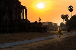
Right, I will be gladly next and I'm looking forward to critique and comments on this shot I've taken a couple of weeks ago in Angor Wat.

I've post-processed the RAW file with a main focus on the monk using Lr5. I've also retouched two people standing near the columns and used radial filter to increase contrast / lighting around the monk.

Here's a link to the RAW file in case anyone wants to have a go with it - feel free please! :):

https://www.dropbox.com/s/i8f3q9gvnope9q7/TN0_2309.NEF?dl=0

Looking forward to any C&C, thanks a lot!
 

Attachments

  • 2015_0203_indochina_fb_003.jpg
    2015_0203_indochina_fb_003.jpg
    1.7 MB · Views: 102

The Bad Guy

macrumors 65816
Original poster
Oct 2, 2007
1,141
3,539
Australia
Right, I will be gladly next and I'm looking forward to critique and comments on this shot I've taken a couple of weeks ago in Angor Wat.

I've post-processed the RAW file with a main focus on the monk using Lr5. I've also retouched two people standing near the columns and used radial filter to increase contrast / lighting around the monk.

Here's a link to the RAW file in case anyone wants to have a go with it - feel free please! :):

https://www.dropbox.com/s/i8f3q9gvnope9q7/TN0_2309.NEF?dl=0

Looking forward to any C&C, thanks a lot!

Fantastic shot and even more impressive after seeing the RAW file you worked from (which I may have a tinker with, seeing as though you've put it up and all).

Composition is great, the leading lines work well, the vignetting looks natural enough and I love the colour treatment you've applied.

Only real criticism's I've got are strictly subjective. I'd lighten the shadows just a tad on the temple, clone out the other 'spectators' in the background and maybe darken that area a little too.

For a real nitpick: the hotspot that is the sun is a pisser, but oh well...you get that. Nice job.
 

Reality4711

macrumors 6502a
Aug 8, 2009
738
558
scotland
Not this forum.

Sorry to hear that this forum has seen some of that bad behavior recently, if that's what you're saying. I haven't been reading it as much as I would like, but in general, I think that the people posting here tend to be very courteous and respectful.

As for qualifications...I reckon that a person's photos say all that anyone needs to know in that department! :)

My comments were not aimed at this forum. There are others.;)
 

tomnavratil

macrumors 6502a
Oct 2, 2013
876
1,588
Fantastic shot and even more impressive after seeing the RAW file you worked from (which I may have a tinker with, seeing as though you've put it up and all).

Composition is great, the leading lines work well, the vignetting looks natural enough and I love the colour treatment you've applied.

Only real criticism's I've got are strictly subjective. I'd lighten the shadows just a tad on the temple, clone out the other 'spectators' in the background and maybe darken that area a little too.

For a real nitpick: the hotspot that is the sun is a pisser, but oh well...you get that. Nice job.

Thanks a lot Bad Guy!

The D610 has amazing sensor and I'm always surprised how much detail you can get from a shot. On this occasion, the monk passed me by and I didn't take a shot, waited and then did a last-minute snap where I thought it was nicely composed.

Thank you, I wasn't 100% sure about the colours as I've tried a few versions but as his outfit was yellow, I wanted to build on that.

Thanks for the feedback, that's great. I completely agree - the shadows on the temple are a bit dark as I didn't want to steal attention from the monk however this is too much, absolutely. I might give this another take cloning out those people too and try it with your comments in mind.

You are right, the sun's temperature and colour is not perfect and I found it as the weakest part of the picture actually. This looks more natural in regard to the overall picture however it's far from perfect.

Once again, thanks a lot and I'm looking forward to your edit if you find a minute with the RAW file ;).
 

Reality4711

macrumors 6502a
Aug 8, 2009
738
558
scotland
Processed?

Right, I will be gladly next and I'm looking forward to critique and comments on this shot I've taken a couple of weeks ago in Angor Wat.

I've post-processed the RAW file with a main focus on the monk using Lr5. I've also retouched two people standing near the columns and used radial filter to increase contrast / lighting around the monk.

Here's a link to the RAW file in case anyone wants to have a go with it - feel free please! :):

https://www.dropbox.com/s/i8f3q9gvnope9q7/TN0_2309.NEF?dl=0

Looking forward to any C&C, thanks a lot!

With what software did you process this image?

Thank you

Sharkey
 

Reality4711

macrumors 6502a
Aug 8, 2009
738
558
scotland
Monthly Critique 2008

Seems there was a 'critique' thread a few years ago.

A 'reboot' maybe of that thread from the Mods with a descriptive header as a guide?

Maybe even a 'Sticky'??

Regards

Sharkey

PS. - you may have gathered that I quite like the 'critique' idea.


OOOOPS! - Simonsi already said it. Treat as a "second that"
 
Last edited:

MacRy

macrumors 601
Apr 2, 2004
4,351
6,278
England
Photo Critiques

Great idea for a thread. I agree with a lot that has been said on the subject - particularly about the critique within the contests being positive because they are more fun than a learning exercise.

I'm willing to offer one of my recent shots up for discussion as I'm trying out some larger scale strobe shots (than the usual head shots and photos of my watches).

16833758535_e7f29d4a37_b.jpg


Have at it.....
 
Last edited:

kenoh

macrumors 604
Jul 18, 2008
6,507
10,850
Glasgow, UK
OK, I've been back and had another go, but hopefully with a better view ...

Original:-

[url=https://farm8.staticflickr.com/7588/16607580648_b203fc9ef1_b.jpg]Image[/url]

Back Street
by Hugh Russell, on Flickr

2nd attempt:-

[url=https://farm8.staticflickr.com/7607/16948664761_01f2506715_b.jpg]Image[/url]

Back Street Revisited
by Hugh Russell, on Flickr

Do you think it has improved somewhat with all your help?

Cheers :)

Hugh

I think that is definitely better but.... are the knees of your trousers dirty? If not then maybe you could have got a little lower to make the houses loom a bit more. Much better now the rubbish bin isnt in shot.

----------

Great idea for a thread. I agree with a lot that has been said on the subject - particularly about the critique within the contests being positive because they are more fun than a learning exercise.

I'm willing to offer one of my recent shots up for discussion as I'm trying out some larger scale strobe shots (than the usual head shots and photos of my watches).

Image

Have at it.....

Ok so i am struggling with this one as i actually like it. Maybe move slightly to the right and get less of an oblique angle? And maybe photoshop out that bit of wire hanging out?
 

Phrasikleia

macrumors 601
Feb 24, 2008
4,082
403
Over there------->
Seriously :rolleyes: you think it is irrelevant to the discussion...

Um. Yes! It's a great quote, but the gist of it is a response to people who would critique someone's endeavors out of the blue and without a leg to stand on. That is an entirely different situation from what we have here: people requesting critique from fellow photographers. Anyone answering that call is no interloper lobbing grenades at an unsuspecting target!
 

Apple fanboy

macrumors Ivy Bridge
Feb 21, 2012
57,006
56,027
Behind the Lens, UK
OK, I've been back and had another go, but hopefully with a better view ...

Original:-

[url=https://farm8.staticflickr.com/7588/16607580648_b203fc9ef1_b.jpg]Image[/url]

Back Street
by Hugh Russell, on Flickr

2nd attempt:-

[url=https://farm8.staticflickr.com/7607/16948664761_01f2506715_b.jpg]Image[/url]

Back Street Revisited
by Hugh Russell, on Flickr

Do you think it has improved somewhat with all your help?

Cheers :)

Hugh

Yes an improvement. One of the parks I go to regularly visit is littered with bins, and dog waste bins. Really spoils the available perspective.
As the comments above, maybe a low shot would add a further interest.

Of course I'm a rank amateur so what do I know!
 
Register on MacRumors! This sidebar will go away, and you'll see fewer ads.