Got a tip for us?
Let us know
Become a MacRumors Supporter for $50/year with no ads, ability to filter front page stories, and private forums.
Photo of the Day January 2015
- Thread starter Hughmac
- Start date
- Sort by reaction score
You are using an out of date browser. It may not display this or other websites correctly.
You should upgrade or use an alternative browser.
You should upgrade or use an alternative browser.
It has my vote too.
I took the liberty to try Doylems suggestion. Ish if you mind, I will of course remove it.

Don't know which one I like more.
That's better, I can see it now, thanks oblomow! No, me neither. It's an interesting new perspective though.
Sorry, can you try a reload. I messed up my first upload
Another EDIT: I used Pixelmator. It has a quick&dirty removal tool.
I've not tried Pixelmator but it's not too expensive so I can see it in my future.
") Do you like it?
Do you like it?This looks better to me. You could lose 20-25% from RHS. There's something about the girl running into the unknown... and the boy seemed to negate it...
Thank you for the suggestion Doylem. I thought at first there'd be too much space but looking at oblomow's edit it looks fine.
I think they both make great shots. I agree with Doylem that the single child makes a more compelling image. The original is still a belter though.
It's funny how someone can look at one of your pictures with a fresh eye and see something different you've not noticed and suddenly it's completely different. Thanks for the comments!
From the other day. Not sure why someone had attached holly to every bench.
 _DSC8252 by apple fanboy1, on Flickr
_DSC8252 by apple fanboy1, on Flickr
South Entrance
Another day here, so another pic ...

South Entrance by Hugh Russell, on Flickr
Cheers
Hugh
Another day here, so another pic ...
South Entrance by Hugh Russell, on Flickr
Cheers
Hugh
Thank you Doylem. Can I ask your opinion: if I take out the boy on the right, there's a lot of empty space. At the moment, to me, the eye takes in the girl first as the more defined figure then travels in the direction she's looking and travelling and rests on the boy and they make a pair. It's always possible to convert to portrait or square format but that makes it a different photograph. Would you mind elaborating a bit more?
EDIT: missed your post oblomow!
Sorry I can't see the photo, I just get the blue question mark. When I try to follow the link I get a page that says IDJIT !!!
ANOTHER EDIT: I can see the photo now by clicking on Image in the link. ??? I'm very happy for you to leave it up, it'll be interesting to see what others think. Is it possible to do what you did in Photoshop CS4, which is what I have?
I have to say while I like the original, the edited version does indeed have a stronger feel. I like the negative space to the right. Doylem, good shout.
----------
That's better, I can see it now, thanks oblomow! No, me neither. It's an interesting new perspective though.
I've not tried Pixelmator but it's not too expensive so I can see it in my future.
Thank you for the suggestion Doylem. I thought at first there'd be too much space but looking at oblomow's edit it looks fine.
It's funny how someone can look at one of your pictures with a fresh eye and see something different you've not noticed and suddenly it's completely different. Thanks for the comments!
Just rememeber it is easier to edit than to create in the first place. While the new version is awesome, it is still your image that you took, just with a different perspective on it. I agree with MacRy the original is a very nice shot and the new one is even better.
----------
The others had a bit more processing Ken. Mainly opening up the shadows and dropping the highlights. The blacksmith had the least amount of PP.
----------
Today's pic.
Image
Mate you are rocking that Fuji! I am going to go along to Summerlee here is Glasgow - if the weather gets better and I am looking to get the same effect you have on the anvil picture so thank you.
Are these with the Jupiter 8? It draws really nice!
I have to say while I like the original, the edited version does indeed have a stronger feel. I like the negative space to the right. Doylem, good shout.
Just rememeber it is easier to edit than to create in the first place. While the new version is awesome, it is still your image that you took, just with a different perspective on it. I agree with MacRy the original is a very nice shot and the new one is even better.
----------
Mate you are rocking that Fuji! I am going to go along to Summerlee here is Glasgow - if the weather gets better and I am looking to get the same effect you have on the anvil picture so thank you.
Are these with the Jupiter 8? It draws really nice!
Thanks for the comments, Kenoh
I've not tried Pixelmator but it's not too expensive so I can see it in my future.
Yes and no. It is very powerful, but has a learning curve. I use it on the side to try things. It hasn't been integrated into my standard workflow.
Bought it on black friday. 14 euros. A real bargain. But it's definitely worth the price.
Yes and no. It is very powerful, but has a learning curve. I use it on the side to try things. It hasn't been integrated into my standard workflow.
Bought it on black friday. 14 euros. A real bargain. But it's definitely worth the price.
Thanks, 14 sounds a bargain! I could envisage using it for the occasional pictures that need something that Aperture or whatever can't do.
Mate you are rocking that Fuji! I am going to go along to Summerlee here is Glasgow - if the weather gets better and I am looking to get the same effect you have on the anvil picture so thank you.
Are these with the Jupiter 8? It draws really nice!
Thanks bud. They were taken with my X100, which is a fixed lens camera. I use the Jupiters on my XE1. Didn't have it when I took those shots.

A small ball on the beach.

Camera SONY SLT-A77V
ISO 100
Focal Length 22mm (33mm in 35mm)
Aperture f/8
Exposure Time 0.0025s (1/400)
Name DSC06784 copy.jpg
Size 4871 x 3247
Date Modified 2015-01-15 19:34:40
Camera SONY SLT-A77V
ISO 100
Focal Length 22mm (33mm in 35mm)
Aperture f/8
Exposure Time 0.0025s (1/400)
Name DSC06784 copy.jpg
Size 4871 x 3247
Date Modified 2015-01-15 19:34:40
Loverly colours in this one. Looks much warmer than where I am.


It was busy but hung around long enough for that moment much to the frustration of my wife given the temperature of -5C or so!
Here's another 20mm effort from in front of Grand Central. Comments always appreciated.
I LOVE that restaurant. One of my favorite places to eat breakfast when I'm in NYC
Love it... but the eye jumps from one child to the other. If you block out the boy on the right, the composition seems much stronger (IMO)...
It has my vote too.
I took the liberty to try Doylems suggestion. Ish if you mind, I will of course remove it.
Image
Don't know which one I like more.
I had the same thought as Doylem when I first saw this photo. Oblomow's edit shows how much stronger the image becomes with a single figure.
Yes, it's true about the color of the river! Looks like a lovely day you had there. The photo makes me want to take off my shoes and go wading!

Our county courthouse's 102 year old stained glass dome finally got an overdue cleaning and refurbishing and was open to the public for viewing (it was blocked by netting protecting the people 5 stories below during renovation) this past week.


[url=https://farm9.staticflickr.com/8655/15647334323_2e5137a684_b.jpg]Image[/url]
TreeLine by Hugh Russell, on Flickr
Cheers
Hugh
That's a better composition than the original Hugh.
That's a better composition than the original Hugh.
Thank you very much, I thought so too
although might have been better with f8Cheers
Hugh
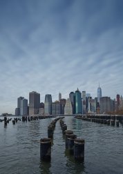
Another from my recent sojourn. Comments always appreciated.
I like it. If the posts were to the left I'd think it would make for a stronger image.
I like it. If the posts were to the left I'd think it would make for a stronger image.
Thanks AFB, I tried to frame up something along the lines you suggested but there was too much 'junk' over on the right. Short of getting my feet wet, this was the best I thought I could do. Still trying to get to grips with a 20mm focal length: I know it's not ultra-wide but framing is a little more challenging for me at least. I will have a look and see if I can crop for the composition you suggest. Many thanks again.
Register on MacRumors! This sidebar will go away, and you'll see fewer ads.