Got a tip for us?
Let us know
Become a MacRumors Supporter for $50/year with no ads, ability to filter front page stories, and private forums.
Photo of the Day January 2017
- Thread starter Hughmac
- Start date
- Sort by reaction score
You are using an out of date browser. It may not display this or other websites correctly.
You should upgrade or use an alternative browser.
You should upgrade or use an alternative browser.
One from October time  It was the last image I took on a Canon system before my Fuji X-T2 arrived and made the switch to the X-System. It's always good to finish on a high with a good image!

I think this may be too foggy but maybe it does work, I'm not sure. I would appreciate hearing the thoughts and opinions of others though. Is there something here possibly?
View attachment 685725
+1 for Black and White, or maybe a Kodachrome style filter as an alternate?
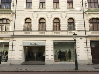
[doublepost=1485518788][/doublepost]Another Paris shot. I will run out of Paris pics to post soon, dont worry.
 L1004599 by Ken OHagan, on Flickr
I like it but a couple of things to try if I may. Feel free to ignore me, I know nothing.
1. You are getting converging verticals, try to minimise the tilt of your camera from horizontal. If you keep your camera as level to horizontal as possible it will reduce this keystone (?) effect. However, If you have to tilt your camera, then there is the upright tool in Lightroom or other editing tools that can fix some of the less severe cases it later.
2. Consider getting in close and taking sharper angles, explore angles and heights that are away from square on in front of the subject to give it some oomph.
3. The cropped street light, elect to either step back and include it, or try to get an angle where you can cut it out as it is a distraction at the minute.
Hope this makes sense. nice colours and lighting.
I'm listening and taking it all in, but sometimes, I feel it's all the palette will allow. I will keep reminding myself to step back, take in the whole and look for the "beauty" in the crop. In hindsight, I should have taken more time in set-up, to better understand this photo. (just for clarity, these were 2 separate photos)


I'm listening and taking it all in, but sometimes, I feel it's all the palette will allow. I will keep reminding myself to step back, take in the whole and look for the "beauty" in the crop. In hindsight, I should have taken more time in set-up, to better understand this photo. (just for clarity, these were 2 separate photos)
It is always a case of interpretation and opinion, my opinion is just that, consider it, take it on board or disregard it. Your call. It is your picture. If you did everything we say it wouldnt be your picture anymore - it would be ours.
Hindsight is an interesting thing... in photography it will always make you doubt your image as you will always have an "if only I..." thought... best to work with what you have...
I had a play... just purely for the purposes of another perspective, not saying this is better than your original. It is easier to edit afterwards than to create in the first place. If this annoys you I can take it back down.
Last edited:
I had a play... If this annoys you I can take it back down.
WOW, a critique of a critique.
Definitely like the look of the tilt tool straightening up the perspective; like the sharpening up of the Art Deco elements both on the window arches and between the windows; rue the loss of the original colour (I know the imagine has a flat appearance BUT that's a true Art Deco colour; and as for the disappearing light pole, well it just ain't going to happen. While I do have a full-blown edition of Photoshop, and use it at times - the main focus of photography for me is to capture the best damned imagine I can throughout my travels - sometimes I capture it and sometimes I can never get the picture because I can't always make the camera capture what my eye sees. To that end, this thread has already provided me with 4 or 5 things for me to be cognizant of every time I take the next photo. Keep the comments coming - it's all good.
A couple of beautiful faces from my last trip to Ethiopia - in the Lake Awasa / Kofele area:

WOW, a critique of a critique.
Definitely like the look of the tilt tool straightening up the perspective; like the sharpening up of the Art Deco elements both on the window arches and between the windows; rue the loss of the original colour (I know the imagine has a flat appearance BUT that's a true Art Deco colour; and as for the disappearing light pole, well it just ain't going to happen. While I do have a full-blown edition of Photoshop, and use it at times - the main focus of photography for me is to capture the best damned imagine I can throughout my travels - sometimes I capture it and sometimes I can never get the picture because I can't always make the camera capture what my eye sees. To that end, this thread has already provided me with 4 or 5 things for me to be cognizant of every time I take the next photo. Keep the comments coming - it's all good.
Remember it is your photo... example, you wanted to maintain the art deco colours, I preferred to bring our the colour contrasts a little more... this is the fun bit... so in photoshop, the removal of the light was crude - not to @oblomow standards and no fire extinguishers in sight...
I applaud your vision. We all have that, sometimes our vision doesnt remember the pole being there... lol...
Like I said earlier, it is perspective of others, feel free to ignore but I had 30 seconds to play and took a liberty... image straight out of camera reflecting reality is a great goal... for me I need a Lightroom and Photoshop shaped sticking plaster to fix my pictures up
The thing about the verticals and the horizons is they feel weird at first and you need to go through your checklist to force yourself on them but after a while, they become muscle memory and you will not realise you are doing them automatically...
enjoying seeing your work. Thank you for taking us on your journey with you.
It is always a case of interpretation and opinion, my opinion is just that, consider it, take it on board or disregard it. Your call. It is your picture. If you did everything we say it wouldnt be your picture anymore - it would be ours.
Hindsight is an interesting thing... in photography it will always make you doubt your image as you will always have an "if only I..." thought... best to work with what you have...
I had a play... just purely for the purposes of another perspective, not saying this is better than your original. It is easier to edit afterwards than to create in the first place. If this annoys you I can take it back down.
View attachment 685815
At some point in time I have got to get a proper photo editing tool. But before doing that I really should replace my computer (I'm too embarrass to mention how ancient it is). Despite the danger of possibly spending too many hours fiddling with pictures in post-processing (when are you done?) I would like to post some better pictures so you all won't have to suffer as much looking at them.
At some point in time I have got to get a proper photo editing tool. But before doing that I really should replace my computer (I'm too embarrass to mention how ancient it is). Despite the danger of possibly spending too many hours fiddling with pictures in post-processing (when are you done?) I would like to post some better pictures so you all won't have to suffer as much looking at them.
We aren't suffering.... we are all enjoying... except @The Bad Guy, seems to have been Drag-ging recently.... badda-bum-tish!
Your banned!We aren't suffering.... we are all enjoying... except @The Bad Guy, seems to have been Drag-ging recently.... badda-bum-tish!
Remember it is your photo... example, you wanted to maintain the art deco colours, I preferred to bring our the colour contrasts a little more... this is the fun bit... so in photoshop, the removal of the light was crude - not to @oblomow standards and no fire extinguishers in sight...
I applaud your vision. We all have that, sometimes our vision doesnt remember the pole being there... lol...
Like I said earlier, it is perspective of others, feel free to ignore but I had 30 seconds to play and took a liberty... image straight out of camera reflecting reality is a great goal... for me I need a Lightroom and Photoshop shaped sticking plaster to fix my pictures up
The thing about the verticals and the horizons is they feel weird at first and you need to go through your checklist to force yourself on them but after a while, they become muscle memory and you will not realise you are doing them automatically...
enjoying seeing your work. Thank you for taking us on your journey with you.
Good advice! This is what makes this forum so great.
But you're wrong. There is one hidden fire extinguisher.

If it gets annoying, let me know. I can use a morale boost.
Last edited:
You're beginning to look more and more like troubleGood advice! This is what makes this forum so great.
But you're wrong. There is one hidden fire extinguisher.

If it gets annoying, let me know. I can a morale boost.
No problem from me, but others might foam at the mouth or try to put out your fire
Had to get in quick before Dad
Cheers
Hugh
But you're wrong. There is one hidden fire extinguisher.
Geez, I removed a red umbrella holder from that exact location because I thought it took away from the light pole.
In B&W and more contrast

To my eye this is better. Thanks.
To my eye this is better. Thanks.
Agree.
[doublepost=1485553844][/doublepost]
A little known fact. His other hobby is taxidermy.How do you do it? Another cracker Peter.
That's great !
Cheers
Hugh
Another kiddo pic. Haven't taken my camera outside the house lately 


Register on MacRumors! This sidebar will go away, and you'll see fewer ads.


 DSC_2269.jpg