Become a MacRumors Supporter for $50/year with no ads, ability to filter front page stories, and private forums.

Tsepz

macrumors 601
Jan 24, 2013
4,888
4,698
Johannesburg, South Africa
And for those who believe 1 notch is not enough...
e0f7783b31deedc5f08d7b23ddfbdcc5.jpg
 

epicrayban

macrumors 604
Nov 7, 2014
6,517
5,353
In case anyone was wondering, this what the Pixel 3 XL looks like with the Notch disabled...
2aafd13e632cbec6cf78f6e77e9a7d06.jpg


Wait, wut. So all the notification and status icons drop below the notch? And you can keep it this way permanently? Even when you open apps and whatnot?

That's... weird. This is all weird.
 
  • Like
Reactions: tbayrgs and Tsepz

Tsepz

macrumors 601
Jan 24, 2013
4,888
4,698
Johannesburg, South Africa
Wait, wut. So all the notification and status icons drop below the notch? And you can keep it this way permanently? Even when you open apps and whatnot?

That's... weird. This is all weird.
That's exactly what I was saying to. Very odd. Most devices that allow disabling the notch will keep the icons in the ears and just blackout the ears, so you keep the usable screen real estate and the ears act simply as a notification area.
 

Ralfi

macrumors 601
Dec 22, 2016
4,374
3,101
Australia
That's exactly what I was saying to. Very odd. Most devices that allow disabling the notch will keep the icons in the ears and just blackout the ears, so you keep the usable screen real estate and the ears act simply as a notification area.
So you do appreciate the increased usable screen real estate the notch brings?

Your gripe is with the aesthetics & non-symmentrical look the notch provides?
[doublepost=1539199518][/doublepost]
Wait, wut. So all the notification and status icons drop below the notch? And you can keep it this way permanently? Even when you open apps and whatnot?

That's... weird. This is all weird.

They have dropped the ball (& icons) with this. Google appears to have absolutely no idea how to implement a notch with efficiency.
 
  • Like
Reactions: epicrayban

Tsepz

macrumors 601
Jan 24, 2013
4,888
4,698
Johannesburg, South Africa
So you do appreciate the increased usable screen real estate the notch brings?

Your gripe is with the aesthetics & non-symmentrical look the notch provides?
This phone would have been better off with a 6.4inch Notchless display, but it makes no sense to bring the icons down when it gets turned off as now it does reduce the usable screen real estate.

What exactly is the Pixel 3 XL's screen size when you remove the notch???
 

5105973

Cancelled
Sep 11, 2014
12,132
19,733
Indeed. What doesn't make sense to me though is that the icons in the Notification bar move down when you disable the notch. On the Huawei P20/Pro and Mate 20 Lite, disabling the notch leaves you still with the icons in "the ears", which IMO makes more sense as you don't lose usable screen real estate, the " ears" just become black.
Ooh Google needs to copy that! Ha, so does Apple. The ears are useful but I do wish they could blend into a dark non distracting background when we set it to do that. Some people want to see the ears all the time, after all.

One thing I was wondering about those of you who are still considering or have preordered the Pixels, are you still comfortable with Gmail?

I am asking this in reference to the news articles about how they’ve let other company’s employees access and read actual emails of their customers.

CNET reported that these employees work for companies that make mail apps. I’m terrible at describing what I’m talking about so here’s the article: https://www.cnet.com/news/third-party-gmail-apps-reportedly-let-employees-read-peoples-emails/

MacRumors might have already discussed this but I was not always reading the forum in July so I don’t know what discussions might have already taken place,

But CNET brought it up again in a new article about Google’s new lineup.

And in conjunction with how they hid news of security breaches, I am concerned they’re too cavalier about the security and sanctity of the data that we expect them to exhibit some measure of care in handling. Care that they have not shown until caught and called out on it.

What are alternatives and options for better security and privacy for Android users and Pixel users in particular, since that’s pretty much Android as Google wants it to be.
 

epicrayban

macrumors 604
Nov 7, 2014
6,517
5,353
So you have to go into developer's settings to disable the notch: https://www.androidpolice.com/2018/10/10/can-turn-off-pixel-3-xl-notch-developer-options/

This isn't just a "black out the background of the ears" feature, it appears to full on disable the notch with permanent software bezels. It's bizarre, but the phone does look better. It just goes to show, Google really should have just skipped the notch entirely.

With the notch disabled, what is the screen size? Back to 6"? Again, who is looking at their 6" device going, boy, I wish it had .3 inches more screen with a giant notch! I sure want a fat and thick status bar. :rolleyes:

p3xl-n3.jpg


p3xl-n2.jpg


The second option looks waaaay better. No horrifically imbalanced front design and no weird and instrusive notch during full screen games/videos. You know, the way a smartphone screen should be.

I wonder if icons can fill the middle of the status bar now? (Same question applies to Pixel 3...)
 
Last edited:
  • Like
Reactions: JaySoul and Tsepz

JaySoul

macrumors 68030
Jan 30, 2008
2,629
2,865
£739 for the smaller Pixel 3 here in the UK so just a fraction cheaper than the XR.

However, I picked my Pixel 2 up just before Christmas from CarPhoneWarehouse last year and it was £499 WITH a free Google Home Mini.

So I’m going to wait it out if I do want to jump on the train.

This is exactly it.

Picked up my Pixel 2 XL from GumTree for £520 in January! It was brand new, an unwanted upgrade, and I clearly got lucky with the lottery since it hasn't had any major issues (by contrast my Samsung S7 Edge and S8 both had to go in for massive hardware fixes to Samsung under warranty).

Probably get a Pixel 3 from eBay or GumTree come Xmas or January again. No rush. Will keep my eyes peeled for a deal. I'm a hustler, baby.
 

epicrayban

macrumors 604
Nov 7, 2014
6,517
5,353
So you do appreciate the increased usable screen real estate the notch brings?

Not quite. It just highlights how weird Google's decisions are (as you've mentioned).

What Google should have done is not bother including a notch at all to begin with. Now that they've committed to the notch, it'd be nice if they allowed all three configurations:

1) Notch as is
2) Hide the notch but keep the status bar icons in the ears
3) Full disabling of the notch by moving the full status bar down.

All three options, letting users decide.

But again, ideally, they could have just avoided the notch altogether. Instead, they invited all this design controversy and drama for really nothing. For what amounts to about .3 inches of "additional screen" and only strictly when in portrait mode.
 
Last edited:

JaySoul

macrumors 68030
Jan 30, 2008
2,629
2,865
Good news that the notch can be disabled! It would annoy me.

One thing I wish wish wish these manufacturers would bring back... Plastic backs.

I don't care about what the back of a phone looks like. I buy a case immediately. Plastic is actually better than glass for transmitting etc. It also doesn't shatter. It's lighter. It's not a fingerprint magnet. And.... It's cheaper!! It should be an option.
 

epicrayban

macrumors 604
Nov 7, 2014
6,517
5,353
With the ability to disable the notch like that, the XL is a far more attractive option...

Another benefit of disabling the notch? The thickness of the status bar is back to regular size. The fatter status bar to accommodate the deep notch is part of what makes it so hideous (and talk about wasted space).


ap_resize.php


This looks so much better! This really changes a lot for the 3 XL. For those who want better speakers and a better OLED panel, it's a far more attractive upgrade now over the 2 XL.
 
Last edited:

Tsepz

macrumors 601
Jan 24, 2013
4,888
4,698
Johannesburg, South Africa
So you have to go into developer's settings to disable the notch: https://www.androidpolice.com/2018/10/10/can-turn-off-pixel-3-xl-notch-developer-options/

This isn't just a "black out the background of the ears" feature, it appears to full on disable the notch with permanent software bezels. It's bizarre, but the phone does look better. It just goes to show, Google really should have just skipped the notch entirely.

With the notch disabled, what is the screen size? Back to 6"? Again, who is looking at their 6" device going, boy, I wish it had .3 inches more screen with a giant notch! I sure want a fat and thick status bar. :rolleyes:

p3xl-n3.jpg


p3xl-n2.jpg


The second option looks waaaay better. No horrifically imbalanced front design and no weird and instrusive notch during full screen games/videos. You know, the way a smartphone screen should be.

I wonder if icons can fill the middle of the status bar now? (Same question applies to Pixel 3...)

Haha, exactly!

And this is the same question that goes for every single
device that claims a certain screen size, while they have a
notch. It seems OEMS are giving us Screen Size that include
the ears

The Huawei Mate20 Lite for example claims 6.3inch, but that seems to include the ears, as the Display generally looks a tad smaller than the Note8s 6.3inch which as full usable 6.3inchs.
With the ability to disable the notch like that, the XL is a far more attractive option...

Another benefit of disabling the notch? The thickness of the status bar is back to regular size. The fatter status bar to accommodate the deep notch is part of what makes it so hideous (and talk about wasted space).


ap_resize.php


This looks so much better! This really changes a lot for the 3 XL. For those who want better speakers and a better OLED panel, it's a far more attractive upgrade now over the 2 XL.
Agreed. They should have just built it with Bezels really

Look at the end of the day Pixel 3 XL seems to be a fantastic device, that improves a lot of what the Pixel 2 XL brought, but I think we both agree that Google really just screwed up with the notch I'm their constant pursuit of trying to be like Apple....but not be Apple.

I feel like "Made By Google" team are all going through a midlife crisis, they are trying to find who they are but are drawing inspiration in some instances from the wrong places, it's so sad, as these areas where they draw the wrong inspiration ends up overshadowing the great stuff they have done. They are like one big walking paradox, it is so strange
 
  • Like
Reactions: epicrayban

epicrayban

macrumors 604
Nov 7, 2014
6,517
5,353
Here's another with the 3 XL notch disabled held up with the regular 3:

DpKDztWUwAA80DN.jpg


So.Much.Better.

And now you can lean into your decision for front firing speakers (especially now that they're louder and better quality) and the dual-front cameras without attracting ridicule for an insanely ugly notch and gigantic chin. If there is no notch, there is no chin, just good ol' fashion bezels that house good features. I personally don't think it's worth having front firing speakers, but at least it isn't a notch/chin.

This would have been an entirely different launch if they had just stuck it out this way. The tone would have been entirely different. They would have been seen as refinements to last gen's, especially for the regular size one, with good upgrades in the right places: speakers, screen, cameras, etc.
 
Last edited:

fjd726

macrumors 6502
Feb 18, 2011
287
60
Is it confirmed that the notch can be hidden? If so where? Nobody has mentioned this other than this forum as far as I've heard.
 

c0ppo

macrumors 68000
Feb 11, 2013
1,890
3,268
I'm sorry, but even with disabled notch, this device is simply too ugly for my taste. Moving the icons and notifications down when notch is disabled is a joke. And the notch on 3XL is simply too big and too ugly.

This is the first flagship of 2018 that I have no desire to even try out :(
 
  • Like
Reactions: tbayrgs

epicrayban

macrumors 604
Nov 7, 2014
6,517
5,353
I'm sorry, but even with disabled notch, this device is simply too ugly for my taste. Moving the icons and notifications down when notch is disabled is a joke. And the notch on 3XL is simply too big and too ugly.

This is the first flagship of 2018 that I have no desire to even try out :(


Indeed. This doesn't change the fact that the Pixel 2 XL was quite ugly to begin with so matching it only makes it less ugly in respect to the notch-monster it was before. As I said in an earlier post, both Pixel 3 models are quite ugly generally speaking.

The Pixel devices have never looked good. Not a single one of them. This is due in large to Google's foolish insistency on front-firing dual speakers -- we're well past those HTC days.
 
Last edited:

Aneres11

macrumors 601
Oct 2, 2011
4,353
9,551
It’s all well and good that the notch can be disabled making the phone look better. But three notification icons only and a gap looks just as bad.
Unless disabling the notch means it uses the available space to behave like a non-notch Android would?
 
  • Like
Reactions: Tsepz

epicrayban

macrumors 604
Nov 7, 2014
6,517
5,353
I'm going to rant some more against notches:

Even when I say, "it's only adding .3 inches of additional screen space," even that statement is false. You're actually not adding all the screen space that goes up to the edge of the ears.

You're only adding as much screen space as the status bar size.

Look carefully at these two pictures and see exactly how much more screen space you're adding:


p3xl-n3.jpg


p3xl-n2.jpg


The rest of the ears aren't actually for any usable screen space. They're purely to tuck the status bar icons and notifications into.

Also, not only is the additional screen space only as tiny as the regular status bar, it's only more screen space strictly in portrait mode. When you're in landscape you're either netting out the exact same screen size by implementing fake bezels, or you're actually losing screen space when in full screen video or gaming.

The arguments for notches are even more absurd the more you think about it. Don't drink the Apple kool-aid. No matter the manufacturer, notches are a mistake.

Unfortunately, Google took a big swig of that kool-aid.
 
Last edited:
  • Like
Reactions: saintforlife

tbayrgs

macrumors 604
Jul 5, 2009
7,467
5,097
I'm going to rant some more against notches:

Even when I say, "it's only adding .3 inches of additional screen space," even that statement is false. You're actually not adding all the screen space that goes up to the edge of the ears.

You're only adding as much screen space as the status bar size.

Look carefully at these two pictures and see exactly how much more screen space you're adding:


p3xl-n3.jpg


p3xl-n2.jpg


The rest of the ears aren't actually for any usable screen space. They're purely to tuck the status bar icons and notifications into.

Also, not only is the additional screen space only as tiny as the regular status bar, it's only more screen space strictly in portrait mode. When you're in landscape you're either netting out the exact same screen size by implementing fake bezels, or you're actually losing screen space when in full screen video or gaming.

The arguments for notches are even more absurd the more you think about it. Don't drink the Apple kool-aid. No matter the manufacturer, notches are a mistake.

First, let me clearly qualify that I am in no way a fan of, nor advocate of notches. I don’t enjoy them and the resulting asymmetry mildly triggers some level of OCD in my brain. That being said, how Apple utilizes it bothers me the least and there is actually a small bit of functional advantage vs. how the phone would have to be designed/implemented without using one. The notch on the Pixel 3 XL is just absurd. Again, this is just my own personal perspective.

Speaking specifically in regard’s to the iPhone’s implementation, the notch affords a space for all the sensors they need for Face ID, the proximity sensor and front facing camera. The alternative would be to just have them housed in a full top bezel. That would mean either a larger device to have the same amount of usable screen space or less usable display area. The information presently in the ears would be part of the status bar and need to be pushed down into the top of full display area, meaning less space usable by apps, home screens, etc—in both portrait and landscape. I might mean a loss of only .3 inches but it would be less.

The hallmark feature of the iPhone that I love is the absence of a chin. I still don’t understand why no other manufacturer has been able to pull this design element off. So as I see it, assuming an implementation of the exact same amount of usable display space, we have 3 display design options (I’m not including designs like the Find X or Nex as I find them functionally compromised)—a larger iPhone with no chin but a full top bezel, an even larger iPhone with matching full top and bottom bezels (a la Note or Galaxy, for symmetry, of course ;)), or the current design, smallest overall of the 3 options, with no chin and a notch. I personally am glad Apple choose the implementation that they did. For my preference, it’s the best fit.
 
Last edited:

Cryates

macrumors 68040
Nov 19, 2013
3,341
5,283
It’s all well and good that the notch can be disabled making the phone look better. But three notification icons only and a gap looks just as bad.
Unless disabling the notch means it uses the available space to behave like a non-notch Android would?
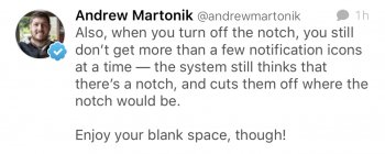
Nope, still get truncated notifications.
 

Attachments

  • F208F553-E338-493E-9316-F0CE84BCCF51.jpeg
    F208F553-E338-493E-9316-F0CE84BCCF51.jpeg
    189.7 KB · Views: 140
  • Like
Reactions: Aneres11
Register on MacRumors! This sidebar will go away, and you'll see fewer ads.