Got a tip for us?
Let us know
Become a MacRumors Supporter for $50/year with no ads, ability to filter front page stories, and private forums.
Pixel 3/Pixel 3 XL
- Thread starter nviz22
- Start date
- Sort by reaction score
You are using an out of date browser. It may not display this or other websites correctly.
You should upgrade or use an alternative browser.
You should upgrade or use an alternative browser.
Honestly, MKBHD's "second impressions" video makes a good case for the 3 XL with the notch turned off via developer's settings, of course.
It somehow looks better than the 2 XL. Like, the bezels appear smaller all around by a bit, (the side bezels for sure, right?). It doesn't look quite like the super bloated bezels of the 2 XL.
Or am I crazy? I could be crazy.
Plus the improved screen panel should make it a better overall screen experience, too.
Oh, the 3XL I'd better in every way. The only reason I'm not throwing money at my screen is because is isn't 1k$ better than the 2XL or more importantly the Note 9.
I'm saying 1k$ more because I own those two phones and so I'd have to justify spending money I don't have.
[doublepost=1539305877][/doublepost]
If you're going to turn off the notch, then why even have it to begin with? Every notch, I think, is a design flaw.
Most people won't turn it off and I'd wager most people won't care. Caring about notches is basically a tech circle thing.
Honestly, MKBHD's "second impressions" video makes a good case for the 3 XL with the notch turned off via developer's settings, of course.
It somehow looks better than the 2 XL. Like, the bezels appear smaller all around by a bit, (the side bezels for sure, right?). It doesn't look quite like the super bloated bezels of the 2 XL.
Or am I crazy? I could be crazy.
Plus the improved screen panel should make it a better overall screen experience, too.
I’m not much of a fan of Unbox Therapy as I find Lew a bit overdramatic and his videos sometimes a bit too ‘click bait-y’ but his latest video is spot on in my opinion. He agrees with you @epicrayban and finds it perplexing why Google pushes everything down in the status bar when hiding the notch, instead of blacking out of the sides and using the space for status icons.
Skip to about the 1:50 mark to get past Lew’s usual excessively long setup rant.
So what Google has basically done is just put out the 2 XL ver. 2.0 with improvements in 3 key areas—display quality, speaker quality, and wireless charging. It’s not the best overall design but I could get behind that. Now just move the status bar info back into the ‘ears’ when the cutout is hidden and it’ll be good to go.
I’m not much of a fan of Unbox Therapy as I find Lew a bit overdramatic and his videos sometimes a bit too ‘click bait-y’ but his latest video is spot on in my opinion. He agrees with you @epicrayban and finds it perplexing why Google pushes everything down in the status bar when hiding the notch, instead of blacking out of the sides and using the space for status icons.
Skip to about the 1:50 mark to get past Lew’s usual excessively long setup rant.
[doublepost=1539311059][/doublepost]So out of curiosity it went and compared dimensions of the 2 XL and 3 XL. I didn’t realize they are very nearly the exact same size (0.1mm difference in length). So when the notch is disabled, resulting in roughly 6.0” of usable display, it is literally the exact same size display and overall dimensions of the 2 XL.
So what Google has basically done is just put out the 2 XL ver. 2.0 with improvements in 3 key areas—display quality, speaker quality, and wireless charging. It’s not the best overall design but I could get behind that. Now just move the status bar info back into the ‘ears’ when the cutout is hidden and it’ll be good to go.
Make all three notch options available. Pull them out of developer's settings and make it a simple option in the display settings. 1) Notch. 2) Notch with status icons. 3) Disable notch with status bar pushed down.
I'm kind of considering it, as long as Google doesn't remove that switch from the developer's settings. The hardware would be good enough to finally let go Samsung.
[doublepost=1539322180][/doublepost]Any info on the screen maker for both models? Do we know yet if it's LG or Samsung?
Err why is there an option for a 'double cutout' that adds a notch to the bottom of the screen???
@ 5:16...
Also @ 4:58... He seems to emphasise how much screen you lose by disabling the notch in developer settings, which is reflective of the point I've made here - the deeper the notch, the more screen you'll lose by disabling it.
@ 5:16...
Also @ 4:58... He seems to emphasise how much screen you lose by disabling the notch in developer settings, which is reflective of the point I've made here - the deeper the notch, the more screen you'll lose by disabling it.
Err why is there an option for a 'double cutout' that adds a notch to the bottom of the screen???
@ 5:16...
Also @ 4:58... He seems to emphasise how much screen you lose by disabling the notch in developer settings, which is reflective of the point I've made here - the deeper the notch, the more screen you'll lose by disabling it.
Well, that's one way to double down on the notch.
why is a pixel 3 $150 more than a pixel 2? the hardware is almost the same and similarly specc-ed S9 is only $620.
yes, google may have better software, but never tell me that it is for us consumers. it's for google too, so they can more easily collect your data to make more money. also software is not worth $150. why? because most of these software upgrades will come to pixel 2, so why am I buying a pixel 3 for $150 more?
sorry for ranting. and i know there are many other choices. just disappointed because i really hoped that google could build a phone to rival apple, to provide competition. but no, i think pixel 3 is going to be another pixel 2.
I'm all for taking the micky out of yourself, but this is next level from Google.Well, that's one way to double down on the notch.
I'm all for taking the micky out of yourself, but this is next level from Google.
In all reality, this will allow them to push the bezel down to the bottom and keep the front facing speakers. They seem to really like those.
. just disappointed because i really hoped that google could build a phone to rival apple, to provide competition. but no, i think pixel 3 is going to be another pixel 2.
Same.
Google have appealed to the selfie-addicts & front-facing speaker crowd with their tech upgrades & design.
Both of which are not up my alley...
If you're going to turn off the notch, then why even have it to begin with? Every notch, I think, is a design flaw.
I see no point in hiding it if I go with pixel xl3 id keep the notch on. Notches don't bother me now they did when the iPhone released and I was like alot of you guys omg the notch I cant handle looking at it, but it isn't end of the world id still happily use the pixel.
I see no point in hiding it if I go with pixel xl3 id keep the notch on. Notches don't bother me now they did when the iPhone released and I was like alot of you guys omg the notch I cant handle looking at it, but it isn't end of the world id still happily use the pixel.
well, google could implement it such that notification icons, time, etc appears along side of the notch, i.e. like what many tech youtubers said. this makes better use of the real estate. also, watching some youtube videos, it seemed like the notch is fine usually, but could become an eyesore when you game or watch videos.
well, google could implement it such that notification icons, time, etc appears along side of the notch, i.e. like what many tech youtubers said. this makes better use of the real estate. also, watching some youtube videos, it seemed like the notch is fine usually, but could become an eyesore when you game or watch videos.
Yes that would be a positive for those that still don't want the notch. Sadly there's always compromises between all these phones. If you spend most of your time watching videos surely getting a note 9 would then be the best option. It's all about the camera for me and why I would choose this over the iPhone X's max or note 9.
Yeah I saw MKBHD's second impressions video and it pretty much convinced me that the XL would be fine. Looking at it, I think the notch would occasionally annoy me but not to the point of complete distraction. Still stupid design but positives would outweigh negatives.
The dimensions are practically identical to my 2 XL, so if I can find a good deal on it (and the proper reviews come out, plus quality control is better) then I'd pull the trigger in January when people are broke and selling their upgrades.
Around mid-January tends to be a good date to trawl eBay and Gumtree
When should we start to see the reviews drop?
I read on the 15th.
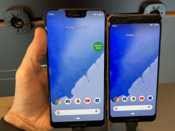
Just played around with the 3 and 3 XL in the O2 store for 10 minutes (albeit in Demo Mode but still).
Wow, can't understand how the Pixel 3 is a 5.5" screen but the 3 XL is exactly the same size as my 2 XL (which has a 6" screen). The 3 feels SO much smaller, the screen size is too small for me. Would be perfect for my wife, if she ever left her Samsung way of life.
So if I do get one, the 3 XL would be it. The screen is definitely better. But honestly, the only difference would be the back camera, the front cameras (I don't take selfied), the speakers (mine are fine) and the SnapDragon 845.
The notch thing - I'm over it, now. After playing around with it for 5 minutes, it was barely an issue. It's ugly to look at, but in practical usage I'd personally be fine with it.
But tbh I don't think it's really an upgrade from the 2 XL, pretty sure I'll just wait for the 4 XL. That should hopefully be HTC'ed up a bit, too, have 6GB RAM, better design etc, an under-screen fingerprint reader maybe....
Definitely on the Pixel train, though. There are so many great phones around but I'm happy with Pixels.
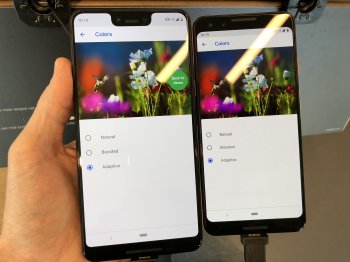
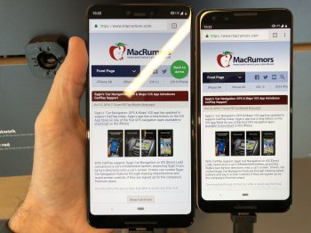
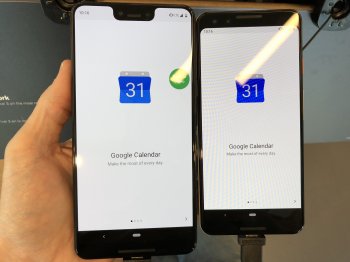
I went back to check the phones out again. Both colors were set to adaptive and brightness to max. Colors are more saturated on the 3. I like what I assume are more accurate colors of the 3XL. Some may like the pop of the colors on the 3. Excuse the crappy pics, but wanted to share.
Attachments
I can't quite grasp how people are saying the notch is now not an issue after being disgusted over it for the last 3 months lol.
But good if you can look past it.
I for one cannot and overall this 'upgrade' to the Pixel line has left a very sour taste. To be paying for the privilege of that notch an upgraded camera (but we don't know quite to what extent yet) and the ability to flip over to silence I think it's madness.
For me, the safe bet would be a 2 XL purchase (hey, Panda) and reap the rewards of constant support still and embrace virtually all the new features - notch free.
But that's just me.
I also hate the colours. Pixel 2 mint green was the ONE.
I can't quite grasp how people are saying the notch is now not an issue after being disgusted over it for the last 3 months lol.
But good if you can look past it.
Same as we did with the iPhone X!
Same as we did with the iPhone X!
See it never really bothered me on the iPhone because there is no chin, and it made sense for FaceID. So there’s kinda a reason for it.
As with all Android phones so far though, there’s seemingly no reason other than the manufacturer thinking it’s the cool thing to do.
I can't quite grasp how people are saying the notch is now not an issue after being disgusted over it for the last 3 months lol.
It's not that it's no longer an issue; people just don't have a choice if they want the larger screen/battery. Make no mistake, the 3 XL notch is still a design flaw, and the most egregious of them all.
For me personally, I only started considering the XL after the discovery of the developer's setting that eliminates the notch (pushing the status bar down) which results in a refined Pixel 2 XL look. The bezels appear less bloated.
IMO, that's what Google should have created in the first place. They would have avoided all the negative press and reaction to the notch. And along with the better quality screen and better speakers to help justify the forehead/chin, it would have, at most, been criticized for being a boring update.
Still not willing to pull the trigger on the XL. I want the 3, but having trouble pulling the trigger on that, too.
[doublepost=1539364314][/doublepost]
See it never really bothered me on the iPhone because there is no chin, and it made sense for FaceID. So there’s kinda a reason for it.
As with all Android phones so far though, there’s seemingly no reason other than the manufacturer thinking it’s the cool thing to do.
The Verge wrote an excellent article about the 3 XL notch and how everyone agrees the notch is a compromise in design, but you have to at least justify it as much as you can. And when it's as ugly as it is on the 3 XL, you need even more justification for it. The 3 XL fails miserably to justify it altogether.
For the record, I don't think even good technology justifies a notch. The good technology can still be there in a balanced, symmetrical bezel. Just that the article really nails Google for failing to justify any of it at all.
Last edited:
It could be. With the screen off and just going by the overall dimensions, the dimensions are off. Way to skinny. Just looks wrong.Probably because of the large bezels at the top and bottom.
[doublepost=1539366154][/doublepost]
Having pre-ordered the Pixel 3 XL after messing with it in a Verizon store (and having used the iPhone X for the last year), I honestly don't care about the notch. It is what it is, and it doesn't bother me. Obviously, they could have done a better job or eliminated it (as Apple could have), but I don't care. It's just a bridge between the old style large bezels and the new phones a year or two from now that will have full screens edge to edge.It's not that it's no longer an issue; people just don't have a choice if they want the larger screen/battery. Make no mistake, the 3 XL notch is still a design flaw, and the most egregious of them all.
For me personally, I only started considering the XL after the discovery of the developer's setting that eliminates the notch (pushing the status bar down) which results in a refined Pixel 2 XL look. The bezels appear less bloated.
IMO, that's what Google should have created in the first place. They would have avoided all the negative press and reaction to the notch. And along with the better quality screen and better speakers to help justify the forehead/chin, it would have, at most, been criticized for being a boring update.
Still not willing to pull the trigger on the XL. I want the 3, but having trouble pulling the trigger on that, too.
[doublepost=1539364314][/doublepost]
The Verge wrote an excellent article about the 3 XL notch and how everyone agrees the notch is a compromise in design, but you have to at least justify it as much as you can. And when it's as ugly as it is on the 3 XL, you need even more justification for it. The 3 XL fails miserably to justify it altogether.
For the record, I don't think even good technology justifies a notch. The good technology can still be there in a balanced, symmetrical bezel. Just that the article really nails Google for failing to justify any of it at all.
Having pre-ordered the Pixel 3 XL after messing with it in a Verizon store (and having used the iPhone X for the last year), I honestly don't care about the notch.
@Lloydbm41, why are you switching from X to the 3 XL?
@Lloydbm41, why are you switching from X to the 3 XL?
@nospleen The difference in size between the 2 looks pretty big!
I still don’t like the look of the notch. But as I’ve become used to the iPhone notch, I’m sure I could do the same with Pixel. The camera quality is definitely my favourite feature on a phone. But while I’m sure the Pixel will be better than the iPhone, it’ll only really be noticeable if you have them side by side and nit pick over minute details.
As much as I enjoyed using the Pixel 2XL for the last 10 months, I’m really enjoying the change to iOS and iPhone again. So for me, it doesn’t really make sense to lose money selling this and buy one. I’ll appreciate the change back to Pixel / Android much more after a year away. Wish they’d up the storage to 256gb though, it at least have sd card support.
Still looking forward to all the full reviews and people’s impressions of it once released. And seeing just how good the camera is.
Register on MacRumors! This sidebar will go away, and you'll see fewer ads.


