The excuse that Google is a software company and therefore gets a pass on their hardware issues is not a position I would take. Google is selling hardware and in some cases, expensive hardware (Google Home Max, Pixel 2 XL, Chromebook, Pixel Buds...). They should be held to no different standard regardless if their origins or forte is software. They obviously want and have a hardware component to their business model, and that seems to be where the disappointments are.
The Pixel 3 looks like what the Pixel 2 should have been. That alone is frustrating.
And the Pixel 3 XL just doesn't seem to really grasp the idea of good design. Speakers or not, the off-balance bottom chin is hard to ignore. And it has to be said again, front-firing speakers doesn't always mean good speakers. I find the dual speaker set ups on the S9+ and the iPhone X to have better speakers than the FFS of the Pixel 2. And I mean this both in quality and loudness. The Pixel 2 FFS are only loud, not good. The set up that the S9+ and iPhone X have allows for a much cleaner front design, especially in the S9+. If you have a notch, you shouldn't have a chin. At the very least, it should be a very tiny chin, ala the OnePlus 6.
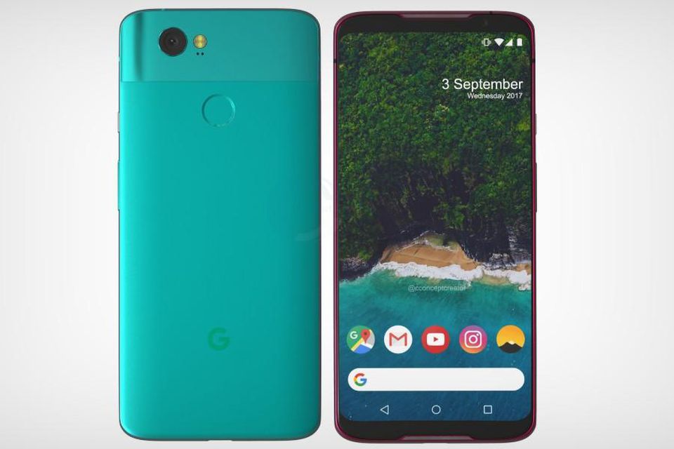
And the back... while it's nice that Google is keeping the two-tone color design even whilst going all glass for what I hope is wireless charging, I'm not sure why they felt they needed to angle/slope the design when it changes tone. What's up with those weird slopping arches? It's such an odd detail. It sort of gives the upper portion "fangs."
I really hope the final design is a little more polished and clean, but the leaks are looking pretty legit.