Got a tip for us?
Let us know
Become a MacRumors Supporter for $50/year with no ads, ability to filter front page stories, and private forums.
Positioning of the "the"?
- Thread starter emdotdee
- Start date
- Sort by reaction score
You are using an out of date browser. It may not display this or other websites correctly.
You should upgrade or use an alternative browser.
You should upgrade or use an alternative browser.
I agree - the dot should stay.Hmm, me thinks the dot should stay,
what does everyone else think?
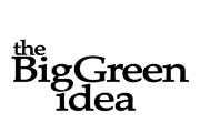
#3 by far (nice and compact), and then #1 (spread out a bit more, very clear on how to read), the "the" just looks out of place in all the others
Hmm, i was about to say that 5 had won (with the dot) but then someone comes along and shouts out for 3 again.
I need to think of some kind of green symbol to go with it, like an energy saving bulb, wind turbine or something nature related. Once the symbol/illustration is decided on then the choice between 3 and 5 can be made to make sure it's all balanced out.
Thanks for your help people.
I need to think of some kind of green symbol to go with it, like an energy saving bulb, wind turbine or something nature related. Once the symbol/illustration is decided on then the choice between 3 and 5 can be made to make sure it's all balanced out.
Thanks for your help people.

I think it's going to be something along the lines of a charity that helps fund small "green" community projects.
Basically, they will be selling things and all the profits will go into a pot to help people buy solar panels or other energy saving devices.
Anyway, it's very very very very very early in development and is an expansion from the site itsnoteasybeinggreen.org which was also a tv show in the uk.
Basically, they will be selling things and all the profits will go into a pot to help people buy solar panels or other energy saving devices.
Anyway, it's very very very very very early in development and is an expansion from the site itsnoteasybeinggreen.org which was also a tv show in the uk.
right, I took spicy apples idea and made a bigger "the" and put it in number 3's position.
This is the almost final design.

I just need a symbol or something. Kinda in a similar vein to treehugger.com's tree logo. hmmms
This is the almost final design.
I just need a symbol or something. Kinda in a similar vein to treehugger.com's tree logo. hmmms
What if you somehow abstracted the "g" in Big into a light bulb or something?I just need a symbol or something. Kinda in a similar vein to treehugger.com's tree logo. hmmms

Wait a minute. You laid out the text before coming up with the mark?I just need a symbol or something. Kinda in a similar vein to treehugger.com's tree logo. hmmms
Although, this idea has merit and wouldn't mess up what you already did, I would have started with the mark, and then added the text to "fit" it.What if you somehow abstracted the "g" in Big into a light bulb or something?
Wait a minute. You laid out the text before coming up with the mark?
Yes, probably not the best way normally but there is a big possibility that different marks could be used depending on its usage so it was better for me to get it so it look balanced on its own without a mark, if that makes sense?
This is what i've got tonight anyway

I've been advised to experiment with other fonts as the logo could be used for a multitude of purposes and i don't know if it will look great at smaller sizes.
The wind turbine image seems to create a lot of empty space so may need repositioning.
err, thanks for all your comments people, they've been very helpful.
more advice
Also, raise the tower (the vertical part of the wind turbine) so that the base is right next to the word "idea". then draw a diagonal hill for the windmill to stand on. this will balance the logo, because allowing the eye to make a complete circle around the logo when viewing it.
nicrose
Also, raise the tower (the vertical part of the wind turbine) so that the base is right next to the word "idea". then draw a diagonal hill for the windmill to stand on. this will balance the logo, because allowing the eye to make a complete circle around the logo when viewing it.
nicrose
I've been advised to experiment with other fonts as the logo could be used for a multitude of purposes and i don't know if it will look great at smaller sizes.
The wind turbine image seems to create a lot of empty space so may need repositioning.
Scale is very important here. The turbine is way too big. Scale it down to, I'd say, nothing bigger than from the top of "the" to the bottom of "idea." Think about the strokes on the letters (combination of thick and thin), and see if you can incorporate that kind of stroke into the image of the turbine.
I'd also play around with the turbine in Illustrator. See if you can get something a little more personal and unique. You said that you liked the treehugger.com logo...use that for inspiration if you want to.
Number three or five because I like the symmetry and lines. In that one, "the" is thoughtfully positioned instead of randomly like in the rest of them.
Just my opinion.
Just my opinion.
idea for logo
This is what I meant in the last comment I made:

Nicrose
Also, raise the tower (the vertical part of the wind turbine) so that the base is right next to the word "idea". then draw a diagonal hill for the windmill to stand on. this will balance the logo, because allowing the eye to make a complete circle around the logo when viewing it.
nicrose
This is what I meant in the last comment I made:
Nicrose
Nice suggestion nicrose but I think im going to need something more "universal" so i have come up with some acorn leaves. They're supposed to mimic the recycling symbol but need a bit of tweaking because i copied them from a small res image quickly with the pen tool.

Register on MacRumors! This sidebar will go away, and you'll see fewer ads.