Got a tip for us?
Let us know
Become a MacRumors Supporter for $50/year with no ads, ability to filter front page stories, and private forums.
Post all of your OS X Yosemite screenshots here!
- Thread starter MartinAppleGuy
- Start date
- Sort by reaction score
You are using an out of date browser. It may not display this or other websites correctly.
You should upgrade or use an alternative browser.
You should upgrade or use an alternative browser.
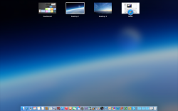
I got this background from taking a screen shot of iCloud.com. I find that it works really well with the new look. After trying a ton of different wallpapers, I finally decided to keep this for a while. I like how it's simple, but still has a lot of depth, and it's quite mesmerizing next to the black bezels and behind the white windows. 

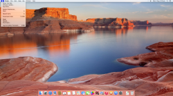
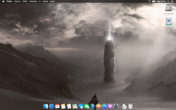
EDIT: Forgot to mention, I made the Beats Music icon, and that takes me to the web player. I also resized the adobe icons, because they're normally way too big.

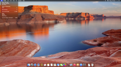
EDIT: Forgot to mention, I made the Beats Music icon, and that takes me to the web player. I also resized the adobe icons, because they're normally way too big.
Last edited:
Hello, how are you?
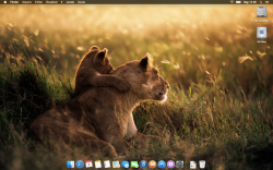
I loved and never returned to OS X 10.9. I am staying mostly in OS X 10.10. I made my +800 own icons for my OS X Yosemite that I made for the future users of Yosemite. You can see my screenshot:

What do you think about my new icons?
I loved and never returned to OS X 10.9. I am staying mostly in OS X 10.10. I made my +800 own icons for my OS X Yosemite that I made for the future users of Yosemite.
You can see my screenshot:
What do you think about my new icons?
Do you have these linked somewhere?Hello, how are you?
I loved and never returned to OS X 10.9. I am staying mostly in OS X 10.10. I made my +800 own icons for my OS X Yosemite that I made for the future users of Yosemite.
Image
What do you think about my new icons?
Like deviantart or Dropbox?
Do you have these linked somewhere?
Like deviantart or Dropbox?
Dropbox:
https://www.dropbox.com/sh/grr2q5c7kpjljky/AAA7XHLJuzZM2-aDbq3J6nMta/iOS Yosemite Icons Pack
Deviantart: http://gusbemacbe.deviantart.com/art/iOS-Yosemite-Icons-Huge-Pack-472635393
You don't need to download as a whole pack, you can choose each one icon with the colour that you like or in your language.


Love this look with a stock wallpaper in dark mode. The translucent drop-down menus look nice.
System Information

iTunes

Safari

LaunchPad

Application Switcher

System Information
iTunes
Safari
LaunchPad
Application Switcher
Last edited:
Hello, how are you?
I loved and never returned to OS X 10.9. I am staying mostly in OS X 10.10. I made my +800 own icons for my OS X Yosemite that I made for the future users of Yosemite.
What do you think about my new icons?
Good job, many compliments


I got this background from taking a screen shot of iCloud.com. I find that it works really well with the new look. After trying a ton of different wallpapers, I finally decided to keep this for a while. I like how it's simple, but still has a lot of depth, and it's quite mesmerizing next to the black bezels and behind the white windows.
Image
EDIT: Forgot to mention, I made the Beats Music icon, and that takes me to the web player. I also resized the adobe icons, because they're normally way too big.
Image
How did you make the icon?


Could you specify the toolbar on the left side?
How did you make the icon?
With Automator.
Start a new document and choose Application type. Find "Get Specified URLs" and drag it to the workspace, and add the website you want to open. Then find "New Safari Document" and drag that into the workspace. When you save that file, you'll be creating an application that opens the website on click. Then just replace the icon as usual.
Could you specify the toolbar on the left side?
It's called control panel by Cindori
With and without dark mode enabled.
The fonts look fine on the 1080p iMac screen. (I full screened your images).
Edit: Just looked at the dark mode. Kind of spoke too soon eh
What do you think of the fonts?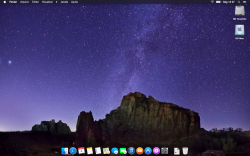
The fonts look fine on the 1080p iMac screen. (I full screened your images).
Edit: Just looked at the dark mode. Kind of spoke too soon eh
Yeah it looks pretty decent, however when dark mode is enabled the font kinda almost look blurry across the system, its worse when you look at a toolbar option with more text on it like History for Safari.
Register on MacRumors! This sidebar will go away, and you'll see fewer ads.