Got a tip for us?
Let us know
Become a MacRumors Supporter for $50/year with no ads, ability to filter front page stories, and private forums.
Post all of your OS X Yosemite screenshots here!
- Thread starter MartinAppleGuy
- Start date
- Sort by reaction score
You are using an out of date browser. It may not display this or other websites correctly.
You should upgrade or use an alternative browser.
You should upgrade or use an alternative browser.
Yeah it looks pretty decent, however when dark mode is enabled the font kinda almost look blurry across the system, its worse when you look at a toolbar option with more text on it like History for Safari.
From what I see, it appears Apple's font smoothing option doesn't affect fonts connected to dark mode. I guess it is still in it's beta stages.
Which is the application that you have on your dock that saw you the temperature of the mac??
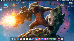
I got this background from taking a screen shot of iCloud.com. I find that it works really well with the new look. After trying a ton of different wallpapers, I finally decided to keep this for a while. I like how it's simple, but still has a lot of depth, and it's quite mesmerizing next to the black bezels and behind the white windows.
Image
EDIT: Forgot to mention, I made the Beats Music icon, and that takes me to the web player. I also resized the adobe icons, because they're normally way too big.
Image
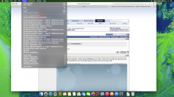
Here is a screenshot of dark mode when on Safari.Looks a mess lol
The pull down menu is fixed now

Last edited:
Which is the application that you have on your dock that saw you the temperature of the mac??
I think you quoted the wrong person.
Am I the only one bothered by how the spotlight icon looks out of place? This happened in DP4 and I was hoping they would fix this in DP5 but they didn't.
It's far too low and big. I really hope they fix that in DP6.
Edit: Added screenshot with dark mode disabled.
It's far too low and big. I really hope they fix that in DP6.
Edit: Added screenshot with dark mode disabled.
Attachments
Am I the only one bothered by how the spotlight icon looks out of place? This happened in DP4 and I was hoping they would fix this in DP5 but they didn't.
It's far too low and big. I really hope they fix that in DP6.
Edit: Added screenshot with dark mode disabled.
beside the magnifying glass is a user icon

Am I the only one bothered by how the spotlight icon looks out of place? This happened in DP4 and I was hoping they would fix this in DP5 but they didn't.
It's far too low and big. I really hope they fix that in DP6.
Edit: Added screenshot with dark mode disabled.
Yeah, looks one pixel too low.
----------
I think he/she was talking about the fonts.
I also think Yosemite looks great. I can't wait till they release the beta so I can use it as my main OS.
Gorgeous wallpaper. Are you able to share it?
Just do a Google image search. I found it in less than 5 seconds.
And you could have pasted a direct link here in 2 :/
Seems like almost everyone here is using dark mode, surprised by its popularity considering how hideous the fonts look on it
Seems like almost everyone here is using dark mode, surprised by its popularity considering how hideous the fonts look on it
I don't like the way menu extras' icons can look with dark mode... so normal mode it is for the time being...
https://www.dropbox.com/s/dymqsb7f074pg3w/Screenshot 2014-08-06 07.09.50.png
OS X Yosemite is really being fixed up lately. Performance is better, bugs are fewer and less noticeable and the whole UI is really starting to become eye grabbing!
Feels like it's christmas every second week due to the developer preview updates, always something new featured or changes. Now it's time to wait 2 weeks more for DP6
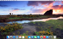
Wallpaper: http://wallpaperswide.com/scenery_of_nature_2-wallpapers.html
PS. I Photoshopped out the watermark on the wallpaper.
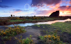
iOS 7 Style Lock Screen Screensaver: http://bodysoulspirit.weebly.com/ios-screensaver-for-osx.html
Attachments
Give a man a fish, feed him today. Teach a man to fish, feed him for a lifetime.
Yeah, except you didn't teach me how to do anything. When I put the link for the image in Google Image Search it just sends me the same link for the Macrumors attachment. What am I doing wrong, oh guru?
Yeah, except you didn't teach me how to do anything. When I put the link for the image in Google Image Search it just sends me the same link for the Macrumors attachment. What am I doing wrong, oh guru?
https://support.google.com/websearch/answer/1325808?hl=en
You’re not real handy with this Google thing, are ya?
Last edited by a moderator:
https://support.google.com/websearch/answer/1325808?hl=en
Youre not real handy with this Google thing, are ya?
wow, 3 messages being a smartass, instead of pasting the direct URL..
You're not very good with people are you?
https://support.google.com/websearch/answer/1325808?hl=en
Youre not real handy with this Google thing, are ya?
Yeah, I had tried that and it wasn't working. I think I figured out why - possibly something to do with how Macrumors attachment files/URLs are named? Anyway, when I saved a copy of the image to my computer and then uploaded it to Google I was able to find it that way.
For anyone else who might like to grab it, the file is here.
Register on MacRumors! This sidebar will go away, and you'll see fewer ads.


