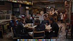
Why so few apps, so few windows?
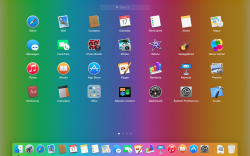
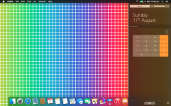
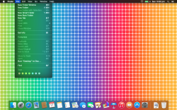
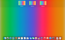
Post all of your OS X Yosemite screenshots here

Any screens ranging from all of the new settings, to the new apps.
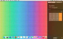
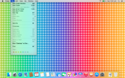
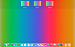
Unless I'm missing something, a majority of screenshots emphasise a user's desktop background often, not an Apple-provided background.
Very few shots show multiple windows. Even fewer show a variety of apps in a single shot.
Without encouraging people to post more shots (think: confidentiality; appearances now may be misrepresentative of a finished product), I'd like the people who had no open windows, or just one window, or just one app, to think about
why there was that nature to their screenshot(s).
An answer might be simply, "I wanted to show the desktop background". Fair enough; some of the backgrounds are gorgeous.
Is a sense of gorgeousness maintained, increased, when attention shifts to things
other than a background, single app or single window?
And so on. The whole caboodle. Realistic, everyday uses of the Mac that are not polished with other observers in mind. How does your personal caboodle please you? Is the mix, the diversity, coming together perfectly? Food for thought. Feedback to Apple


