Become a MacRumors Supporter for $50/year with no ads, ability to filter front page stories, and private forums.

anubis72

macrumors regular
Jan 18, 2004
146
15
I don't get the disdain for the folder icons...I like them.

They are a tad distracting at first, but they grow on you. I'd personally like to have the option of going to a tan color, like the color that most folders actually are...but I guess that would mess with the whole color scheme?

Just be glad you didn't see the first developer preview when they were using reflections in the finder windows. I'm still not sure if that was intentional, or just a glitch. :confused: That was awful...
 

rmercier

macrumors member
Aug 18, 2014
90
4
Im a Mac user since 2011 and I also never used to Dock. Could anybody tell me what the Dock is used for?

NEVER used the Dock? WTF?? I could not live without it. Quick and easy access to applications/folders, dragging files for quick saves...too many uses to name.

I was pissed when they removed the abilty to change to "no Glass" via the command terminal...so happy when they removed the 3D Dock completely with Yosemite

----------

They are a tad distracting at first, but they grow on you. I'd personally like to have the option of going to a tan color, like the color that most folders actually are...but I guess that would mess with the whole color scheme?

Just be glad you didn't see the first developer preview when they were using reflections in the finder windows. I'm still not sure if that was intentional, or just a glitch. :confused: That was awful...

Maybe I'm blind, but I've never even noticed the difference between the Yosemite PB folder icons and Mavericks...perhaps it just doesnt matter that much to me....it's just an icon, I don't really give a shib
 

beosound3200

macrumors 6502a
Nov 23, 2010
684
0
can anyone put a few 2560x1440 (imac 27) screenshots so i can see that translucency effects and sidebar in 1:1 pixels, i would be very grateful

thank you :)
 

bennymac

macrumors newbie
Aug 20, 2014
1
0
Yosemite screenshot with 3d dock

Screen Shot 2 2014-08-20 at 11.59.13 PM.jpg :cool:
 

grahamperrin

macrumors 601
Jun 8, 2007
4,942
648
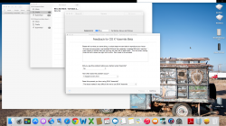
Inconsistent appearance of pressed radio buttons


Looks nice … notification center …

It took me three or more consecutive viewings, each one disoriented, to realise that the wrong button appears to be pressed. To me the pressed button is clearly Notifications. With that as a heading, I was naturally disoriented by the things below appearing nothing like the style of notification with which I'm familiar.
 
Last edited:

Takuro

macrumors 6502a
Jun 15, 2009
584
274
The wallpaper I'm using is based on one called "Wolke" which is pretty popular in Deviantart. Since it's such a basic design, I basically upscaled it to 2560x1600 in photoshop and vectorized the layers so the images stayed crisp, then tried applying 4 different color schemes. Here they are if you want them… not sure I have permission from the original author, but it's probably not going to get distributed too much anyway:

Dark Aqua


Dark Graphite


Light Aqua


Light Graphite


For the Dock, I'm using a program called cDock. Here are the custom settings I am using (they're stored as text files.)

Code:
0
0
0
10
0
0
0
0
0
0
0
0
0
0
4000
0
-2000
0
1
0
1
 

MagicHAM

macrumors 6502
Sep 2, 2013
293
143
Australia
The wallpaper I'm using is based on one called "Wolke" which is pretty popular in Deviantart. Since it's such a basic design, I basically upscaled it to 2560x1600 in photoshop and vectorized the layers so the images stayed crisp, then tried applying 4 different color schemes. Here they are if you want them… not sure I have permission from the original author, but it's probably not going to get distributed too much anyway:

Dark Aqua
[url=http://i.imgur.com/9hbf3nE.jpg]Image[/URL]

Dark Graphite
[url=http://i.imgur.com/7eT1xvC.jpg]Image[/URL]

Light Aqua
[url=http://i.imgur.com/vxaLTGm.jpg]Image[/URL]

Light Graphite

[url=http://i.imgur.com/tDcYVDR.jpg]Image
[/URL]

For the Dock, I'm using a program called cDock. Here are the custom settings I am using (they're stored as text files.)

Code:
0
0
0
10
0
0
0
0
0
0
0
0
0
0
4000
0
-2000
0
1
0
1

so which text file did you use in the package? was it the script one? bit confused as to where to to put those numbers?
 

grahamperrin

macrumors 601
Jun 8, 2007
4,942
648
… where to to put those numbers?

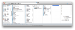
In the themes subfolder of the application support folder for the app. A Mavericks view:

attachment.php


I use the Secrets pane for System Preferences. The second screenshot shows the result of my current preferences:
 

Attachments

  • application support.png
    application support.png
    242.2 KB · Views: 3,601
  • 2014-08-22 15-30-30 screenshot.png
    2014-08-22 15-30-30 screenshot.png
    1.9 MB · Views: 391

Takuro

macrumors 6502a
Jun 15, 2009
584
274
so which text file did you use in the package? was it the script one? bit confused as to where to to put those numbers?

I just edited one of the pre-existing templates that come bundled with cDock.

Right click the app, "show package contents", then go to Contents -> Resources -> app_support -> themes. You can edit any of the templates. This is a modification of the "Fullscreen - Horizontal" template basically. Once you make your change, save the text file, reapply the theme in cDock.

There's also a "settings info" file in the app_support folder that tells you what each number does. It basically controls the red green blue color values of the dock, the alpha (opacity), and some options for borders and width, etc.
 

forza69

macrumors 6502a
Jan 30, 2010
790
131
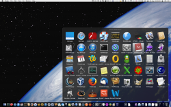
I'm assuming once the final release is out, all of the windows will follow dark mode? Kinda sucks that only the desktop is dark. Also, is anyone else bothered by the fact that the "Trash" text in the Trash window is white on white? Aside from PB2 being laggy, it's nice.
 

Attachments

  • Screen Shot 2014-08-22 at 10.40.31 PM.jpg
    Screen Shot 2014-08-22 at 10.40.31 PM.jpg
    320.3 KB · Views: 277

kmj2318

macrumors 68000
Aug 22, 2007
1,669
712
Naples, FL
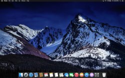
Here's the wallpaper I've been using. It reminds me of the design of Yosemite. Mostly stark whites and greys, and a few splashes of color.

ScreenShot2014-08-23at105101AM_zps2b7ffc41.png
 

igucl

macrumors 6502a
Oct 11, 2003
569
17
Here's the wallpaper I've been using. It reminds me of the design of Yosemite. Mostly stark whites and greys, and a few splashes of color.

I found your image striking. I have to say, everything on that desktop goes very well together. Good eye.
 

Takuro

macrumors 6502a
Jun 15, 2009
584
274
I think I've settled on a final design:


Support the original artist who made the wallpaper. The ones I posted earlier were my own modifications of one he made years ago, and he has released a much cleaner, refreshed version in the time since. It has a lot less color banding and dithering.

http://alexrbsm.deviantart.com/art/Wolke-141517815
 
Register on MacRumors! This sidebar will go away, and you'll see fewer ads.