Become a MacRumors Supporter for $50/year with no ads, ability to filter front page stories, and private forums.
not fond of all the glass everywhere :s
looks like Windows's Aero

Have you seen it in motion? It's definitely NOT like aero at all. It is quite subdued in real life. After a few hours you've forgotten about it's "newness". It's just Mac as you've always known it, just a little more modern.
 
So the translucency doesn't seem to work in full screen. I'm not sure what to think about the look of this. It's a really weird cross between iOS and previous OS X. I wish the apps looked like the ones on iCloud.com. Yosemite feels like a person's mockup from deviantart. I would have liked them to go all the way and make it the same look as iOS 7. Oh well.

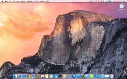
Changing the stock wallpaper really tones down the ugly however.
 
Thanks. So no real changes there, except that App icons are removed in Mission Control, and that Dashboard appear to be missing? :( Such a pity, I use it every day..
The app icons are already not there in Mountain Lion and Mavericks when you don't let the windows be grouped by application (which also seems to be the case in the Yosemite screenshot). And Dashboard will apparently be replaced by the widgets in the Notification Center.
 
The app icons are already not there in Mountain Lion and Mavericks when you don't let the windows be grouped by application (which also seems to be the case in the Yosemite screenshot).
Ah, did not know that!
And Dashboard will apparently be replaced by the widgets in the Notification Center.
I will hold my judgement on this change for when I actually try Yosemite.. I can only be negatively surprised i assume, as I use a lot of widgets and don't look forward to cramming them into such a small area as the notification center currently is. ;)
 
Anyone (with the developer preview installed) mind opening up OpenGL Extensions Viewer and taking a screenshot of the "OpenGL"-tab?
 
Seems like a lot of the icons in Yosemite needs working on eg. System Preference pane icons and the hard drive icons. Not really consistent with the whole design philosophy they have now.
 
Ah, did not know that!

I will hold my judgement on this change for when I actually try Yosemite.. I can only be negatively surprised i assume, as I use a lot of widgets and don't look forward to cramming them into such a small area as the notification center currently is. ;)

Dashboard is still there! It's just turned off by default. In System Preferences > Mission Control, there is an entry for Dashboard, and the options are Show as a Space, Overlay, or Off.

I can't do a screenshot right now though, I just saw it last night when I was playing around with it.
 
Take screenshots of the utility folder! Anything new in there?

How is chess?
 
They still have this old iPhoto icon somewhere in the system.
 

Attachments

  • Screen Shot 2014-06-03 at 15.48.56.png
    Screen Shot 2014-06-03 at 15.48.56.png
    355.3 KB · Views: 663
Dashboard is still there! It's just turned off by default. In System Preferences > Mission Control, there is an entry for Dashboard, and the options are Show as a Space, Overlay, or Off.
Ah, so it's not quite dead yet. But I guess that it's disabled by default while the Notification Center seems to be supposed to supplant its functionality can be taken as a sign that it will be gone for good in OS X 10.11 at the latest.
 
Ah, so it's not quite dead yet. But I guess that it's disabled by default while the Notification Center seems to be supposed to supplant its functionality can be taken as a sign that it will be gone for good in OS X 10.11 at the latest.

I personally don't use Dashboard as I wasn't a fan of the memory usage in the past and never got into the whole widgets experience. I would say that Today view in notification center sounds like it is somewhat replacing the dashboard.

I will say that I have rarely used Spotlight and may have to start using it more now that it is so prominent and has expanded capabilities.

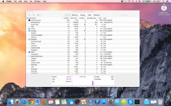
What do you mean memory usage? Dashboard only uses 17Mb of RAM...
 
What do you mean memory usage? Dashboard only uses 17Mb of RAM...

When Dashboard first debuted, it would continue to run in the background, using both memory and for portables, power. However that was several OS releases ago, and while I'm sure they improved that significantly, especially with 10.9 where nothing in the background should use power and resources if it doesn't need it, I had avoided it in the past and never adopted it later. I always disable dashboard as a space in Mission Control.
 
When Dashboard first debuted, it would continue to run in the background, using both memory and for portables, power. However that was several OS releases ago, and while I'm sure they improved that significantly, especially with 10.9 where nothing in the background should use power and resources if it doesn't need it, I had avoided it in the past and never adopted it later. I always disable dashboard as a space in Mission Control.

Dashboard now only updates when you go to it.
 
I find it weird that the System Preferences icon is square when almost everything else is rectangular or round.
 

Attachments

  • Screen Shot 2014-06-03 at 17.10.22.png
    Screen Shot 2014-06-03 at 17.10.22.png
    2.1 MB · Views: 1,134
Register on MacRumors! This sidebar will go away, and you'll see fewer ads.