Got a tip for us?
Let us know
Become a MacRumors Supporter for $50/year with no ads, ability to filter front page stories, and private forums.
Post all of your OS X Yosemite screenshots here!
- Thread starter MartinAppleGuy
- Start date
- Sort by reaction score
You are using an out of date browser. It may not display this or other websites correctly.
You should upgrade or use an alternative browser.
You should upgrade or use an alternative browser.
(still looking, how to hide app-names on mouseover...)
I did not try it, but maybe this can help you out?
http://apple.stackexchange.com/questions/57300/hide-app-name-in-mac-os-x-lion-dock
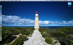
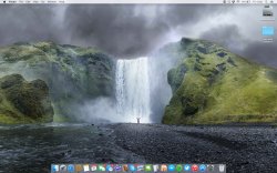
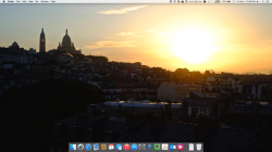
Is that one of the standard desktop images in Yosemite, (I'm in work on my Windows laptop at the moment so cant check)? Or if not where did you get it from? It looks so much better than the default mountain side image
Is that one of the standard desktop images in Yosemite, (I'm in work on my Windows laptop at the moment so cant check)? Or if not where did you get it from? It looks so much better than the default mountain side image
It is one of the default wallpapers (5th from the top left)
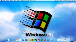
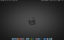
Btw, here is my desktop:

That one really made me laugh! You should reduce transparency in Universal Access just to finish things.
How do you get the date and time on the left like that? And can you share that wallpaper? Looks awesome.
Looks coolHow do you get this clock on your wallpaper?
Sorry for my belated answer. I just got back from a trip to Prague.
Anyway, you can get the wallpaper here:
http://jarekz.deviantart.com/art/Apple-colour-wall-2-128762838
And the clock is an app called Live Wallpaper. See here:
https://itunes.apple.com/us/app/live-wallpaper/id531123879?mt=12
I hope this helps.
ThanksSorry for my belated answer. I just got back from a trip to Prague.
Anyway, you can get the wallpaper here:
http://jarekz.deviantart.com/art/Apple-colour-wall-2-128762838
And the clock is an app called Live Wallpaper. See here:
https://itunes.apple.com/us/app/live-wallpaper/id531123879?mt=12
I hope this helps.
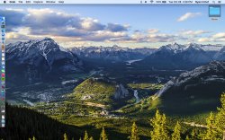
Nice wallpaper! Would you mind sharing it?
Nice wallpaper! Would you mind sharing it?
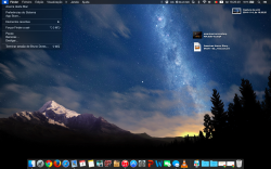
It's included by default in OS X Yosemite.
Nice wallpaper! Would you mind sharing it?
I wouldn't mind, but if you have Yosemite, it's Yosemite 3 under wallpaper.
Yosemite has really grown on me after being apart of the developer program since DP1 back in June.. Looking at Mavericks and backwards makes it look so outdated compared to Yosemite 
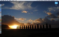
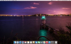
I love how vibrant and attractive the dock looks with the icons. Made some of them my self and others were picked up from DeviantART.
But Apple please, get Yosemite to run even better on Retina Macs. Such poor performance from time to time compared to non-retina Macs.
Wallpaper provided by: ziggy19.deviantart.com
Attachments
It's included by default in OS X Yosemite.
I wouldn't mind, but if you have Yosemite, it's Yosemite 3 under wallpaper.
Thank you guys. I don't have Yosemite installed yet. I am waiting for 10.10.1 update and that is when I will get the wallpaper, I guess.
I wouldn't mind, but if you have Yosemite, it's Yosemite 3 under wallpaper.
It's included by default in OS X Yosemite.
actually, I grabbed it on a website. Great looking wallpaper.
Register on MacRumors! This sidebar will go away, and you'll see fewer ads.


