Got a tip for us?
Let us know
Become a MacRumors Supporter for $50/year with no ads, ability to filter front page stories, and private forums.
Post all of your OS X Yosemite screenshots here!
- Thread starter MartinAppleGuy
- Start date
- Sort by reaction score
You are using an out of date browser. It may not display this or other websites correctly.
You should upgrade or use an alternative browser.
You should upgrade or use an alternative browser.
Multiple apps, multiple windows shots that are somewhat more realistic
Echo … there's more to an operating system than desktop backgrounds …
Myriad lovely desktop backgrounds, but what good is a desktop background when windowing is a mess?
I strongly suspect that some of the changes to the UI were bulldozed through.
Echo … there's more to an operating system than desktop backgrounds …
… harder to distinguish between active and inactive windows..they just blend together too much …
… I don't have Yosemite on my laptop and so (with apologies) the image below is a mock-up, with more exaggeration than I would have liked (no shadows, and so on). Hopefully people can get the idea …
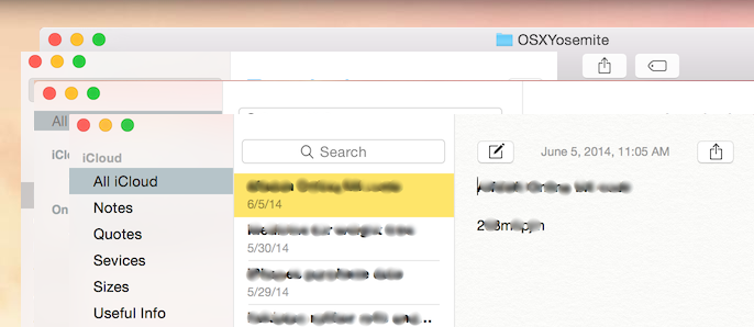
It's not easy to identify two of the apps.
Does anything in Yosemite prevent arrangements such as this?
… Apple seems to have done the same mistake as Microsoft and forgot that this is a computer, not a goddamn smartphone. Computers are visually busy, so differentiation through appropriate design of UI elements is critical for a good workflow.
I hate this new UI because it doesn't WORK as well as the previous one. So it is definitely a step back.
… open 5 different windows, some maximized, some almost maximized, some touching the top of the screen and some other not. You know, to have something that looks like a real-world use.
… Here's one :

To me, this looks like a mess. You probably haven't noticed, but there are 3 windows in this screenshot.
The MOST important area of a window where the outline of the window should show that it's active (the top!), it just blends with all the windows that are behind. The drop shadow is too wide and too diffuse. Stupid choice Apple. Stupid choice.
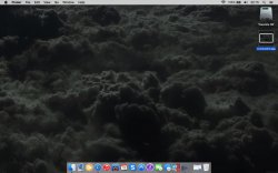
Note that I had to turn off transparency, because Apple did the very stupid thing of making the "open application" dots black as well as the dock transparent, which means that the black dots are barely visible when using a black wallpaper.
Myriad lovely desktop backgrounds, but what good is a desktop background when windowing is a mess?
I strongly suspect that some of the changes to the UI were bulldozed through.
Nature Bqmb8ra2 by promisenwaeke on deviantART
Nature Bqmb8ra2 by promisenwaeke on deviantART is that the original?
How does Yosemite appear when you use it for something other than a desktop background?
Realistic shots more about the operating system's presentation of multiple apps, than about wallpaper will be appreciated.
Today's
Nature Bqmb8ra2 by promisenwaeke on deviantART is that the original?
How does Yosemite appear when you use it for something other than a desktop background?
Realistic shots more about the operating system's presentation of multiple apps, than about wallpaper will be appreciated.
How does Yosemite appear when apps have windows?
Finder, Firefox and Messages are running but there are no windows. How does Yosemite appear when you use the apps?
Hint: you can use Preview to select then cut, from a shot, any part that should not be shared publicly.
For Now
Finder, Firefox and Messages are running but there are no windows. How does Yosemite appear when you use the apps?
Hint: you can use Preview to select then cut, from a shot, any part that should not be shared publicly.
Finder, Firefox and Messages are running but there are no windows. How does Yosemite appear when you use the apps?
Hint: you can use Preview to select then cut, from a shot, any part that should not be shared publicly.
Thanks for the hint, it'll come in handy in the future.
Which apps in particular?
… Which apps in particular?
Any combination of apps. Your choice
Realistic, everyday uses of the Mac that are not polished with other observers in mind. I'm more interested in realism than in tidiness-for-publication.
(The default and dark appearances of the menu bar and Dock are already well-known. A majority of screenshots give no sense of what it's like to really use Yosemite.)
Thanks …
Last edited:
Desktop background: Apple colour wall 2 by JarekZ on deviantART (2009)
The desktop background is at 45 Free High Quality Apple Wallpapers – You The Designer (2010) and other sites. That page gives the source as http://jarekz.deviantart.com/art/Apple-colour-wall-2-128762838
Date, time and weather aside: how does Yosemite look when you start using some of the apps that are in the Dock?
Last edited:
Been running the public beta on my 09 MBP since day 1, but I just updated my late-2013 rMBP. Looks awesome  Not sure how I feel about them removing the sidebar in iTunes outside of the Playlist tab. It had been there forever
Attachments
Here my screen shot (i flew A380 from dubai on the way to europe to see my relative last year before xmas)
http://imgur.com/gaSSrW5
http://imgur.com/gaSSrW5
Last edited:
Mine currently.
How can u change black on top bar i want that?? i hate looking at white bar
How can u change black on top bar i want that?? i hate looking at white bar
Go into settings>general. Select dark theme.
Go into settings>general. Select dark theme.
??? system perferences, Just got it now thanks mate
----------
Thank u very much sumsing
Here dark theme
http://imgur.com/TfPBXDy
I change to
http://imgur.com/L96LsxZ
Last edited:
here you go http://www.reddit.com/r/ImaginaryLandscapes/comments/2gs2f0/white_castle_by_yuri_shedoff/where did you find your wallpaper? looks awesome
awesome, thanks!
Whether I put it it in light or dark mode, the menubar is very harsh on my eyes with my monitor. So I came up with a way to deal with it using GeekTool and just overlaying an image strip on top and changing the opacity. Works pretty good so far.

Whether I put it it in light or dark mode, the menubar is very harsh on my eyes with my monitor. So I came up with a way to deal with it using GeekTool and just overlaying an image strip on top and changing the opacity. Works pretty good so far.
What have you got running in your dock or how did you mod it?
How did you get the dock to look like that?
What have you got running in your dock or how did you mod it?
It's uBar. I also used an image on top of it to make it more transparent.
uBar will just move and auto-hide your dock on the right, but you can set the delay to like a day or something so it never pops up.
Register on MacRumors! This sidebar will go away, and you'll see fewer ads.


