Got a tip for us?
Let us know
Become a MacRumors Supporter for $50/year with no ads, ability to filter front page stories, and private forums.
Post Your ADIUM Setup!
- Thread starter calebjohnston
- Start date
- Sort by reaction score
You are using an out of date browser. It may not display this or other websites correctly.
You should upgrade or use an alternative browser.
You should upgrade or use an alternative browser.
Does anyone know how to set the Adium buddy list to 0% opacity? The lowest it can go right now is 5%, but I know you can set it lower by manually editing some files.
Nevermind: Figured it out. For those curious, Edit /Library/Application Support/Adium 2.0/Users/Default/Appearance.plist by changing the opacity setting to a very small number.
Nevermind: Figured it out. For those curious, Edit /Library/Application Support/Adium 2.0/Users/Default/Appearance.plist by changing the opacity setting to a very small number.
Thanks.calebjohnston said:what message style is that caitlyn? me gusta.
I'm using Adium X 0.89. When I go into the preferences > advanced tab > contacts list, and hover the pointer over the "show window shadow" option, I get a tool tip that says "Stay close to the Vorlon." 

edit - seems to be a babylon 5 quote: "Stay close to the Vorlon, and watch out for shadows. They move when you're not looking at them." but i'm still confused.
edit - seems to be a babylon 5 quote: "Stay close to the Vorlon, and watch out for shadows. They move when you're not looking at them." but i'm still confused.
Oryan said:I'm using Adium X 0.89. When I go into the preferences > advanced tab > contacts list, and hover the pointer over the "show window shadow" option, I get a tool tip that says "Stay close to the Vorlon."
edit - seems to be a babylon 5 quote: "Stay close to the Vorlon, and watch out for shadows. They move when you're not looking at them." but i'm still confused.
I have the same
calebjohnston said:They really need to add support for completely transparent thing. Fluck 5%.
The thing is though that below a certain transparency OS X doesn't let windows be clickable anymore. Someone correct me if I am wrong.
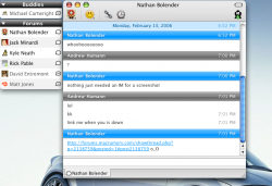
I'll upload my screen later, for now you can check my xtras in my sig, as this is what I am using.
cwedl said:http://img115.imageshack.us/img115/8721/adium8jn.jpg[IMG][/QUOTE]
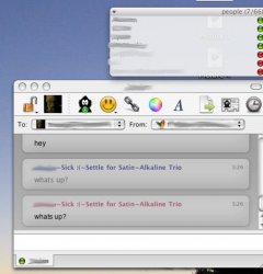
I use that message window theme too. Nice.
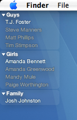
calebjohnston said:Since I created the thread, figured it's time to add my .02
Is that a downloadable theme? I like it. Very elegant. And do you seriously have your contact list sorted into guys and girls? That's so 1950s cute.
It's actually a combination of completely standard options. If you want more details, feel free to PM me and let me know.
+ Yeah, I'm old school. Guys and Girls all the way.
+ Yeah, I'm old school. Guys and Girls all the way.
I might take you up on that. I'll play around some too. 
Now I'm tempted to split my contacts into a "this is for the G's" and a "this is for the Hustlas" section.


Now I'm tempted to split my contacts into a "this is for the G's" and a "this is for the Hustlas" section.
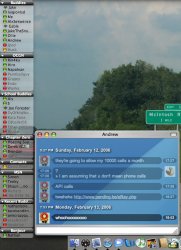
Here's mine. I left the message window alone mostly, so didn't bother posting it. I happen to particularly like my Adium Icon (better than the duck), so here it is with part of the dock as well. Yes, those are two different desktops, they change once a minute so it's easy to get screenshots with different ones.
jW
jW
Attachments
calebjohnston said:that's one weird adium icon there bud
It's a reference to the HitchHiker's Guide to the Galaxy.
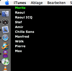
Caleb, I tried to get a look like yours, but I just have too many contacts.  So I'm never going to get rid of having a scroll bar on my iBook. I guess on my iMac I don't though.
  Hmmm...
Right now I copied the plist for Adium from my iBook to my iMac. So it's actually 100% the same. But I could make some modifications...
Right now I copied the plist for Adium from my iBook to my iMac. So it's actually 100% the same. But I could make some modifications...
Heh, I don't talk to many people online so I don't have many contacts. Having a scroll bar would definetely ruin the appearance of the contact list. oh well :|.
To each, his own. Adium's extras section of their site has plenty of good styles.
To each, his own. Adium's extras section of their site has plenty of good styles.
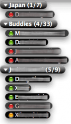
For anyone interested, mine is basically the following.
8% Opacity. Sized to fit vertically/horizontally. Normal list layout. Group Bubbles. Color theme = white for the background of the contact list. Helvetica Neue 11 font. Other than that, check out the more advanced options in List Layout, you'll be able to adjust spacing and remove icons and all that.
Gotta love Adium's customization opportunities.
Register on MacRumors! This sidebar will go away, and you'll see fewer ads.


