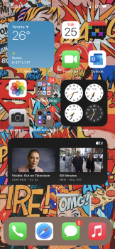
Inability to see something up close...myopic/myopia...EYE SEE what you did there...Depending on the time of day and lighting conditions etc, it can be easier to see the classic clock than the small digital at the top. This is especially true for someone who wears glasses but may not have the on the moment they are checking the time on the phone.
When you step outside your own myopic thought process, a lot of variables come into focus that make the obvious answer more gray and weathered down by circumstance.
Got a tip for us?
Let us know
Become a MacRumors Supporter for $50/year with no ads, ability to filter front page stories, and private forums.
Post your iOS 14 home screen layout
- Thread starter PilotTiny
- Start date
- Sort by reaction score
You are using an out of date browser. It may not display this or other websites correctly.
You should upgrade or use an alternative browser.
You should upgrade or use an alternative browser.
Myopic thought process. How silly. I do wear glasses and never have an issue seeing the clock at the top right in any lighting condition.

Product Feedback
We would love to hear your comments about any of our hardware and software products. Send us your thoughts.
www.apple.com
You can always send feedback to suggest that they remove the function entirely since you can see the clock just fine as it is and don't find the widget to be useful.
I do agree with @TonyC28 that you should have the option to disable the small clock if you are using the widget (or even if not and you just want to remove it)
I am visually impaired and cannot read the digital clock at the top. will you accept me appreciating the larger clock widget?Myopic thought process. How silly. I do wear glasses and never have an issue seeing the clock at the top right in any lighting condition.
I just want access to the clock from my homescreen. I used to have the app there in a folder together with calendar, notes and reminders. Now I replaced that folder with a smart widget stack. It looks neater and it works better as well. Most of the time the smart stack shows the right widget at the right time, which saves me a tab.I’m a little OCD so it kinda annoys me a little to have the large clock widget and the digital time still displayed. That’s just me. It feels redundant.
The clock icon always had a live analog clock as well. So in that sense it always was redundant, it's just a bit more apparent now.
Agreed. First thing I noticed when my phone restarted after installing the first beta and I still haven't gotten used to it.
Looks terrible IMO would have been slightly better if icons wrapped from the bottom with a gap at the top, as it is it is just further to reach up.
Lazy implementation and lacks the attention to detail that we have come to expect from Apple.
Whats the music widget actually showing? I cant seem to get it to change from what its showing which isnt something i even use. The only reason its there is because i have Apple Music attached to my Echo device and my wife tried to get it to play something for my daughter which Apple Music picked the wrong thing and throughout beta 4 to 6 the music widget has never shown anything else.
I never got it to work right so I haven't used it. Maybe I'll try again on B6.Whats the music widget actually showing? I cant seem to get it to change from what its showing which isnt something i even use. The only reason its there is because i have Apple Music attached to my Echo device and my wife tried to get it to play something for my daughter which Apple Music picked the wrong thing and throughout beta 4 to 6 the music widget has never shown anything else.
Hasnt done anything different for me in any beta from 4 to 6!I never got it to work right so I haven't used it. Maybe I'll try again on B6.
Hasnt done anything different for me in any beta from 4 to 6!
It’s always shown my recently played...I think...and let’s me pick on which playlist/album I want from that. I really like it for that, but most of the time I use CarPlay or Apple Music online, so I'm not sure I’ll keep it as a widget as I only seem to listen on my phone when I’m cutting the lawn.
Maybe when I’m back to traveling a lot more.

Last edited:
Are we not able to have a blank home screen on the Beta?
Several posts in the DP6 thread suggest that it is not possible, at least in the DP6 build.
Whats the music widget actually showing? I cant seem to get it to change from what its showing which isnt something i even use. The only reason its there is because i have Apple Music attached to my Echo device and my wife tried to get it to play something for my daughter which Apple Music picked the wrong thing and throughout beta 4 to 6 the music widget has never shown anything else.
I found that it only updates if you play music and playlists available through Apple Music, not including local files or personal stuff you uploaded to iCloud Music. I wish it worked like the Control Center, where it shows what you play from any source. I also think tapping the icon in the upper right should open Now Playing in whatever app is playing or was last used. This functionality is one of the few things I miss about Android.
That would make sense as I generally listen to playlists I’ve compiled although they do consist of music through Apple Music.I found that it only updates if you play music and playlists available through Apple Music, not including local files or personal stuff you uploaded to iCloud Music. I wish it worked like the Control Center, where it shows what you play from any source. I also think tapping the icon in the upper right should open Now Playing in whatever app is playing or was last used. This functionality is one of the few things I miss about Android.
Several posts in the DP6 thread suggest that it is not possible, at least in the DP6 build.
 I hope it’s a bug!! Apple cannot be serious about controlling the whole damn experience.
I tried that and the watch and fitness app won’t delete from the home screen. I tried rebooting the phone. How did you get them to delete? They are already in the app library.Enjoying this layout. No apps except the dock ones. Just App Library.
You can have one of the 2 x 2 squares showing one shortcut, a 4 x 2 showing 4 shortcuts or a 4 x 4 widget showing 8 shortcuts.Is there a reduced version of the shortcuts widget? If so, could someone upload an example please?
Yeah, there's no 1x1 widget (you need to create a shortcut icon on the homescreen to do that). Every shortcut takes up 2x1 icon spaces within a widget. Pity.You can have one of the 2 x 2 squares showing one shortcut, a 4 x 2 showing 4 shortcuts or a 4 x 4 widget showing 8 shortcuts.
Decided to try something totally new and throw my OCD about having some semblance of the factory default layout out the window. Smart Stack on top with Weather, Batteries, Music, Apple TV, and Podcasts. Siri App Suggestions on the bottom. Still just using a single page and leaving the rest to my App Library.
Attachments
iPhone 11 Pro max
Trying to decide if I love or hate this. I think it's the former....where's the wallpaper from, if I might ask?
Register on MacRumors! This sidebar will go away, and you'll see fewer ads.


