There is an API.
I literally cannot wait to see the sort of Widgets we can get for third party apps. This is gonna be so good.

There is an API.
There was a cool clock widget in the keynote, but I can’t find it. Maybe it’ll be added later.
Living like a rebel on my primary device.curious are you all on your primary phone or a backup device?
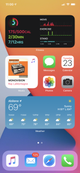
Here’s mine folks. View attachment 926621
This is on my spare 6S.Question. What phone is this? On the se2 I can’t use the big weather widget because the numbers get cut off on the bottom.
Same here, seems extremely stable to far. Hopefully stays that way.Living like a rebel on my primary device.
It’s still better than what we had before. Also, I’m sure developers will create more attractive, unique widgets than the ones Apple is currently offering. Apple’s widget are frankly ugly, especially that Calendar widget.While I give credit to Apple for finally allowing widgets a la Android, Apple has decided to give everyone “customization” while still locking down the iOS Launcher to look exactly the same as everyone else’s iPhone. No offense to anyone posting screenshots, but really, they pretty much look the same. I would be more impressed if you could resize the icons or shuffle them out of their locked position for better customization than what iOS 14 is currently allowing in beta.
Does iOS 14 allow for vacant icon spot or still forces apps next to each other?
Interesting I will have to try this. I do like this widget thing, but they do take up a lot of real estate. I'd like to be able to stack as you say, and have Weather stacked with Maps and scroll from one to the other. Is this how t works?I love the fact we can, when in jiggle mode, drop same-sized widgets on top of one another to create stacks.
It’s still better than what we had before. Also, I’m sure developers will create more attractive, unique widgets than the ones Apple is currently offering. Apple’s widget are frankly ugly, especially that Calendar widget.
Interesting I will have to try this. I do like this widget thing, but they do take up a lot of real estate. I'd like to be able to stack as you say, and have Weather stacked with Maps and scroll from one to the other. Is this how t works?
[automerge]1592932696[/automerge]
Definitely some wasted space on Max phones. They can definitely squeeze another row in there. Maybe it's coming.

I tried to add some last night and couldn’t. Hopefully, Apple will enable the ability at some point.Can anyone confirm about 3rd party widgets??
How is your personal and work life “vastly” different because of the widgets?Still changing mine. Love it so much more than I thought I would already. My personal and work is vastly different. Not showing my work one. On my personal (shown) the top widget is a Siri smart stack. It works really well. It was showing the map widget showing how long it would take to get to work as I sometimes leave in 30 min to go.
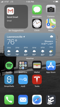
View attachment 926723