That is bad.ForcesAlso found out you can't put a two wide widget in the middle of the top edge. It sucks it to the closest corner.
Got a tip for us?
Let us know
Become a MacRumors Supporter for $50/year with no ads, ability to filter front page stories, and private forums.
Post your iOS 14 home screen layout
- Thread starter PilotTiny
- Start date
- Sort by reaction score
You are using an out of date browser. It may not display this or other websites correctly.
You should upgrade or use an alternative browser.
You should upgrade or use an alternative browser.
I really wish you could have a 1x2 widget. The 2x2 take up a lot of space. The weather widget takes up a lot of dead space.
Has anybody tried iOS 14 on the original iPhone SE yet? Curious to see what the home screen widgets look like on such a small display.
Forces
I agree, I am a symmetry nut and it drives me crazy.
You can create your own stacks from scratch this way. Just make sure the widgets are the same size.
But it doesn’t work for Siri suggestions. The rectangle with app suggestions can’t be dropped or stacked.
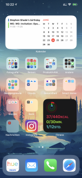
Messed around a lot and finally settled on just one stacked widget at the top. I did remove all my apps except for the ones on the main home screen. Probably had about 150 apps organized in folders all added to library. Nothing in page 2. A swipe to the left brings me to the library. Love the fact we don’t have to have every app downloaded on a home screen.

Does iOS 14 allow for vacant icon spot or still forces apps next to each other?
Still forces apps next to each other. So annoying.
You can use iEmpty to make blank icons as a work around?

Since I have no use for App Library, I pretty much left it as it is and only removed apps I barely ever used from the home screen itself to make room for some widgets
organized folders on my own for the win
organized folders on my own for the win
Attachments
I tried to use the Siri suggested actions (to replicate the missing Favourites widget) but it just recommends random things I may have one done in the past, ignoring the repetitive actions (oo-er!) I'd recently done.But it doesn’t work for Siri suggestions. The rectangle with app suggestions can’t be dropped or stacked.
I tried to use the Siri suggested actions (to replicate the missing Favourites widget) but it just recommends random things I may have one done in the past, ignoring the repetitive actions (oo-er!) I'd recently done.
Same. I had it running yesterday all day and hoped it would learn the apps I use frequently and it did to some extent, but it also suggested apps that run in the background a lot, like my smart home apps.
If I remember how it went with the iOS 13 betas, this slowly improves during the betas. Things on the first few betas simply don't update properly (e.g the Weather and Stocks widgets at the moment too, which give different values to the apps when run, or even another widget from the same app).Same. I had it running yesterday all day and hoped it would learn the apps I use frequently and it did to some extent, but it also suggested apps that run in the background a lot, like my smart home apps.
While I give credit to Apple for finally allowing widgets a la Android, Apple has decided to give everyone “customization” while still locking down the iOS Launcher to look exactly the same as everyone else’s iPhone. No offense to anyone posting screenshots, but really, they pretty much look the same. I would be more impressed if you could resize the icons or shuffle them out of their locked position for better customization than what iOS 14 is currently allowing in beta.
Thus far I am liking what I am seeing overall. I think the small battery widget should give the option for percentages.
I agree with this. I don’t want a large battery widget just so I can read the %. I would like the smaller one showing my phone & watch battery percentage. Hopefully this will be added over the course of betas.
You can have a blank home screen and just have widgets to the left and app library to the right. I didn‘t keep this option but just wanted to see if it was possible.
It looks strange but cool at the same time lol
I like this thread. It gave me some ideas on how to arrange my new home screen. I'm thinking about keeping the most used apps on the first page plus some widgets, hide all the remaining pages and use the app library to access my other "hidden" apps.
Yeah that's what I did. I am only using Widgets on my main screen, plus Siri App suggestions. I like using suggestions because they change dynamically during the day based on what you use when. The remainder of my apps are all in the app library.I like this thread. It gave me some ideas on how to arrange my new home screen. I'm thinking about keeping the most used apps on the first page plus some widgets, hide all the remaining pages and use the app library to access my other "hidden" apps.
Personally I don't get the point of widgets on the home screen, besides wasting space and looking flashy. 🤷

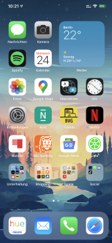
Here's my current setup. The top weather widget is actually a smart stack with battery, maps, podcasts and Siri suggestions underneath. I think I will also experiment with having the two full icon rows as Siri suggested apps, but rearranging the home screen seems very buggy on my device at the moment (adding a widget to a stack can randomly remove apps from my home screen), so will wait until the next beta to try again.
It's a very minor thing, but iOS 14 is probably the first release since iOS 5 to have a default wallpaper I actively dislike. All too desaturated, dark and drab looking, especially in dark mode. Using Big Sur's instead which I think looks a lot better!
Personally I don't get the point of widgets on the home screen, besides wasting space and looking flashy. 🤷
The home screen is literally the first thing you get to see when you unlock your phone. One could have a use to put the widgets they need the most there and leave the "secondary" widgets on the widget panel, where they were before.
Personally I don't get the point of widgets on the home screen, besides wasting space and looking flashy.

I’m on the fence. I tend to agree with you. It’s the latest cool new toy for Apple. They are running out of impactful ideas for a new Big Bang release. I definitely see 90% of consumers not using these and App Library and just keeping six pages of apps organized randomly.
I personally think I am really going to like app library. Now I don’t have to keep 100 apps on home screens in 10 folders. The reality is I don’t ever go to a folder anyway. I swipe down and search. But before library you were forced to have them take up home screen space.
I like this thread. It gave me some ideas on how to arrange my new home screen. I'm thinking about keeping the most used apps on the first page plus some widgets, hide all the remaining pages and use the app library to access my other "hidden" apps.
I did the same. Just one home page. Swiping left is straight to app library. I also tired the large horizontal Siri app suggestions but it’s not there yet in terms of suggesting what I use, so I had to put some apps back on the home screen. I know I could forget certain suggestions, but there’s too many useless suggestions.
BTW, a swipe down brings the same suggestions as the widget.
That was sort of one of the pro/con type of things with iOS -- you couldn't customize too much and there were times you wanted more, but at the same time you wouldn't have to agonize trying out potentially endless combinations and trying to perfect it all (using those terms somewhat loosely).
Agreed. I was one of the people that used the default app layout, filled in the empty spaces on page 1, and page 2 was only folders.
It was simple and didn’t give me headaches. I’m happy to have more customization options, I just know I’m going to struggle over picking one I’m happy with.
I agree with you. I think most people I know who just have apps populate on the screens when they install them (with zero effort at organizing) would benefit if they are given an option upon installing the update to remove all apps from the pages and instead, just organize them into the library. I think they should also have the library automatically be the main page if all other apps are removed.I’m on the fence. I tend to agree with you. It’s the latest cool new toy for Apple. They are running out of impactful ideas for a new Big Bang release. I definitely see 90% of consumers not using these and App Library and just keeping six pages of apps organized randomly.
I personally think I am really going to like app library. Now I don’t have to keep 100 apps on home screens in 10 folders. The reality is I don’t ever go to a folder anyway. I swipe down and search. But before library you were forced to have them take up home screen space.
What I see most people doing here (from the screenshots I've seen) is that they have a few widgets, a handful of frequently used apps, and then the library. For those of us with a ton of apps, I've found its super easy to just swipe down to search for an app instead of going into a folder and swiping a few times to get to it. Once more widgets are available on the main screens, this would also be a quick way to access frequently used apps.
Register on MacRumors! This sidebar will go away, and you'll see fewer ads.