After digesting the features and moving on from the initial clamour, my comments (entirely subjective) on the aWatch are:
Hardware
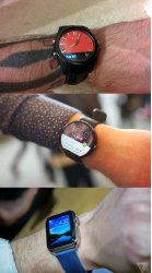
Non-circular doesn't look as nice but it will likely be easier to use. However, I do think with software refining, the 360 form can be quite usable. I don't intend on this replacing the phone. I see a watch useful for time and notifications plus maybe some dictation. Maps and photos are far better on the phone in my pocket since I must take it.
The twirling dial - hailed before the demo then largely unused. Certainly less so than the tried and tested touch and swipe that is in our muscle memory now. I'm not convinced this is that useful. I almost feel that if the dial is needed, the app is over complex or lacks a simple UI that a smart watch should have.
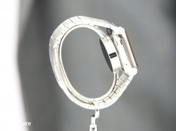
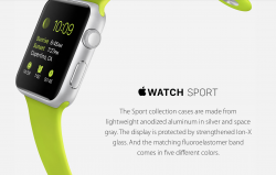
Lots of customisation and choices are a plus. Can't complain here. And sapphire is a major positive.
Overall I feel the circular style is better and might actually prevent over elaborate and unnecessary software features that are more suited to the phone in your pocket.
Software
There seems to be a catch-all approach with the software. Dare I say it, a bit Samsungy? The emoticons and pulse might be fun for a while but don't really add much. Same for drawing fish.
Likewise, they are over-stating the sports ability. I noted elsewhere that, as a keen cyclist, this will not replace anyone's Edge or SRM any time soon. There is too much data missing, even with a Bluetooth speed and cadence sensor. And don't think it'll last a 4-6 hour long ride, maybe not even a 2-hour tour. And did I mention we don't like extra weight (the iphone in the back pocket).
For other less demanding sports maybe it's adequate for an hour but I would not swap my Forerunner or Edge for this. Additionally, I doubt the battery would last serving GPS and Bluetooth devices with the screen on non-stop.
Maps - screen too small and cumbersome to operate no matter how good this dial is. Takes 2 seconds to get my phone and be gone with such frustrations. These are too small a device to be scrolling lists and zoom/panning.
Photos - see above. Really puzzled why this made it in.
I like the idea of parsed text and suggested responses - could be very useful and a typical quick glance/reply/carry on what I am doing scenario.
Seeing cinema times, etc on such a small screen is not that great. Did they not realise people have been wanting a larger screened iphone for a long time? Why cram this info onto a tiny screen?
Overall, I think the focus on priority functions has been lost a little. I'm sure people will tune their needs over time and we will see a more optimised device.
Ultimately I'm looking for a stylish looking watch with a decent all-day battery life. It can display the time and let me know when I have a call of other notification that needs dealing with (or not). A basic sports/health tracker that simply has a goal and if I made it or not.
The rest? I'm not convinced I need anything else that won't be cumbersome and frustrating on the small display.
Look, tap, carry on. That's the killer smart watch feature - convenience and speed. Speed that beats the few seconds it takes to get my phone out of my pocket.
Would be interested to know what else you guts use, or plan on using your watch for.


 watch at least doesn't look so boring, but I'm worried it wouldn't look so good on the arm as well.. not enough to get me buying one.
