Become a MacRumors Supporter for $50/year with no ads, ability to filter front page stories, and private forums.

dk001

macrumors demi-god
Oct 3, 2014
11,136
15,488
Sage, Lightning, and Mountains
Agreed customization is not for everyone. But at least Apple is moving in the right direction.

For the bolded above...have they? I am running IOS 18 DB1 and it has a way to go to putting things wherever we want them. They still snap to a grid in a lot of ways. But it is still in beta so we will see what the finished product is in Sept.
But I gotta say the DB1 is pretty sweet. The most stable beta release in recent memory.

The snap left is still there and can mess things up. Also found that widgets will sometimes float above it all not allowing it to be placed in a space big enough. Wish widgets were scaleable instead of next/previous size.

Still, it is a step in the right direction IMO. ;)

UPDATE: same issue with beta 2.
 
Last edited:
  • Like
Reactions: jamezr

tbayrgs

macrumors 604
Jul 5, 2009
7,467
5,096
Agreed customization is not for everyone. But at least Apple is moving in the right direction.

For the bolded above...have they? I am running IOS 18 DB1 and it has a way to go to putting things wherever we want them. They still snap to a grid in a lot of ways. But it is still in beta so we will see what the finished product is in Sept.
But I gotta say the DB1 is pretty sweet. The most stable beta release in recent memory.
Sorry, by grid snapping I meant the mechanism where it always moves it to first available space up and left. It’s still a grid but you can at least now place free form around that grid. Android still uses a grid format too, no (though I know you can adjust the size of the grid)?
 
  • Like
Reactions: dk001 and jamezr

jamezr

macrumors P6
Aug 7, 2011
16,072
19,066
US
Sorry, by grid snapping I meant the mechanism where it always moves it to first available space up and left. It’s still a grid but you can at least now place free form around that grid. Android still uses a grid format too, no (though I know you can adjust the size of the grid)?
I haven't seen anything that we could change the grid yet. But I would love to change the grid to 5x6. Having an extra row of icon on the bottom dock would be very nice.
 

dk001

macrumors demi-god
Oct 3, 2014
11,136
15,488
Sage, Lightning, and Mountains
Was sitting down to breakfast this morning running through some new stuff on the 15 ProMax running iOS 18. It just kind of dawned on me that across all the phones I use and test, I keep coming back to the S24 Ultra. The iPhone is nice and with iOS 18 has the potential to be better, the look, the feel, the general usage, the iPhone, even the 15 ProMax, places second. From what I have seen that is coming with the iPhone 16, unless there is a surprise, the status quo will stay the same; the iPhone is second fiddle IMO. Have to see just what Apple unveils come September.
 

The Game 161

macrumors Nehalem
Dec 15, 2010
30,980
20,169
UK
Beta 2 the tinted icons do seem better and don’t ruin widgets as much. I was sticking with dark mode icons but tinted could work and I’m sure will get better before launch
 

Vegastouch

macrumors 603
Jul 12, 2008
6,185
992
Las Vegas, NV
Was sitting down to breakfast this morning running through some new stuff on the 15 ProMax running iOS 18. It just kind of dawned on me that across all the phones I use and test, I keep coming back to the S24 Ultra. The iPhone is nice and with iOS 18 has the potential to be better, the look, the feel, the general usage, the iPhone, even the 15 ProMax, places second. From what I have seen that is coming with the iPhone 16, unless there is a surprise, the status quo will stay the same; the iPhone is second fiddle IMO. Have to see just what Apple unveils come September.
I been saying that since iPhone 3 and why i dont own one anymore. Its always behind and has potentual to be better but falls more behind every year. How long has Siri been around? Still crap and just now seems they care about making it better.
 

drinkingtea

macrumors 65816
Original poster
Jan 31, 2016
1,240
3,271
It’s only in beta 1 and already looks better in beta 2

this is certainly to the final product

also dark mode icons developers will update apps to make it match
It definitely doesn’t look better in beta 2. Maybe Apple will polish it up one day.
 

The Game 161

macrumors Nehalem
Dec 15, 2010
30,980
20,169
UK
It definitely doesn’t look better in beta 2. Maybe Apple will polish it up one day.

The difference isn’t massive but it’s better in beta 2. Colours on widgets aren’t as extreme and there’s a different tint to the options

It’s beta 2 after all it needs work and still not close to public release so plenty of work for improvements. If Apple can have it so widgets aren’t affected with icons it would be manageable
 
  • Like
Reactions: eltoslightfoot

mjschabow

macrumors 601
Dec 25, 2013
4,924
6,239
You can, without having to go through shortcuts, make them white based, black based, or tint all a specific shade.
Different and lame but it is a change.
I guess I’m just a bit confused. I’m seeing a lot of hate for the icons, but isn’t it the exact same thing android does?
 

Ludatyk

macrumors 603
May 27, 2012
5,963
5,131
Texas
I guess I’m just a bit confused. I’m seeing a lot of hate for the icons, but isn’t it the exact same thing android does?
I think what folks expected... was the ability to completely change an icon. Apple gave us the ability to only change the color... I think some expected different shapes as well.

I personally don't see the issue with the change but given the rumors... folks hoped for something much more ambitious.
 

mjschabow

macrumors 601
Dec 25, 2013
4,924
6,239
I think what folks expected... was the ability to completely change an icon. Apple gave us the ability to only change the color... I think some expected different shapes as well.

I personally don't see the issue with the change but given the rumors... folks hoped for something much more ambitious.
Ohhhh I gotcha. Makes sense. I've never been a big icon changer, but when I had the S23 Ultra, I really did enjoy changing color pallets, but absolutely HATED how only stock icons would change and 3rd party apps wouldn't. I don't know if Samsung figured that out, but if Apple is able to change all icons including 3rd party, that is huge, imo.
 
  • Like
Reactions: dk001

dk001

macrumors demi-god
Oct 3, 2014
11,136
15,488
Sage, Lightning, and Mountains
Ohhhh I gotcha. Makes sense. I've never been a big icon changer, but when I had the S23 Ultra, I really did enjoy changing color pallets, but absolutely HATED how only stock icons would change and 3rd party apps wouldn't. I don't know if Samsung figured that out, but if Apple is able to change all icons including 3rd party, that is huge, imo.

Many of us were hoping that Apple’s solution was the ability to change icons without having to go through the “Shortcut” process. What they did introduce was pretty minimal and needs work.
But it is a beta.
 
  • Like
Reactions: mjschabow

mjschabow

macrumors 601
Dec 25, 2013
4,924
6,239
One thing I find really interesting, is when I go through my contacts (especially the last month of text messages), I'm at about 50/50 of them being iPhone/Android, where probably 4-5 years ago, it was probably more like 70/30 or 80/20.
 

drinkingtea

macrumors 65816
Original poster
Jan 31, 2016
1,240
3,271
One thing I find really interesting, is when I go through my contacts (especially the last month of text messages), I'm at about 50/50 of them being iPhone/Android, where probably 4-5 years ago, it was probably more like 70/30 or 80/20.
I'm noticing that I am starting to know more Android users as well. It makes me more confident in switching to Android.
 

Aneres11

macrumors 601
Oct 2, 2011
4,353
9,550
Saw a Thread regarding the upcoming iPhone 16's. I enjoyed my 15 PM up until I sold it after around 6 months with it.
However this year's line up looks really lacking (if the leaks are to be believed).

I cannot believe that they are peddling out the regular iPhone 16 with a 60hz display again. The Pros look exactly the same as last year with the addition of a new brown colour which looks absolutely dreadful.

It's disappointing to see so many companies just putting out incremental "upgrades" to phones year on year. Innovation, for the most part, seems long gone. I do include Google in that too to a degree but at least they are refining their designs year on year. You could even say the same for Samsung who seem to make valuable changes such ass the display used in the S24U. I've seen wide praise for the anti-reflective coating and images online I've seen do look really good. It's something I think we will start seeing with other brands soon too.

I also have never seen so many people on social media commenting on possibly switching from iPhone following the pixel event on Tuesday. I don't think a lot will follow through with it, or if they do they may end up switching right back, but there does seem to be a bit of apple fatigue out there which I haven't really seen before.
 

dk001

macrumors demi-god
Oct 3, 2014
11,136
15,488
Sage, Lightning, and Mountains
Saw a Thread regarding the upcoming iPhone 16's. I enjoyed my 15 PM up until I sold it after around 6 months with it.
However this year's line up looks really lacking (if the leaks are to be believed).

I cannot believe that they are peddling out the regular iPhone 16 with a 60hz display again. The Pros look exactly the same as last year with the addition of a new brown colour which looks absolutely dreadful.

It's disappointing to see so many companies just putting out incremental "upgrades" to phones year on year. Innovation, for the most part, seems long gone. I do include Google in that too to a degree but at least they are refining their designs year on year. You could even say the same for Samsung who seem to make valuable changes such ass the display used in the S24U. I've seen wide praise for the anti-reflective coating and images online I've seen do look really good. It's something I think we will start seeing with other brands soon too.

I also have never seen so many people on social media commenting on possibly switching from iPhone following the pixel event on Tuesday. I don't think a lot will follow through with it, or if they do they may end up switching right back, but there does seem to be a bit of apple fatigue out there which I haven't really seen before.

FYI -that screen anti-reflective on the S24U is amazing. It’s my main.
 

mjschabow

macrumors 601
Dec 25, 2013
4,924
6,239
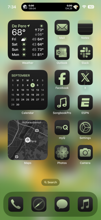
Really hard to beat having my fantasy score live on Dynamic Island.
 

Attachments

  • IMG_0592.png
    IMG_0592.png
    992.8 KB · Views: 37

tbayrgs

macrumors 604
Jul 5, 2009
7,467
5,096
Widgets are great for scores too!

dd3bc724e41c43bad3d96c5828cf2c0b.jpg
Definitely nice to have some different options. The advantage of the dynamic island is you’ll see that information and changes in real time where ever you are in the OS, be it on the home screen or in an app.

And damn, 105 degrees at 7 pm. :oops: Arizona?
 
  • Like
Reactions: jamezr and Bkdodger

jamezr

macrumors P6
Aug 7, 2011
16,072
19,066
US
Definitely nice to have some different options. The advantage of the dynamic island is you’ll see that information and changes in real time where ever you are in the OS, be it on the home screen or in an app.

And damn, 105 degrees at 7 pm. :oops: Arizona?
There are some widgets that do real time updates. Then having options is always a good thing!

Yes...Arizona is in the middle of a heat wave right now.....so done with the triple digits!
 
Register on MacRumors! This sidebar will go away, and you'll see fewer ads.