Become a MacRumors Supporter for $50/year with no ads, ability to filter front page stories, and private forums.
Don't have an iPad to test it on, but judging from the screen shots, it looks to be about the same amount of physical size as when comparing it side by side to physical touchable space on an iPhone. Non issue.

One has to scroll. It’s a small window on a largish screen.
 
  • Like
Reactions: millydog and chfilm
Don't have an iPad to test it on, but judging from the screen shots, it looks to be about the same amount of physical size as when comparing it side by side to physical touchable space on an iPhone. Non issue.
In your screenshot you can update 6 apps without scrolling, in mine 3 max 4. So it appears it is even smaller on iPad despite the much larger screen (screenshot is from a 12.9" pro).
 
In your screenshot you can update 6 apps without scrolling, in mine 3 max 4. So it appears it is even smaller on iPad despite the much larger screen (screenshot is from a 12.9" pro).

One has to scroll. It’s a small window on a largish screen.

So we are complaining about 1-2 less apps showing on the screen and having to scroll a moment sooner than an iPhone user? What a problem to have this day in age. That being said, as with most things in the Betas, it’s a Beta and bound to change. The trash can icon when deleting individual texts in a thread is entirely too tiny. They updated in Dev Beta 3... patience people.
 
So we are complaining about 1-2 less apps showing on the screen and having to scroll a moment sooner than an iPhone user? What a problem to have this day in age. That being said, as with most things in the Betas, it’s a Beta and bound to change. The trash can icon when deleting individual texts in a thread is entirely too tiny. They updated in Dev Beta 3... patience people.

The process is inefficient. I am not averse to change, I welcome it where it improves experience, but this does not do it for me. If you have not yet understood, I care about the experience.

Generally, by this point in betas, the significant changes have been made, only small refinements are done.

The size of a icon is not a large thing.
 
  • Like
Reactions: chfilm
The process is inefficient. I am not averse to change, I welcome it where it improves experience, but this does not do it for me. If you have not yet understood, I care about the experience.

Generally, by this point in betas, the significant changes have been made, only small refinements are done.

The size of a icon is not a large thing.

There’s almost two full months remaining before the GM of 13 comes out. Patience... let’s see what happens.
 
  • Like
Reactions: utwarreng
So we are complaining about 1-2 less apps showing on the screen and having to scroll a moment sooner than an iPhone user? What a problem to have this day in age. That being said, as with most things in the Betas, it’s a Beta and bound to change. The trash can icon when deleting individual texts in a thread is entirely too tiny. They updated in Dev Beta 3... patience people.
Can you stop defending apple’s stupid, anti user decision please? It seems to be ok on the phone, which is good to hear, i haven’t installed the beta on iPhone yet. But on iPad it definitely SUCKS. If you have the 12.9 iPad, you need to first understand that you’re meant to click on the user profile icon (something that you normally would RARELY do in the App Store app), then you have to scroll down immediately because in the beginning you see only one, the first app that wants to be updated, because the window is so damn tiny. It’s clearly not designed to hold this list, as it was never intended for this usecase. If they want to move such an important every day feature to a hidden place, at least they could resize the window!!
 
this reeeeaaaalllly isn't a change worth stressing over this much. I'm sorry you don't like this change, but this is very minor

Agreed, it's minor and possible to get used to / get over, BUT why are there two game sections? One game section with an arcade and not arcade subsection would make more sense to me. Seems like a bad design decision to me.
 
To me it’s just a different way of doing it, so no big deal once someone helps you find it.
 
Can you stop defending apple’s stupid, anti user decision please? It seems to be ok on the phone, which is good to hear, i haven’t installed the beta on iPhone yet. But on iPad it definitely SUCKS. If you have the 12.9 iPad, you need to first understand that you’re meant to click on the user profile icon (something that you normally would RARELY do in the App Store app), then you have to scroll down immediately because in the beginning you see only one, the first app that wants to be updated, because the window is so damn tiny. It’s clearly not designed to hold this list, as it was never intended for this usecase. If they want to move such an important every day feature to a hidden place, at least they could resize the window!!

Lol... getting bent over a beta. Like I said, stuff changes. Let’s see what happens, shall we?
 
  • Like
Reactions: jonblatho
Can you stop defending apple’s stupid, anti user decision please? It seems to be ok on the phone, which is good to hear, i haven’t installed the beta on iPhone yet. But on iPad it definitely SUCKS. If you have the 12.9 iPad, you need to first understand that you’re meant to click on the user profile icon (something that you normally would RARELY do in the App Store app), then you have to scroll down immediately because in the beginning you see only one, the first app that wants to be updated, because the window is so damn tiny. It’s clearly not designed to hold this list, as it was never intended for this usecase. If they want to move such an important every day feature to a hidden place, at least they could resize the window!!
o_O There’s a badge indicator on the profile icon that’s there specifically to help you understand that you need to tap it to get to your app updates in iOS 13.
 
o_O There’s a badge indicator on the profile icon that’s there specifically to help you understand that you need to tap it to get to your app updates in iOS 13.
No worries, I personally got it- but what about our parents generation or people who are not on MR? That badge looks like they want you to update your credit card information or something user account related!
 
  • Like
Reactions: d5aqoëp
No worries, I personally got it- but what about our parents generation or people who are not on MR? That badge looks like they want you to update your credit card information or something user account related!

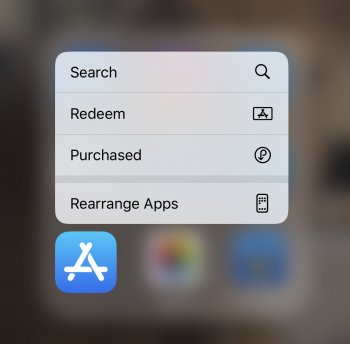
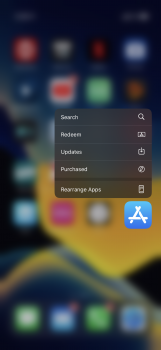
FYI in the new beta 4 when you 3D Touch or long press on the App Store icon one of the options is updates.... before that option would only come up if you had new updates, but now it’s always there. So this is a quick way to go straight to the updates section. Hope this alleviates the issue for you.

FF60D9B4-6365-4CC4-B1A5-A5216CCF1CDE.png
 
Searching for App updates by tapping on your profile pic in App Store is 10000% non intuitive. We might get used to it eventually. But such questionable UI choices sums up Apple of today which is full of poor choices.
 
  • Like
Reactions: kazmac and chfilm
Searching for App updates by tapping on your profile pic in App Store is 10000% non intuitive. We might get used to it eventually. But such questionable UI choices sums up Apple of today which is full of poor choices.
EXACTLY!
[doublepost=1563445708][/doublepost]
FYI in the new beta 4 when you 3D Touch or long press on the App Store icon one of the options is updates.... before that option would only come up if you had new updates, but now it’s always there. So this is a quick way to go straight to the updates section. Hope this alleviates the issue for you.

View attachment 848802
this is good news. At least they gave us something. But still, strange workaround for a problem they created themselves!...
 
It’s been said, but for those of us have profile locked down in restrictions/screen time it very much is a worse experience.

It’s not because of an extra couple presses, it’s because if you use restrictions you can’t even access updates unless you allow it in screen time.

Ideally there’d be separate restrictions for updates too, not just profile.
 
  • Like
Reactions: IowaLynn
FYI in the new beta 4 when you 3D Touch or long press on the App Store icon one of the options is updates.... before that option would only come up if you had new updates, but now it’s always there. So this is a quick way to go straight to the updates section. Hope this alleviates the issue for you.

View attachment 848802
Great thanks :cool:
 
no updates and not listed as option latest pb3 - same on iPad.

If there are no updates, then don't show in list, and show number of updates when there are.

The app badges doesn't necessarily show so thats not reliable indication either.
 

Attachments

  • 0EE740B5-3396-43C8-8411-91120F075FC7.jpeg
    0EE740B5-3396-43C8-8411-91120F075FC7.jpeg
    523.6 KB · Views: 130
Last edited:
no updates and not listed as option latest pb3 - same on ipad.
Updated to the latest public beta at lunch. When i first checked it wasnt showing Update on the 3D Touch menu but now it is and when i used it to update some apps it worked fine.

wqP8mN.png
 
no updates and not listed as option latest pb3 - same on iPad.

If there are no updates, then don't show in list, and show number of updates when there are.

The app badges doesn't necessarily show so thats not reliable indication either.

Have you tried closing down the App store app and rebooting your phone?
 
After I installed the beta, I literally had to Google where the hell the app updates went. It's not terrible, but I also don't really see a point to having an Arcade tab.
 
  • Like
Reactions: utwarreng
I think I am loving this change. Whatever Apple does is for our own benefit. I spend $100 as in app purchases for few games. I called up Apple help and they explained to me how my life was fuller and how spending that amount was for my own benefit. I thanked the executive and disconnected the call.
 
  • Like
Reactions: bigjnyc
I think I am loving this change. Whatever Apple does is for our own benefit. I spend $100 as in app purchases for few games. I called up Apple help and they explained to me how my life was fuller and how spending that amount was for my own benefit. I thanked the executive and disconnected the call.

welcome brother d5aqoep we are so glad that you have seen the light. Please make sure to get rid of all of your earthly belongings.... except your Apple products of course.
 
  • Like
Reactions: d5aqoëp
And lay off the kool-aide (leave the rose tired glasses if they help you see clearly!)
 
Register on MacRumors! This sidebar will go away, and you'll see fewer ads.