Become a MacRumors Supporter for $50/year with no ads, ability to filter front page stories, and private forums.

ConnYoungy

Cancelled
Original poster
Aug 14, 2010
535
201
Is anyone else really disappointed with this design? It's so....bland!

I loved the way in iOS9 each screen would be totally differently coloured depending on the artwork of the artist, and the 'now playing' screen also was subtly coloured by that out of focus glass overlay.

Now everything's just white and plain, and SO BIG.
 

jdillings

macrumors 68000
Jun 21, 2015
1,540
5,175
It's pretty awful from both a design and usability perspective. The only good thing about it is you can now use home sharing if you have no files in your local music library. In IOS9, you had no way to switch to home sharing if your local music library was empty.
 

ConnYoungy

Cancelled
Original poster
Aug 14, 2010
535
201
What on earth made anyone think this:
img_1346.png

Is a better idea than this:
ios-9-music.jpg


Also, hoping it's a bug but ALL of my playlists show under 'Recently Added' before any of the new actual music I've added does
 

Threejw

macrumors member
Jul 13, 2014
75
46
I love the new app

i wish they could add a few options like

On each song u could check its other versions, if it's available in other languages, if there are covers, remixes or more
Or that you could explore not just genre's but other regions's charts and music in other languages like spotify
Have the lyrics highlighted as the song plays
Share my playlist with friends and creat smart playlists on iOS
They seriously need to design a better interface for the ipad... It looks unfinished..
 

i0Nic

macrumors 65816
May 17, 2006
1,456
68
Sydney, Australia
Disagree, I think the new app is much more fun and intuitive. Also it appears Apple are introducing a very swiss minimalism style and card based UI in Music, as well as in Maps, News and the Home app. I expect this bold UI to continue to flow into other apps in iOS 11, I can see how Calendar, Phone, Mail and Notes could be updated to this modern design.

The iOS7 style while clean, was quite sterile. A lot of the whimsy left iOS. This new UI provides some pop, a bit of whimsy. It reminds me of the updated Pinterest app UI which I love.
 

0000757

macrumors 68040
Dec 16, 2011
3,893
850
Disagree, I think the new app is much more fun and intuitive. Also it appears Apple are introducing a very swiss minimalism style and card based UI in Music, as well as in Maps, News and the Home app. I expect this bold UI to continue to flow into other apps in iOS 11, I can see how Calendar, Phone, Mail and Notes could be updated to this modern design.

The iOS7 style while clean, was quite sterile. A lot of the whimsy left iOS. This new UI provides some pop, a bit of whimsy. It reminds me of the updated Pinterest app UI which I love.

You know what it reminds me of? WebOS.
 

onethinline

macrumors regular
Apr 27, 2015
120
92
Chicago
Apart from what you think of the visual presentation itself (it's grown on me, but I do miss the art-cued color schemes for each page), the big design change in the new Apple Music is how all the content is organized. It's much clearer than it used to be: getting directly to your library, downloads, recommendations, and everything under what is now "Browse" ("New" was never accurate) makes much more sense. Performing actions on albums and songs is clearer now too (but can still be better). The biggest complaint all my friends had about the original design was how confusing it was to get around or do anything.

I do think the font size can be brought down just a little bit, though being bigger than before helps with when your iPhone is further away, which is more common in music-listening situations.
 

LordQ

Suspended
Sep 22, 2012
3,582
5,653
It is good but the 'now playing' screen can be improved with: always visible shuffle and repeat buttons, remove the horrible shadow and big controls and remove the rounded corners in the album art—three things I am sure won't happen.
 
  • Like
Reactions: ConnYoungy

iFanaddic

macrumors 6502a
Sep 24, 2008
819
242
Montréal, Canada
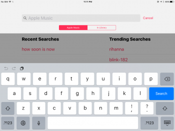
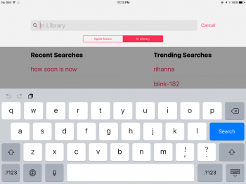
I agree the design is bland and so are the functionalities, it goes beyond me that you cannot search locally by default.

How it is by default:
IMG_0304.PNG


How it should be by default:
IMG_0305.PNG

Even Siri when asked "Play songs by *artist*" will start playing songs of said artist that are not in my personal library. If i'm asking to play a song by someone it's safe to assume I meant those in to Apple music!!
 

Shirasaki

macrumors P6
May 16, 2015
16,263
11,764
What on earth made anyone think this:
View attachment 639786
Is a better idea than this:
View attachment 639787


Also, hoping it's a bug but ALL of my playlists show under 'Recently Added' before any of the new actual music I've added does
"Recently added" works exactly as it says: shows the recently added songs first in that list. If you edit playlist rather than importing new albums in previous sync, playlist will show first than your album. This is not a bug.

And if you don't like iOS 10 idea, what about this?
b99576fcfa40cac95e6a059c75ab7686.png

And this?
90cf8489424ce96bcb9287d326361525.png
 
  • Like
Reactions: cswifx

QuarterSwede

macrumors G3
Oct 1, 2005
9,886
2,157
Colorado Springs, CO
Disagree, I think the new app is much more fun and intuitive. Also it appears Apple are introducing a very swiss minimalism style and card based UI in Music, as well as in Maps, News and the Home app. I expect this bold UI to continue to flow into other apps in iOS 11, I can see how Calendar, Phone, Mail and Notes could be updated to this modern design.

The iOS7 style while clean, was quite sterile. A lot of the whimsy left iOS. This new UI provides some pop, a bit of whimsy. It reminds me of the updated Pinterest app UI which I love.
I absolutely agree. It looks really big but in actual use I have yet to miss any buttons or sliders. It works really well and it's simple so I think the majority of users will like it a lot more. It isn't confusing, which is a major step forwards from the iOS 9 Apple Music/local music/iTunes Match mess.
 
  • Like
Reactions: dolphin2421

TheTom9

macrumors member
Apr 26, 2015
79
23
London, UK
I'm really not sure just yet. I really hate that some of the fonts are Really, really big, like the song and album name but on the other hand, the app feels a little more ''alive'' , not sure why, maybe it's just in my head but when i compared it to the old one, on another device, the old version felt flat. I also like that it's more simple plus I can see more of my recent music that I added to my library. Oh, and did you know you can now 3D touch on an album to start paling it?

I just miss the transparency when playing songs or when browsing albums but that's just design and i prefer usability, which the new app is better at, so i guess I like the new one more.
 

TJCooperGB

macrumors newbie
Jun 18, 2016
7
5
I simply do not understand the rationale behind the iOS 10 design changes. It's a massive step backward. Perhaps the obsession with super-thin lightweight fonts was overdone at times but doing a complete 180 U-turn and using something akin to bolded size 15 Arial harks back to the late 90s.

After using the beta for a number of weeks now, in terms of design it is incredibly fragmented. News, Music and the Lock Screen do not match the rest of the system one bit.
 

ConnYoungy

Cancelled
Original poster
Aug 14, 2010
535
201
"Recently added" works exactly as it says: shows the recently added songs first in that list. If you edit playlist rather than importing new albums in previous sync, playlist will show first than your album. This is not a bug.

Except that's not what it does, it shows every single one of my playlists, regardless of when it was last edited, and then UNDER those, it shows recently added music. That's either a beta bug or a silly design change
 

Shirasaki

macrumors P6
May 16, 2015
16,263
11,764
Except that's not what it does, it shows every single one of my playlists, regardless of when it was last edited, and then UNDER those, it shows recently added music. That's either a beta bug or a silly design change
Mine shows exactly as it does, a mixture of playlists and albums.
Someone guesses beta software may run in an inconsistent state on any device. Or everyone's beta experience would not be the exact same one. Like this, my "recently added" works exactly as I think, while yours are not.
Maybe you are AM or iTunes Match user, because I am not. But, I would like to say this is more like a beta bug than a silly design change.
 
  • Like
Reactions: QuarterSwede

mr.bee

macrumors 6502a
May 24, 2007
750
468
Antwerp, belgium
I simply do not understand the rationale behind the iOS 10 design changes. It's a massive step backward. Perhaps the obsession with super-thin lightweight fonts was overdone at times but doing a complete 180 U-turn and using something akin to bolded size 15 Arial harks back to the late 90s.

After using the beta for a number of weeks now, in terms of design it is incredibly fragmented. News, Music and the Lock Screen do not match the rest of the system one bit.

I heard that they actually wanted to bring back that 90's mtv music vibe, so you're spot on :D
 

pudge104

macrumors regular
Oct 9, 2015
138
21
I believe I saw in another thread that under Settings, Music, Downloads that there are more features.
I think one of them is Optimize music storage. I don't have anything under Downloads except Downloaded Music. Does iCloud Music Library have to be turned on to see this?
I have been scared to turn that on ever since the launch because of the horror stories of what it did to your personal library.
 
And if you don't like iOS 10 idea, what about this?
b99576fcfa40cac95e6a059c75ab7686.png

And this?
90cf8489424ce96bcb9287d326361525.png

The screenshots of Marvis are great. Hands down the most customizable music app in terms of functionality AND appearance. That's what I use and why I no longer fret over how Apple mishandles and abuses their music app.


Since that video they've added a few features, including a "light mode" and artist thumbnails so in Artist view you see the artist instead of one of their random albums.

That's just scratching the surface.

I just hope that whatever Apple is doing under the hood doesn't radically affect third party apps. It did with iOS 8.4.
 
Last edited:
Register on MacRumors! This sidebar will go away, and you'll see fewer ads.