There's a lot of confusion about this issue, so I decided to investigate it myself.
I'm using a Dell P2715Q 27" 4K external monitor. I've tried the CGFontRenderingFontSmoothingDisabled workaround in Mojave (along with the various font smoothing value options), and still can't get acceptable font rendering (one can see this in, for instance, reading the NYTimes in Safari). Thus I've stayed with High Sierra. Others on this thread have also found the Mojave workaround doesn't give the readability they get in High Sierra. So what's going on? The answer seems to be that, while subpixel rendering can be activated in Mojave (M), it doesn't work the same way it does in High Sierra (HS). Specifically, in HS, gray base text most stays dark gray, with colored pixels added around it; by contrast, in M, much of the base text is changed from gray to other, lighter colors, thus reducing contrast. As much of Apple's menu text is gray rather than black, this effect reduces contrast throughout the OS.
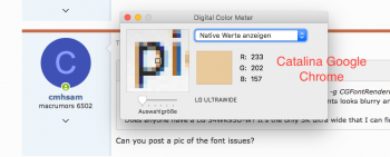
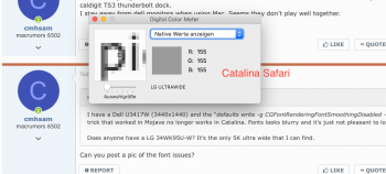
Take a look at the screenshot below. The NYT renders its bulleted text in gray. Here I used the Digital Color Meter to look at the the circled three-letter sequence "era" in "relatives". Look at the middle letter ("l"). In HS, the vertical bar of the letter is still gray. By contrast, activating subpixel rendering in M turns it blue.
[N.B.: There's an artifact in the DCM with HS; it changes how the letter is displayed as the cursor moves. So offsetting the cursor to the left in HS changes the appearance of the "l". In particular, I don't think the added subpixels are displayed correctly for the "l" when the cursor is centered on the "l". This does not happen in M.]
To confirm that the original color of the text really is gray, here are screenshots of the DCM in M with subpixel rendering off.
You can also see that increasing font smoothing doesn't actually make the letters thicker (i.e., it doesn't darken more pixels). Rather, it makes the darkened pixels darker, thus giving the appearance of added thickness.


