Become a MacRumors Supporter for $50/year with no ads, ability to filter front page stories, and private forums.

KapnKrunchColorado

macrumors newbie
Oct 27, 2019
2
0
I'm using an LG 32UK50T-W 32" Class 4K UHD FreeSync Monitor as my main display (connected via DisplayPort, 3840 x 2160), and a ViewSonic VX2703 27" as my secondary display (connected via HDMI, 1920 x 1080), both connected to a Radeon RX 580 8 GB graphics card.

I had these "fixes" implemented in Mojave, and upgrading to Catalina made everything horrible, especially on the ViewSonic.

Using the below "undo" command sequences, everything is now beautiful. No need to purchase an additional monitor at all.

YMMV.

Text (and everything else) on the P2415Q (which is not 220 ppi) looks fantastic in Catalina.

I will say though, while I was waiting for it to be delivered, I undid the old commands that worked on Mojave, with this combo (with a login/logout after each one):

Code:
defaults -currentHost delete -globalDomain AppleFontSmoothing

defaults write -g CGFontRenderingFontSmoothingDisabled -bool YES

...and text clarity did improve compared to how it looked right after upgrading to Catalina, it just wasn't great. I think there's an issue with the commands we all ran for Mojave, where somehow when you upgrade to Catalina it messes things up further.
 

Herbit

macrumors member
Feb 17, 2008
38
17
With these commands all the (remaining) sub pixel rendering is turned off and the the system only uses grey scale pixels for the smoothing. At least it is consistent, then. For low res displays I prefer sub pixel rendering though.
 

StellarVixen

macrumors 68040
Mar 1, 2018
3,254
5,779
Somewhere between 0 and 1
With these commands all the (remaining) sub pixel rendering is turned off and the the system only uses grey scale pixels for the smoothing. At least it is consistent, then. For low res displays I prefer sub pixel rendering though.

Grayscale antialiasing does not do much to help with non Retina monitors.

Nothing can replace RGB subpixel antialiasing. That’s why UI fonts look hideous in Catalina on anything non Retina.
 
  • Like
Reactions: Herbit

theorist9

macrumors 68040
May 28, 2015
3,880
3,059
Here's a great blog (author: Steve Gibson of Gibson Research Corp) that gives a clear, illustrative explanation of how subpixel rendering actually works. Essentially, by using the subpixels, you are (approximately) effectively tripling the horizontal resolution of the display (at the cost of some color fringing):


[My comment is that it may not effectively be quite like tripling the horizontal resolution, as the subpixels may not give as sharp an edge as full pixels (some of this may be reflected in the color fringing). I.e., to human perception, a display that actually has triple the horizontal ppi may, without subpixel rendering, look sharper. Having said that, it's still clear that subpixel rendering provides a substantial boost in horizontal resolution.]
 
Last edited:

StellarVixen

macrumors 68040
Mar 1, 2018
3,254
5,779
Somewhere between 0 and 1
Screen Shot 2019-11-01 at 4.08.55 PM.png


Out of curiosity, I took a look at how fonts are rendered in Snow Leopard, and it seems that it's using grayscale method.


Now this might be due to fact that I am running 10.6 in virtual machine, and graphics acceleration is not possible in VMs, but I remember when I used High Sierra in VM, it had RGB sub pixel rendering on, even without hardware acceleration.
 
  • Like
Reactions: Amethyst1

theorist9

macrumors 68040
May 28, 2015
3,880
3,059
View attachment 874238


Out of curiosity, I took a look at how fonts are rendered in Snow Leopard, and it seems that it's using grayscale method.


Now this might be due to fact that I am running 10.6 in virtual machine, and graphics acceleration is not possible in VMs, but I remember when I used High Sierra in VM, it had RGB sub pixel rendering on, even without hardware acceleration.

It's interesting you mention Snow Leopard, because I thought that was the last OS that was good for lower-res (~100 ppi) monitors. I wasn't comfortable with font rendering post-SL until I got a 4K monitor. I.e., in my view:

~100 ppi: front rendering unacceptable after 10.6
~160 ppi (4K 27"): font rendering unacceptable after 10.13
~220 ppi (5K 27" = retina): font rendering acceptable with all OS's

Also, from what I've read, SL did have the subpixel rendering capability, since that was introduced with Quartz 2D, which was pre-SL.
 

Kutfe

macrumors newbie
Oct 17, 2017
18
7
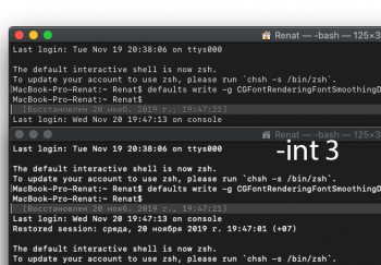
Some changes with "-int 3" monitor Benq PD2700U (ppi 163) over MiniDP with Catalina 10.15.1

defaults write -g CGFontRenderingFontSmoothingDisabled -bool YES

1.png
2.png
 
  • Like
Reactions: Amethyst1

b1narych0ice

macrumors newbie
Sep 30, 2014
13
9
Milwaukee, WI
So I've gone back and forth with these tweaks on my old 2012 rMBP, but when my new 16" arrived and I plugged it in, the most pleasant surprise was that THE FONTS ACTUALLY LOOK GOOD -- better than with any combination of the tweaks and removals in this thread did on my old machine, while hooked up to the same monitor.

The only other explanation I can think of is that maybe whatever was wrong had to do with having an Nvidia GPU vs the AMD GPU in the new machine, and some kind of driver issue or bug? I'm happy and all that my fonts are rendering properly on the new machine, but this only confirms my feelings that the fonts just weren't quite right on my old machine.
 

reda-alaoui

macrumors newbie
Dec 12, 2019
1
0
Paris, France
I was on Linux PC with a Samsung C43J89 3840 x 1200 @ 120 Hz.

I received a new Macbook Pro 16, connected it to the same monitor.
Tried everything, the text looks bad :/

Going to send it back I guess ...
 

cybercap

macrumors newbie
Aug 1, 2010
16
0
Hi,
Went quickly through these interesting pages.

Would someone be kind enough to sum up what I should be using for the best rendering on:
- an iMac 27" 5K on the latest catalina version
- a Mac Mini connected to a 24" Dell standard 1920x1080 monitor on hdmi also running the latest version of Cat.

Thanks.
 

BohdanKolesnyk

macrumors newbie
Jan 5, 2020
16
6
Ukraine, Kyiv
Text (and everything else) on the P2415Q (which is not 220 ppi) looks fantastic in Catalina.

I will say though, while I was waiting for it to be delivered, I undid the old commands that worked on Mojave, with this combo (with a login/logout after each one):

Code:
defaults -currentHost delete -globalDomain AppleFontSmoothing

defaults write -g CGFontRenderingFontSmoothingDisabled -bool YES

...and text clarity did improve compared to how it looked right after upgrading to Catalina, it just wasn't great. I think there's an issue with the commands we all ran for Mojave, where somehow when you upgrade to Catalina it messes things up further.
Yes, I can confirm that if you do these commands on Mojave before the update, things might be better on Catalina. And yes, it almost looks like on Mojave then (tested on iMac late 2015 21,5”)
 
Last edited:

zeiter

macrumors 6502
Jan 19, 2008
384
3
Canada
Some changes with "-int 3" monitor Benq PD2700U (ppi 163) over MiniDP with Catalina 10.15.1

defaults write -g CGFontRenderingFontSmoothingDisabled -bool YES

View attachment 878194
View attachment 878195

Hi there, I have the same screen connected to mdp with catalina 10.15.2 I have done the formula in the terminal and well, i think the text is still fuzzy. I am in "look like" 1440p. What sharpness setting do you have in the display's menu?

Do you guys think a 25 inch 1440p monitor (instead of this 4k) will look good enough? 4k with a non 4k screen on windows is ugly so I might change to 1440p...
 

Idec50

macrumors regular
Feb 22, 2019
108
50
TX
AFAIK these settings do not improve fonts inside Web browsers. I tested with fontsmoothing off, on and set to 3. So, we are left with this:

macos hell enlarged.png


Compared to this in Windows:

windows hell enlarged.png


The latter is a hell of a lot more clear and easy to read from further away. How the hell is this acceptable?

Has anyone found settings that improve Web fonts?
 
  • Like
Reactions: turbineseaplane

Ritsuka

Cancelled
Sep 3, 2006
1,464
969
Subpixel antialiasing has been removed in 10.15, you can reenable it. The only solution is to buy a monitor with > 200 ppi.
 

theorist9

macrumors 68040
May 28, 2015
3,880
3,059
AFAIK these settings do not improve fonts inside Web browsers. I tested with fontsmoothing off, on and set to 3. So, we are left with this:

View attachment 891627

Compared to this in Windows:

View attachment 891628

The latter is a hell of a lot more clear and easy to read from further away. How the hell is this acceptable?

Has anyone found settings that improve Web fonts?
It's the nature of the difference between Windows and MacOS. Windows is designed to display readable text on the widest possible range of monitors, including those with low ppi. With MacOS, by contrast, as higher ppi displays come available, they jettison the functionality that allows text to look good on lower ppi displays. They did this once before, when they went from 10.6 to 10.7, as well as more recently, when they went from 10.13 to 10.14.

[You can bring back the subpixel antialiasing in 10.14, using Terminal commands; but because 10.14 wasn't designed to be used with this, it still can't be made to look as good (for text) as 10.13.]

I agree, it sucks for those whose displays aren't all retina, which comprises most of those that use their Macs with external monitors. That's why I'm sticking with 10.13 as long as I can.
 
Last edited:
  • Like
Reactions: Amethyst1

zeiter

macrumors 6502
Jan 19, 2008
384
3
Canada
I guess I'll go back to windows...I have been using it a lot at work and I like it more and more...I'm just tired of OSX little things like this....and I don't have the budget to buy new macbook pro so I can support the LG 5k display...
 

Viamusic10000

macrumors regular
Dec 11, 2019
239
99
It's the nature of the difference between Windows and MacOS. Windows is designed to display readable text on the widest possible range of monitors, including those with low ppi. With MacOS, by contrast, as higher ppi displays come available, they jettison the functionality that allows text to look good on lower ppi displays. They did this once before, when they went from 10.6 to 10.7, as well as more recently, when they went from 10.13 to 10.14.

[You can bring back the subpixel antialiasing in 10.14, using Terminal commands; but because 10.14 wasn't designed to be used with this, it still can't be made to look as good (for text) as 10.13.]

I agree, it sucks for those whose displays aren't all retina, which comprises most of those that use their Macs with external monitors. That's why I'm sticking with 10.13 as long as I can.
Text seems fine on my 27inch 4k. Why did apple nuke sub pixel AA?
 

theorist9

macrumors 68040
May 28, 2015
3,880
3,059
Text seems fine on my 27inch 4k.
This depends on how sensitive you are to text sharpness. I have a 27" 4k and, for me, text is noticeably sharper in High Sierra than Mojave/Catalina. That's partly due to my own prediliction for very sharp text, and partly that my close vision is pretty good: I can still (though barely) read the microprinting on a Series 2013 $20 bill. ["THE UNITED STATES OF AMERICA 20 USA 20 USA" is written in black in the border below the Treasurer’s signature.]


Why did apple nuke sub pixel AA?

From:

"Apple says that the removal of subpixel rendering is because the effect depends on a specific subpixel arrangement, which could be reliably assumed in the early days of LCDs but can’t be relied upon now that different technologies (like OLED) use so many different subpixel arrangements. For instance, the iPhone X’s OLED screen uses a diamond subpixel layout, a radical departure from RGB stripe subpixels.

This argument doesn’t quite pass muster, since the older non-Retina screens that MacBook Airs and iMacs are using are precisely the kinds of screens that are still using the classic RGB stripe subpixels that subpixel antialiasing was designed for. But it’s the same argument that Microsoft has used when disabling ClearType in latter-day versions of Office, so it’s not unprecedented. And Apple has tweaked some fonts over the course of the Mojave betas to improve areas of the operating system that looked especially bad without subpixel rendering."
 
Last edited:
  • Like
Reactions: Viamusic10000

Ritsuka

Cancelled
Sep 3, 2006
1,464
969
Subpixel anti-aliasied text needs to know the background on which will be rendered, because it uses coloured pixel that can't be simply composed over a different background.
It required a lot of specific code to not look horrible on macOS translucent views, and it still looked horrible in many places.
 
  • Like
Reactions: frou

frou

macrumors 65816
Mar 14, 2009
1,392
2,002
Subpixel anti-aliasied text needs to know the background on which will be rendered, because it uses coloured pixel that can't be simply composed over a different background.
It required a lot of specific code to not look horrible on macOS translucent views, and it still looked horrible in many places.
Here's a quote from another site expanding on this:

ex-MacOS SWE here. Subpixel antialiasing is obnoxious to implement. It requires threading physical pixel geometry up through multiple graphics layers, geometry which is screen-dependent (think multi-monitor). It multiplies your glyph caches: glyph * subpixel offset. It requires knowing your foreground and background colors at render time, which is an unnatural requirement when you want to do GPU-accelerated compositing. There's tons of ways to fall off of the subpixel antialiased quality path, and there's weird graphical artifacts when switching from static to animated text, or the other way. What a pain!
 
Register on MacRumors! This sidebar will go away, and you'll see fewer ads.