Become a MacRumors Supporter for $50/year with no ads, ability to filter front page stories, and private forums.

StellarVixen

macrumors 68040
Mar 1, 2018
3,255
5,779
Somewhere between 0 and 1
I do have High Sierra on a USB - but unsure if I am to install because of theming being better - I have put most theming on pause for now with Mojave and certainly Catalina. I get that you take time off of theming.

No, I am pretty content with the present state of things, I stopped fighting some time ago. Right now I am more busy with programming than graphic design.

But if you create anything beautiful Aqua-like for 10.14 or 10.15, I will be happy to try out.
 

NordicBoots

macrumors regular
Apr 9, 2019
165
55
Hi, please accept this file with mini and small graphics for the Blue/Aqua Appearance. Let me know how it goes? Edit. if it pleases you I will continue with making the same files available in the DarkAppearance files.
The Blue-Aqua Appearance file is the only change in this archive.
Again... I'm very happy with your Blue Appearance. One observation at my configuration: if I click on one of the traffic lights, I don't see the "pressed" state. Is that related to High Sierra?
 

NordicBoots

macrumors regular
Apr 9, 2019
165
55

Attachments

  • Screen Shot 2019-10-18 at 23.39.51.png
    Screen Shot 2019-10-18 at 23.39.51.png
    59.2 KB · Views: 256

allan.nyholm

macrumors 68020
Original poster
Nov 22, 2007
2,317
2,574
Aalborg, Denmark
Again... I'm very happy with your Blue Appearance. One observation at my configuration: if I click on one of the traffic lights, I don't see the "pressed" state. Is that related to High Sierra?

I'll go see if I made a huge mistake. Perhaps I didn't make it pressed-enough in graphics for smaller dpi screens. Edit. try this single SystemAppearance.car (note: only the regular sized "traffic-lights" are altered in this - I'l wait for your reply to continue down-sizing them all)
Single SystemAppearance.car file
[automerge]1571483062[/automerge]
Just for a laugh: I tried your DarkAppearance (High Sierra) and I was surprised by the text in the SideBar.

Are you using any SIMBL plugins such as the one called DoctorDark? I can't test the High Sierra .car files myself but I can try creating a whole new DarkAppearance.car from the default 10.13.6 files.
 
Last edited:

NordicBoots

macrumors regular
Apr 9, 2019
165
55
I'll go see if I made a huge mistake. Perhaps I didn't make it pressed-enough in graphics for smaller dpi screens. Edit. try this single SystemAppearance.car (note: only the regular sized "traffic-lights" are altered in this - I'l wait for your reply to continue down-sizing them all)
Single SystemAppearance.car file
[automerge]1571483062[/automerge]


Are you using any SIMBL plugins such as the one called DoctorDark? I can't test the High Sierra .car files myself but I can try creating a whole new DarkAppearance.car from the default 10.13.6 files.
I'm sorry. I see no difference when clicking on the regular traffic lights. So, perhaps it has to do with High Sierra.
And yes, I'm using mySMBL with DoctorDark, because High Sierra doesn't have a dark mode.
 

NordicBoots

macrumors regular
Apr 9, 2019
165
55
I'll go see if I made a huge mistake. Perhaps I didn't make it pressed-enough in graphics for smaller dpi screens. Edit. try this single SystemAppearance.car (note: only the regular sized "traffic-lights" are altered in this - I'l wait for your reply to continue down-sizing them all)
Single SystemAppearance.car file
[automerge]1571483062[/automerge]


Are you using any SIMBL plugins such as the one called DoctorDark? I can't test the High Sierra .car files myself but I can try creating a whole new DarkAppearance.car from the default 10.13.6 files.
I inspected your SystemAppearance file and saw that the "pressed" versions are almost as dark as the "rollover" ones. Is that how it should be? Because I see a clear difference between "normal" and "rollover". In that case I'm mistaken.
 

allan.nyholm

macrumors 68020
Original poster
Nov 22, 2007
2,317
2,574
Aalborg, Denmark
I inspected your SystemAppearance file and saw that the "pressed" versions are almost as dark as the "rollover" ones. Is that how it should be? Because I see a clear difference between "normal" and "rollover". In that case I'm mistaken.

Looking it over I see that there's a difference between the regular non-rollover and rollover vs the pressed state. But perhaps I should make it much more distinct. Try this file. These are the traffic lights as single files. Just for kicks here
[automerge]1571503213[/automerge]
Aha... and how can I convict the culprit?

By not using DoctorDark. It is the same for me - There are two version of DoctorDark, mind you. There's one here: https://github.com/w0lfschild/DoctorDark on the link to download latest version of DoctorDark down towards the bottom and then I believe the version in the source download(green button) is different than the before mentioned link. the one in the /build folder after the download. I don't know which is actually newer. My memory also tells me that there's a possible fix in either one of the versions.
 

NordicBoots

macrumors regular
Apr 9, 2019
165
55
Looking it over I see that there's a difference between the regular non-rollover and rollover vs the pressed state. But perhaps I should make it much more distinct. Try this file. These are the traffic lights as single files. Just for kicks here
[automerge]1571503213[/automerge]


By not using DoctorDark. It is the same for me - There are two version of DoctorDark, mind you. There's one here: https://github.com/w0lfschild/DoctorDark on the link to download latest version of DoctorDark down towards the bottom and then I believe the version in the source download(green button) is different than the before mentioned link. the one in the /build folder after the download. I don't know which is actually newer. My memory also tells me that there's a possible fix in either one of the versions.
Thanks for sharing, Allan.
About the traffic lights: for me there is only a slight difference. I checked them against the standard ones; they have more difference in terms of brightness (see attachments).
Concerning DarkAppearance: I said goodbye to DoctorDark. I will try to use a terminal-command instead.
Clicking (original).png
Hovering (original).png
Nothing (original).png
Clicking.png
Hovering.png
Nothing.png
 

allan.nyholm

macrumors 68020
Original poster
Nov 22, 2007
2,317
2,574
Aalborg, Denmark
Thanks for sharing, Allan.
About the traffic lights: for me there is only a slight difference. I checked them against the standard ones; they have more difference in terms of brightness (see attachments).
Concerning DarkAppearance: I said goodbye to DoctorDark. I will try to use a terminal-command instead.
View attachment 871069 View attachment 871070 View attachment 871071 View attachment 871072 View attachment 871073 View attachment 871074

I see. I must work on them a little more. I have only recently installed 10.13 as a VM but of course it defaults to @2x resolutions when I install the virtual machine tools. Luckily, I can fix it.
 

NordicBoots

macrumors regular
Apr 9, 2019
165
55
If you are going for authentic look, why not change UI font to Lucida Grande?
Ha ha... well... I tried, but maOSLucidaGrande doesn't seem to work in my case.
[automerge]1571583915[/automerge]
I see. I must work on them a little more. I have only recently installed 10.13 as a VM but of course it defaults to @2x resolutions when I install the virtual machine tools. Luckily, I can fix it.
That would be great!
 

NordicBoots

macrumors regular
Apr 9, 2019
165
55
There is no way it doesn't work if you are on High Sierra. You must be doing something wrong.
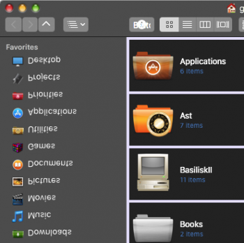
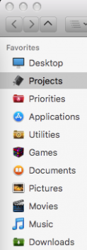
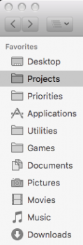
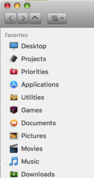
Sorry that I most likely did something wrong.. although I guess there is a conflict. If I compare these screen shots I see no difference between the fonts, but the coloured sidebar has gone.
 

Attachments

  • Screen Shot 2019-10-20 at 16.48.57.png
    Screen Shot 2019-10-20 at 16.48.57.png
    32 KB · Views: 189
  • Screen Shot 2019-10-20 at 16.54.32.png
    Screen Shot 2019-10-20 at 16.54.32.png
    25.6 KB · Views: 185

NordicBoots

macrumors regular
Apr 9, 2019
165
55
Too bad I do not have the High Sierra machine now to show you, but I remember very well, it was pretty much straightforward.


It wasn't flawless, though, text overlapped in Safari tabs, and password field didn't show symbols when typing. But that was solved, too.


Check this: https://github.com/LumingYin/macOSLucidaGrande/issues/23
SOLVED: For some stupid reason, Lucida Grande was gone. After reinstalling it, the (almost) complete authentic look is back. Thank you!
 

Attachments

  • Screen Shot 2019-10-20 at 18.30.41.png
    Screen Shot 2019-10-20 at 18.30.41.png
    35.4 KB · Views: 202
Register on MacRumors! This sidebar will go away, and you'll see fewer ads.