Become a MacRumors Supporter for $50/year with no ads, ability to filter front page stories, and private forums.

epicrayban

macrumors 604
Nov 7, 2014
6,517
5,353
After using Lollipop a little longer, I must say, it indeed is a little "laggy" for lack of a better term. I say lack of a better term because I'm not so sure it's lag per se, just that apps launch really slowly. I don't know if that's by design or not...

Also, I don't like how app icons don't get highlighted when you press them. Didn't they use to on Kit Kat? I can't remember now. So if say I press Gmail icon on my home screen, there'll be no UI reaction (no glow, now shadow like in iOS that says the tap registered). And couple that with the slower app loading time, there's always this split second of being unsure if I tapped it or not or if it registered or not.

It's a bit annoying.

The App Switcher, too, although beautiful and fun to scroll through, opens very slowly.

This is all on a Nexus 5 btw.

Otherwise, I am enjoying Lollilop. The animations look great and make a lot of sense the way things slide in and out. And I'm enjoying some of the new features.
 

flameproof

macrumors 6502a
Jan 14, 2011
615
18
I used Lollipop for about a week now on a Nexus 5 and have to admit that I didn't see one single improvement compare to 4.4.4

If there is any improvement, please let me know and I will check that out.

Most annoying for me is the no more flight mode and/or silent mode from power button and the double login.
 

JackieInCo

Suspended
Jul 18, 2013
5,178
1,601
Colorado
I got Lolipop pushed to my Nexus 4 yesterday and installed it last night. First thing I "fixed" was the adaptive brightness. I hated that on the iPhone and I hate it on the Android. There is always something on the lock screen now unlike before. which is basically the icons that lived in the notification bar on the left, that's what you get on the lock screen now.

I don't like that standard keyboard is now white with no individual keys like before so I switched back to swiftkey.

Not sure what I'm going to do about the photo gallery now.
 

Stooby Mcdoobie

macrumors 6502a
Jun 26, 2012
834
45
I don't like that standard keyboard is now white with no individual keys like before so I switched back to swiftkey.
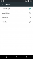
This post isn't directed at you as I've seen a lot of complaints about this, but you can change the appearance of the Google keyboard if the white doesn't suit you.

Settings > language & input > Google keyboard > appearance and layout > theme

Holo blue = ICS/JB
Holo white = KK
 

Attachments

  • Screenshot_2014-11-26-10-14-35.png
    Screenshot_2014-11-26-10-14-35.png
    69.5 KB · Views: 154

JackieInCo

Suspended
Jul 18, 2013
5,178
1,601
Colorado
This post isn't directed at you as I've seen a lot of complaints about this, but you can change the appearance of the Google keyboard if the white doesn't suit you.

Settings > language & input > Google keyboard > appearance and layout > theme

Holo blue = ICS/JB
Holo white = KK

Thank you. I have a lot to learn with the new update. I got my keyboard back with the individual buttons.
 

mrex

macrumors 68040
Jul 16, 2014
3,458
1,527
europe
After using Lollipop a little longer, I must say, it indeed is a little "laggy" for lack of a better term. I say lack of a better term because I'm not so sure it's lag per se, just that apps launch really slowly. I don't know if that's by design or not...

Also, I don't like how app icons don't get highlighted when you press them. Didn't they use to on Kit Kat? I can't remember now. So if say I press Gmail icon on my home screen, there'll be no UI reaction (no glow, now shadow like in iOS that says the tap registered). And couple that with the slower app loading time, there's always this split second of being unsure if I tapped it or not or if it registered or not.

It's a bit annoying.

The App Switcher, too, although beautiful and fun to scroll through, opens very slowly.

This is all on a Nexus 5 btw.

Otherwise, I am enjoying Lollilop. The animations look great and make a lot of sense the way things slide in and out. And I'm enjoying some of the new features.

If it is an animation, you can increase the speed of the animation. (Go to the developer options and then Animation...)
 

JackieInCo

Suspended
Jul 18, 2013
5,178
1,601
Colorado
My favorite feature is battery saver. I am using a Nexus 4 and over the last several months, I rarely got 15 minutes screen time and the battery life has always been bad.

I don't care that battery saver cuts off some background processes as long as it's ready to go when I want to use it.

They did a good job on this.
 

animalx

macrumors 6502
Apr 1, 2013
474
330
My favorite feature is battery saver. I am using a Nexus 4 and over the last several months, I rarely got 15 minutes screen time and the battery life has always been bad.

I don't care that battery saver cuts off some background processes as long as it's ready to go when I want to use it.

They did a good job on this.

One of my favorite features, besides ambient display (which I love), is the always on "Ok Google". This has been EXTREMELY useful, especially those times I'm in the shower and want to turn on a song, or send someone a text message or something.
After that, one of the most useful features I've used is the smart lock. The smart lock is flat out awesome. I have my home set as a safe zone, so that I never have to unlock it here. My bluetooth headset and my car are both set as safe devices, so that when I'm using either of them, I don't have to worry about unlocking. My face is also set as a trusted face, so when I'm not using either of those things, and I'm not at home, the phone still unlocks quickly by me looking at it. In short, smart lock is flat out great!
 

SlCKB0Y

macrumors 68040
Feb 25, 2012
3,431
557
Sydney, Australia
Thinks this one will be very popular with the kids... atleast until they realize it's a phone and not candy.

thinks this comment can be lumped together with ones which don't really mean much until the readers of the comment realise is a forum post and not candy. :rolleyes:

----------

My favorite feature is battery saver. I am using a Nexus 4 and over the last several months, I rarely got 15 minutes screen time and the battery life has always been bad.

You are claiming your Nexus 4 gets 15 minutes screen on time? Post a photo/screenshot or I call lies (or prematurely dead battery).

----------

This has been EXTREMELY useful, especially those times I'm in the shower and want to turn on a song, or send someone a text message or something.

Honestly? I have never once been in the shower and thought "I must SMS this person so urgently i can't wait for the 5 minutes it takes to dry myself." :eek:
 

JackieInCo

Suspended
Jul 18, 2013
5,178
1,601
Colorado
You are claiming your Nexus 4 gets 15 minutes screen on time? Post a photo/screenshot or I call lies (or prematurely dead battery).

----------


Yes I am claiming that. This is over a 24hr period. This is why I skipped the Nexus 5 and 6. My GSM Nexus 7 was just about as bad before I disabled data all together and just used it on WiFi. Now the Nexus 7 gets about an hour or two. The battery would only last that long if I barely used it. It would go 12 hrs if I made a few phone calls and used a few apps.
 
Last edited:

fredaroony

macrumors 6502a
Aug 1, 2011
670
0
I think it's awful. My biggest complaint is the white on off white theme, I'm having a hard time fathoming that Google forgot about dark places and nighttime. That is a HUGE form over function error IMO.

Otherwise I'm quite underwhelmed. Why spend so much time and money on aesthetic changes that aren't' really needed. What Android has always needed is simple uniformity, to throw away all the little pieces from each OS upgrade and just pick a single theme. I don't get why such a big deal over a flat theme, skeumorphism, or whatever marketing crap they invent next year. There is so much that is buggy and not fully functional in android that they need to put their energy into, but instead I get icons that look the same except they are flatter and have a shadow, woohoo that's really going to help my work flow.

What a load of garbage, it's obvious you are fully engulfed in Apple but no need to make up such nonsense.
 

spinedoc77

macrumors G4
Jun 11, 2009
11,488
5,413
What a load of garbage, it's obvious you are fully engulfed in Apple but no need to make up such nonsense.

What's garbage is your response. I use a Note 4, last time I checked it had the Android OS on it. I don't even use an Apple device anymore, and I find iOS8 has the same AWFUL white on off white scheme.

It's my opinion that Lollipop (and iOS) have AWFUL coloring schemes, and I have good reason to feel that way. The bright white scheme is awful to use at night in general. It's also extremely annoying to others in a dark room, such as my sleeping wife.

Thanks for identifying yourself as a hardcore fandroid unwilling to consider others opinions. Move on.
 

Oletros

macrumors 603
Jul 27, 2009
6,002
60
Premià de Mar
Yes I am claiming that. This is over a 24hr period. This is why I skipped the Nexus 5 and 6. My GSM Nexus 7 was just about as bad before I disabled data all together and just used it on WiFi. Now the Nexus 7 gets about an hour or two. The battery would only last that long if I barely used it. It would go 12 hrs if I made a few phone calls and used a few apps.
You have a faulty Nexus 4
 

JackieInCo

Suspended
Jul 18, 2013
5,178
1,601
Colorado
Nexus 7 shouldn't have that problem either.

But it did, most likely because it was the GSM. Once I disabled data completely and only used it on WiFi. Once I did that, it could standby for 3-4 days and I could use it straight through for a few hours. This was the 2012 model.
 

Aika

macrumors regular
Apr 7, 2006
207
177
What's garbage is your response. I use a Note 4, last time I checked it had the Android OS on it. I don't even use an Apple device anymore, and I find iOS8 has the same AWFUL white on off white scheme.

It's my opinion that Lollipop (and iOS) have AWFUL coloring schemes, and I have good reason to feel that way. The bright white scheme is awful to use at night in general. It's also extremely annoying to others in a dark room, such as my sleeping wife.

Thanks for identifying yourself as a hardcore fandroid unwilling to consider others opinions. Move on.

http://nerdsmagazine.com/apps-like-flux-for-android/
 

spinedoc77

macrumors G4
Jun 11, 2009
11,488
5,413

Thanks, those are good suggestions. The Note 4 has an amazing low light capability, it dims down nicely. Still, it's not enough for night time use, especially in bed when the rest of the room is dark. I just really do not understand why both iOS and Android don't have dark themes, I'd love to sit down in a room with one of their designers and ask them why. That's my point is that I'd rather see them putting time and money into a dark theme than into prettying up icons.
 

diamond.g

macrumors G4
Mar 20, 2007
11,445
2,674
OBX
What's garbage is your response. I use a Note 4, last time I checked it had the Android OS on it. I don't even use an Apple device anymore, and I find iOS8 has the same AWFUL white on off white scheme.

It's my opinion that Lollipop (and iOS) have AWFUL coloring schemes, and I have good reason to feel that way. The bright white scheme is awful to use at night in general. It's also extremely annoying to others in a dark room, such as my sleeping wife.

Thanks for identifying yourself as a hardcore fandroid unwilling to consider others opinions. Move on.

What is odd is that theme is only apparent in the app drawer and settings menu.
 

spinedoc77

macrumors G4
Jun 11, 2009
11,488
5,413
What is odd is that theme is only apparent in the app drawer and settings menu.

It's also apparent in all of Google apps, which is a huge percentage of the apps I use. I also see some 3rd party apps beginning to adopt the same design look. It's like a spreading virus.
 

fredaroony

macrumors 6502a
Aug 1, 2011
670
0
What's garbage is your response. I use a Note 4, last time I checked it had the Android OS on it. I don't even use an Apple device anymore, and I find iOS8 has the same AWFUL white on off white scheme.

It's my opinion that Lollipop (and iOS) have AWFUL coloring schemes, and I have good reason to feel that way. The bright white scheme is awful to use at night in general. It's also extremely annoying to others in a dark room, such as my sleeping wife.

Thanks for identifying yourself as a hardcore fandroid unwilling to consider others opinions. Move on.

You look silly when you make statements such as this "There is so much that is buggy and not fully functional in android" as they are not true.

Fandroid? Are you ten?
 

bubulol

macrumors 6502a
Mar 7, 2013
967
273
I hate material design while i really enjoy flat design made by Apple
iOS interface and design looks much prettier
 
Register on MacRumors! This sidebar will go away, and you'll see fewer ads.