Become a MacRumors Supporter for $50/year with no ads, ability to filter front page stories, and private forums.

ReanimationN

macrumors 6502a
Sep 7, 2011
724
0
Australia
Can someone explain something to me- what did Google do to simple volume adjustments? Pressing the volume up/down buttons pre-Lollipop would adjust the volume of my Nexus 7 for videos, games etc, no matter whether I was playing a video or not. This is the behaviour I want, and the behaviour I would expect, however with Lollipop, pressing volume up/down now changes the volume of 'alerts', instead of the volume of videos etc.
How do you adjust video/game/music volume when you aren't playing a video etc. now? It's a real nuisance as I have to plug in headphones to avoid being blasted by the speakers late at night when I start a video. It's probably something really simple, but I'm obviously missing it at the moment.
 

TimelessOne

macrumors regular
Oct 29, 2014
236
2
Can someone explain something to me- what did Google do to simple volume adjustments? Pressing the volume up/down buttons pre-Lollipop would adjust the volume of my Nexus 7 for videos, games etc, no matter whether I was playing a video or not. This is the behaviour I want, and the behaviour I would expect, however with Lollipop, pressing volume up/down now changes the volume of 'alerts', instead of the volume of videos etc.
How do you adjust video/game/music volume when you aren't playing a video etc. now? It's a real nuisance as I have to plug in headphones to avoid being blasted by the speakers late at night when I start a video. It's probably something really simple, but I'm obviously missing it at the moment.

go into settings.
Sound and notifications
There you will see 3 volumes. One for each type.
 

Tig Bitties

macrumors 603
Sep 6, 2012
5,517
5,692
I have been running the CM12 alpha builds on my OnePlus One, for the past 3 weeks. And overall they are good enough as daily drivers, pretty darn solid and stable.

But not sure what changed recently, the battery drain sucks, and getting ***** battery life on the CM12 builds the past week or so. Where as earlier builds from the beginning of the month had much better battery life, not sure why newer builds got worse on battery ? I always use Greenify, and Location settings set to off, and Display brightness never above 50%.

I do a clean flash every two days of the newest CM12 build. Always factory reset wipe, no backups, always setup the phone as a new device. And battery life been sucking bad recently. Think I need to go back to stock 44S Kit Kat ROM's, I was getting 7+h On Screen time. Now with Lollipop I am only getting 4.5h On Screen time.

Screenshot_2014-12-16-12-57-47_zps5103c7ca.png.html


Screenshot_2014-12-16-12-58-09_zps12fdf4f0.png.html
 

Bahroo

macrumors 68000
Jul 21, 2012
1,860
2
Lollipop is nice, but barely made my Nexus 7 2013 any faster, it is the same speed essentially as it was on 4.4.4(on 5.0.1 right now)
 

ReanimationN

macrumors 6502a
Sep 7, 2011
724
0
Australia
Can you post a screenshot, because all the volumes should show in the settings app.

Ah, right, I was only talking about the quick settings menu for sound, which use to suffice. Yeah, you can still adjust media volume in the full settings app, but that's still useless, as there's no option to change the behaviour of the volume buttons, which is what I'm looking for.

Bottom line is, either you delve into the settings app to adjust media volume every time you need to do it, which is painful, or you put up with getting blasted every time you start a video. I'm sure there's some solution where you can add a widget to the homescreen to control media volume, but you shouldn't have to do that, tablets are media focused by nature, this is an unbelievably stupid decision by Google.
 

gotluck

macrumors 603
Dec 8, 2011
5,717
1,260
East Central Florida
Ah, right, I was only talking about the quick settings menu for sound, which use to suffice. Yeah, you can still adjust media volume in the full settings app, but that's still useless, as there's no option to change the behaviour of the volume buttons, which is what I'm looking for.

Bottom line is, either you delve into the settings app to adjust media volume every time you need to do it, which is painful, or you put up with getting blasted every time you start a video. I'm sure there's some solution where you can add a widget to the homescreen to control media volume, but you shouldn't have to do that, tablets are media focused by nature, this is an unbelievably stupid decision by Google.

Totally agreed, I want volume buttons to manage media volume. I use Slider Widget - Volumes to help manage volumes. Basically any ROM supports what we want, but I don't want to ROM.
 

Attachments

  • Screenshot_2014-12-17-21-58-32.png
    Screenshot_2014-12-17-21-58-32.png
    961.9 KB · Views: 138

Dontazemebro

macrumors 68020
Jul 23, 2010
2,173
0
I dunno, somewhere in West Texas
Thoughts on Android Lollipop?

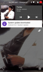
Don't know if anyone else has perceived this one glaring annoyance with the music controls on the lock screen. But, why in the world did Google decide to omit the back track button and only include the play/pause and skip forward controls? What genuine sense does that make?
 

animalx

macrumors 6502
Apr 1, 2013
474
330
Don't know if anyone else has perceived this one glaring annoyance with the music controls on the lock screen. But, why in the world did Google decide to omit the back track button and only include the play/pause and skip forward controls? What genuine sense does that make?

It's there when you tap it.
 

diamond.g

macrumors G4
Mar 20, 2007
11,445
2,674
OBX
Wow what a glaring change. I would of never even thought of sliding it down to reveal a 2nd widget underneath. Why 2 widgets? What purpose does the first widget serve?

I think it may be because most folks don't usually rewind a song, pause and play are probably most used.

And it isn't that there are two widgets it is that the notification (because that is what it is to Android) is expandable, like others.
 

Fernandez21

macrumors 601
Jun 16, 2010
4,840
3,183
Wow what a glaring change. I would of never even thought of sliding it down to reveal a 2nd widget underneath. Why 2 widgets? What purpose does the first widget serve?

Yeah, that's probable the one thing I'm not liking about lollipop, I really liked how music controls was handled in KitKat, hate that they changed it.
 

Dontazemebro

macrumors 68020
Jul 23, 2010
2,173
0
I dunno, somewhere in West Texas
I grasp the concept of expanding notifications but music lock screen controls shouldn't be viewed the same way. At least Google should have added the back track button or none at all. It's mad confusing.

----------

Yeah, that's probable the one thing I'm not liking about lollipop, I really liked how music controls was handled in KitKat, hate that they changed it.


Ditto
 

animalx

macrumors 6502
Apr 1, 2013
474
330
And it isn't that there are two widgets it is that the notification (because that is what it is to Android) is expandable, like others.
Right. It's still the same widget, it just expands, like the gmail widget.


Yeah, that's probable the one thing I'm not liking about lollipop, I really liked how music controls was handled in KitKat, hate that they changed it.
I completely agree. I don't like that I now have to swipe down the widget just to be able to start a song over. It really makes no sense for that change to have been made..

I grasp the concept of expanding notifications but music lock screen controls shouldn't be viewed the same way. At least Google should have added the back track button or none at all. It's mad confusing.

I couldn't agree more. Initially, I was like you, in thinking there was no back button. A person wouldn't naturally think to expand the already present controls (especially if they are already used to the way it used to be). This is one of those cases where Google fixed something that wasn't broken.....and now it needs fixing.
 

apolloa

Suspended
Oct 21, 2008
12,318
7,802
Time, because it rules EVERYTHING!
Its different! A bit too cheesy with some of the animations, seems to run smoothly though but it also takes a very long time to boot up. I don't like the layout of the settings as the quick settings just let you turn on and off things, to get into other settings for the same things like WiFi, you have to access the full settings screen.

And I utterly hate gmail 5! I HATE CONVERSATION LIST VIEW!!! Yet you cannot turn it off and google have seen fit to totally disable the alternative built in email app, when you click on it you get a message saying use the gmail app!

What's the best alternative email app with a good widget?
 

Oletros

macrumors 603
Jul 27, 2009
6,002
60
Premià de Mar
Its different! A bit too cheesy with some of the animations, seems to run smoothly though but it also takes a very long time to boot up. I don't like the layout of the settings as the quick settings just let you turn on and off things, to get into other settings for the same things like WiFi, you have to access the full settings screen.

If you tap the text it goes to the setting
 

Kariya

macrumors 68000
Nov 3, 2010
1,820
10
Got a white 32GB Nexus 5 today. It came with Android 4.4.2 OTB. Updated to 4.4.4 but thats where it stops. It doesn't see the Lollipop update and keeps saying my device is up to date. :rolleyes:
 

MRU

macrumors Penryn
Aug 23, 2005
25,370
8,952
a better place
Got a white 32GB Nexus 5 today. It came with Android 4.4.2 OTB. Updated to 4.4.4 but thats where it stops. It doesn't see the Lollipop update and keeps saying my device is up to date. :rolleyes:


Did you get it from a carrier or directly from Google?
 

jeffe

macrumors 6502a
Feb 17, 2008
601
50
I grasp the concept of expanding notifications but music lock screen controls shouldn't be viewed the same way. At least Google should have added the back track button or none at all. It's mad confusing.

Pretty sure the google play music notification has always worked this way. The only difference now is that notifications are on the lock screen.

I don't really find it confusing but that's probably because I use the app every day.

----------

Its different! A bit too cheesy with some of the animations, seems to run smoothly though but it also takes a very long time to boot up. I don't like the layout of the settings as the quick settings just let you turn on and off things, to get into other settings for the same things like WiFi, you have to access the full settings screen.

Clicking on the text labels in quick settings will jump you into the specific settings page. For instance, You can click on the bluetooth icon to turn it on and off, or click the word bluetooth to enter the bluetooth settings page.


And I utterly hate gmail 5! I HATE CONVERSATION LIST VIEW!!! Yet you cannot turn it off and google have seen fit to totally disable the alternative built in email app, when you click on it you get a message saying use the gmail app!

Just a thought but have you tried setting up your gmail account as an imap account under the gmail app?
 
Register on MacRumors! This sidebar will go away, and you'll see fewer ads.