Become a MacRumors Supporter for $50/year with no ads, ability to filter front page stories, and private forums.

What do you think of Lucida Grande + OS X Yosemite

  • Lucida Grande looks amazing as a UI Font on all Macs

    Votes: 74 34.4%
  • Lucida Grande looks amazing as a UI Font on non-retina Macs

    Votes: 29 13.5%
  • Lucida Grande looks just fine with Yosemite's UI

    Votes: 48 22.3%
  • Lucida Grande looks terrible with Yosemite's UI

    Votes: 64 29.8%

  • Total voters
    215

vista980622

macrumors 6502
Original poster
Aug 2, 2012
369
178
I personally prefer Lucida Grande as UI font on non-hidpi Mac.
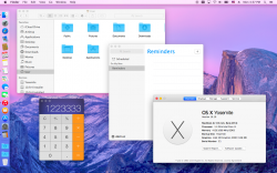
What do you think of Lucida Grande + OS X Yosemite?
(Screenshot of Lucida Grande as UI Font on Yosemite is attached below)


schreiberstein created a script that automates the process of using Lucida Grande as Yosemite's default UI font. A huge thank you to him!

Download : https://drive.google.com/folderview?id=0B_u6AjwB3JxSR19USk9CSWhMTnM&usp=sharing

Navigate to the top of the site. You should find 'Download' in its very center.
This is an Automator script which patches the default Lucida Grande font and copies it to /Library/Fonts. No system files are changed. The original font isn't included in this package, hence it's not redistribution of copyrighted Apple content.
Use with caution! I'm not liable for any damages, as stated in the license (BSD).
You can use the Automator.app to see the source code (Apple Script + Shell with embedded Apple Script) .

I'm planning to publish this thing on GitHub, too.

Let me hear whether or not this works for you (especially people using the Developer Previews).
I tested it on my Yosemite Public Beta 2 system.

The patch was created using 'bsdiff', a binary patch creation tool.
I ran 'bsdiff' to create a binary patch containing the difference between the original Lucida Grande font and vista980622' patched font.
'bspatch' is used in the script to apply the patch and move the newly created font to '/Library/Fonts'
Thank you very much, vista980622!

Best regards,
schreiberstein

EDIT: Download directly from my website (online most of the time) : https://schreiberstein.co.uk/wp/wp-content/uploads/2014/08/Lucida-Grande-Yosemite-1.0.zip

I just tested it on a fresh Yosemite Public Beta 2 installation. Works fine for me.

EDIT2: GitHub : https://github.com/schreiberstein/lucidagrandeyosemite
 

Attachments

  • Lucida Grande.png
    Lucida Grande.png
    1.3 MB · Views: 17,242
Last edited:

n-evo

macrumors 68000
Aug 9, 2013
1,909
1,731
Amsterdam
For consistency's sake with iOS I prefer Helvetica. The issues we're seeing with the font on non-retina screen are more a result of something going wrong with the font smoothing engine than anything else. I'm sure Apple will address it.


PS Calculator isn't Lucida Grande, so not sure why it's in the screen shot.
 

vista980622

macrumors 6502
Original poster
Aug 2, 2012
369
178
For consistency's sake with iOS I prefer Helvetica. The issues we're seeing with the font on non-retina screen are more a result of something going wrong with the font smoothing engine than anything else. I'm sure Apple will address it.


PS Calculator isn't Lucida Grande, so not sure why it's in the screen shot.

Good point.
 

mr.bee

macrumors 6502a
May 24, 2007
750
468
Antwerp, belgium
I voted terrible. It looks messy.

It's not only the retina vs non retina screens. The entire UI is focused on using a font like Helvetica and not like Lucida Grande.

It doesn't match with the buttons, frames, and the overall look and feel of Yosemite.
 

leman

macrumors Core
Oct 14, 2008
19,523
19,680
I think Helvetica Neue looks more at home with Yosemite than Lucida Grande. But Lucida Grande certainly does not look bad.
 

GatorGhost

macrumors regular
Jun 30, 2014
113
19
No Problem with the font...but

No problem with the font, but the size is a real issue on an iMac 27" running the full resolution 2560 X 1440. The text is quite tiny and the only fix is to scale down to a lower resolution which degrades the quality of the screen's image. However on my MacBook Pro with retina...it is okay. I would hope Apple creates a way to tweak the system fonts for the larger screens.
 
Last edited:

pickaxe

macrumors 6502a
Nov 29, 2012
760
284
They will. What about external displays? And all the hundreds of thousands of Macs out there with non-retina displays :rolleyes:

Yeah, apparently we're expected to drop several hundred dollars on a 4K display to get the same screen real estate we currently have but with a properly-rendered interface.

What's worse, nearly every Mac out there (except for nMP, hackintoshes and maybe the 15" MBP) is NOT going to have an easy time powering those HiDPI displays due to the underpowered GPUs Apple are using.
 

Siannath

macrumors regular
Nov 21, 2012
111
312
Lima, Perú
It's not a rant. Lucida Grande has objectively better readability than Helvetica Nueue, especially when used as UI font.
 

Takuro

macrumors 6502a
Jun 15, 2009
584
274
I don't like these poll options, with "looks amazing" thrown in for several options. I'd just say Lucida Grande "looks appropriate" on Yosemite for non-retina Macs.

Yeah, all Macs will be retina-ized in the next 2 years, as sure as the sun will rise tomorrow. It's a given. But during Yosemite's lifecycle, there will be a decent mix of retina and non retina machines running it. I feel there should be an option to toggle it.
 

Planey28

macrumors 6502
Jul 10, 2010
474
576
Birmingham, UK
I don't like these poll options, with "looks amazing" thrown in for several options. I'd just say Lucida Grande "looks appropriate" on Yosemite for non-retina Macs.

Yeah, all Macs will be retina-ized in the next 2 years, as sure as the sun will rise tomorrow. It's a given. But during Yosemite's lifecycle, there will be a decent mix of retina and non retina machines running it. I feel there should be an option to toggle it.

That would be a bit inconsistent and messy. I loved Lucida Grande, it was a nice font and was very readable but after seeing these mockups it's obvious how much it clashes with Yosemite's design. I've seen rumours that Apple are developing their own typeface for their OSes, which would serve them much better than compromise.
 

vista980622

macrumors 6502
Original poster
Aug 2, 2012
369
178
No problem with the font, but the size is a real issue on an iMac 27" running the full resolution 2560 X 1440. The text is quite tiny and the only fix is to scale down to a lower resolution which degrades the quality of the screen's image. However on my MacBook Pro with retina...it is okay. I would hope Apple creates a way to tweak the system fonts for the larger screens.

Actually there's a unofficial solution to your problem. Try searching "non 2x hidpi" in this forum.
 

vista980622

macrumors 6502
Original poster
Aug 2, 2012
369
178
That would be a bit inconsistent and messy. I loved Lucida Grande, it was a nice font and was very readable but after seeing these mockups it's obvious how much it clashes with Yosemite's design. I've seen rumours that Apple are developing their own typeface for their OSes, which would serve them much better than compromise.

This is actually not a mockup but I get your point. Also hoping to see their own typeface.
 

vista980622

macrumors 6502
Original poster
Aug 2, 2012
369
178
Hey, vista980622, so, how did you put Lucida Grande as Yosemite's system font?

I used ttfname, which is a open-source (and Windows-only) software to modify the configuration within Lucida Grande's ttc file and placed it under /Library/Fonts.

Since OS X first loads fonts under /Library/Fonts before looking under /System/Library/Fonts, putting it there does the trick.

If you want an easy method, just use schreiberstein's AppleScript.
 
Last edited:

Siannath

macrumors regular
Nov 21, 2012
111
312
Lima, Perú
I used ttfname, which is a open-source (and Windows-only) software to modify the configuration within Lucida Grande's ttc file and placed it under /Library/Fonts.

Since OS X first loads fonts under /Library/Fonts before looking under /System/Library/Fonts, putting it there does the trick.

If you want an easy method, just download this font from dropbox and drop it under /Library/Fonts

Oh, thank you very much! :D
 

schreiberstein

macrumors newbie
Oct 12, 2013
17
1
I used ttfname, which is a open-source (and Windows-only) software to modify the configuration within Lucida Grande's ttc file and placed it under /Library/Fonts.

Since OS X first loads fonts under /Library/Fonts before looking under /System/Library/Fonts, putting it there does the trick.

If you want an easy method, just wait till schreiberstein releases an AppleScript that automates this process.

Download : https://drive.google.com/uc?export=download&id=0B_u6AjwB3JxSdVR5SzhTclRkZUE

This is an Automator script which patches the default Lucida Grande font and copies it to /Library/Fonts. No system files are changed. The original font isn't included in this package, hence it's not redistribution of copyrighted Apple :apple: content.
Use with caution! I'm not liable for any damages, as stated in the license (BSD).
You can use the Automator.app to see the source code (Apple Script + Shell with embedded Apple Script) .

I'm planning to publish this thing on GitHub, too.

Let me hear whether or not this works for you (especially people using the Developer Previews).
I tested it on my Yosemite Public Beta 2 system.

The patch was created using 'bsdiff', a binary patch creation tool.
I ran 'bsdiff' to create a binary patch containing the difference between the original Lucida Grande font and vista980622' patched font.
'bspatch' is used in the script to apply the patch and move the newly created font to '/Library/Fonts'
Thank you very much, vista980622!

Best regards,
schreiberstein


I just tested it on a fresh Yosemite Public Beta 2 installation. Works fine for me.

EDIT2: GitHub : https://github.com/schreiberstein/lucidagrandeyosemite

EDIT3: Facebook page : https://www.facebook.com/systemfontyos
LATEST download link : https://drive.google.com/uc?export=download&id=0B_u6AjwB3JxSRWRzVDRjanpzYXc
 
Last edited:

grahamperrin

macrumors 601
Jun 8, 2007
4,942
648
17" glossy display (MacBookPro5,2) better with Lucida Grande

Before testing Lucida Grande Yosemite.app

Yosemite

A short while ago I booted the currently seeded build to test the Show All Tabs view of Safari 8,

Shift-Command-\

… The menu bar was not too bad, but words elsewhere in the user interface of Safari were consistently difficult to read. I frequently leaned towards the Mac to see whether the UI was more legible. Close up, things were no better.

With the first level of zoom enabled, for accessibility, the words remained difficult to read. Lack of clarity, as if my spectacles were unusually dirty.

Option-Command-=
increasing the zoom did increase legibility, but I don't intend to work in that way. I prefer to see the menu bar, Dock and so on.

YMMV

Mavericks

Better.

Words in the user interface of Safari 7.x appear legible – without using the Accessibility pane of System Preferences.

… whether or not this works for you (especially people using the Developer Previews). …

EDIT: Download directly from my website (online most of the time) : https://schreiberstein.co.uk/wp/wp-content/uploads/2014/08/Lucida-Grande-Yosemite-1.0.zip

After using Lucida Grande Yosemite.app to prefer Lucida Grande

What do you think of Lucida Grande + OS X Yosemite? …

That combination is much more legible than Apple's current choice for Yosemite.

Whilst the font preference improvement, alone, is not enough for me to choose Yosemite for myself, the improvement will certainly make test periods less troublesome for people like me.

To schreiberstein and vista980622: many thanks.

Test environment
  • MacBookPro5,2
  • NVIDIA GeForce 9600M GT preferred (discrete)
  • 17" glossy display
  • 1920 x 1200 resolution (best for display)
  • Build 14A329f of OS X 10.10
  • Lucida Grande Yosemite.app 1.2

Discussion

I don't like these poll options, with "looks amazing" thrown in for several options. …

I would have preferred slightly different wording, but with all the excitement and PR/marketing-speak around Yosemite, I'm happy with the emphatic wording of some of the poll options here.

… during Yosemite's lifecycle, there will be a decent mix of retina and non retina machines …

I expect non-Retina peripheral displays from a variety of vendors to remain in use – with Retina and non-Retina Macs – for much longer.

For consistency's sake with iOS …

I never viewed OS X Mavericks as inconsistent with iOS. Both of the released operating systems appear fine, I never had difficulty – individually, and together (e.g. iPad alongside MacBook Air), the different types of hardware are good with the released systems. Moving from one to the other feels effortless.

To me, Apple's fonts for pre-release Yosemite appear inconsistent with Mavericks – without any sense of improved consistency with iOS.

I think the font ran its course with the aqua design, time for change.

After Yosemite is released, with the most suitble font for OS X: approximately when should Apple cease to prefer that font? Ballpark. Thanks.

(In other topics I see that some users tire of things in less than a year. I don't imagine that all reactions will be so extreme; I'll genuinely appreciate any individual's thoughts on how many years might pass before the next change of font is due.)
 
Last edited:

schreiberstein

macrumors newbie
Oct 12, 2013
17
1
Before testing Lucida Grande Yosemite.app

Thank you very much for this detailed post!
Nice to hear that it worked for you, too!

The new font isn't bad in a way that makes the system unusable for me.
I think it's just not as readable and good looking as Lucida Grande.
The new UI, combined with Lucida Grande, looks very Mac OS X Tiger-ish :
Solid color selection, 2D Dock, ...
OS X Yosemite absolutely fits my needs. It is my main OS for the time being.
A few days ago, I was searching the web for a font replacement and was unable to find something suitable. TinkerTool wasn't able to do the trick, either.
I was very relieved to find this post and more than happy because he published his findings.
The only issue I can think of : Elements in Finder's column-view are too crisp.
Everything else looks great, in my opinion. But I have to admit, I don't have a good eye for fonts. I just wanted to have an easy and legal way to revert this font change.

Best regards,
schreiberstein :apple:
 

grahamperrin

macrumors 601
Jun 8, 2007
4,942
648
OT from Lucida Grande: problem with font appearance in Finder windows

Off-topic from Lucida Grande (I believe …)

… The only issue I can think of : Elements in Finder's column-view are too crisp.…

I, too, observed that issue alone; but I observed it both before and after use of Lucida Grande Yosemite.app 1.2. I do have screenshots, but I refrain from publishing them.

For me, that particular issue – with the pre-release as provided by Apple – is most apparent where an item within a column is selected.
 
Register on MacRumors! This sidebar will go away, and you'll see fewer ads.