Become a MacRumors Supporter for $50/year with no ads, ability to filter front page stories, and private forums.

What do you think of Lucida Grande + OS X Yosemite

  • Lucida Grande looks amazing as a UI Font on all Macs

    Votes: 74 34.4%
  • Lucida Grande looks amazing as a UI Font on non-retina Macs

    Votes: 29 13.5%
  • Lucida Grande looks just fine with Yosemite's UI

    Votes: 48 22.3%
  • Lucida Grande looks terrible with Yosemite's UI

    Votes: 64 29.8%

  • Total voters
    215

schreiberstein

macrumors newbie
Oct 12, 2013
17
1
Off-topic from Lucida Grande (I believe …)
For me, that particular issue – with the pre-release as provided by Apple – is most apparent where an item within a column is selected.

Indeed!
Maybe one could patch the Finder to increase font size, or something like that...
By the way, it's just version 1.0 (which is quite optimistic, too.).
I plan to level it up whenever changes are needed, hence maintain it.
(Though I doubt that Apple will introduce any groundbreaking changes regarding fonts.)

Best regards,
schreiberstein :apple:
 

vista980622

macrumors 6502
Original poster
Aug 2, 2012
369
178
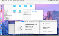
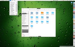
Before testing Lucida Grande Yosemite.app


After using Lucida Grande Yosemite.app to prefer Lucida Grande


That combination is much more legible than Apple's current choice for Yosemite.

Whilst the font preference improvement, alone, is not enough for me to choose Yosemite for myself, the improvement will certainly make test periods less troublesome for people like me.

To schreiberstein and vista980622: many thanks.

Test environment
  • MacBookPro5,2
  • NVIDIA GeForce 9600M GT preferred (discrete)
  • 17" glossy display
  • 1920 x 1200 resolution (best for display)
  • Build 14A329f of OS X 10.10
  • Lucida Grande Yosemite.app 1.2

Discussion


I would have preferred slightly different wording, but with all the excitement and PR/marketing-speak around Yosemite, I'm happy with the emphatic wording of some of the poll options here.


I expect non-Retina peripheral displays from a variety of vendors to remain in use – with Retina and non-Retina Macs – for much longer.


I never viewed OS X Mavericks as inconsistent with iOS. Both of the released operating systems appear fine, I never had difficulty – individually, and together (e.g. iPad alongside MacBook Air), the different types of hardware are good with the released systems. Moving from one to the other feels effortless.

To me, Apple's fonts for pre-release Yosemite appear inconsistent with Mavericks – without any sense of improved consistency with iOS.


After Yosemite is released, with the most suitble font for OS X: approximately when should Apple cease to prefer that font? Ballpark. Thanks.

(In other topics I see that some users tire of things in less than a year. I don't imagine that all reactions will be so extreme; I'll genuinely appreciate any individual's thoughts on how many years might pass before the next change of font is due.)

Thank you for your detailed post!
Great to know schreiberstein and I have helped!
 

schreiberstein

macrumors newbie
Oct 12, 2013
17
1
**** fonts are back with the last beta. Even Lucida is now too thin/washed out, let's hope it's fixed soon.

Hm. Bad news!
The tool should stop working because it checks the font before patching.
(Patching wouldn't be possible, anyway.)
If the MD5-hash has changed, it will fail.
I hope the font of 10.10 PB 2 is forward compatible to the final release, that way, it could be included as a patch or as "obtain it yourself and put it in folder <xyz>".
If it isn't compatible, Lucida Grande really is a thing of the past.
Let's be optimistic... :cool:

Best regards,
schreiberstein :apple:
 

schreiberstein

macrumors newbie
Oct 12, 2013
17
1

coldjeanzzz

macrumors 6502a
Nov 4, 2012
655
17
I actually don't mind the look of Helvetica Neue at all on retina displays, I think it looks great as the Yosemite font. But that's it. It looks awful outside of those screens. Too many people are non-retina users to justify screwing them over like that.

After looking at some new screenshots it seems Apple made the font even thinner which is absolutely insane.
 

imacan

macrumors regular
Jan 14, 2007
104
5
Montreal, Canada
Would it be possible for you to try this :
https://github.com/schreiberstein/lucidagrandeyosemite/issues/1
(See second post)

It is based on your post.
In case this happens to be a misconception and you were not actually talking about DP7, please tell me so.

Best regards and thanks in advance,
schreiberstein :apple:

Hi, thanks for being involved! In fact the patch still works since Lucida Grande is applied and there is no error. However, it is not as good as it was. They did something to the way the font is rendered making it look thinner and/or with less contrast. The person that answered you with some screenshots seems to have "Increase Contrast" set to ON in the Accessibility Settings which restores some heft the the font and makes it easier on the eyes. That is what I used to do before your patch (although you then loose transparency on everything from the menu bar to every other menus and other differences on the way things are rendered).

As I mentioned in a previous post, what was great in the previous DP is that, with your patch, things were looking great even with the "Increase Contrast" set to OFF. It was like being on Mavericks. Now, I still prefer Yosemite with your patch on my non-retina iMac but I have to again activate Increase Contrast to make it look good enough for my taste. They obviously did something different since a lot of people are reporting the difference in look. I really don't understand what is going on with Apple lately, I've never used the cliché sentence that I might abandon OS X in the past, but I am really getting close with all those stupid changes in the last 2 years.
 

grahamperrin

macrumors 601
Jun 8, 2007
4,942
648
… The person that answered you with some screenshots seems to have "Increase Contrast" set to ON …

Yeah. That was me, with reference to https://forums.macrumors.com/showthread.php?p=19580611#post19580611 where (although it wasn't explicit) I thoroughly dislike the transparency of Yosemite, and transparency is forced off √ when I increase contrast, and … yeah … nothing like that is required in Mavericks.

Yosemite out-of-the-box is remarkably inaccessible compared to Mavericks.
 

imacan

macrumors regular
Jan 14, 2007
104
5
Montreal, Canada
Fonts solved in last beta!

The problem is now solved. Things are not washed out anymore even without having to rely on accessibility settings like Increase contrast or Reduce transparency. Now it is just a matter of taste and pure font readability wether someone wants to install Lucida Grande or not and activate some Accessibility settings. Apple listened, yes, they did listen, can you believe it? ;) (I know, some will say it was going to change, it was bad only because it is beta, not sure...)
 

schreiberstein

macrumors newbie
Oct 12, 2013
17
1
The problem is now solved. Things are not washed out anymore even without having to rely on accessibility settings like Increase contrast or Reduce transparency. Now it is just a matter of taste and pure font readability wether someone wants to install Lucida Grande or not and activate some Accessibility settings. Apple listened, yes, they did listen, can you believe it? ;) (I know, some will say it was going to change, it was bad only because it is beta, not sure...)

Great!

I'm going to install Public Beta 3, soon.
Hopefully, the font will look as great as it did in Beta 2.
Apple's latest update to iTunes changed its complete look font-wise :-/
If someone is able to tweak that, just tell me and I'll be happy to incorporate them into the application.

Best regards
schreiberstein :apple:
 

MaxPayne79

macrumors regular
Jun 11, 2014
182
1
I personally prefer Lucida Grande as UI font on non-hidpi Mac.
What do you think of Lucida Grande + OS X Yosemite?
(Screenshot of Lucida Grande as UI Font on Yosemite is attached below)


schreiberstein created a script that automates the process of using Lucida Grande as Yosemite's default UI font. A huge thank you to him!

so this font change is in todays release?
 

Attachments

  • Screen Shot 2014-09-15 at 4.05.27 PM.png
    Screen Shot 2014-09-15 at 4.05.27 PM.png
    983.9 KB · Views: 1,141

jamesarm97

macrumors 65816
Sep 29, 2006
1,090
116
It really needs to be configurable. I have a hard time seeing it. I also have a friend with an 27"iMac that is hard at seeing and I had to reduce his screen res all the way down to something like 800x600 just so the menu fonts would be larger. Why can't they ever get anything just right. How hard is it to at least set the size or bold.

Indeed!
Maybe one could patch the Finder to increase font size, or something like that...
By the way, it's just version 1.0 (which is quite optimistic, too.).
I plan to level it up whenever changes are needed, hence maintain it.
(Though I doubt that Apple will introduce any groundbreaking changes regarding fonts.)

Best regards,
schreiberstein :apple:
 

coldjeanzzz

macrumors 6502a
Nov 4, 2012
655
17
The problem is now solved. Things are not washed out anymore even without having to rely on accessibility settings like Increase contrast or Reduce transparency. Now it is just a matter of taste and pure font readability wether someone wants to install Lucida Grande or not and activate some Accessibility settings. Apple listened, yes, they did listen, can you believe it? ;) (I know, some will say it was going to change, it was bad only because it is beta, not sure...)

Got a screenshot of the most up to the date version?
 

PsykX

macrumors 68030
Sep 16, 2006
2,754
3,931
Not a fan of thin fonts here.
Overall, Yosemite's new interface isn't all that bad, but there are major disappointments like this one.
 

KALLT

macrumors 603
Sep 23, 2008
5,380
3,415
I have to say, I wasn’t very fond of the idea to replace Lucida Grande with Helvetica Neue on every UI element, but I have to admit, in Public Beta 3, the font swap doesn’t look as bad anymore. The menu bar in particular uses a thicker version on my non-Retina MacBook. It’s not as fuzzy or pixellated as it was, it looks fine now.

Sadly, the text does look rather small in many places. I don’t think Apple consistently adjusted the text sizes yet to accommodate for the differences between Helvetica Neue and Lucida Grande (the latter is bulkier and spacier).
 

Mr. Retrofire

macrumors 603
Mar 2, 2010
5,064
519
www.emiliana.cl/en
I personally prefer Lucida Grande as UI font on non-hidpi Mac.
What do you think of Lucida Grande + OS X Yosemite?
(Screenshot of Lucida Grande as UI Font on Yosemite is attached below)
I think the LG font looks great! I copied (i think) the LG font from OS X 10.0.0 beta to a partition with Mac OS 9.1 or 9.2.2, IIRC. The results was disastrous, IIRC. On OS X i always liked LG. It's really a font for a human/machine interface. Other fonts look nice, but are like machine/machine interface fonts. Lifeless, cold, without a good history in the human/machine interface realm.

Btw, thanks for the script & screenshot. Nice! :D
 
Last edited:

Paradoxally

macrumors 68000
Feb 4, 2011
1,987
2,898
Been using LG font since the first DP1 came out. I dislike Helvetica Neue with a passion, it does not belong on OS X as a system font. Makes everything harder to read even on a retina screen.
 
Register on MacRumors! This sidebar will go away, and you'll see fewer ads.