Become a MacRumors Supporter for $50/year with no ads, ability to filter front page stories, and private forums.
I think it needs a proper ending - and I don't feel like we've had one yet.

I guess the proper ending would be the OP taking some professional graphic advice and get a good-looking logo and also a website redesign considering it's 2016. However that's not probably happening.. maybe we get some more ideas from a community so when any of us start a scanning / archiving business, there's a good start :).
 
I haven't read the whole thread, so this may have been said already, but your website is breathtakingly amateurish and poor.

There is simply no excuse in 2016 to have a website that looks like that.

It may be that your business is running very successfully, but it won't be because of your website. Indeed, your website is harming your brand. It makes me ask: if this guy is running a technology company, why is he so poor at using technology himself?
 
I think it needs a proper ending - and I don't feel like we've had one yet.

Then against my better judgment, I will offer my own take, which places emphasis on fast, professional, sleek, savvy, modern, mobility, and above all, modern:

actionize_your_life.gif
 
I haven't read the whole thread, so this may have been said already, but your website is breathtakingly amateurish and poor.

There is simply no excuse in 2016 to have a website that looks like that.

It may be that your business is running very successfully, but it won't be because of your website. Indeed, your website is harming your brand. It makes me ask: if this guy is running a technology company, why is he so poor at using technology himself?

Sounds like you are a professional. Maybe you can design one for me at no cost. Or anyone else needing experience.
 
I will be reviewing everyones suggestions. I have been quite busy latley.
 
I will be reviewing everyones suggestions. I have been quite busy latley.

A few suggestions:

  • Check your entire page for spelling
  • Make sure the design of your logo is consistent with the design of the rest of the site
  • Do not add animated stuff to your logo on holidays. It seems very amateurish (you mentioned that you wanted to make a professional impression).
  • Check your page for proper use of paragraphs and sections. It is often not clear when something ends and something else starts.

Thank you for some positive suggestions.
 
Thank you for some positive suggestions.

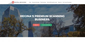
Hey new site looking much better indeed, but shame that you seem to have given up on a logo altogether.

One point re the main image, if you're going to stick with it I'd suggest editing out the HSBC signage!

UPDATE: Just been playing around with a logo idea and maybe you need to keep it simple and clean, something that works with the new look site so have attached a screenshot showing the kind of thing I was thinking of.

Also I would do a bit of research into contemporary colour palettes as I think you could improve on those used, that brown is not pleasant!

And lastly maybe you need to find a main image that has more relevance to what your business is/does?
 

Attachments

  • Screen Shot 2016-10-13 at 17.41.35.jpg
    Screen Shot 2016-10-13 at 17.41.35.jpg
    610.5 KB · Views: 319
Last edited:
  • Like
Reactions: profmjh
Hey new site looking much better indeed, but shame that you seem to have given up on a logo altogether.

One point re the main image, if you're going to stick with it I'd suggest editing out the HSBC signage!

UPDATE: Just been playing around with a logo idea and maybe you need to keep it simple and clean, something that works with the new look site so have attached a screenshot showing the kind of thing I was thinking of.

Also I would do a bit of research into contemporary colour palettes as I think you could improve on those used, that brown is not pleasant!

And lastly maybe you need to find a main image that has more relevance to what your business is/does?

Thank ypu for your suggestion. I like your logo idea and I will be changing the colors very soon as I agree on the brown looking not so pleasant.

I am thinking of using a picture of a scanner with photographs on top with white glove maybe.
 
It's difficult to narrow down on an image that covers all bases of your business, but if you were to take the photo scanning as a focus then I would think something along the lines of the attached might work?

Image1.jpg Image2.jpg Image3.jpg
 
Thanl you Davedee65. I have the most money invested in Photo scanning equipment, but VHS to Digital is my most popular.

What does everyone think of Roboto for a logo?
 
Last edited:
bvuously
What does everyone think of Roboto for a logo?

You need to stop asking people what they think of ABC or XYZ for a logo, and hire a professional. Even if you just invest a few hundred dollars it will be a huge improvement.

Your logo, branding and website all look like they were done by a kid working out of his parents basement, and that is OK but you have several very substantial problems that dozens of people have pointed out to you, and you are repeatedly ignored them.

1. Your name makes it clear that you are a one man show. Those are obviously your initials. This makes it risky that as soon as you are busy, or distracted you have no team to support you.

2. Your website, facebook and instagram all have different logos on them. Hire a pro to develop a brand for you and take their advice. If you really want to build a business, and see this thing be successful you need to concentrate 100% on what YOU are good at and trust someone who CRUSHES DESIGN to do their magic. Just as you want a customer to trust you to do your job well. You are literally hurting yourself by not taking the advice of this thread, and you are only hurting yourself.

3. all these elements make the customer feel that you are just a hobby, and that you may not be around in a few years.

4. Your website and brand are unprofessional. and are obviously homemade. Why would any customer trust you with their money, if you dont think you are worth investing in yourself

5. The site is obviously a wordpress theme. Hire a web designer, to go thru and format your site properly and spend a day cleaning it up. Put a nice logo in there. A few customer testimonials. Offer your skills for free to other businesses in town, in order to use their logos on your site. You need to show that you are credible.
 
I'll chime in with a simple suggestion that I'm surprised no one else has mentioned (at least not that I've seen). On your website, all the links in the nav bar at the top use Title Case except for VHS to DVD transfer service. Keep it consistent across everything. Change it to VHS to DVD Transfer Services.

Check the whole site for inconsistencies like that. For example; in the sentence, "We can scan your photos in Bulk or professionally hand scan your photos," I'd drop the capital B in Bulk. Even the smallest details matter.
 
I will be looking for a freelance designer soon.

Though JW is not my initals. It is mine and my business partners.
 
You need to stop asking people what they think of ABC or XYZ for a logo, and hire a professional. Even if you just invest a few hundred dollars it will be a huge improvement.

Your logo, branding and website all look like they were done by a kid working out of his parents basement, and that is OK but you have several very substantial problems that dozens of people have pointed out to you, and you are repeatedly ignored them.

1. Your name makes it clear that you are a one man show. Those are obviously your initials. This makes it risky that as soon as you are busy, or distracted you have no team to support you.

2. Your website, facebook and instagram all have different logos on them. Hire a pro to develop a brand for you and take their advice. If you really want to build a business, and see this thing be successful you need to concentrate 100% on what YOU are good at and trust someone who CRUSHES DESIGN to do their magic. Just as you want a customer to trust you to do your job well. You are literally hurting yourself by not taking the advice of this thread, and you are only hurting yourself.

3. all these elements make the customer feel that you are just a hobby, and that you may not be around in a few years.

4. Your website and brand are unprofessional. and are obviously homemade. Why would any customer trust you with their money, if you dont think you are worth investing in yourself

5. The site is obviously a wordpress theme. Hire a web designer, to go thru and format your site properly and spend a day cleaning it up. Put a nice logo in there. A few customer testimonials. Offer your skills for free to other businesses in town, in order to use their logos on your site. You need to show that you are credible.

This. Exactly.
 
I've been out of the business for a decade but I used to make lots and lots of signs & banners, and I've created my fair share of logos as a result. Effective designs & layouts are clear, simple, and instantly readable -- which requires simple, simple fonts & lots room to read it. I like to envision my work on a billboard viewed by cars zipping by at 100km/h. If you can't read it at 100km/h then you've wasted your money.
.......
I'd personally avoid the Northern Lights effect, it's tough to do that right and depending on what you want to do with your logo, additional colours may still increase the cost (screenprinting etc.) And if you ever have to print it in B&W it'll look ridiculous. This logo still works effectively in B&W.

My thoughts FWIW...


View attachment 613843

View attachment 613844
perfect logo - simply and clearly. A check mark adds the entourage and the right marketing mindset.
 
Please ,please kill this annoying thread it has really gone on for long enough.

Sometimes you just have to pay for a service and not try to do it all alone if you lack the skills/aptitude
 
  • Like
Reactions: iamgalactic
Please ,please kill this annoying thread it has really gone on for long enough.

Sometimes you just have to pay for a service and not try to do it all alone if you lack the skills/aptitude

I've been tempted just to do one to hopefully end it - but part of me is still hopeful that he'll go and get a designer to fix everything and we can all say 'well done'. But then, America did vote for Trump and UK for Brexit so 'hope' as a concept is kind of goosed.
 
Register on MacRumors! This sidebar will go away, and you'll see fewer ads.