Become a MacRumors Supporter for $50/year with no ads, ability to filter front page stories, and private forums.

Sky Blue

Guest
Original poster
Jan 8, 2005
6,856
11
They not gonna redesign these buttons (or "boxes" how you call them) in all programs and dialogs. This is how the new design looks like, it's not some small glitch or whatever what needs to be fixed, that's a design Apple chose, and you bet it wasn't a spontaneous decision Lol.

I agree. Doesn't mean it does look crap though.

----------

Not if you uncheck "Double-click a window's title bar to minimize" option in the Dock settings.

Right. I don't want to uncheck that.
 

53kyle

macrumors 65816
Mar 27, 2012
1,282
111
Sebastopol, CA
Your complaint is similiar to someone saying that he wants 3d icons back or that he wants Apple to disable all the blur and transparency, therefore it's absurd and not gonna happen. ;)

They not gonna redesign these buttons (or "boxes" how you call them) in all programs and dialogs. This is how the new design looks like, it's not some small glitch or whatever what needs to be fixed, that's a design Apple chose, and you bet it wasn't a spontaneous decision Lol.

Actually, apple built in an option to disable all blur and transparency. Anyway, they might change the button boxes, like they changed them in lion. Remember the sliding button in toolbars?
 

Sky Blue

Guest
Original poster
Jan 8, 2005
6,856
11
Actually, apple built in an option to disable all blur and transparency. Anyway, they might change the button boxes, like they changed them in lion. Remember the sliding button in toolbars?

Right. iOS 7 has a button shapes toggle, but nice on to have it on OS X too.

Really they could just make the icons a little bolder. A grey icon on a white box on a grey toolbar doesn't look very sharp.

----------

Just hold Option when clicking the green button and it will act as it did on 10.9 and before.

Yes. We're going round in circles here.
After using OS X for near 14 years, I instinctively use the green button to make the window bigger, not full screen.

If there was a way to switch it back, I would, if not I'll get used to it.
 

mattburley7

macrumors 68040
Oct 13, 2011
3,675
909
update the iTunes icon to look like the one in the WWDC 2014 preview along with a redesign. also redesign for the app store.
 

triptolemus

macrumors 6502a
Apr 17, 2011
865
1,736
WOW, so many complaints.

No offence, but the funniest of them all was about those "boxes" around finder buttons. :D

These "boxes" are one of the main and most distinctive things of the Yosemite UI. How can one possibly think that they could be replaced?
Designers can add a frame to search bar to differentiate it, but that's pretty much all what could be possibly needed there actually. ;)

Join Date: Jun 2014
Total Posts: 119
Posts Per Day: 28.30

Wowzers. Ease back, son!
 

PsykX

macrumors 68030
Sep 16, 2006
2,716
3,888

Yeah I know it exists, I want the whole pane overhauled to something fresher. Everything about it hasn't changed since I can remember and now it looks out of place. I was a Tiger user nearly 10 years ago now.

The icons need a refresh, the layout needs a refresh, hell even the horizontal rule isn't the one used throughout the OS. And the cherry on top, it has never been clear to use, because the UI is different from the rest of the OS. Nowhere else in the OS do you click on an icon once to change an option. Clicking on an icon once is supposed to represent the user selection, it does not change a preference. There should be a drop-down menu or radio buttons or something instead.
 

zedsdead

macrumors 68040
Jun 20, 2007
3,435
1,250
Folders are way too bright.

Otherwise from what I am seem it looks really nice overall....great redesign.
 

0000757

macrumors 68040
Dec 16, 2011
3,893
850
Yeah I know it exists, I want the whole pane overhauled to something fresher. Everything about it hasn't changed since I can remember and now it looks out of place. I was a Tiger user nearly 10 years ago now.

The icons need a refresh, the layout needs a refresh, hell even the horizontal rule isn't the one used throughout the OS. And the cherry on top, it has never been clear to use, because the UI is different from the rest of the OS. Nowhere else in the OS do you click on an icon once to change an option. Clicking on an icon once is supposed to represent the user selection, it does not change a preference. There should be a drop-down menu or radio buttons or something instead.

It literally says "Select the system you want to use to start up your computer" and then it will confirm your selection.

I don't think it's complicated at all...I think you're making it way more complicated than it actually is....

----------

Join Date: Jun 2014
Total Posts: 119
Posts Per Day: 28.30

Wowzers. Ease back, son!

That's how I was in the beginning too...I think I maxed my PPD at 40 once :)
 

Saturn1217

macrumors 65816
Apr 28, 2008
1,360
1,048
My UI tweak list is minor.

I like the white buttons against gray but I agree with the OP that the search bar (or any other text field in the toolbar of an app) looks exactly like a button except elongated which could be confusing. I'd rather have them make such text field look " sunk in" as opposed to sticking out (if that makes any sense)

I also wish the dots for active apps in the dock would be white, not black. Seems kind of hard to see.


Now that the new spotlight pops up in the middle of the screen it would be amazing to have an option to not show the spotlight icon in the menu bar without disabling spotlight. I have ALOT of icons in the menu bar and most of them do useful things so I want to keep them there. The spotlight icon on yosemite would be redundant if you remembered the keyboard shortcut (but of course for less savvy users it would be good to keep the spotlight icon)

EDIT: Almost forgot but yes the folder icons are a bit too bright.
 

Attachments

  • Screen Shot 2014-06-07 at 4.38.06 PM.png
    Screen Shot 2014-06-07 at 4.38.06 PM.png
    7.1 KB · Views: 1,126

Cougarcat

macrumors 604
Sep 19, 2003
7,766
2,553
+1 to the maximize button and folder icon complaints. Also, I prefer the old Finder icon.

With the big caveat I have not used it yet, I hope they tone down the transparency for the final release. It reminds me of 10.0 and not in a good way, context menus in particular look like they are a lot less legible. The transparency isn't bad per se, but it doesn't serve any useful purpose and just makes things harder to read. I know you can disable it completely, but I found the transparency in SL and above to be just right.

In general, I find the colors too bright (not a big deal, I use Graphite anyway), but this is especially true of the folders. I'm eager to see Dark Mode. I hope it changes folder icons as well, because a dark theme with those bright folders would look really odd.
 

294307

Cancelled
Mar 19, 2009
567
315
The back and forward button look so off. They need to be united

I've been thinking that as well.

-

I am wondering whether windows would look better if Apple got rid of the rounded corners. Very doubtful this will happen though.
 

Osullivan1

macrumors 6502
Aug 1, 2011
283
13
London
Your complaint is similiar to someone saying that he wants 3d icons back or that he wants Apple to disable all the blur and transparency, therefore it's absurd and not gonna happen. ;)

They not gonna redesign these buttons (or "boxes" how you call them) in all programs and dialogs. This is how the new design looks like, it's not some small glitch or whatever what needs to be fixed, that's a design Apple chose, and you bet it wasn't a spontaneous decision Lol.

I think it was more that they need to alter/refine/tone down the boxes... Evem though I'm getting used to them, they definately at least need refining, if only simply joining the back/forward buttons.

----------

Anyway, they might change the button boxes, like they changed them in lion. Remember the sliding button in toolbars?

I loved those!! Was actually kinda bummed when they removed them, even though I could see why :p
 

Lolito

macrumors 6502
Mar 20, 2013
397
34
here
1.- New fonts suck big time in non-retina screens!! Hope they either fix the font rendering and antialias, or they allow to keep the good old fonts system. The new ones i´m sure look great in a retina screen or 4k, but in current screens they are obviously quite wrong.

2.- the new location for full screen is bad, it removes resize button, and anyways the button for exit full screen is in the opposite corner, in the upper right...

All this makes me think that 10.9 will be now the new snow leopard; just the os to stick too if you don't get one of the new models and/or a 4k display...
 

Sky Blue

Guest
Original poster
Jan 8, 2005
6,856
11
1.- New fonts suck big time in non-retina screens!! Hope they either fix the font rendering and antialias, or they allow to keep the good old fonts system. The new ones i´m sure look great in a retina screen or 4k, but in current screens they are obviously quite wrong.

I agree. i've tested on an Air and 2013 Retina, looks a lot better on the Retina.
I can certainly believe those rumors of a Retina iMac and Air in the fall, they're going to need them.
 

SmOgER

macrumors 6502a
Jun 2, 2014
805
89
I agree. i've tested on an Air and 2013 Retina, looks a lot better on the Retina.
I can certainly believe those rumors of a Retina iMac and Air in the fall, they're going to need them.

Well you can adjust fonts a bit by playing with color profiles and
defaults -currentHost write -globalDomain AppleFontSmoothing -int x command. Can't remember my Mavericks settings, but they seem to have stayed after upgrade. TBH I think default color profile is a notch off anyway.
 

haravikk

macrumors 65832
May 1, 2005
1,501
21
I've mentioned this in other threads too, but I want to see a more graphite icon set across the OS, either as standard or as an option (i.e - apps would have two icons for themselves and any supported files types), with the graphite look insisting upon a strict duotone and a focus on being iconic, which means clean lines, low contrast gradients and so-on.

I much prefer the folder icons in Mavericks to Yosemite's while I like the straighter profile of Yosemite's icons, they over saturation of colour makes the icon on the folder (for ~/Movies, ~/Music etc.) appear very indistinct, particularly with the icon being lighter along with the gradient! IMO they've really dropped the ball with folder icons.

But the proliferation of colour in the Dock/Launchpad is just as intrusive; maybe some people like it, but I'd like the colour vs graphite setting (if Yosemite even still has this) to apply system wide, not just to the close/minimize/fullscreen widget.
 

Yakibomb

macrumors 6502
May 13, 2014
413
60
Cape Town
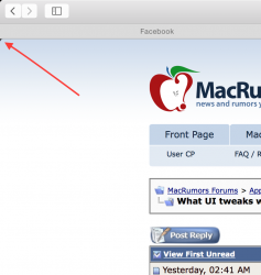
Okay so this is a tinny thing and I guess I could learn to live with it but would be great if it was removed.

Has anyone noticed how the corners of webpages are rounded off in Safari?
Screen Shot 2014-06-08 at 3.45.31 PM.png
I agree that visually it does look nice to have the bottom of the webpages rounded off when in full screen, but not the top :( Or maybe have the rounding off to show that i'm at the top of the webpage, but once I scroll it disappears? I just don't see why then added it there:confused:

Oh well thats just my $0.02
 

Yakibomb

macrumors 6502
May 13, 2014
413
60
Cape Town
Oh yes, it would be nice if the calculator app would share the same design as the notification center calculator.

(will post screen shots when i'm back on Yosemite)

EDIT:
Screen Shot 2014-06-08 at 4.23.36 PM.png
 
Last edited:

kmj2318

macrumors 68000
Aug 22, 2007
1,669
712
Naples, FL
Okay so this is a tinny thing and I guess I could learn to live with it but would be great if it was removed.

Has anyone noticed how the corners of webpages are rounded off in Safari?
View attachment 475667
I agree that visually it does look nice to have the bottom of the webpages rounded off when in full screen, but not the top :( Or maybe have the rounding off to show that i'm at the top of the webpage, but once I scroll it disappears? I just don't see why then added it there:confused:

Oh well thats just my $0.02

I agree with this too, but it looks like a bug and not a design choice. Sometimes it doesn't happen.
 

Sky Blue

Guest
Original poster
Jan 8, 2005
6,856
11
Oh yes, it would be nice if the calculator app would share the same design as the notification center calculator.

(will post screen shots when i'm back on Yosemite)

I'm guessing the actual Calculator app will get an update to match it's icon.
 
Register on MacRumors! This sidebar will go away, and you'll see fewer ads.