Become a MacRumors Supporter for $50/year with no ads, ability to filter front page stories, and private forums.
Your criticism is invalid, wallpaper is customizable, if you find that font and icons do not contrast well against the background, you can change it.

It would be horrible if you couldn't change the wallpaper.

Except that your criticism is invalid instead, while his is not.

Apple routinely prides iOS as 'the most advanced operating system' in the world. Marketing speech for sure, but everyone knows they hold themselves to a certain quality ever since iPhone OS 1.

Should customers adjust our customisations BASED ON Apple's incoherent design choices, or should Apple design iOS based on a no-brainer consideration for every single colour palette in the world? Of the 2, which do you think should be more likely? Obviously the latter.

The fact that Apple's font is only legible against certain backgrounds is THEIR design flaw, plain and simple. They should have accounted and adjusted for all background colours during the design process, which they clearly haven't.

--

@Feyl, don't mind the Apple defenders in this thread. I agree with your sentiment.

Many folks often come to the defense of Apple's choices without considering what Apple could've done better. The common excuses like 'why are you even bothering about such a small thing' or 'just do something else to mitigate X' or 'nobody cares' are pathetic. Caring about the small things was what made iOS so great in the first place, and over the years, people have forgotten about that and lowered their expectations/demands of standard from Apple. When it comes to Apple, it seems like almost every thing can be forgiven or written off. I wonder why are these people so inclined to cut this trillion dollar company some slack when it comes to the design and usability of their software used on the most common smartphone around the world.

If a design in a software is bad to the extent that a user needs to work around that, then it is just plain shoddy and there shouldn't be any excuses for that. Small or big flaw, it's still a flaw.

People are too busy justifying the greatness of Tim Cook's Apple that they have chosen to look past the degradation in iOS's design over the past few years. iOS used to be the epitome of simplicity, but not anymore. Here are a few examples that people choose to stick their heads in the sand and not talk about:

1. On iPhone 10 brethren, there are two ways to access in the camera in the lockscreen - pressing the on screen button or swipe left to reveal the camera interface. Why do we need 2 different interactions to access camera? This is so open that I can't believe the iOS software team green-lighted this and haven't changed it till now.

2. At your home screen, there are 2 ways to access music controls - by swiping to access control center or by accessing notification center. Again, why 2 different places to do the same thing?

3. 2 different places to access search - widget panel on the left side of your home screen and by swiping down on the home screen. Why is that?

4. What is the rationale for the big ass, left-aligned, titles in 1st party apps? Apple has never explained that. It is purely change for the sake of change, to accommodate the notch that is now occupying the middle of the top section of the screen. If I open messages, I already know I'm in messages. Do I need to be reminded that 'HEY YOU ARE NOW IN MESSAGES' in bold and extra big fonts?

5. No consistency across iOS devices. Control center is accessed up swiping up on iPhone 8 and earlier, but accessed by swiping down on the right top of the screen on the iPhone 10 brethren. Why is that? Why is the new Stocks app on dark mode for iPhone, but white for iPad? Why are some apps in dark mode, while others are in white?

6. 3D Touch, although a touch control with a lot of potential, is not intuitive. How does a user know where he can 3D Touch, and where he cannot? How many iPhone users out there know you can 3D Touch the edge of the screen to access multitasking? How many users know you can 3D Touch the keyboard to use it like a mouse? These are examples of what happens when you implement software design without thinking about making it intuitive.

These are just a few of the many design flaws that are currently present in iOS, and they should not be swept under the carpet just because it's 'Apple's' software. They deserved to be called out for what they are - flaws.
 
I have a friend a few streets over and comes out each and every morning, later on during the day, and evening and picks up small leaves from his very small patch of artificial lawn in front of his apartment with his hand and a small Can. OCD is an understatement for him.

Some people have OCD regarding other matters as well. Just saying. Have a nice day. ;)
 
Except that your criticism is invalid instead, while his is not.

Apple routinely prides iOS as 'the most advanced operating system' in the world. Marketing speech for sure, but everyone knows they hold themselves to a certain quality ever since iPhone OS 1.

Should customers adjust our customisations BASED ON Apple's incoherent design choices, or should Apple design iOS based on a no-brainer consideration for every single colour palette in the world? Of the 2, which do you think should be more likely? Obviously the latter.

The fact that Apple's font is only legible against certain backgrounds is THEIR design flaw, plain and simple. They should have accounted and adjusted for all background colours during the design process, which they clearly haven't.

--

@Feyl, don't mind the Apple defenders in this thread. I agree with your sentiment.

Many folks often come to the defense of Apple's choices without considering what Apple could've done better. The common excuses like 'why are you even bothering about such a small thing' or 'just do something else to mitigate X' or 'nobody cares' are pathetic. Caring about the small things was what made iOS so great in the first place, and over the years, people have forgotten about that and lowered their expectations/demands of standard from Apple. When it comes to Apple, it seems like almost every thing can be forgiven or written off. I wonder why are these people so inclined to cut this trillion dollar company some slack when it comes to the design and usability of their software used on the most common smartphone around the world.

If a design in a software is bad to the extent that a user needs to work around that, then it is just plain shoddy and there shouldn't be any excuses for that. Small or big flaw, it's still a flaw.

People are too busy justifying the greatness of Tim Cook's Apple that they have chosen to look past the degradation in iOS's design over the past few years. iOS used to be the epitome of simplicity, but not anymore. Here are a few examples that people choose to stick their heads in the sand and not talk about:

1. On iPhone 10 brethren, there are two ways to access in the camera in the lockscreen - pressing the on screen button or swipe left to reveal the camera interface. Why do we need 2 different interactions to access camera? This is so open that I can't believe the iOS software team green-lighted this and haven't changed it till now.

2. At your home screen, there are 2 ways to access music controls - by swiping to access control center or by accessing notification center. Again, why 2 different places to do the same thing?

3. 2 different places to access search - widget panel on the left side of your home screen and by swiping down on the home screen. Why is that?

4. What is the rationale for the big ass, left-aligned, titles in 1st party apps? Apple has never explained that. It is purely change for the sake of change, to accommodate the notch that is now occupying the middle of the top section of the screen. If I open messages, I already know I'm in messages. Do I need to be reminded that 'HEY YOU ARE NOW IN MESSAGES' in bold and extra big fonts?

5. No consistency across iOS devices. Control center is accessed up swiping up on iPhone 8 and earlier, but accessed by swiping down on the right top of the screen on the iPhone 10 brethren. Why is that? Why is the new Stocks app on dark mode for iPhone, but white for iPad? Why are some apps in dark mode, while others are in white?

6. 3D Touch, although a touch control with a lot of potential, is not intuitive. How does a user know where he can 3D Touch, and where he cannot? How many iPhone users out there know you can 3D Touch the edge of the screen to access multitasking? How many users know you can 3D Touch the keyboard to use it like a mouse? These are examples of what happens when you implement software design without thinking about making it intuitive.

These are just a few of the many design flaws that are currently present in iOS, and they should not be swept under the carpet just because it's 'Apple's' software. They deserved to be called out for what they are - flaws.
I like iOS. Imo i like it better than android and by my biases it’s designed better than android. There are things that could be improved however overall I give ios a good to excellent. Again, imo, They do not make incoherent design choices with two ways of doing things not supporting the viewpoint.

And 3dt, my favorite feature.:)

I share the same thoughts. I use an iPhone and I prefer iOS over Android. Just feel that there are plenty of things that Apple can improve.
 
Except that your criticism is invalid instead, while his is not.

Apple routinely prides iOS as 'the most advanced operating system' in the world. Marketing speech for sure, but everyone knows they hold themselves to a certain quality ever since iPhone OS 1.

Should customers adjust our customisations BASED ON Apple's incoherent design choices, or should Apple design iOS based on a no-brainer consideration for every single colour palette in the world? Of the 2, which do you think should be more likely? Obviously the latter.

The fact that Apple's font is only legible against certain backgrounds is THEIR design flaw, plain and simple. They should have accounted and adjusted for all background colours during the design process, which they clearly haven't.

--

@Feyl, don't mind the Apple defenders in this thread. I agree with your sentiment.

Many folks often come to the defense of Apple's choices without considering what Apple could've done better. The common excuses like 'why are you even bothering about such a small thing' or 'just do something else to mitigate X' or 'nobody cares' are pathetic. Caring about the small things was what made iOS so great in the first place, and over the years, people have forgotten about that and lowered their expectations/demands of standard from Apple. When it comes to Apple, it seems like almost every thing can be forgiven or written off. I wonder why are these people so inclined to cut this trillion dollar company some slack when it comes to the design and usability of their software used on the most common smartphone around the world.

If a design in a software is bad to the extent that a user needs to work around that, then it is just plain shoddy and there shouldn't be any excuses for that. Small or big flaw, it's still a flaw.

People are too busy justifying the greatness of Tim Cook's Apple that they have chosen to look past the degradation in iOS's design over the past few years. iOS used to be the epitome of simplicity, but not anymore. Here are a few examples that people choose to stick their heads in the sand and not talk about:

1. On iPhone 10 brethren, there are two ways to access in the camera in the lockscreen - pressing the on screen button or swipe left to reveal the camera interface. Why do we need 2 different interactions to access camera? This is so open that I can't believe the iOS software team green-lighted this and haven't changed it till now.

2. At your home screen, there are 2 ways to access music controls - by swiping to access control center or by accessing notification center. Again, why 2 different places to do the same thing?

3. 2 different places to access search - widget panel on the left side of your home screen and by swiping down on the home screen. Why is that?

4. What is the rationale for the big ass, left-aligned, titles in 1st party apps? Apple has never explained that. It is purely change for the sake of change, to accommodate the notch that is now occupying the middle of the top section of the screen. If I open messages, I already know I'm in messages. Do I need to be reminded that 'HEY YOU ARE NOW IN MESSAGES' in bold and extra big fonts?

5. No consistency across iOS devices. Control center is accessed up swiping up on iPhone 8 and earlier, but accessed by swiping down on the right top of the screen on the iPhone 10 brethren. Why is that? Why is the new Stocks app on dark mode for iPhone, but white for iPad? Why are some apps in dark mode, while others are in white?

6. 3D Touch, although a touch control with a lot of potential, is not intuitive. How does a user know where he can 3D Touch, and where he cannot? How many iPhone users out there know you can 3D Touch the edge of the screen to access multitasking? How many users know you can 3D Touch the keyboard to use it like a mouse? These are examples of what happens when you implement software design without thinking about making it intuitive.

These are just a few of the many design flaws that are currently present in iOS, and they should not be swept under the carpet just because it's 'Apple's' software. They deserved to be called out for what they are - flaws.
Nicely written mate. We're talking about a company that prides itself on design. It's weird to me that some people come here just to make excuses for a bad job.
[doublepost=1541256995][/doublepost]
Improving is one thing, saying things just suck all around is another.
To my knowledge nobody here said anything like that.
 
Improving is one thing, saying things just suck all around is another.

Thanks for putting words in my mouth. May I know in which part of my post did I say 'things just suck all around'?
 
Except that your criticism is invalid instead, while his is not.

Apple routinely prides iOS as 'the most advanced operating system' in the world. Marketing speech for sure, but everyone knows they hold themselves to a certain quality ever since iPhone OS 1.

Should customers adjust our customisations BASED ON Apple's incoherent design choices, or should Apple design iOS based on a no-brainer consideration for every single colour palette in the world? Of the 2, which do you think should be more likely? Obviously the latter.

The fact that Apple's font is only legible against certain backgrounds is THEIR design flaw, plain and simple. They should have accounted and adjusted for all background colours during the design process, which they clearly haven't.

--

@Feyl, don't mind the Apple defenders in this thread. I agree with your sentiment.

Many folks often come to the defense of Apple's choices without considering what Apple could've done better. The common excuses like 'why are you even bothering about such a small thing' or 'just do something else to mitigate X' or 'nobody cares' are pathetic. Caring about the small things was what made iOS so great in the first place, and over the years, people have forgotten about that and lowered their expectations/demands of standard from Apple. When it comes to Apple, it seems like almost every thing can be forgiven or written off. I wonder why are these people so inclined to cut this trillion dollar company some slack when it comes to the design and usability of their software used on the most common smartphone around the world.

If a design in a software is bad to the extent that a user needs to work around that, then it is just plain shoddy and there shouldn't be any excuses for that. Small or big flaw, it's still a flaw.

People are too busy justifying the greatness of Tim Cook's Apple that they have chosen to look past the degradation in iOS's design over the past few years. iOS used to be the epitome of simplicity, but not anymore. Here are a few examples that people choose to stick their heads in the sand and not talk about:

1. On iPhone 10 brethren, there are two ways to access in the camera in the lockscreen - pressing the on screen button or swipe left to reveal the camera interface. Why do we need 2 different interactions to access camera? This is so open that I can't believe the iOS software team green-lighted this and haven't changed it till now.

2. At your home screen, there are 2 ways to access music controls - by swiping to access control center or by accessing notification center. Again, why 2 different places to do the same thing?

3. 2 different places to access search - widget panel on the left side of your home screen and by swiping down on the home screen. Why is that?

4. What is the rationale for the big ass, left-aligned, titles in 1st party apps? Apple has never explained that. It is purely change for the sake of change, to accommodate the notch that is now occupying the middle of the top section of the screen. If I open messages, I already know I'm in messages. Do I need to be reminded that 'HEY YOU ARE NOW IN MESSAGES' in bold and extra big fonts?

5. No consistency across iOS devices. Control center is accessed up swiping up on iPhone 8 and earlier, but accessed by swiping down on the right top of the screen on the iPhone 10 brethren. Why is that? Why is the new Stocks app on dark mode for iPhone, but white for iPad? Why are some apps in dark mode, while others are in white?

6. 3D Touch, although a touch control with a lot of potential, is not intuitive. How does a user know where he can 3D Touch, and where he cannot? How many iPhone users out there know you can 3D Touch the edge of the screen to access multitasking? How many users know you can 3D Touch the keyboard to use it like a mouse? These are examples of what happens when you implement software design without thinking about making it intuitive.

These are just a few of the many design flaws that are currently present in iOS, and they should not be swept under the carpet just because it's 'Apple's' software. They deserved to be called out for what they are - flaws.

Wow. Just wow.
 
Thanks for putting words in my mouth. May I know in which part of my post did I say 'things just suck all around'?

You endorsed the viewpoint of the OP who did not say in his title that Apple software design sucks in one tiny area.
 
Thanks for putting words in my mouth. May I know in which part of my post did I say 'things just suck all around'?
What I was saying wasn't about your comments, but the nature of the thread and how it was started, which is essentially what you commented on earlier.
 
Now you're just exaggerating. Let's talk about the issue and not my choice of words and please stop making assumptions.
In the realm of online forums written words are the medium of communication and thus exactly what matter. No assumptions exaggerations are being made--if anything, it seems like exaggerations are actually elsewhere--as that's what the words appear to say (and clearly various others seem to think so as well).
 
Last edited:
In the realm of online forums written words are the medium of communication and thus exactly what matter. No assumptions exaggerations are being made--if anything, it seems like exaggerations are actually elsewhere--as that's what the words appear to say (and clearly various others seem to think so as well).

Indeed, to assume otherwise is to conclude that the OP meant the title purely as clickbait.
 
Except that your criticism is invalid instead, while his is not.

Apple routinely prides iOS as 'the most advanced operating system' in the world. Marketing speech for sure, but everyone knows they hold themselves to a certain quality ever since iPhone OS 1.

Should customers adjust our customisations BASED ON Apple's incoherent design choices, or should Apple design iOS based on a no-brainer consideration for every single colour palette in the world? Of the 2, which do you think should be more likely? Obviously the latter.

The fact that Apple's font is only legible against certain backgrounds is THEIR design flaw, plain and simple. They should have accounted and adjusted for all background colours during the design process, which they clearly haven't.

--

@Feyl, don't mind the Apple defenders in this thread. I agree with your sentiment.

Many folks often come to the defense of Apple's choices without considering what Apple could've done better. The common excuses like 'why are you even bothering about such a small thing' or 'just do something else to mitigate X' or 'nobody cares' are pathetic. Caring about the small things was what made iOS so great in the first place, and over the years, people have forgotten about that and lowered their expectations/demands of standard from Apple. When it comes to Apple, it seems like almost every thing can be forgiven or written off. I wonder why are these people so inclined to cut this trillion dollar company some slack when it comes to the design and usability of their software used on the most common smartphone around the world.

If a design in a software is bad to the extent that a user needs to work around that, then it is just plain shoddy and there shouldn't be any excuses for that. Small or big flaw, it's still a flaw.

People are too busy justifying the greatness of Tim Cook's Apple that they have chosen to look past the degradation in iOS's design over the past few years. iOS used to be the epitome of simplicity, but not anymore. Here are a few examples that people choose to stick their heads in the sand and not talk about:

1. On iPhone 10 brethren, there are two ways to access in the camera in the lockscreen - pressing the on screen button or swipe left to reveal the camera interface. Why do we need 2 different interactions to access camera? This is so open that I can't believe the iOS software team green-lighted this and haven't changed it till now.

2. At your home screen, there are 2 ways to access music controls - by swiping to access control center or by accessing notification center. Again, why 2 different places to do the same thing?

3. 2 different places to access search - widget panel on the left side of your home screen and by swiping down on the home screen. Why is that?

4. What is the rationale for the big ass, left-aligned, titles in 1st party apps? Apple has never explained that. It is purely change for the sake of change, to accommodate the notch that is now occupying the middle of the top section of the screen. If I open messages, I already know I'm in messages. Do I need to be reminded that 'HEY YOU ARE NOW IN MESSAGES' in bold and extra big fonts?

5. No consistency across iOS devices. Control center is accessed up swiping up on iPhone 8 and earlier, but accessed by swiping down on the right top of the screen on the iPhone 10 brethren. Why is that? Why is the new Stocks app on dark mode for iPhone, but white for iPad? Why are some apps in dark mode, while others are in white?

6. 3D Touch, although a touch control with a lot of potential, is not intuitive. How does a user know where he can 3D Touch, and where he cannot? How many iPhone users out there know you can 3D Touch the edge of the screen to access multitasking? How many users know you can 3D Touch the keyboard to use it like a mouse? These are examples of what happens when you implement software design without thinking about making it intuitive.

These are just a few of the many design flaws that are currently present in iOS, and they should not be swept under the carpet just because it's 'Apple's' software. They deserved to be called out for what they are - flaws.
Oh, really? Whose fault is that I almost cannot distinguish what is highlighted here, mine or Apple's?
Screen Shot 2018-11-03 at 7.04.50 PM.png


Those fonts just appear to be against the worst possible background, if someone asked me to choose the worst possible background, I think I would fail to find something worse than that. Put it against the pure background that have average RGB value of those rocks, and it's gonna stand out.

There is no font that is going to look good against that background. No amount of shadow, no amount of glow, no amount of any color will make it stand out AND be consistent with the rest of the UI.

I am not Apple apologist. I do equal amount of praise and criticism of Apple, based on what they do and how they do. You want my fair criticism? The idiotic move is having to swipe down from the top right corner to bring the Control Center, instead of doing it old way. Why in the name of god has this been changed? OK, I thought "maybe new iPads will have a notch, and this is to account for that?" But no! The new iPads do not have a notch! which makes it even more stupid!

I am just being realistic. This is unnecessary whining, imagining there are problems when there are none.
 
Last edited:
Oh, really? Whose fault is that I almost cannot distinguish what is highlighted here, mine or Apple's?View attachment 800985

Those fonts just appear to be against the worst possible background, if someone asked me to choose the worst possible background, I think I would fail to find something worse than that. Put it against the pure background that have average RGB value of those rocks, and it's gonna stand out.

There is no font that is going to look good against that background. No amount of shadow, no amount of glow, no amount of any color will make it stand out AND be consistent with the rest of the UI.

I am not Apple apologist. I do equal amount of praise and criticism of Apple, based on what they do and how they do. You want my fair criticism? The idiotic move is having to swipe down from the top right corner to bring the Control Center, instead of doing it old way. Why in the name of god has this been changed? OK, I thought "maybe new iPads will have a notch, and this is to account for that?" But no! The new iPads do not have a notch! which makes it even more stupid!

I am just being realistic. This is unnecessary whining, imagining there are problems when there are none.
All I can say on this example is.. you can’t have this issue on OS X Mavericks. If that’s telling or not is up to you, because everything I say here is apparently wrong.
 
  • Like
Reactions: Tozovac and tkermit
Oh, really? Whose fault is that I almost cannot distinguish what is highlighted here, mine or Apple's?View attachment 800985
Apple's. The menu doesn't have to take on the color of the background. Have we all forgotten what they used to look like?

menunew.png
menuold.png


There is no font that is going to look good against that background. No amount of shadow, no amount of glow, no amount of any color will make it stand out AND be consistent with the rest of the UI.

Pick any wallpaper you'd like and everything in this screenshot will remain readable. Enough said.

iu.jpeg
 
Apple's. The menu doesn't have to take on the color of the background. Have we all forgotten what they used to look like?

View attachment 801005 View attachment 801006


Pick any wallpaper you'd like and everything in this screenshot will remain readable. Enough said.

View attachment 801007

First, that's why you have the option to choose different accent color, if the one does not seem appropriate.

Second, the fonts are not contrasting against the wallpaper but against the black stripe which covers the wallpaper.
 
First, that's why you have the option to choose different accent color, if the one does not seem appropriate.

Second, the fonts are not contrasting against the wallpaper but against the black stripe which covers the wallpaper.
Not such a bad idea to put a (semitransparent) black stripe there, maybe.

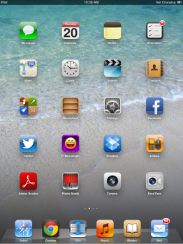
Although home screen icon labels also always remained readable regardless of the wallpaper. Which is not the case anymore.

iOS 6 Software update for iPad2 home.png iu.jpeg
 
  • Like
Reactions: Beeplance and Feyl
Not such a bad idea to put a (semitransparent) black stripe there, maybe.

Although home screen icon labels also always remained readable regardless of the wallpaper. Which is not the case anymore.

View attachment 801008


Not such a bad idea to put a (semitransparent) black stripe there, maybe.

Maybe, that could be an option.

Although home screen icon labels also always remained readable regardless of the wallpaper. Which is not the case anymore.

If I had the iPad/iPhone with iOS 6 now, I would definitely find some background against which the fonts on certain area of background would be almost illegible.
I doubt that. Because they used a white font with a black outline in addition to a shadow.
 
  • Like
Reactions: Beeplance and Feyl
Maybe off-topic (sorry), but rearranging app icons on the springboard has seemingly become even more frustrating than ever. It’s so difficult just to move an icon without accidentally creating a folder w/another app; pushing it onto an adjacent page and rearranging all the other icons by mistake; etc. I can’t believe that they can’t do better than this (after all this time).
 
  • Like
Reactions: Feyl
Maybe off-topic (sorry), but rearranging app icons on the springboard has seemingly become even more frustrating than ever. It’s so difficult just to move an icon without accidentally creating a folder w/another app; pushing it onto an adjacent page and rearranging all the other icons by mistake; etc. I can’t believe that they can’t do better than this (after all this time).
I have the same issue. Sometimes I can’t even move apps out of folder and it’s incredibly frustrating. It’s been broken since iOS 11.
 
Register on MacRumors! This sidebar will go away, and you'll see fewer ads.