how often do u stare at your homescreen for something like this to even bother u.. lol
You are seriously complaining about the wallpaper in a iPad ad?
Your criticism is invalid, wallpaper is customizable, if you find that font and icons do not contrast well against the background, you can change it.
I get what @Feyl is saying. It's not so much this one thing upsetting the mood but it's one of the straws that breaks the back. It's the larger issue of Apple's monochromatic flat-design no-depth UIx prioritizations since iOS 7 that's resulted in an interface that's too often less robust across varying conditions and results in frequent pauses to reorient oneself, where those pauses add up into accumulated frustrations for some. LINK
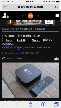
Look at the screenshot below; with the obliteration of shading, shadows, & borders that help UI define context, too often the copy/paste "buttons" are completely lost amongst a dark background and take that extra second or two to self-calibrate where the copy or cut “button” is.

The text looks difficult to read in that pic but in reality it is much clearer, more so due to parallax as well.
Ha. So Jony Ive removes helpful shading/shadows/borders in the UIx that previously helped define context globally in an application's controls, in an application's content, and in the iOS itself and addresses this design decision mistake with parallax that "helps" define context only for app icons and which was found to be sea-sickness inducing to some and then relegated to being optional, resulting in 3 fails: 1) turning off parallax loses the supposed function of defining what's pressable due to this non-robust UIx decision, 2) requiring the user to do something to accommodate Apple's design blunder that should require no user action, and 3) further erosion of the "it just works" feeling.
The bigger issue once again is replacing UIx elements that were once robust across multiple scenarios with a minimalist less-robust UIx element that shows its weaknesses often. Not always, but often.
Just my opinion from a design point of view it's probably on the lower end, but from a practical point-of-view it's better that it doesn't standout. I mean most people know what the home button does and for those who don't then it tells them what it does.
At the very (black) heart of the rationale for iOS 7, Jony is quoted as saying people know how to touch/tap glass, so certain metaphors aren't necessary anymore. And also there was some gibberish about "the interface being able to disappear amongst the content, so as to not distract and clutter the interface." But when "enacting changes resulting in reduced clarity/function for many" is contrasted with "leave alone something that works pretty darn great and results in no reduced clarity or impaired function for any," then which seems to be the better longer-view robust choice that a truly great designer would (or should) consider?
Last edited:

