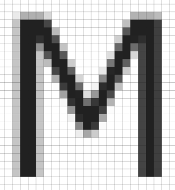
This is completely untrue. I screenshotted the text "MacOS stopped..." on my M1 MBP and opened it in an image editor so I could blow it up. As you can see, this is antialiased rendering.The problem started when MacOS stopped supporting text Anti-aliasing few years ago.

The only thing Apple stopped supporting is subpixel AA, which is what Microsoft markets as Cleartype. Subpixel / Cleartype is not a clean win. There are downsides to the trick it's based on, which is why Apple stopped using it.Windows has ClearType technology, which is more superior and enabled on by default.

Microsoft ClearType - Typography
ClearType is a software technology developed by Microsoft that improves the readability of text on existing LCDs, such as laptop screens, Pocket PC screens, and flat panel monitors.docs.microsoft.com
On Mac there is no solution to the problem except going for ultra high resolution displays (5K) to overcome the need of text sharping technologies.
The trick is built on the fact that RGB LCD pixels are composed of three subpixels, one each for R G and B, and typically these are three vertical stripes side-by-side.
Subpixel AA treats these stripes as individual pixel elements, raising the effective resolution by a factor of 3 (only in the horizontal dimension, of course). But the cost is that you'll generate off-color pixels at the edges of glyphs. These are not as visible as you might think, given adequate software massaging and sufficiently thick strokes (it looks real bad for thin elements), but there's always a little bit of weird color fringing going on.
There's failure modes. LCD manufacturers differ on whether subpixels are RGB or BGR order, and if you rasterize for the wrong order the result can look really awful. You can also run into severe problems in circumstances where displays are rotated.
There's also a scaling issue - if you ever dynamically blow up or shrink an area of the display without re-rasterizing everything, subpixel AA looks nasty. Guess what Apple does during pinch-to-zoom?

