Become a MacRumors Supporter for $50/year with no ads, ability to filter front page stories, and private forums.

Mike Vogelius

macrumors newbie
Jan 15, 2020
17
21
So, let me know if I'm understanding correctly: before, you liked the menu bar because it matched the window chrome (gray vs mostly gray), whereas now the chrome is white and the menu bar is either completely transparent or black? Does turning off transparency and turning on dark mode help at all?
Exactly. I have personally thought about adding a white line to my wallpaper as the best solution. As it is right now, the menu bar itself is even transparent when it hides itself in full screen mode. Hope this is something they are working on, because even in iOS the menu bar would not be transparent when you are inside an application.
 
Last edited:

ErikGrim

macrumors 604
Jun 20, 2003
6,522
5,145
Brisbane, Australia
All your issues solved mate

Screen Shot 2020-08-11 at 10.18.19.png
 

nickdalzell1

macrumors 68030
Dec 8, 2019
2,787
1,670
When folks complain about Big Sur looking cartoonish does no one remember how fisher-price looking iOS 7 was? Or Yosemite? Flat design is finally going away (good riddance!) and I'm enjoying the skeuomorphic bits of Big Sur. Y'all make me laugh! I'm enjoying everyone whining now you know how we skeuo fans felt when everything became washed out and flat! The tables, they've finally turned!
 

Heat_Fan89

macrumors 68030
Feb 23, 2016
2,887
3,746
When folks complain about Big Sur looking cartoonish does no one remember how fisher-price looking iOS 7 was? Or Yosemite? Flat design is finally going away (good riddance!) and I'm enjoying the skeuomorphic bits of Big Sur. Y'all make me laugh! I'm enjoying everyone whining now you know how we skeuo fans felt when everything became washed out and flat! The tables, they've finally turned!
Can you enlighten us on why you think Big Sur is not a flat design? I would love to see a 3D look make a comeback but Big Sur looks pretty flat to me.
 

nickdalzell1

macrumors 68030
Dec 8, 2019
2,787
1,670
The icons showing 3D/skeuo depth especially Messages, Mail, Chess, and Stickies, to name a few, the skeuo battery icon in system prefs, the skeuo icons all over system prefs mainly as well, need I go on? Even dark mode seems to have more 'of a surface' to it than it appeared on Catalina. More obvious, to me at least. It's less like Ive's look and more unique to me. I wouldn't have even bothered updating if not for that. I'm not into updates as they usually fall flat (pun intended).

I wish iOS could take on some of Big Sur's looks, myself. It's still flat-land over there. I themed Windows 10 to look indistinguishable from Windows 7 (and run a ton of 2010 apps too to complete the look). I use an HTC Thunderbolt as my main phone, with older Samsung devices for tablets. I never have 'got used to' flat design. Me and my eyes prefer the whimsy and depth of skeuo interfaces.

IMG_0142.JPG


The other things that matter to me in Big Sur is the dark mode finally working (it never adjusted to dark on its own in Catalina) and it waking from sleep a lot faster. The chime being there also brings back some well-missed nostalgia. Just wish it woke from sleep with a chime like my PowerBook G4 does.

Any skeuo from Big Sur is small right now, but I expect and hope that it's a sign of things to come. Like when OS X went from Puma to Jaguar all the way to Panther and so on. With more skeuo added with each update.
 
Last edited:

R1t6yM

macrumors newbie
Jun 26, 2020
10
21
The icons showing 3D/skeuo depth especially Messages, Mail, Chess, and Stickies, to name a few, the skeuo battery icon in system prefs, the skeuo icons all over system prefs mainly as well, need I go on?

Honestly that's the problem with Big Sir, at least to me, it seems like Apple doesn't know what their design is supposed to be. There are icons that look like bad 3d models, icons straight up from iOS, icons from Mojave but enclosed in some crappy square with a textured background. Considering that 3d model looking icons are what's new, suggests that they're supposed to be trying to go for 3d looking UI, but then, new windows and their controls are extremely flat, a total opposite.
 

Royksöpp

macrumors 68020
Nov 4, 2013
2,404
4,018
I had the displeasure of playing around with Big Sur over the weekend and I have some thoughts. Big Sur looks like something that was designed just for the sake of designing something new. The lack of contrast between elements is absolutely terrible. The tool bar is so far from Apple it might as well be from another company. The music icon and interface is gross. That awful pink color looks dated. It’s just as awful as it was on iOS 7. I also think that the menu bar is not well proportioned. It’s too thin and all of the elements are too small. It needs a lot of work. Based on my experience I will not be upgrading this year. Maybe after two or three updates it will finally be acceptable. Catalina looks fine. Why did they feel the need to start over fresh? It makes no sense.
 

StellarVixen

macrumors 68040
Mar 1, 2018
3,253
5,779
Somewhere between 0 and 1
Honestly that's the problem with Big Sir, at least to me, it seems like Apple doesn't know what their design is supposed to be. There are icons that look like bad 3d models, icons straight up from iOS, icons from Mojave but enclosed in some crappy square with a textured background. Considering that 3d model looking icons are what's new, suggests that they're supposed to be trying to go for 3d looking UI, but then, new windows and their controls are extremely flat, a total opposite.

Because sudden changes are bad and generally not well received. I think they are gonna slowly change it, bit by bit.
 

Mike Vogelius

macrumors newbie
Jan 15, 2020
17
21
Big Sur looks like something that was designed just for the sake of designing something new. The lack of contrast between elements is absolutely terrible.

Could not agree more, especially when it comes to the lack of contrast between elements. The lack of contrast clearly comes from iOS and is only implemented to create this bridge between the two platforms. But just because something works fine on iOS does not mean that it will work as well in macOS.
 

Royksöpp

macrumors 68020
Nov 4, 2013
2,404
4,018
Because sudden changes are bad and generally not well received. I think they are gonna slowly change it, bit by bit.

That has been a major problem post jobs. Apple wants to be the first at everything which has resulted in quite a few missteps. Bending Phones, Buggy Software, Bad Keyboards, Overheating Laptops, etc... No one is taking a look at the big picture. It should be close to perfect on the first shot. This step by step process is not the Apple I fell in love with. Big Sur was not needed. I’d rather them clean up Catalina and give us Snow Leopard 2.0!
 
Last edited:
  • Like
Reactions: RandomDSdevel

fisherking

macrumors G4
Jul 16, 2010
11,251
5,560
ny somewhere
That has been a major problem post jobs. Apple wants to be the first at everything which has resulted in quite a few missteps. Bending Phones, Buggy Software, Bad Keyboards, Overheating Laptops, etc... No one is taking a look at the big picture. It should be close to perfect on the first shot. This step by step process is not the Apple I fell in love with. Big Sur was not needed. I’d rather them clean up Catalina and give us Snow Leopard 2.0!

every company has it's rough moments (funny, tho, am typing this on a 2016 12" macbook that i live on, & the keyboard is fine).

it's your right to believe that 'no one is taking a look at the big picture'; many would disagree. apple makes the choices it makes, even if that doesn't make you, specifically, happy.

opinions are great, as long as we admit that our opinions are just... opinions.
 

Wowfunhappy

macrumors 68000
Mar 12, 2019
1,745
2,087
I’d rather them clean up Catalina and give us Snow Leopard 2.0!

What I find a little odd about the way people talk about Snow Leopard is that we've actually had a lot of Snow Leopard sequels.

Snow Leopard 2.0 came out years ago, and it was called Mountain Lion.
Snow Leopard 3.0 was called El Capitan
Snow Leopard 4.0 was called High Sierra.

I also was kind of hoping for one of these stability releases following the disaster that is Catalina, but the Developer Beta of Big Sur that I used was remarkably fast and stable, so if they can keep that up...
 

Mike Vogelius

macrumors newbie
Jan 15, 2020
17
21
What I find a little odd about the way people talk about Snow Leopard is that we've actually had a lot of Snow Leopard sequels.

Snow Leopard 2.0 came out years ago, and it was called Mountain Lion.
Snow Leopard 3.0 was called El Capitan
Snow Leopard 4.0 was called High Sierra.

I also was kind of hoping for one of these stability releases following the disaster that is Catalina, but the Developer Beta of Big Sur that I used was remarkably fast and stable, so if they can keep that up...
In my opinion, there is nothing that beats the original Snow Leopard. It is not like, Lion, Mountain Lion, El Capitan etc. haven't been good operating systems, I simply just miss a thorough cleanup. I need to see Apple remove redundant elements rather than adding new ones whether there is room for them or not, just for the sake of making people happy. Try to compare Finder on Snow leopard with Catalina, finder is a complete mess with its default settings. Functions that are not used by the majority of users should be something you can turn on yourself and not something the majority of users have to turn off themselve.
 

fisherking

macrumors G4
Jul 16, 2010
11,251
5,560
ny somewhere
In my opinion, there is nothing that beats the original Snow Leopard. It is not like, Lion, Mountain Lion, El Capitan etc. haven't been good operating systems, I simply just miss a thorough cleanup. I need to see Apple remove redundant elements rather than adding new ones whether there is room for them or not, just for the sake of making people happy. Try to compare Finder on Snow leopard with Catalina, finder is a complete mess with its default settings. Functions that are not used by the majority of users should be something you can turn on yourself and not something the majority of users have to turn off themselve.

snow leopard was a great os, for a simpler time. i personally would not want to give up 11 years of tech advancement for it; and (in my humble experience), people use the functions they need, and ignore the rest. the finder is not that much different, then, as most options can be selected (or deselected).

we all have too much time on our hands (we stress every little detail with every new OS...); am certainly including myself in that
 

Mike Vogelius

macrumors newbie
Jan 15, 2020
17
21
snow leopard was a great os, for a simpler time. i personally would not want to give up 11 years of tech advancement for it; and (in my humble experience), people use the functions they need, and ignore the rest. the finder is not that much different, then, as most options can be selected (or deselected).

we all have too much time on our hands (we stress every little detail with every new OS...); am certainly including myself in that
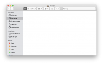
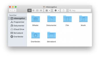
Take my example with Finder, on picture nr.1 I have rest finder to the default settings in Catalina and on pics nr.2. I have only activated what I think most people need. On picture nr. 1 I can't even finde my own home folder. Do most people not use that anymore? Maybe it's just me, but I just think Finder is a complet mess in every version of macOS after Snow leopard.
 

Attachments

  • 1.png
    1.png
    381.6 KB · Views: 234
  • 2.png
    2.png
    355 KB · Views: 257

Wowfunhappy

macrumors 68000
Mar 12, 2019
1,745
2,087
On picture nr. 1 I can't even finde my own home folder.

That's not macOS being too complicated, that's macOS lacking sane defaults. I have a setup script that fixes it.

I agree Snow Leopard had better default settings, but there are a lot of features I would really miss if I were to use it. Autosaving is a big one, I still have this vivid memory of being in High School, spending hours writing a paper in iWork on Snow Leopard, and losing all of it due to a power outage. Auto-save was already a standard feature in non-Apple products at the time, and suffice to say I was livid.

As I've mentioned before in this thread, Mavericks is my favorite macOS release in practice, provided I've run my setup script.
 
Last edited:
  • Like
Reactions: Mike Vogelius

Mike Vogelius

macrumors newbie
Jan 15, 2020
17
21
That's not Mac OS being too complicated, that's Mac OS lacking sane defaults. I have a setup script that fixes it.

I agree Snow Leopard had better default settings, but there are a lot of features I would really miss if I were to use it. Autosaving is a big one, I have vibrant memories of loosing a great deal of work in Snow Leopard when I was in High School due to a power outage, and having to start writing all over again.
fair enough :)

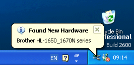
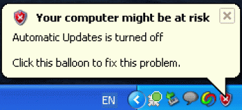
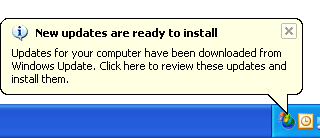
But then again, the "Recents" feature that Finder default are set up to open in. Dos anyone actual use it and What about the tags, or the notification center. I mean the notifications in Catalina itself are just as annoying as these popup messages people got in windows XP.

As I've mentioned before in this thread, Mavericks is my favorite macOS release in practice, provided I've run my setup script.
If only Apple combined the best from Snow Leopard and Mavericks. Because Mavericks did definitely get a lot of new features in the engine compartment that no one needs to see or think about, but which at the same time also make one's life so much easier.
 

Attachments

  • rHWdd.png
    rHWdd.png
    26.6 KB · Views: 154
  • xp1.gif
    xp1.gif
    11.7 KB · Views: 184
  • 20070614_updates.gif
    20070614_updates.gif
    10.3 KB · Views: 173
  • EiMeG.gif
    EiMeG.gif
    5.1 KB · Views: 148
Last edited:
  • Like
Reactions: Rivvvers

fisherking

macrumors G4
Jul 16, 2010
11,251
5,560
ny somewhere
fair enough :)

But then again, the "Recents" feature that Finder default are set up to open in. Dos anyone actual use it and What about the tags, or the notification center. I mean the notifications in Catalina itself are just as annoying as these popup messages people got in windows XP.

honestly, i respect your right to your opinion, but i personally think you're overthinking all of this. most people just use their macs, they don't stress these details; most just live on their desktops. and, if they need something (the hard drive ON the desktop, for example) they figure it out by googling the issue, or asking me...or someone else.

ppl on these forums stress the details, but... that's the point here, isn't it? to discuss eveything? so, party on... and i'll stay out of it (or, at least, try) ;)
 

Wowfunhappy

macrumors 68000
Mar 12, 2019
1,745
2,087
If only Apple combined the best from Snow Leopard and Mavericks. Because Mavericks did definitely get a lot of new features in the engine compartment that no one needs to see or think about, but which at the same time also make one's life so much easier.

I actually really like most of the features added between Lion and Mavericks. I'm not sure what I'd do without e.g. Notification Center, and I appreciate Fullscreen when I need to focus on a single task. I even occasionally use "All My Files", although I agree it should absolutely not be the default view. Still, there's not much cruft!

A handful of features bother me. I think file "colors" were better than namable "tags"—the inability to think about it too much was an advantage—but it doesn't make much difference in practice.

The one feature that's in Mavericks and not Snow Leopard which I absolutely hate with a passion is Launchpad. Launchpad completely breaks Apple's beautiful "an app is just a special type of file" metaphor, by creating a special UI that's kind of like a folder, but isn't, and works based on obtuse and arbitrary rules. I wrote a bit more about this on Hacker News a year ago: https://news.ycombinator.com/item?id=20224370 (Note at the time, I said I preferred Snow Leopard to Mavericks; I've since I changed my mind after actually using them side-by-side.)

I mostly neutered Launchpad in my setup script, but it's technically still there, if you know where to look for it...

honestly, i respect your right to your opinion, but i personally think you're overthinking all of this. most people just use their macs, they don't stress these details; most just live on their desktops. and, if they need something (the hard drive ON the desktop, for example) they figure it out by googling the issue, or asking me...or someone else.

I still think the details matter, even if not every user knows it. Someone without an art background won't necessarily be able to tell you why they like a painting, but their opinion will still be influenced by all the artist's little touches. When added together, those details make a difference, whether or not a layperson can identify them.

If it wasn't for these types of details, I'd recommend everyone forget about Mac and buy Windows machines instead. They're usually less expensive.

Just yesterday several people from my company were on an important Zoom call with a client. My boss was supposed to present, but he wasn't able to share his screen, which was kind of embarrassing! It turns out the problem was macOS Catalina—the screensharing permission dialog had appeared behind his other application windows, where he wasn't able to find it.

That's one anecdote of one experience—but again, stuff adds up. I don't expect most people to care about UI design as much I do, but I do think it has an affect on everyone's lived experience—how much they like their computer, and how much they're able to get done.
 
Last edited:
  • Like
Reactions: Snowlover and Feyl
Register on MacRumors! This sidebar will go away, and you'll see fewer ads.