Does anyone find it funny how LTD is the biggest Apple fan poster and yet he still cant even get people to agree with his pro-Apple/Anti-MS nonsense on an Apple centric board?
Last edited by a moderator:
What exactly is wrong with a user controlled file system anyway? Yeah, sure, we'll get the occasional moron who will delete kernal32.dll thinking it's a virus, although that is mostly prevented by making it awkward to get to the contents of the Windows folder. Other than that, what is the issue? It works perfectly fine. The way Apple has been hiding everything in these 'library files' bugs me.Forget MS, the question you should be asking is WHY hasn't APPLE done this yet? At least with MS you have an excuse cos they don't "innovate", but what's stopping Apple?
Why does OS X STILL have a filesystem? Apple was meant to be the innovator, thinking differently, the revolutionist so what are they still doing with that god aweful filesystem that even MS is still using.
He'll just claim that this forum is full of Apple haters. Whereas it has it's fair share, it is no way near as bad as he makes it out to be.Does anyone find it funny how LTD is the biggest Apple fan poster and yet he still cant even get people to agree with his pro-Apple/Anti-MS nonsense on an Apple centric board?
What exactly is wrong with a user controlled file system anyway? Yeah, sure, we'll get the occasional moron who will delete kernal32.dll thinking it's a virus, although that is mostly prevented by making it awkward to get to the contents of the Windows folder. Other than that, what is the issue? It works perfectly fine. The way Apple has been hiding everything in these 'library files' bugs me.
Having to open an app before choosing the file seems like a step backwards to me. I don't just have one filetype in one folder, I have a wide range, and I imagine most users will be the same. Having to first open your app before choosing a file is just plain awkward in my mind. It would be like using Windows 3.1 again, as it was even more awkward to use the actual File Manager app in Windows 3.1.
In fact, iOS reminds me a lot of Windows 3.1.
I applaud MS for having blogs on so many different topics. They have one for W8, WP7, Photosynth, Office for Mac and so on and on.
Apple on the other hand has nothing. Nope, not even a squeak.

Looks like those blogs aren't exactly paying off.
No need, when Apple knows exactly what they're doing.
Their innovation-to-R&D-ratio is pretty lousy. It's easy for folks to disrespect MS when MS does a great job of disrespecting themselves. Being "open" is pretty worthless if you're churning out a lot of crap all the time.
Well let me start. Ballmer needs to GTFO. Three years ago.
Compared to the travesty of Sculley, Ballmer doesn't come close. Microsoft is still an industry leader in operating systems.
Fact is MSFT outspends Apple 3:1 in R&D and has worse ROI by far.
Forget MS, the question you should be asking is WHY hasn't APPLE done this yet? At least with MS you have an excuse cos they don't "innovate", but what's stopping Apple?
Why does OS X STILL have a filesystem? Apple was meant to be the innovator, thinking differently, the revolutionist so what are they still doing with that god aweful filesystem that even MS is still using.
Having to open an app before choosing the file seems like a step backwards to me. I don't just have one filetype in one folder, I have a wide range, and I imagine most users will be the same. Having to first open your app before choosing a file is just plain awkward in my mind. It would be like using Windows 3.1 again, as it was even more awkward to use the actual File Manager app in Windows 3.1.
Do you use an email client? how often do you go to the file system to find an email?
Do you use iTunes or similar media catalog?
It's all data. Forget about "files". Data should be stored in open, transferrable formats in open databases. Applications should have access to that data.
You open an app to get something done.
Seems like you want to have a shoebox with all your stuff. So you want to first open the shoebox, rummage thru all your reciepts, tax documents, old cassette tapes, college papers, etc. in order to find a photo you want to show to a relative. I'd rather open the photo album that holds my photos and skip all the other stuff that is noise.
Windows 8 is going to be interesting. UI-wise, it's like they went from one extreme to the other. Are they going to prompt the user to select their preferred UI after install? Really?
Just having two separate UIs for one product tells me Microsoft doesn't know what it's doing.
Maybe they should split Windows back up again and have a consumer OS and enterprise OS instead of trying to be everything to every body.
I still don't understand why they didn't just make a Windows Phone-based tablet OS instead.
Yeah. Because you know the specifics of the way Microsoft is run.Fire Ballmer and tell Sinofsky to grow a pair. Sinofsky has talent, but unfortunately he's chained and hamstrung by MS' inefficient, maddening, and stifling bureaucracy.
Yeah. Because you know the specifics of the way Microsoft is run.
How so? Last time I checked they were making an astounding profit. Not as much as Apple is currently as we all know, but Microsoft have been making an astounding profit for well over a decade now, unlike Apple who have risen, fallen and risen.Something is very, very wrong at MS.
How so? Last time I checked they were making an astounding profit. Not as much as Apple is currently as we all know, but Microsoft have been making an astounding profit for well over a decade now, unlike Apple who have risen, fallen and risen.
The way I see it, Microsoft is still a very healthy company.
Good question. By ltd logic and metrics he uses for Apple worship ms is doing great. Let's see osx sucks because it has so little market share and windows 7 rules, and he'll vista is better than osx by the same metrics. Office is a heck of a lot better and pages sucks by the same logic.
I know what Apple's managed to do and MS hasn't. I know what Google's managed to do (in very little time) and MS hasn't. We all do. This is public knowledge.
Something is very, very wrong at MS.
When you have that kind of R&D money (far more than Apple) and that lousy of a ROI, something's not working right. And it starts with the CEO. And we all know that Ballmer makes it ridiculously easy to point fingers at him.
You don't need to understand the inner-workings of MS to see how their results stack up. Just like you don't need to go to Langley Park, Maryland or Flint, Michigan to know that it's not a place you'd likely want to go. Just like you don't need to get a Vizio tablet to figure out your money is probably better spent elsewhere.
How's Apple doing on the new Final Cut Pro X? I guess it was so innovative and magical that they had to put the old version back on sale again since the new one has been so poorly received. Oh, wait, let me guess your response...It's a limited market product so it doesn't really matter. Or, gee, Apple is so in tune with the market that they brought back the old version, or the pro users don't know what they are doing and Apple knows best....or..................:

Except that isn't what I say at all.
If you're going to use my words against me (wrongly), at least read my posts (in the very thread in which you're posting) before you do.
https://forums.macrumors.com/posts/13281387/
Last paragraph.


I know members are free to post, but I ask please if you can simply stick to the topic at hand. This thread isn't about market numbers or anything financial. The focus here is on Windows 8 and its development which can be compared to the OS X Lion which was released not long ago.
Anyways getting back on topic:
It's interesting to read some of the comments on the Office for Mac palette that was used in previous version. I have to say at someone who was never familiar with Office for Mac, I found it rather confusing and never got accustomed to it. But that's probably because I never used it as much as I did the Windows version of Office. I could see how it was like the Ribbon, but with more flexibility. But it still felt awkward to me, buttons sometimes too small, palettes often felt like clicking on file menus and just a strange experience overall.
With Explorer, there will be some major screen space savings when hiding the Ribbon. And in reality, the Ribbon is for those who don't use keyboard shortcuts. Anyone who has been using Windows for a while now should be familiar with basic keyboard shortcuts. Imagine having the Ribbon hidden, there's a lot more visible and yet you still keep the File path and some of those basic features like Back, Forward, Refresh, and Up.
Talk to me about confusing and I can point you to OS X Lion Finder. I'm still getting used to it but I can't stand the way items appear on the left side. It just feels all very cluttered. But to be honest, I haven't been using Lion too long so I'm sure I'll get used to it over time.
But moving on to other features:
There's apparently another feature MS is adding: the ability to mount ISOs. Pretty cool and seemed like a no-brainer as soon as they allowed users to burn ISOs in Win7. OS X already has this built in so it'll be nice to finally have it available in Windows.
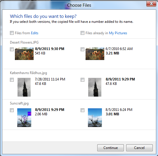
Also they are also improving the Copy, Merge dialog boxes (read more here: http://blogs.msdn.com/b/b8/archive/...ement-basics-copy-move-rename-and-delete.aspx ). OS X up until recently didn't even have a Merge option. MS has had this feature for a while now but I have to admit in Windows 7 it has often gotten confusing to pick which file to pick. Based on the screenshots, I love the level of information you get:
Image
I think it becomes a lot easier to pick which files you want when you get it visually lined up in columns like this. Although it might also get confusing if you have folders with same name.
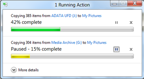
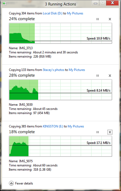
And I like how they're improving the Copy dialog box as well. OS X keeps it very simple (which isn't bad or good) but outside of the progress bar and the number of files, it's hard to say what's really going on. But I do like how file transferred are stacked up on top of each other when multiple transfers are going on at the same time. MS is doing something similar here:
Basic view:
Image
Detailed view:
Image
My one wish is that they improve Windows support for multi-display setups, I don't really like having to run a 3rd party application to get my external monitor working as it should.

