It looks okay for a mouse, but how do you navigate that with the keyboard?
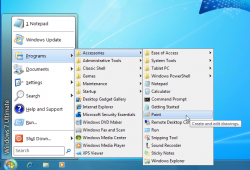
What I really like is the classic start menu from way back when (See attached thumbnail below). I think it went away in XP, or maybe Vista, but anyway in XP and Vista there was a way to get it back. Then when I couldn't get it back in Win 7, I pinned a shortcut to the "~Start Menu\Programs" folder to the Start Menu, and when I want to find a program I don't use that often (my most often used programs are pinned to the Start Menu or to the Taskbar), I click on the "~Start Menu\Programs" folder, then navigate it with the arrow keys on my keyboard.
Yeah, there is. Hit one of the arrow keys, and you'll get a highlighted box surrounding a tile. From there, just click away until you get what you want.
Though what you're seeing in the main start screen is more analogous (10 buck word of the day) to your pinned start menu apps. The metro-whatever it is equivalent to all programs folder is the apps screen, which looks like
this. It's a bit crowded, but tons better than all those nested menus in my opinion. I hate nested menus. Think they're sloppy as hell.
Though the best thing to do, and the one thing you miss out on by reverting to the oldschool 95-XP start menu is type to search. Like if you're looking for a program you don't have pinned anywhere, but know the name of it, just hit the win key and type the first couple of letters of the name out, and you'll see it pop up.
Like this.
The only downside to type to search in Win8 is it doesn't have an all programs and files category. It defaults to apps, so if you want to look for a file, you have to hit the down key twice to select it, or mouse over to it. Kinda stupid, specially since they had that option in Vista/7's type to search. The one plus side to 8's search is you can drill down to more specific selections, so I guess it's a semi-even tradeoff.
So yeah, long post short, you can use the keyboard, and do most of the things you can do in the old start menus. It looks and feels different, but acts about the same, plus or minus a couple extra features.
Is there a way to move around that grid with the keyboard? Then I suppose I wouldn't hate the new start menu. But as I said before (in this thread or another one, I forget), what I find irritating about Win8 is how it keeps flipping me back and forth between the traditional windows desktop and the new "previously known as Metro" interface. If they had found a way to totally get rid of the traditional desktop and somehow run legacy programs in virtual windows, I think I'd be happier.
But btw, what do you do if you want to see two metro programs side by side? I know there is a way to open up another app in a smaller "sidebar" strip, but is there a way to have two programs open side by side in the same size? Or just open many windows at once and position them all however you want? If not, why would I want to use Metro apps on my desktop?
Same size? No. It's always 1/3rd 2/3rds on the left or right side, and you can only ever multitask between two metro apps at once.
Really truthfully honestly, if you're mostly intending on using the desktop there aren't any huge reasons to upgrade from 7. Sure, it's a little faster, a little thinner, and all that good stuff, and it's nowhere near the horror show ruination of Windows some people claim it is, but it also doesn't offer anything you absolutely have to have. It's nowhere near as huge a jump from XP/Vista to 7, in other words. As far as desktop usage goes, it's only an incremental update to what you've already got. Sure, the new start screen, task manager, and ribbon wrapped explorer are nice, but they're not full priced upgrade nice. In fact, if the upgrade weren't just $40 or so, I probably would've gone back to 7, and only made the official jump if and when I grab a Surface.
I guess that's kinda my final review of Windows 8. If you're not making the jump into the new MS ecosystem, there isn't anything earth shattering here to come to. It's not a bad upgrade, but not a totally necessary one, either.


