Return it if the damaged frame is getting annoying.It’s funny how a slight tune calibration can give that appearance. The panel on the s21u doesn’t look pink. But as soon as I tweak color filter on iPhone it then makes the s21u look pink tinted. It’s all normal. All good. Lol. Just the pesky frame gouge is still on my mind. Not sure why as I don’t see it with case on.
Got a tip for us?
Let us know
Become a MacRumors Supporter for $50/year with no ads, ability to filter front page stories, and private forums.
iPhone 12 Pro Yellow Screen/Tint? Display seem "Warm"? Check here first!
- Thread starter kre62
- Start date
- Sort by reaction score
You are using an out of date browser. It may not display this or other websites correctly.
You should upgrade or use an alternative browser.
You should upgrade or use an alternative browser.
Here’s another video I just did from the 2nd s21u. Is there a difference? Not sure. Perhaps. Lol.Return it if the damaged frame is getting annoying.
- YouTube
Enjoy the videos and music you love, upload original content, and share it all with friends, family, and the world on YouTube.
 youtube.com
Here’s another video I just did from the 2nd s21u. Is there a difference? Not sure. Perhaps. Lol.
- YouTube
Enjoy the videos and music you love, upload original content, and share it all with friends, family, and the world on YouTube.
Remember a mate who had a Samsung S8, his screen had red tint that you could see from a mile away, he never complained about it, guess everyone sees things differently.
I believe there is no such thing as a perfect oled panel.
You going to get the phone replaced?
What phone ? The first s21u was returned on the 2nd day 6 months ago. The current s21u I purchased beginning of September. There is no red tint. The video on the first YouTube link doesn’t show the color shift , it would shift pink to green , green primarily. The s21u is near flawless image wise. Just dimmer than the note 20 ultra 🤣🤣Remember a mate who had a Samsung S8, his screen had red tint that you could see from a mile away, he never complained about it, guess everyone sees things differently.
I believe there is no such thing as a perfect oled panel.
You going to get the phone replaced?
Your iPhone 13 pro max, going back or keeping it?What phone ? The first s21u was returned on the 2nd day 6 months ago. The current s21u I purchased beginning of September. There is no red tint. The video on the first YouTube link doesn’t show the color shift , it would shift pink to green , green primarily. The s21u is near flawless image wise. Just dimmer than the note 20 ultra 🤣🤣
There is always apple care + if I ever get the urge 📱🔨😂
I don’t know cuz, it’s a 35 mile journey each way. For what a nik? Without wanting to sounding anti iPhone, who’s to say the next one doesn’t have another issue ? I ask myself , am I working for the iPhone or is the iPhone working for me ? 🤣Your iPhone 13 pro max, going back or keeping it?
There is always apple care + if I ever get the urge 📱🔨😂
Km please 🤦♂️😂35 mile
There is always the easier option, get apple to send you a new phone in the mail, transfer everything onto it, then send back the damaged phone. Don’t have to leave your house.
I had apple send out a courier for a item I was returning. 😁😂
56 clicks? Km. I tried that last year they didn’t offer me this. They told me to return it either in store or mail it in for refund. Maybe I got a wrong rep. Plus hassle of being on the phone etc. doing diagnosis blah blah blah. Calling up again with reference number.Km please 🤦♂️😂
There is always the easier option, get apple to send you a new phone in the mail, transfer everything onto it, then send back the damaged phone. Don’t have to leave your house.
I had apple send out a courier for a item I was returning. 😁😂
Yeah this is the healthy frame of mind imo. The more any of us try and chase down the unicorn example, the further out of reach it gets. It will never end!I don’t know cuz, it’s a 35 mile journey each way. For what a nik? Without wanting to sounding anti iPhone, who’s to say the next one doesn’t have another issue ? I ask myself , am I working for the iPhone or is the iPhone working for me ? 🤣
I am seriously thinking of trying to borrow/rent a proper colorimeter. I have a friend with a properly calibrated ProDisplay XDR and was eyeballing my phones against it over the weekend while we were playing with them. D65 is my personal target white point as a photographer. I believe my old iPhone X shipped with a white point around 6200K. My 13 Pro appears to be around 5400K, maybe even warmer. After applying the blue color filter, it appears to be on the cool side, around 7000K, even at the lowest intensity. That intensity slider just doesn’t quiiiite go low enough- even at it’s lowest intensity it’s changing a *lot*. Anyway, I feel like I’m around 7000K, closer to my desired spec but cooler than I’d prefer- still far closer, and wildly preferable to my eye vs the out of the box calibration. I’m a nerd though, I want the real numbers! I want validation! It wouldn’t mean a whole lot because of the panel lottery but it might be of interest to some folks here.
I will say though, after messing with the filters, if you decide to go that route you have to be *dead* specific to only bring in blue light and no additional green or magenta shift. The best way to do it is to crank the intensity slider all the way, find the spot where no green or magenta is getting into the crayons in the sample image, and then reduce the intensity and there you go.
Must of got some newbie who has no idea what his doing, most likely still using his training wheels. 🚴♀️56 clicks? Km. I tried that last year they didn’t offer me this. They told me to return it either in store or mail it in for refund. Maybe I got a wrong rep. Plus hassle of being on the phone etc. doing diagnosis blah blah blah. Calling up again with reference number.
Call them again, they’ll definitely send you one out, there is nothing to diagnose, some dirty grub opened your phone, used it and damaged it.
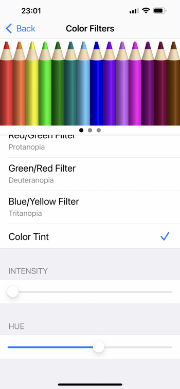
Yep. I know it’s a moot request, but any chance of posting a screen shot of the color filter menu and your settings ? Cheers.Yeah this is the healthy frame of mind imo. The more any of us try and chase down the unicorn example, the further out of reach it gets. It will never end!
I am seriously thinking of trying to borrow/rent a proper colorimeter. I have a friend with a properly calibrated ProDisplay XDR and was eyeballing my phones against it over the weekend while we were playing with them. D65 is my personal target white point as a photographer. I believe my old iPhone X shipped with a white point around 6200K. My 13 Pro appears to be around 5400K, maybe even warmer. After applying the blue color filter, it appears to be on the cool side, around 7000K, even at the lowest intensity. That intensity slider just doesn’t quiiiite go low enough- even at it’s lowest intensity it’s changing a *lot*. Anyway, I feel like I’m around 7000K, closer to my desired spec but cooler than I’d prefer- still far closer, and wildly preferable to my eye vs the out of the box calibration. I’m a nerd though, I want the real numbers! I want validation! It wouldn’t mean a whole lot because of the panel lottery but it might be of interest to some folks here.
I will say though, after messing with the filters, if you decide to go that route you have to be *dead* specific to only bring in blue light and no additional green or magenta shift. The best way to do it is to crank the intensity slider all the way, find the spot where no green or magenta is getting into the crayons in the sample image, and then reduce the intensity and there you go.
No problem, here you go! You really do have to get that hue slider *exact* for the best result- like I said, crank the intensity while setting it and look at the crayons. You should see even the slightest movement bringing a ton of color back to the red and green crayons. Ideally you want them both “dark,” swallowed by the blue entirely, and then yank the intensity all the way back and enjoy the finished product.
The end goal is to combat yellow shift with blue shift. The reason people bash the color filters is because they’re accidentally changing the green or magenta of their screen in the process and the results look wonky.
I also have that color filter setting mapped to my accessibility shortcut (triple click power button,) So I can turn it on and off without having to go to the settings over and over. It’s good for doing a quick A/B glance at the screen and deciding if the filter route is for you.
I do think the filters are the answer for most people here until apple changes the display technology again or adds user calibration. Whether we want to admit it or not, the filter helps

“Filter” being a dirty word in the photography community, and the crude inexact method by which you set it up here, are the reason it gets a bad rep.
That setting is awesome with true tone enabled. It’s very difficult to get it spot on using fat finger 😂View attachment 1849486
No problem, here you go! You really do have to get that hue slider *exact* for the best result- like I said, crank the intensity while setting it and look at the crayons. You should see even the slightest movement bringing a ton of color back to the red and green crayons. Ideally you want them both “dark,” swallowed by the blue entirely, and then yank the intensity all the way back and enjoy the finished product.
The end goal is to combat yellow shift with blue shift. The reason people bash the color filters is because they’re accidentally changing the green or magenta of their screen in the process and the results look wonky.
I also have that color filter setting mapped to my accessibility shortcut (triple click power button,) So I can turn it on and off without having to go to the settings over and over. It’s good for doing a quick A/B glance at the screen and deciding if the filter route is for you.
I do think the filters are the answer for most people here until apple changes the display technology again or adds user calibration. Whether we want to admit it or not, the filter helps
“Filter” being a dirty word in the photography community, and the crude inexact method by which you set it up here, are the reason it gets a bad rep.
PS you’re right about the intensity slider. Wish it could go a tad lower than it’s current minimum value.
Attachments
It’s true they help but after using it a while on my 12 pro max I decided not to use it anymore because of the lower brightness.View attachment 1849486
No problem, here you go! You really do have to get that hue slider *exact* for the best result- like I said, crank the intensity while setting it and look at the crayons. You should see even the slightest movement bringing a ton of color back to the red and green crayons. Ideally you want them both “dark,” swallowed by the blue entirely, and then yank the intensity all the way back and enjoy the finished product.
The end goal is to combat yellow shift with blue shift. The reason people bash the color filters is because they’re accidentally changing the green or magenta of their screen in the process and the results look wonky.
I also have that color filter setting mapped to my accessibility shortcut (triple click power button,) So I can turn it on and off without having to go to the settings over and over. It’s good for doing a quick A/B glance at the screen and deciding if the filter route is for you.
I do think the filters are the answer for most people here until apple changes the display technology again or adds user calibration. Whether we want to admit it or not, the filter helps
“Filter” being a dirty word in the photography community, and the crude inexact method by which you set it up here, are the reason it gets a bad rep.
That’s a fair consideration, it definitely seems to affect it. Haven’t tried outside in the sun yet, that’ll be the real test!It’s true they help but after using it a while on my 12 pro max I decided not to use it anymore because of the lower brightness.
Yep- although it’s understandable why it doesn’t go lower, given the intention of the feature is ostensibly to help those with colorblindness.That setting is awesome with true tone enabled. It’s very difficult to get it spot on using fat finger 😂
PS you’re right about the intensity slider. Wish it could go a tad lower than it’s current minimum value.
I actually hadn’t considered using it in tandem with True Tone, might give that a go.
I used to use the filter function back with my iPhone XS Max. It really didn’t hinder my view ability even with the occasional usage under the Florida sunshine. My phone usage is primarily indoors, slight dim doesn’t bother me personally. If anything I prefer it then it being too bright. I have the reduce white point on as well. 😂That’s a fair consideration, it definitely seems to affect it. Haven’t tried outside in the sun yet, that’ll be the real test!
It's worth noting that some 12 PM displays were warmer than others. We had 12 PMs n the household (now it's one 13 PM, and one 12 PM), and the displays were significantly different -- both the yellow tint and max brightness.
The new 13 PM is ever so slightly cooler than the better of the two 12 PMs, but way better than the yellow one.
With my 13 PM I still use the colour filter to get the display quality I like. In the 13 PM it does not seem to affect the brightness quite as much as the 12 PM.
The new 13 PM is ever so slightly cooler than the better of the two 12 PMs, but way better than the yellow one.
With my 13 PM I still use the colour filter to get the display quality I like. In the 13 PM it does not seem to affect the brightness quite as much as the 12 PM.
I can see color filter bothering people that normally have the attached brightness levels 24/7 😂😎It's worth noting that some 12 PM displays were warmer than others. We had 12 PMs n the household (now it's one 13 PM, and one 12 PM), and the displays were significantly different -- both the yellow tint and max brightness.
The new 13 PM is ever so slightly cooler than the better of the two 12 PMs, but way better than the yellow one.
With my 13 PM I still use the colour filter to get the display quality I like. In the 13 PM it does not seem to affect the brightness quite as much as the 12 PM.
Attachments
Yeah panel variance is always going to throw a wrench into any “scientific” analysis we think we might have around these parts.It's worth noting that some 12 PM displays were warmer than others. We had 12 PMs n the household (now it's one 13 PM, and one 12 PM), and the displays were significantly different -- both the yellow tint and max brightness.
The new 13 PM is ever so slightly cooler than the better of the two 12 PMs, but way better than the yellow one.
With my 13 PM I still use the colour filter to get the display quality I like. In the 13 PM it does not seem to affect the brightness quite as much as the 12 PM.
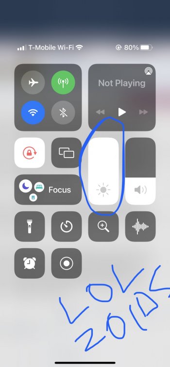
How similar are your filter settings to mine?damn!!! You got it set to max brightness indoors, feel sorry for your eyeballs 😳😂I can see color filter bothering people that normally have the attached brightness levels 24/7 😂😎
This is plenty for me during the day when indoors.
As do I.damn!!! You got it set to max brightness indoors, feel sorry for your eyeballs 😳😂
This is plenty for me during the day when indoors.
View attachment 1849555
Yeah it’s normal. It’s custom for obsessed people to do a 5% brightness test with new OLED tvs and they all suck, lots of clouding and unevenness. My 13P screen is also slightly warmer on all the right side at minimum brightness (as I already said it’s also sliiightly darker at all times on that side, but I only notice if I search for it on very white apps like mail or messages)
My 13PM also is warmer towards the bottom - but as others have said, this is a characteristic of OLED and while it’s perhaps possible to get a perfect one, or one that’s perfect to the user’s eye, it could take a lot of trips to the Apple Store and may in fact never happen!
Thanks, good for my sanity. My older iPhones have probably had issues like this as well, I guess as this is my first pro max it’s the first time I’ve found the screen viable to use as a kindle. Which makes it the first time I’ve noticed it!Yeah it’s normal. It’s custom for obsessed people to do a 5% brightness test with new OLED tvs and they all suck, lots of clouding and unevenness. My 13P screen is also slightly warmer on all the right side at minimum brightness (as I already said it’s also sliiightly darker at all times on that side, but I only notice if I search for it on very white apps like mail or messages)
I had a 2 days old 6S with a darker top. Shipped to have only my screen changed with a new one, which had a greener spot up left. Not perfect but better. But they didn't attach it correctly on the upper right side and it moved. Went to an Apple Store and they exchanged the whole phone with a regen 6S. Which had the same upper half darker.... and a spongy half recessed power button. Cursed a little then kept it, the cover didn't let me see the crooked power button. My iPhone 8 had the same problem of my current 13P, the right side of the screen is slightly dimmer. Kept it for 3 years. As I'm keeping this 13P. It bothers me for a week or two then I manage not to care. Another person probably would not have noticed any of these "defects". We all like this shiny costly objects to be perfect, but truth is no one is, and there are a lot of things that can go wrong in other units. We must be able to cope with something good enough. A perfect iPhone, discarding all the slightly subpar units, would cost 5000$.Thanks, good for my sanity. My older iPhones have probably had issues like this as well, I guess as this is my first pro max it’s the first time I’ve found the screen viable to use as a kindle. Which makes it the first time I’ve noticed it!
Register on MacRumors! This sidebar will go away, and you'll see fewer ads.