Got a tip for us?
Let us know
Become a MacRumors Supporter for $50/year with no ads, ability to filter front page stories, and private forums.
Your most hated font....excluding Comic Sans
- Thread starter dornoforpyros
- Start date
- Sort by reaction score
You are using an out of date browser. It may not display this or other websites correctly.
You should upgrade or use an alternative browser.
You should upgrade or use an alternative browser.
iGav said:I can't believe Helvetica is in this list. Unbelievable.
I thought of you when I saw that someone had included that...
")
After all, it's so boring.
I agree Helvetica is a thing of great beauty. Now, Chicago on the other hand...iGav said:I can't believe Helvetica is in this list. Unbelievable.
Blue Velvet said:I thought of you when I saw that someone had included that...
Excellent...
that means I'm finally building a 'reputation' of some kind. heh iGav said:I can't believe Helvetica is in this list. Unbelievable.
Helvectica in the wrong hands can be boring, but if a designer knows what they are doing with it, it's one of the very best fonts out there.
C
CompUser
Guest
Peignot
I hate Peignot. With a passion. So much that it's reason enough for me to not do business with any company that uses it for their logo/advertising/whatever. I want to own/run a design shop just so I can make rule No. 1 that if you ever use Peignot in anything, for any reason, you're immediately canned on the spot.
I hate Peignot. With a passion. So much that it's reason enough for me to not do business with any company that uses it for their logo/advertising/whatever. I want to own/run a design shop just so I can make rule No. 1 that if you ever use Peignot in anything, for any reason, you're immediately canned on the spot.
1. Arial - because so many clients really want to use it
2. Gill Sans - because it creates a lot of kerning issues
3. Hobo - it turns my stomach
2. Gill Sans - because it creates a lot of kerning issues
3. Hobo - it turns my stomach
DavidFDM said:Gill Sans - because it creates a lot of kerning issues
True... some of those caps are oddly tight. The A, W and T particularly.
It used to be one of our corporate fonts and I was always asked to double-space
a sentence beginning with a W by an internal client. So we eventually had to spend some time setting up new kerning tables in Quark to deal with the problem.DavidFDM said:3. Hobo - it turns my stomach
Ick. There's a whole bunch of 70's Letraset ones that would have been better left in rub-down format rather than being digitised.
ATD said:Helvectica in the wrong hands can be boring, but if a designer knows what they are doing with it, it's one of the very best fonts out there.
totally agree. usually people forget about letter spacing/kerning, leading, font weights and other typesetting "rules" which can end up ruining a great font like helvetica. my vote is for all the 90's grunge fonts---if you need the relic'd effect, create it yourself and make it halfway decent. eras would also be on my list. i don't like to use capitals...
Apple Hobo said:
There are plenty of garbage fonts, but Helvetica is what came to mind first.
I read a book about Helvetica once. Well no so much a text book but full of uses of Helvetica; album art, book titles. Pretty much everything. Even screenshots of videos that are just helvetica fonts floating around.
It's a mad world.
SpookTheHamster said:Not allowed to complain about Comic Sans?
Then I'll just have to choose Impact
But it's so ... industrial!
Font
Critter....my boss at work loves this font for some odd ball reason. By the way he likes to think of himself as a designer but he's just an editor or a daily newspaper.
Critter....my boss at work loves this font for some odd ball reason. By the way he likes to think of himself as a designer but he's just an editor or a daily newspaper.
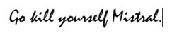
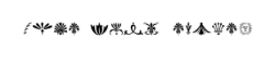
My vote goes to Lucida Handwriting. And the wingdings set- can someone explain to me when you would EVER need to communicate through a series of symbols (That's another one!) which are impossible to read? !
Sorry, it's late and I've got a deadline tommorrow
Sorry, it's late and I've got a deadline tommorrow
dornoforpyros said:I back up my original argument, seriously I could probably start a website just with pictures of this damn font.
When I first read the thread title, my gut response was also Papyrus. Although I don't hate it, the font is way overused. I'll gladly provide pictures of it's (mis)-use in the bay area if set up the site. =)
dmw007 said:Not sure that I have an official™ "most hated" font, but fonts like the following I see no real purpose for:
gasp!
I love using these actually. Decoratively only of course (and only as background imagery). Really HUGE, they become abstract curves of sexy goodness.
i remember back in high school i despised the font 'creepy' or something of the sorts. luckily i can't find it on my powerbook for an adequate example...
Lunja said:My vote goes to Lucida Handwriting. And the wingdings set- can someone explain to me when you would EVER need to communicate through a series of symbols (That's another one!) which are impossible to read? !
Sorry, it's late and I've got a deadline tommorrow
Back in primary school we used to use wingdings to code messages.
Register on MacRumors! This sidebar will go away, and you'll see fewer ads.